Super-Supra
(Banned)
- 4,111
Yep, it's gon.

<html>

  <head>
    <title>Sunny Mangat</title>
    <meta name="description" content="This is a graphical resource, providing wallpapers, games and soon tutorials.">
    <meta name="keywords" content="Sunny Mangat, games, graphical, mangat, photoshop, sunny, sunnymangat, web">

<script language = "JavaScript">
  <!-- hide start
  function popup() {
    window.open("http://banners.dot.tk/banner?fldpromonr=1&fldbannernr=0&flddomainnr=2680539","bannerpopup","height=100,width=486");
  }
  // hide end -->
</script>

  </head>

  <frameset onLoad="JavaScript:popup()" rows="*,1" framespacing="0" border="0" frameborder="NO">
    [color=darkred]<frame src="http://www.kinesophobia.com/sunny/" name="dot_tk_frame_content" scrolling="auto" noresize>[/color]
  </frameset>

  <noframes>
    <body>
    </body>
  </noframes>

</html>")
Oh, ok... in that case, you might to reference that link, since the single frameset thing is yucky poo poo.Originally posted by Super-Supra
That's the .tk frame. It's just the URL cloaking thing.
http://www.kinesophobia.com/sunny/
This URL doesn't have any frames.
Nope!Originally posted by Mr. Snowtire
Hack much Sage?
 Viewing a site's source code is something that's built into the browser, ya know...
 Originally posted by Sage
Oh, ok... in that case, you might to reference that link, since the single frameset thing is yucky poo poo.
Two more things:
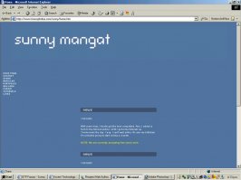
On the home page, the news is way, way, way down there, because of your navigation bar... either use CSS to make a two-column design, use tables to make a two-column design, or make a horizontal navigation bar. The setup you have here is discouraging to a visitor, because there's vast expanses of wasted space.
On the note of the navigation bar, make them rollover images instead of SWF files... the parameter and object junk used for SWF files bulks up code to a huge extent (Javascript code for rollover images is also bulky, but nowhere near as bulky).
Your talking about the top image right?Originally posted by Cobraboy
Were you not able to get the images to match the background colour (or vice versa)? It seems to stand out quite a bit..
Originally posted by Super-Supra
Your talking about the top image right?
I just noticed that this morning.
Originally posted by Super-Supra
Ok, so the buttom and top?

Originally posted by DODGE the VIPER
Your "articles" are a bit short.

Originally posted by daan
The links on your links page don't work. Every link highlights when you move the mouse onto one of them, but nothing happens when you click.
Originally posted by Super-Supra
Yeah. I don't know how to do that table stuff. So I kept it basic. I'm gonna try to use CSS on my v2. But I'm in the process of learning how to use it.