Cytoria
Staff Emeritus
- 2,615

- France
- Cytoria
THIS FORTNIGHT'S THEME
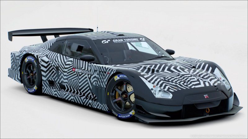
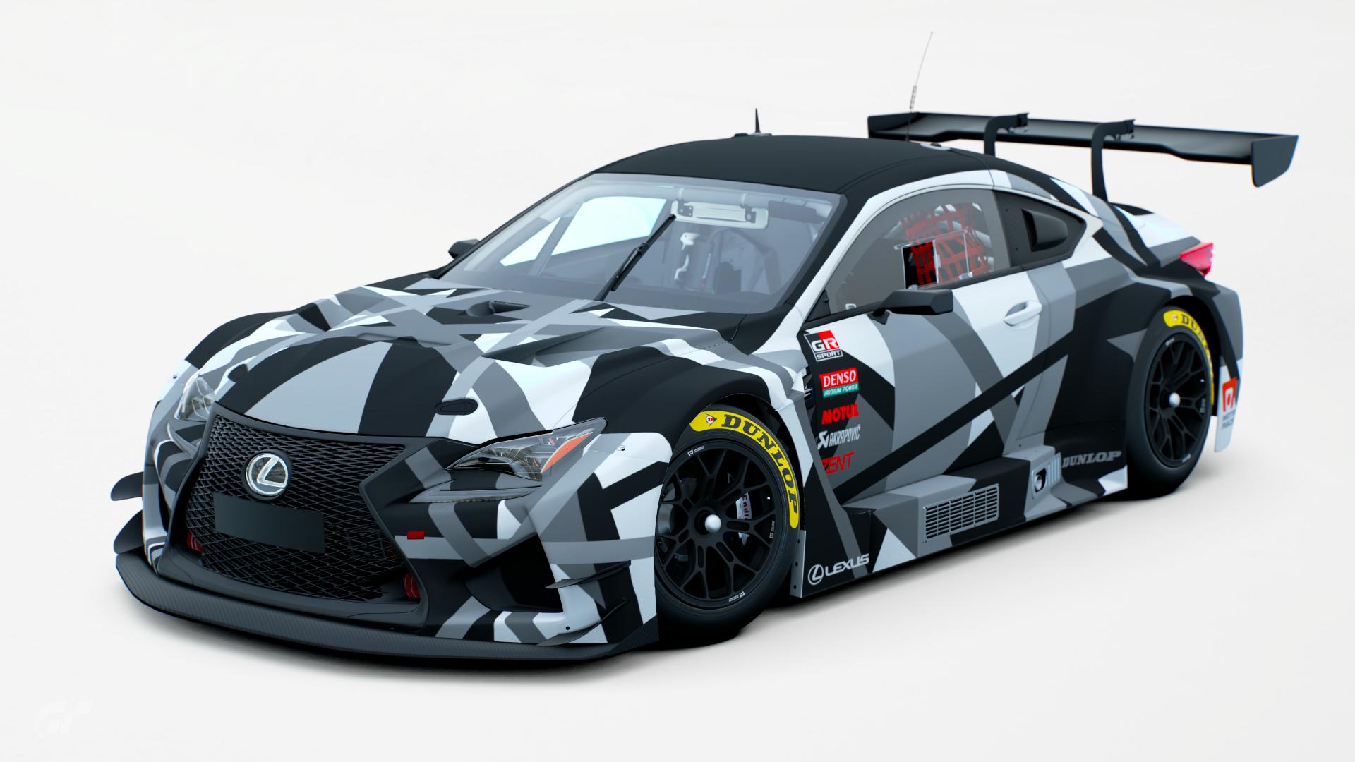
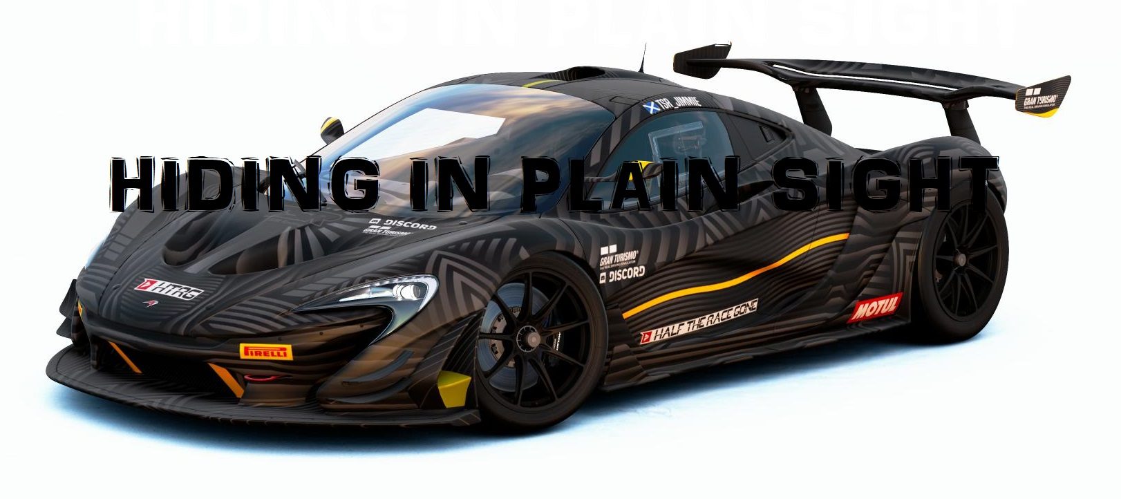
This week, we will try to keep our cars secret. Last winner @D-Max set this theme, let's hear what he has to say :
I’m looking for cars to be covered in an alternate/pre-season camouflage. Think red bull F1 pre season, Alfa Romeo valentines livery, production car camouflage.
I want your take on a camouflage for your newly developed race car.
CARS :
- Race cars only
- Any Race Car (Gr.1, Gr.2, Gr.3, Gr.4 or Gr.B.)
- Any Racing Gr.X.
LIVERIES :
- No replicas, original designs only.
UNIQUE RESTRICTIONS :
- No ‘military’ camouflage. The design must be a complete one off and totally unique.
- No large title sponsors (Tyre/lubricant sponsors and small product sponsors are fine. Placement of team names are fine but again, must not cover excessive areas of the car.).
BONUS PICTURES SETTINGS :
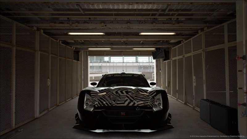
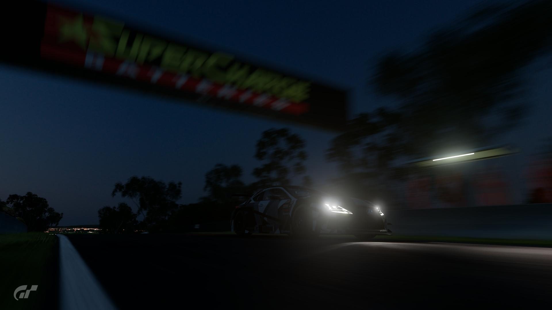
- 2 bonus pictures needed, set as follow :
- 1 still image in a garage setting
- 1 moving image on track.
USER MADE DECALS :
- Allowed.
GENERAL COMPETITION RULES
ENTRY SUBMISSION
- The only way you can take part is to be a member of the GTPlanet forums. If you haven't created your account yet, click here
- Mark your FINAL ENTRY clearly, with red text.
- Unsure how to? Copy and paste the following:
Code:
[COLOR=red][B]FINAL ENTRY[/B][/COLOR]- You may change your entry once. Do it clearly; edit out your previous entry, and either post the new one in a new reply, or in place of the original.
- Do not post "Honourable Mentions" or outtakes - just your Final Entry, that's all.
- Absolutely no entries which utilize edited/hacked file saves.
- Winner gets to choose the following Fortnight's theme.
- Winners cannot enter in their own theme!
- The Host may ask for the original image/livery and it must be submitted if so.
- It's recommended to share the original livery online (in-game) to prove it’s your work.
- Winner, second and third places will have to share the links of the liveries for the Hall of Fame thread
ENTRY PRESENTATION
- All images shall have preview images which may not exceed 640 pixels in either direction (main and bonus pictures)
- You have to post two main pictures of your entry using the mandatory locations and settings as shown below
- You are allowed to post two bonus pictures in a spoiler with free location and settings (unless the unique restrictions of the week’s theme specify something else)
- You have to make one post with ONLY the 4 pictures and the FINAL ENTRY mark. If you want to add precisions/background story/links, you are allowed to double-post under your entry. The best way to do it will be to "reply" to your own post.
- It is recommended you host your image either here on GTPlanet (via the Media section), or on Flickr
- Not sure how to submit your image? Here's a guide for both methods mentioned above.
- A preview image must be representative of the full-size image. Do not add effects to it.
- Please use a clickable-preview to full-size, not a separate text link for it; it makes poll creation much easier!
- No heavy post-game editing, slight enhancing is allowed.
MANDATORY PICTURES
- You have to post a front quarter view and a rear quarter view of your car.
- You can choose between the Shiretoko 03 location or the White Sands 01/09 locations. No other location will be allowed for the main pics.
- If you choose the Shiretoko location, please follow the settings in the spoiler below.
Car:
Detailed Settings:
- Key Lights: Off
Camera:
EV: +0.5
Effects:
Temperature: 9500 K
Screen Effects 1:
Mask: Background
Individual Colour Tone Correction:
- Saturation: 0
- Brightness: 500
- Contrast: 150 (This is key to controlling how light/dark the under-car shadow will appear)
Car Effects:
Individual Colour Tone Correction:
- Saturation: 125
- Brightness: 125
(Adjust these figures to suit the colour of the car)
- If you choose the White Sands 01/09 location, please follow the settings in the spoiler below.
Zoom: around 90mm at stock position
Aperture: f/32
Exposure Correction: +1.0
Shutter Speed: 1/1
Single AF on the A-pillar/mirror
Temperature: 6500
Color Cast Correction: 0.025
Screen Effect: Background Mask
Individual Correction:
Saturation: 100%
Brightness: 500
Contrast: 250
Highlight: 0
Car Effects:
Brightness 120
Aperture: f/32
Exposure Correction: +1.0
Shutter Speed: 1/1
Single AF on the A-pillar/mirror
Temperature: 6500
Color Cast Correction: 0.025
Screen Effect: Background Mask
Individual Correction:
Saturation: 100%
Brightness: 500
Contrast: 250
Highlight: 0
Car Effects:
Brightness 120
Please, ensure you read and understand all requirements for this competition. Failure to follow the rules may result in disqualification. If you have questions, start a convo with me.
DEADLINE
July 10, 2019 (23:59, CEST/GMT+1)


 )
)


