The GT7 Livery Editor Competition #12 (The Left is not the Right) - CLOSED

  • Thread starter Nuschel01
  • 87 comments
  • 13,346 views

Nuschel01

Enjoy Car Life
Premium
6,753
Germany
Fürstentum Lippe
GTP_Nuschel
THE LEFT IS NOT THE RIGHT
full

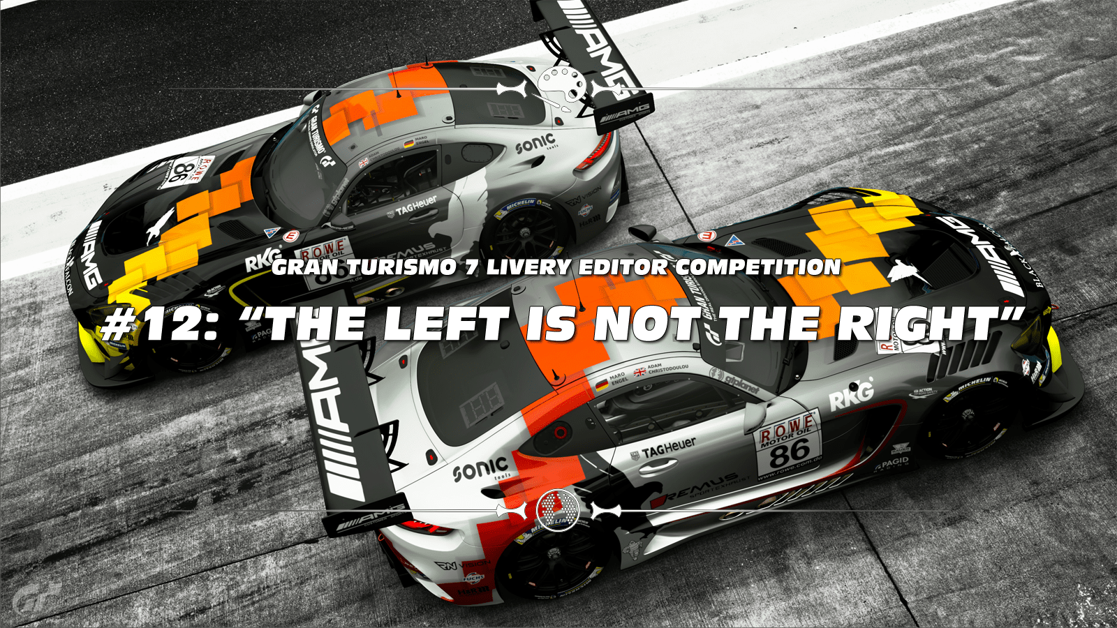
Image courtesy of @Cytoria


THIS MONTH'S THEME

Forget about that "Dupicate to other side" feature of the livery editor! Last winner @ziggedzag chose this theme which was originally proposed by @Noisy for GTS LEC #19. Let's recap what Noisy said about this theme:

"I want to challenge our designers and take them out of their comfort zone.

Design a livery that is asymmetrical, that is different in design on one side compared to the other.

The design should be noticeably different on the drivers' and passengers' side of the car with a transition on the top of the car. Asymmetric designs are quite uncommon in racing and it would be great to see what people can come up with. Good luck!"


Please read the rules below to make sure you don't miss anything when you post your entry, as ignoring them can get you disqualified.


CARS:
  • Any

BODY PARTS / WIDEBODY:
  • Allowed

LIVERIES:
  • Original or replica desgins

UNIQUE RESTRICTIONS:
  • Livery must be noticeably different in design on drivers and passenger side of the car.
  • No simple colour swaps between sides (so no red text on white background in one side and white text on red background on the other).
  • No split designs i.e. 1999 BAR F1 influenced designs.
  • Sponsor logos and number plates can be symmetric.

BONUS PICTURE SETTINGS:
  • None

USER MADE DECALS:
  • Allowed


GENERAL COMPETITION RULES

ENTRY SUBMISSION

  • The only way you can take part is to be a member of the GTPlanet forums. If you haven't created your account yet, click here.
  • Mark your FINAL ENTRY clearly, with red text.
  • Unsure how to? Copy and paste the following: [COLOR=red][B]FINAL ENTRY[/B][/COLOR]
  • One entry per user. It must be your own work, and never previously used in a competition.
  • You may change your entry once. Do it clearly; edit out your previous entry, and either post the new one in a new reply, or in place of the original.
  • Do not post "Honourable Mentions" or outtakes - just your Final Entry, that's all.
  • Absolutely no entries which utilise edited/hacked file saves.
  • Winner gets to choose the following month’s theme.
  • Winners cannot enter their own theme!
  • The organisers may ask for the original image/livery and it must be submitted if so.
  • It's recommended to share the original livery online (in-game) to prove it’s your work.


ENTRY PRESENTATION
  • All images shall have preview images which may not exceed 640 pixels in either direction (main and bonus pictures).
  • You have to post two main pictures of your entry using the mandatory location and settings as shown in the quote below.
  • You are allowed to post two bonus pictures in a spoiler ([SPOILER]...[/SPOILER]) with free location and settings (unless the unique restrictions of the week’s theme specify something else).
  • You have to make one post with ONLY the set allowed number of pictures and the FINAL ENTRY (see above) mark. If you want to add precisions/background story/links, you are allowed to double-post under your entry, but please put all additional images in a spoiler. The best way to do it will be to "reply" to your own post.
  • It is recommended you host your image either here on GTPlanet (via the Media section), or on Flickr
  • Not sure how to submit your image? Here's a guide for both methods mentioned above.
  • Do not attach your phots directly to your entry post.
  • A preview image must be representative of the full-size image. Do not add effects to it.
  • Please use a clickable-preview to full-size, not a separate text link for it; it makes poll creation much easier!
  • No post-game editing of any entry image is allowed.
  • Mark your entry with which platform you're on and which mode you're using, whether it’s taken on PS4 Base, PS4 Pro, PS5 Raytracing or PS5 Framerate.


MANDATORY PICTURES
  • You have to post a front and a rear quarter view of your car:
    • Mandatory Scape: S&Company East, Saitama, Japan (scape number 5)
    • Focal Length: ~80mm ±5mm
    • Aperture: f5.6 or f8.0
    • Shutter Speed: 1/1 Second
    • Exposure Correction: +0.5 to +1.0
  • Do not use any Filters or Effects at all and only the camera setting above within the allowed limits; the pictures are supposed to be as equal as possible for all entries and not give anyone who is a bit more savvy with the Scapes Camera an advantage! Try to stay as close as possible to how the video shows the shot to be taken!

NOTE: if you have previously entered, just go to Scapes > My Library > click your previous entry > Open Scapes > change car to the new entry, refocus and snap a new photo. No need to reposition the camera/car unless its proportions are wildly different.

Please, ensure you read and understand all requirements for this competition. Failure to follow the rules may result in disqualification. If you have questions, start a convo with me, Matski or any other participant you feel comfortable reaching out to.

PLEASE NOTE: Repeat offenders will be disqualified. If your entry doesn’t match the rules you will be made aware of it at least once, so please keep an eye out for any notifications reaching your profile.


DEADLINE

November 14th 2022 - 23:59 UTC
 
A few additional marks this time, please also read them :)
Do not use any Filters or Effects at all and only the camera setting above within the allowed limits; the pictures are supposed to be as equal as possible for all entries and not give anyone who is a bit more savvy with the Scapes Camera an advantage! Try to stay as close as possible to how the video shows the shot to be taken!
Just a reminder for everyone to not tinker too much with the entry pics, it's kinda obvious some of the mandatory pics look very different to others ;)

And regarding the theme:
- Livery must be noticeably different in design on drivers and passenger side of the car. - The main rule of the competition and one which has had little to no debate. Noticeably different means doing more than just adding an extra stripe to one side, it should be easy to notice the difference on each side:
ALLOWED


ALLOWED
- No split designs i.e. 1999 BAR F1 influenced designs. - This rule was made to stop people putting two separate liveries on the same car. This does not mean that there can't be multiple main sponsors on the same car however if the two sides are not related in some way then it would be deemed a split livery:
REJECTED : Split design
- No simple colour swaps between sides (so no red text on white background in one side and white text on red background on the other). - This rule was made to stop people creating a normal livery and then changing the colours to get around the asymmetric rules. It does not stop a design being different colours on each side if enough effort is put in and it can be seen to still be part of a continuous design:
REJECTED : Colour swap only

Happy painting :gtpflag:
 
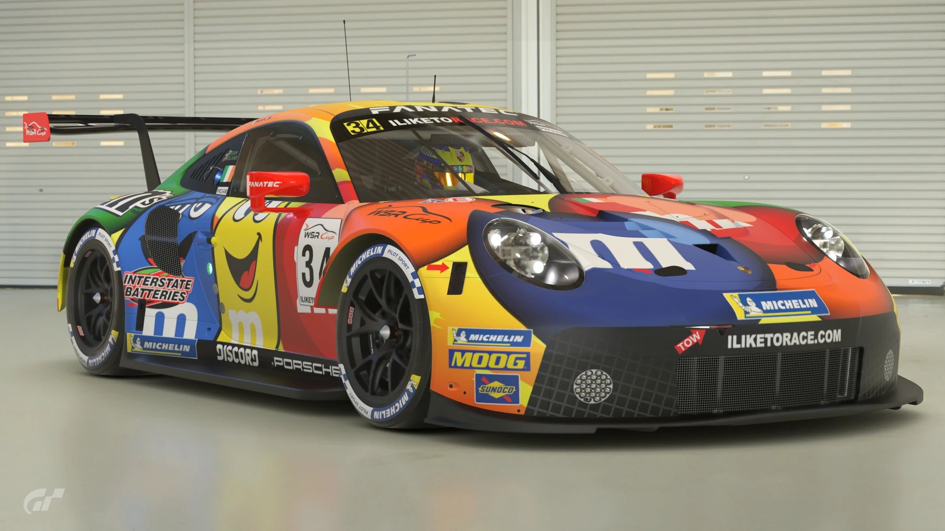
I made this for WSR Cup specifically to try my hand at an asymmetrical livery, because they’re not normally what I make. Using M&Ms allowed me to play around with different colours and placement while keeping the mandatory decal requirements.

It also comes with a matching M&Ms helmet and suit. You can see the helmet in the first pic.
 
Last edited:
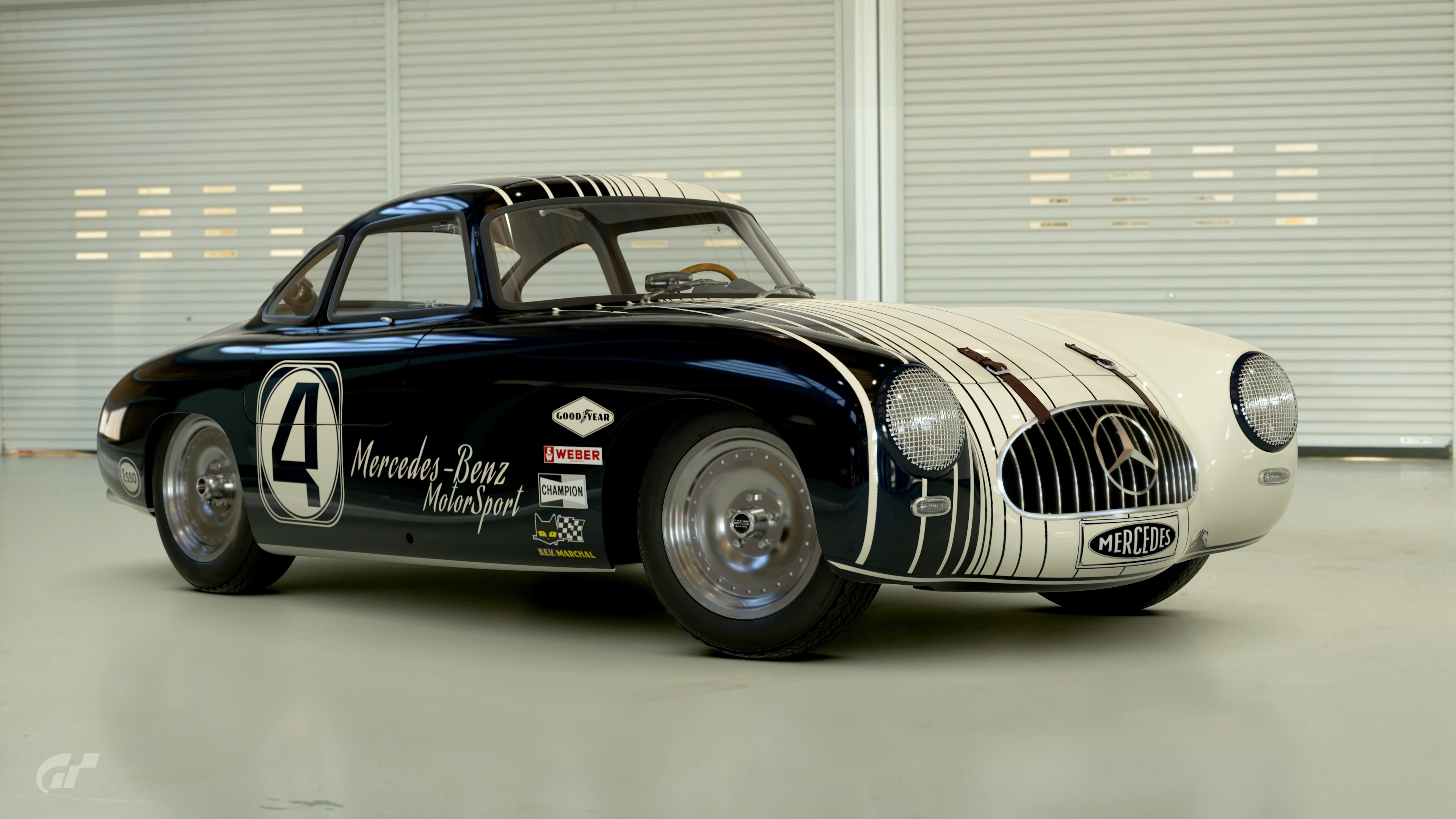
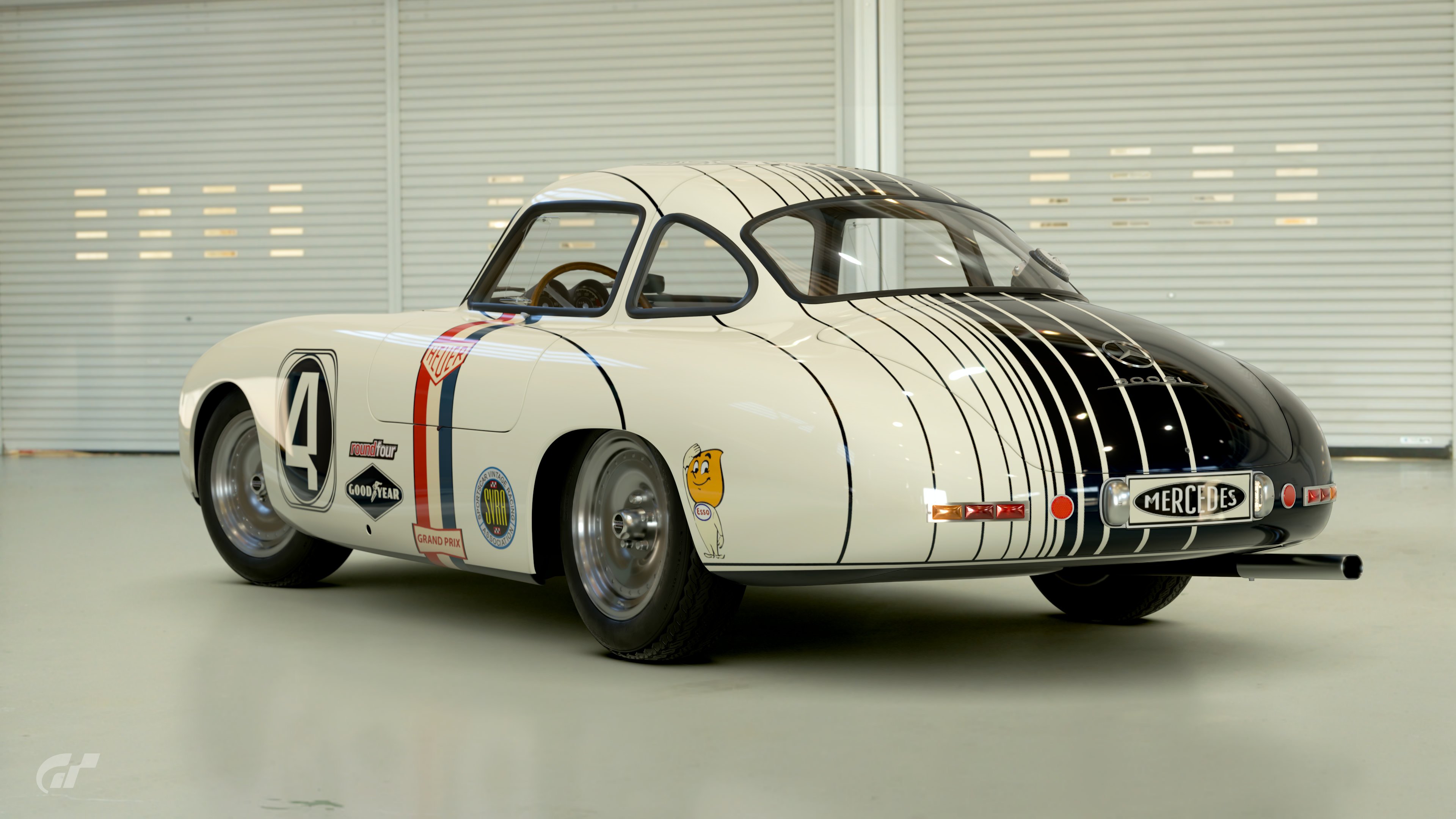
Wanted to make a livery for the 300SL racecar for a while now. I knew I wanted something classic, but even more so... classy. The asymmetrical pinstripe pattern in deep dark blue and off-white really hit the spot!

Download link
 
Last edited:
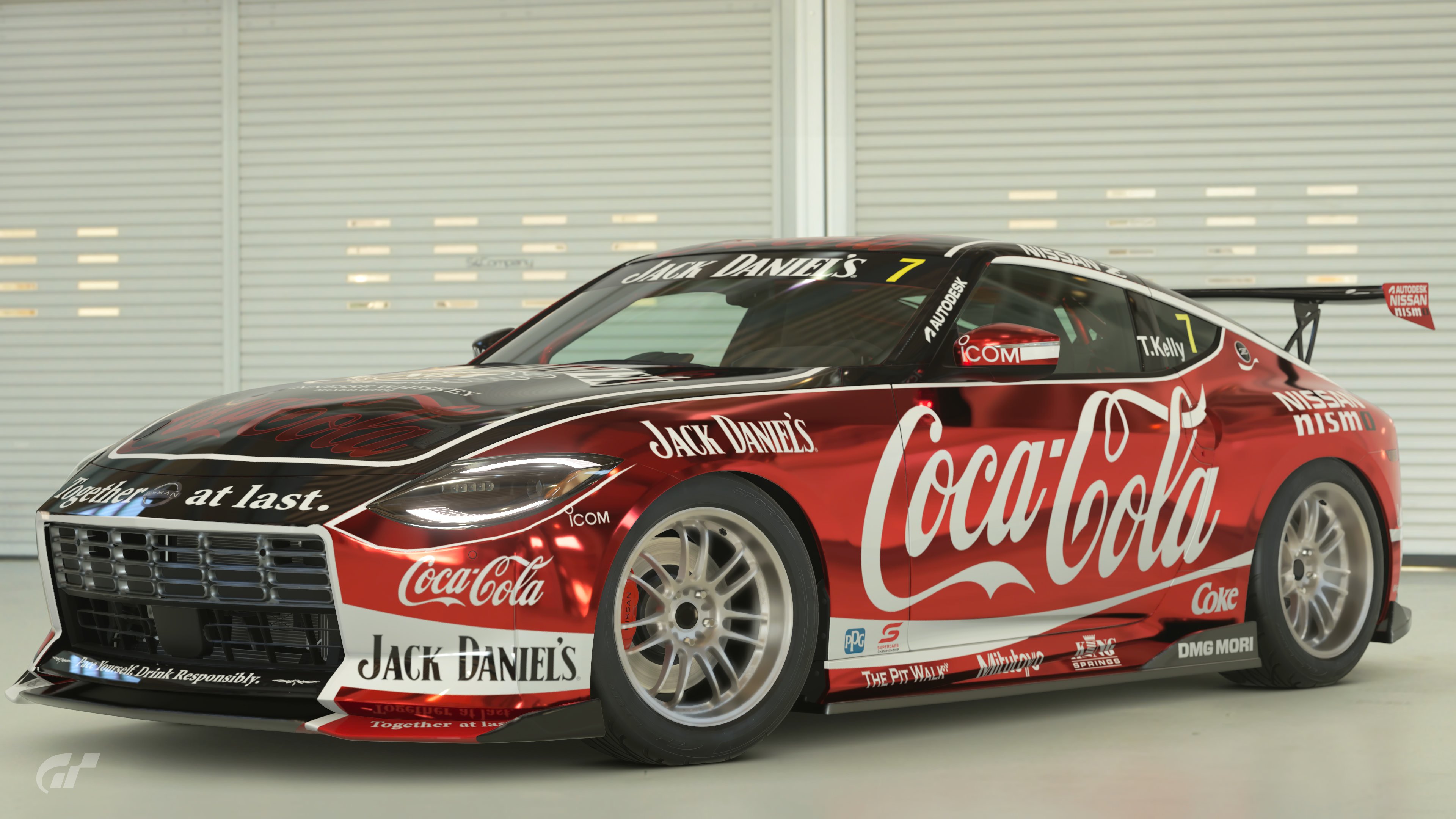
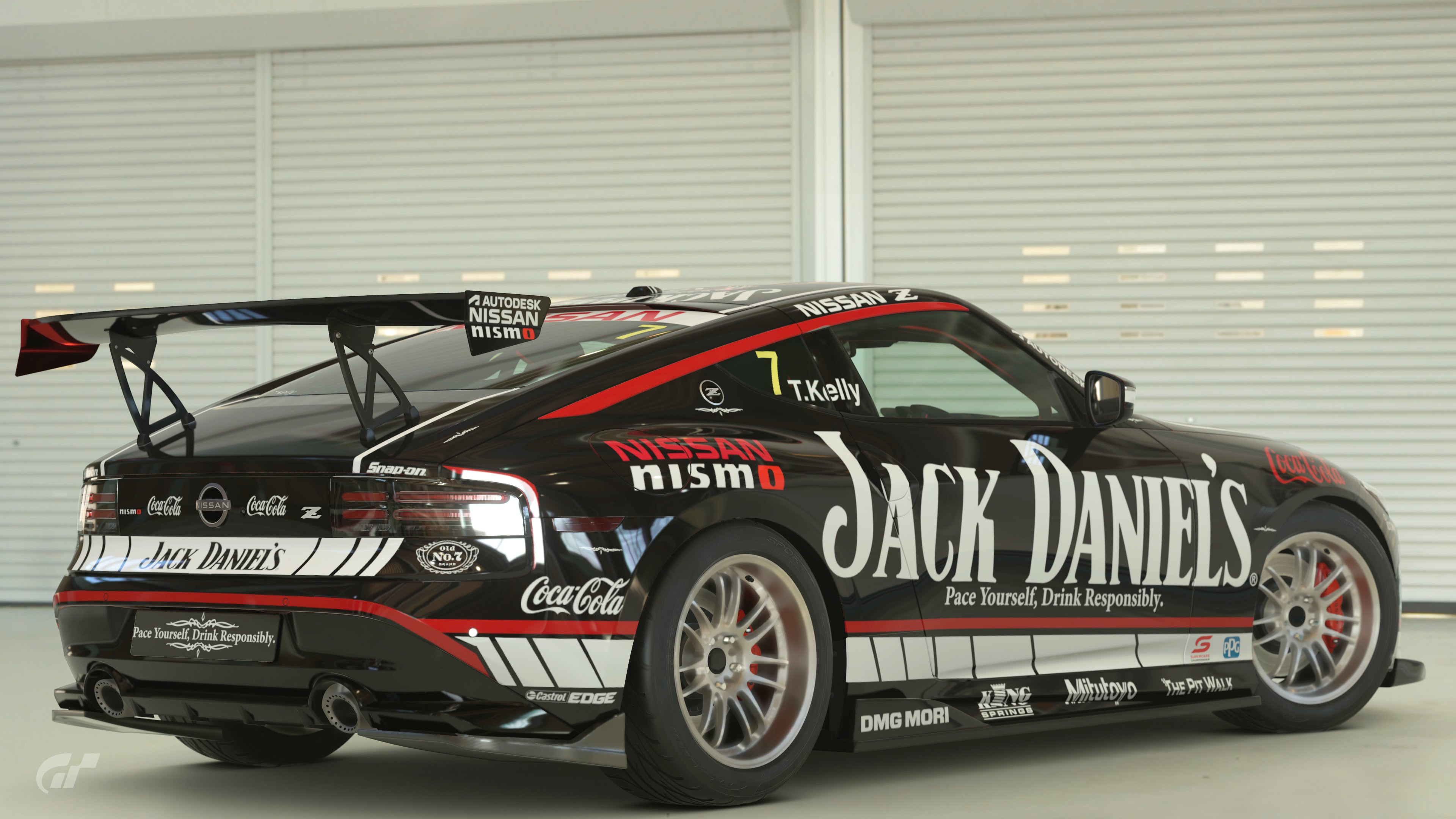
Final Entry


My very first idea for this was some kind of alcohol & coke design. By chance I stumbled onto the fact that Jack Daniels & Coca Cola are actually working together at the moment with a pre-mix to be released later this year.

Jack Daniels & Nissan have history in Aussie Supercars, and they’re my favourite style of livery to make, so here we are.

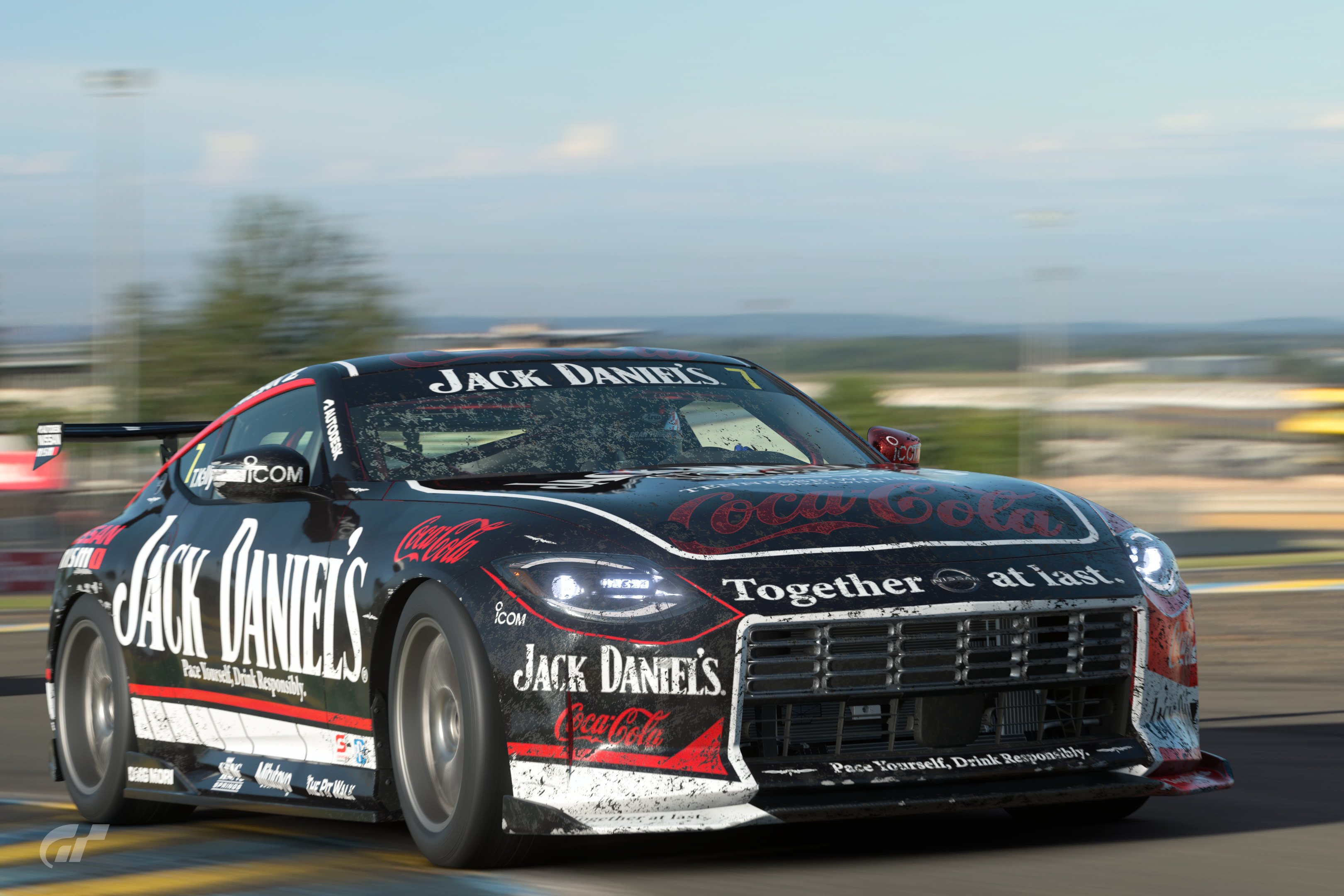
I’ve been conscious not to go the Half-N-Half BAR approach and instead joined the colours on the body lines on the side of the car. The designs are different but cohesive and a lot of thought has gone into making it feel like 1 design instead of two glued together. I feel like I’ve achieved that and it successfully advertises the new pre-mix along with both brands (and their individual brand languages) at the same time.

This may be my favourite livery I’ve ever made and I spent a fair bit of time watching it drive around on the video scapes. Thanks for a fun challenge! :D
 
Ill let you guys decide whether this qualifies as there isn't a massive difference left to right.

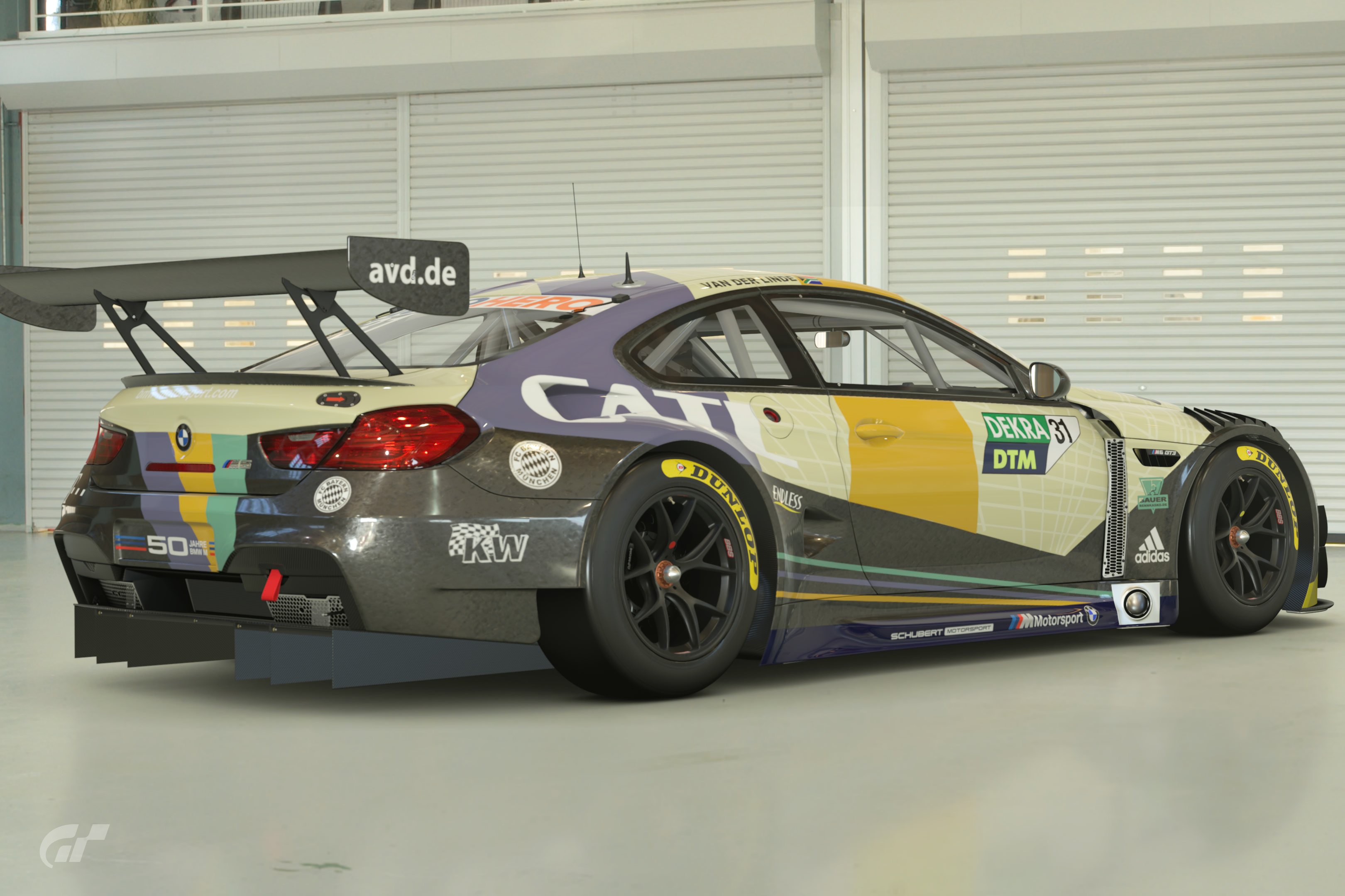
Here I have taken the 2022 DTM champions Schubert Motorsport and Sheldon van der Linde and combined a one off livery with that other Bavarian staple Bayern Munich

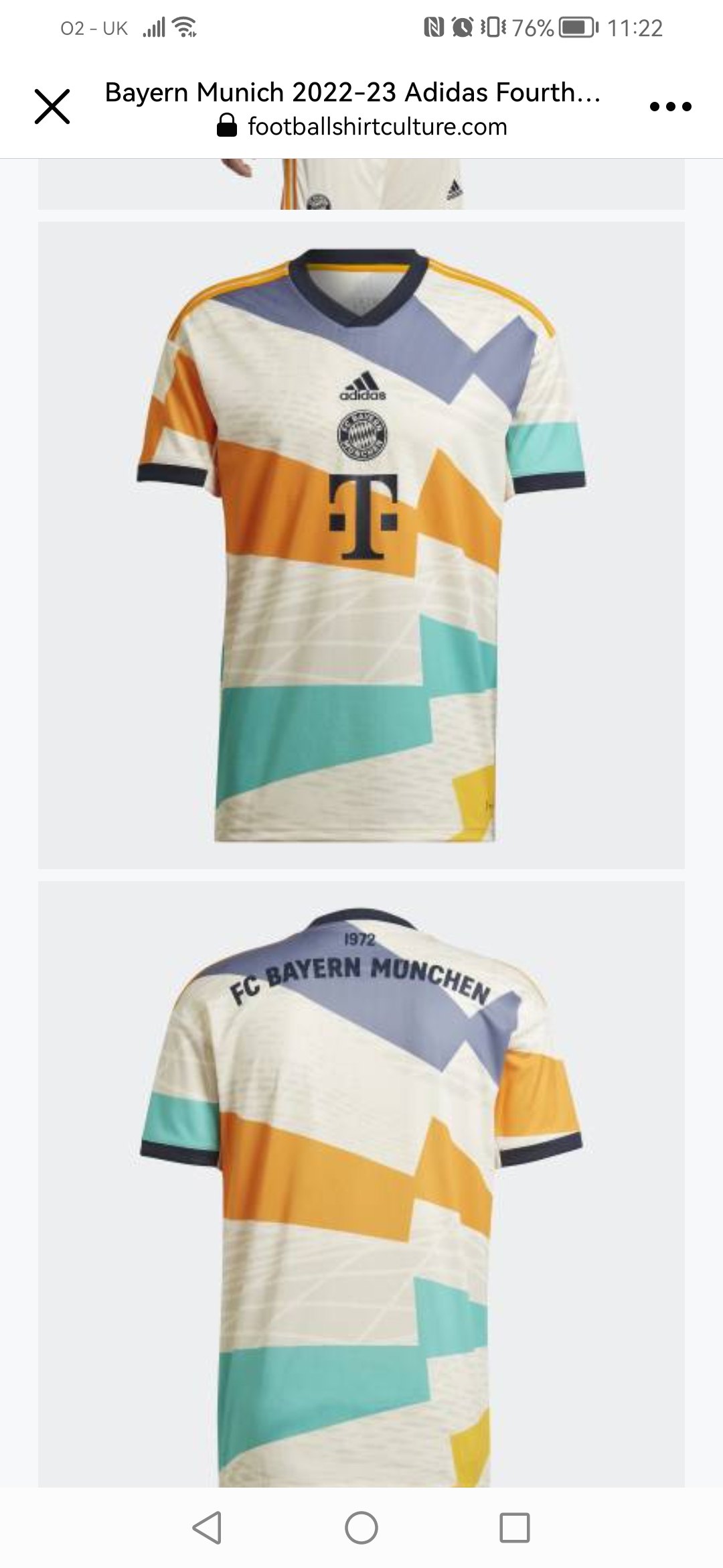
They released this shirt


To mark to 50th anniversary of the Olympic Stadium in Munich and I thought it would make a nice crossover piece.
 
FINAL ENTRY
PS4PRO


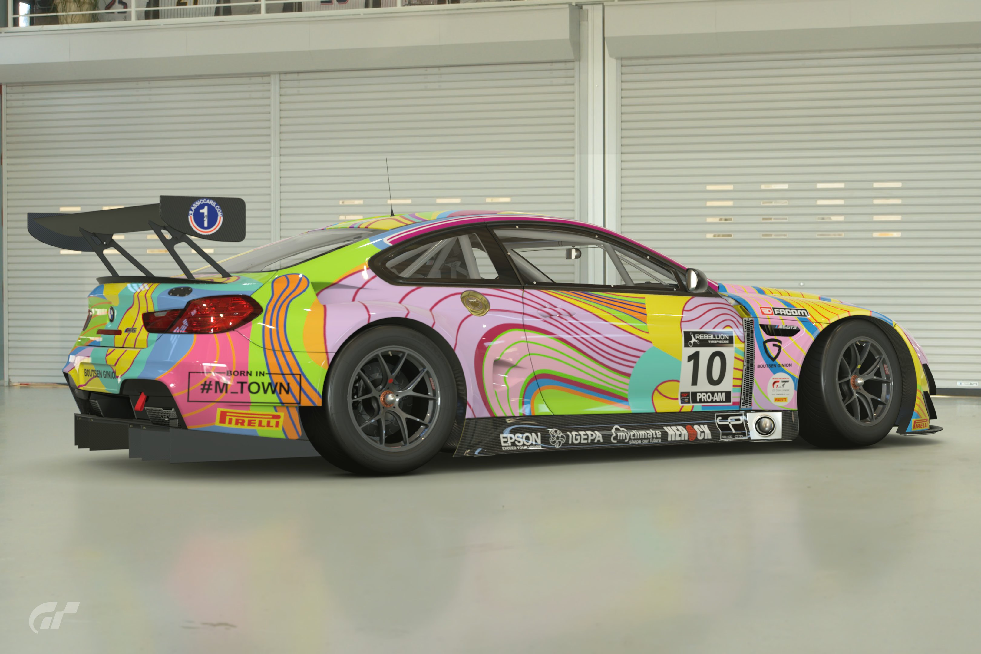
Peter Halley art car, 2020 Total 24hr at Spa.
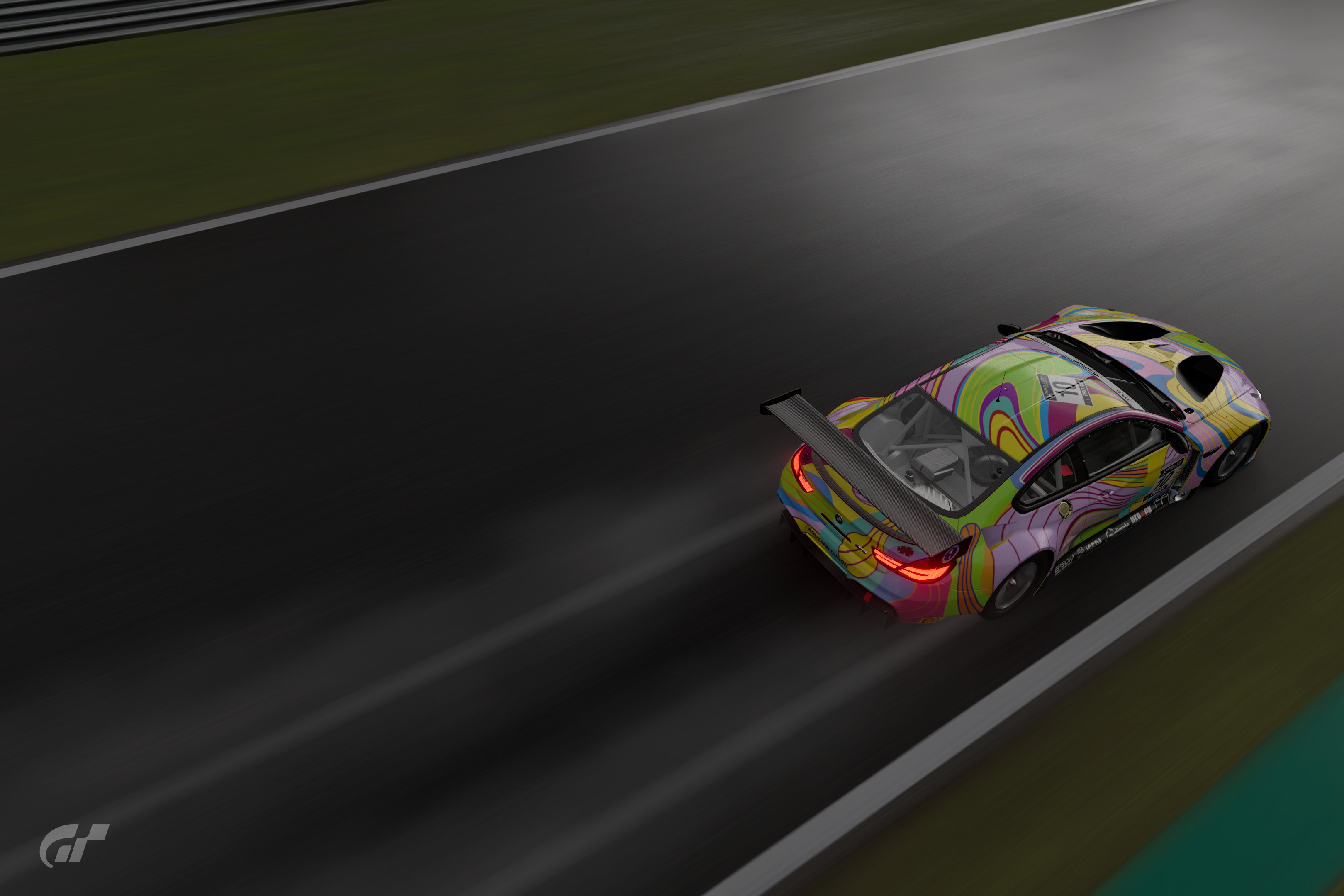
Certainly my most challenging paint job so far, this probably took 50+ hours with the combination of time making decals and in game creation. There are a few big decals and hundreds of in game shapes. I have maxed out the decal limit on the body and hood, even with each side being big decals. One of my reference sources was a Facebook video about the team and the car, and it had some nice shots during the rain. I tried to capture them in my bonus shots, I am not much of a photographer though.
 
Last edited:
Yeah its almost as if you waited for me to post my M6 hahaha

Awesome work though mate - definitely a front runner already 👍
I love yours! I was undecided between a bunch of eligible liveries I have, but after seeing the first four I knew this was going to be a tough LEC.
 
Last edited:
I've got quite a lot of stuff that would be eligible already, but if possible I like to try and create something new for each LEC. I have an idea for this one, but I've got to do a gradient livery yet as well, and if I run out of time, you know I'm just gonna throw an art car up for both - nothin' like trading on past glories :D :D
 
Back