 With the announcements and interviews expected to begin pouring out of E3 2010 on Tuesday, next week could be the most exciting ever for GT fans around the world. To kick things off, I’m proud to launch the first major revision to GTPlanet in more than two years. Over the past 6 months, I’ve personally crafted this custom set of templates for our news blog, forum, and guides, and I hope you’re as happy with the finished product as I am. As you look around, watch for these new features on the blog:
- You can now reply to specific comments on blog posts by clicking on the “Reply” link below the comment text. Your post will then appear immediately below it, indented slightly. This will make it easier to directly attack trolls and answer questions. My comments will also be highlighted.
- “Previous” and “Next” links are now available when viewing image galleries posts, so you can just keep clicking the link without having to track down the thumbnail of each image you want to see. Here’s a good example.
- The most popular posts, as judged by the number of comments over the past 30 days, are displayed in the sidebar.
- Links to related posts are now displayed above the comment section, which should help draw your attention older news, screenshots, or videos that you may have missed.
As always, please let me know if you spot anything broken or out of place. Meanwhile, I’ll be composing a post for tomorrow that provides everything you need to know about E3, including links to all the live streams and a word about what to expect from GTPlanet’s own exclusive coverage (yep, we’ll have our own man on the show floor this year!).
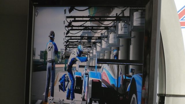
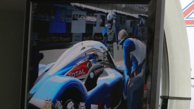
And yes, as of posting we’re still waiting for video of the Le Mans demo to be uploaded from France. For now, enjoy these two pictures:







I love it, keep your hard work! Respect! ;) thanks!
I’m using brand new iMac. It would be better to “sum up” the article in a few sentences that would fit, rather than just cut off the beginning text of the article.
Long live the desktop, thumb-twitchers!
truncated news text is annoying
A little bit, but it’s only one finger over .001″ to scroll back and forth on my Touch Pro. A pinch would do on an iPhone.
If it’s bothering you and you’re using a PC, you need a new monitor.
Its definitely an improvement.. nice job jordan =)
Hey Jordan, We’ll be at E3 as well covering GT5.. Maybe we’ll see your guy there..
Nice new look of the site !
Darin Gangi
Inside Sim Racing
Proper nice.
To be honest, I preferred the old layout. It looked more slick and easy on the eye.
Nice new look, Jordan. I even checked out the chat room last night.
Nice, new look! Great work!
Jordan> what tools you use for creating and managing this site?
The Planet looks great!!
Jordan you have outdone yourself the new website looks great, thanks a lot :)
The only thing i can see wrong with the comment system is that you have all of your comments on the same page – Good for people who don’t like multiple pages, bad for people with slow connections.
Haha. :)
Looking great though, Jordan!
I’m sorry but I think it needs some more polishing, I dont like how the tabs at the top look like and what happened to the gtplanet logo? It’s all fuzzy and wierd.
Clean, easy and necessities only. Good.
Impressed with the obvious time invested in keeping this site looking fresh and interesting, especially since there is only one topic to work with.
Yea the iPhone/iPod touch mobile version needs a touchup (i always check gtplanet on it vs the computer). Other than that, we all appreciate your work Jordan =)
Great work Jordan. It takes a GTP oldtimer like me a little while to get used to the new sleek design, but the new functions are great, especially the -next- function when looking at news item pictures. Well done!!!
Nice change!
Very nice job Jordan, love the clean lines. Well done!
Thank you for all the hard work you put into running this site Jordan, it doesn’t go unnoticed :)
I’m liking the new look, it makes reading articles on the front page much easier. The forum also looks a lot cleaner and easier to navigate.
Many thanks :)
Thanks for all the work Jordan!
This website is the website I visite the most,
next to google I guess;)
My Compliments. Very, very good!
New site is really cool, cheers Jordan!
Well done Jordan!
Will you be modifying the “mobile theme” to partake in some of the new functions?
great design. nice surprise.
Good news indeed! Thanks Jordan! =)
TBH, I expected Jordan gonna change the site for GT5 and he really did it! I like it!
Sweet!! We haven’t had much GT news so at least something entertaining has happened :)
It doesn’t look good. Go back please.
Wow this is awesome! We can now comment to the trolls instantly!! J/k. Thanks a lot Jordan, your awesome! #1 Site for me.
its different, it will take some getting used to but I like it! looks very professional, top job Jordan!
The new layout is excellent. Thanks for all the hard work, Jordan.
looking good mr. J
Agreed, the new format is excellent, great work Jordan!
I approve of the update! Solid.
looking good! keep up the good work!
This is soooooooo awesome
Awesome !
thanks!
Absolutely fantastic work Jordan, the new GTPlanet is looking great, double :tup: from me!!
Although looking at those two 908 pics, GT5s accuracy now worries me as both of those Peugeots still appear to be running, haha!!
http://www.youtube.com/watch?v=tVlcSyLFFEU
Looks very very good. I liked the previous layout very much, too. Simple, effective, great use of space. Easy to find what you want. Why can’t more sites be this well layed-out? kudos.
As an aside, the blue border between the top area and the content area is a little jarring to me. Not sure if it’s the shade or what; I’m not much of a designer, though.
Hi everybody, i found this on youtube:
http://www.youtube.com/watch?v=7_Rz0NLS_-Q
and this is taken from GT5rs team
http://www.youtube.com/watch?v=tVlcSyLFFEU&feature=player_embedded&eurl=http%3A%2F%2Fwww.gt5rs.com%2F#!
Hold up! in those two pics i see multiple cars…. i hope theonline part of the games has that Quality.If it does im gonna buy some stock in “NO DOZE” lmao!
Nice look jordan, Two thumbs up!
looks very nice and easy on the eyes.
It reminds me more of the version displayed on the iphone
WOW :O) 10/10 …
Just a quick GT/Le Mans note.
Danish TV2 had a segment with racedriver Casper Elgaard taking a lap in the Gran Turismo Le Mans Demo.
He mentioned that the track in the game was from 2004 – not 2010.
beautifull!!!!!!!!!!nice work jordan!!!!!!!!!
Awesome, I’ve been waiting for those reply things for a while.
Good bye to @ BobSomeone
Hello one-click reply.
And the site looks more professional, great job!
Nice job with the layout!
beutiful jordan, the new forum layout too
this is awesome i love you Jordan!!!!!!!!!!!!
I like the new layout looks good :)
Random thought for everyone… I’m sure a lot of users / visitors to this site are only on here awaiting confirmation of a release date and for details of the game prior to its release. I might have been one of them but after seeing the work Jordan’s put into this site I’d be tempted to revisit even when I have the game in my sweaty palms.
A question for Jordan – what kind of news will you be expecting to post on the site once the game is released?
Thanks Ollie, if you like GT you’ll love how the community changes after games are released (the site is nearly ten years old and has seen it all). Post-GT5, GTP will be heavily focused on online racing tournaments and competitions, and I’ll be posting about that and other online events. I’m also working on a custom Photomode and video gallery for everyone to share their pictures and videos (exported through the new YouTube feature), in addition to a tuning database for help in setting up your car.
Yup, stick around. Lots of stuff post release.
Site looks great guys!!
Great Job, one of the best and most comfortable redesigns I’ve seen.
So much more clearer now. Good upgrade IMO.
Brilliant job Jordan. Looks much better…way more professional.
love the main page with smaller news icon …easier to watch n navigate …n comment page n replies 2 .. brilliant !
I don;t like the new looks that much.
Thank you Jordan, nice job, really. (altough I will need some time to get used to the new look)
Must say this looks very good.
Looking good. Nice work :)
Good work Jordan, looks great.
gratz.
and now lets just wait peugeot gameplay with interior view :)
Gracias Jordan !! un gran trabajo en el nuaevo sitio
CONGRATS !!
Very nice work Jordan! GTP looking crisp !
I’ve been refreshing this all day and when I saw the new layout I got a little excited.
looks really nice!
Great job JORDAN!!!
nice and simple
Very nice look Jordan! As other people said, very professional look.
Are you all alone on this website, or do you have a design team behind this?
Thanks! This is a one man show.
Jordan, If you need help with WP stuff. I’ll be glad to help! Can’t call myself a pro but I know the ins and outs. Hard coding stuffs.
Characters are a bit small
Well done Jordan, I didn’t think GTPlanet could get any better. You deserve a huge round of applause from everyone here. Thankyou for your contribution and time to this community.
Thanks for the kind words, Jack!
Jack_uk speaks the truth…
Cheers Jordan, it looks brilliant.
GTPlanet put on a suit for E3! Lookin’ sharp playa!
Also, do you plan on changing your underwear (the forums) anytime soon?
The forums have been updated, hit refresh to make sure you’re seeing the new look over there.
No luck getting the forums to update. Anyone else having this issue?
Looks simple and good.
Is it just me or is the site slightly narrower now? I like the new look, but i’d be fond of a few more horizontal pixels D:
I hope for the video, too.
Do they show pit stops ??
The stops in GT4 were slow and not so amazing.
Sweet! Looking very nice here. Been a part of GTPlanet since December 2003… lovely new look!
Really nice work. Looks pro
It is pro:D
Very nice. Streamlined and good looking. New GTPlanet and E3 this week, does it get any better?
I like it, some cool little details added ^_^. The comments pages look much better now, as well.
Wowza. Thanks Jordan!
me likey very muchly
I’m assuming the theme will be rolled out across all pages very soon?
Nice Jordan, Got some feedback for you if you want ;)
Sure, you know how to reach me.
Jordan, fabulous job and thanks for all you do!!!
Lets all give him an applause.
like it, nice. Exciting times are upon us.
I definitely like the next button for pictures and the ability to reply to a certain post.
Yey. Thanks very much Jordan :D
much better ^_^
Everything is fine, except for the RSS feed subscription.
When I try to subscribe, this is what happpens:
XML Parsing Error: XML or text declaration not at start of entity
Location: http://feeds.feedburner.com/gtplanet
Line Number 3, Column 1:
^
Thanks Matt, I’ll see what I can do.
The feed should be back up now, thanks again for letting me know about that.
Much better than the previous site.
Looks faster too
Love the new look, most of the time when this happens, its never for the best. But I must say it looks really good, much more professional look.
likeit :) good work
Hm. Looks good =)
NICE WEBPAGE!
Nice one looks good :)
Lookin’ good ;)
Yes I have made the first reply on GTplanet
You can only reply once though :L. So perfect for flaming trolls :D
Yeah, there’s only one depth of comment replies so things don’t get out of hand. Just click “Reply” on the top-level message for your post to appear below other replies.
Nice work Jordan, very nice looking. Best Gran Turismo site by a mile and very professional. Thanks for all your work.
Very nice improvement! The looks are great and it’s nice to have subthread. (can have my reply at the top of the page now :P)
Now let the E3 news come in! Can’t wait for a release date.
Very nice
Very nice :) It sure is the most exciting time for GT fans, I hope to read the official release date for GT5 in the following days!! :D
Well done! Looks good :D
Hi Jordan, I’ve been a follower of the GT planet web site for several years, by far the best GT web site on the net, even better than the official GT site.
Have one question for you: At this time, are you doing this full-time?
Thanks George, yes, it’s more than full-time for me right now.
Great job! I am a big GT fan and will continue coming to your site. Thanks for putting this new interface together, it is fantastic!