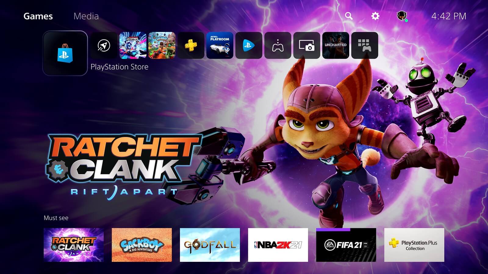
A special State of Play episode has revealed how the next-generation PlayStation 5’s user interface will function. The video, presented by Hideaki Nishino, PlayStation’s SVP in platform planning and management, with a walkthrough from Sid Shuman of SIE content communications, shows what players can expect when the console launches next month.
There’s quite a few changes to get to grips with compared to how things worked in PS4 and PS3, with the Cross Media Bar (XMB). The interface on PS5 is now known as “Control Center”, and in some respects it acts in a similar fashion. No matter where you are, you can call up Control Center with a single tap of the PlayStation button.
However, how it looks and behaves is radically different. With PS4, tapping the PS button switches screens entirely, putting the game in the background and bringing up the XMB — with its large tiles for each game and app strewn across the middle of the screen. For PS5, Control Center pops up over the top of whatever you’re doing, with a variety of menu options at the bottom of the screen and relevant activity “Cards” just above.
The cards allow you to see activities and events within your current game. This could be things like level completion or progress towards a PlayStation Trophy for the title, or captured media; like the PS4, the PS5 will record recent gameplay and allow you to share images and video. If the game supports it, you can hop to the appropriate level to fill in anything you’ve missed.

In addition, you might be able to see hints and tips for your objectives. As shown in the demo, these can even be video clips to show you where to go for a certain task, and you can place this clip on your screen — tiled, or picture-in-picture — to guide you as you play it for yourself.
The activity cards also let you see what your friends are up to. If you fancy joining in with their play, you can hop right in — again, Sony is flagging the console’s SSD and high speed IO that enables players to rapidly switch between games.
There’s also a totally new home screen, replacing the sometimes cluttered XMB. PlayStation has re-thought the layout, so now you’ll find two main screens — one for Games and one for Media — that hold all of your content. Visiting the tile for a specific game takes you into a hub for that title, including news, activities, and any DLC.
You’ll also find tiles for other functions, such as PS Now and PS Plus. There’s an Explore tab for more general news and information on PlayStation and any games you follow too. Most significant is a complete overhaul of PlayStation Store, which is now built into the UI rather than as a separate app. The PS Store page is no different than any other, allowing you to browse for new games and content in the same way as within the individual game pages.
See more articles on PlayStation 5.


