 One great thing about the pervasion of real world circuits in racing games is the ability for the gaming community to compare how different companies approach the modelling of the tracks.
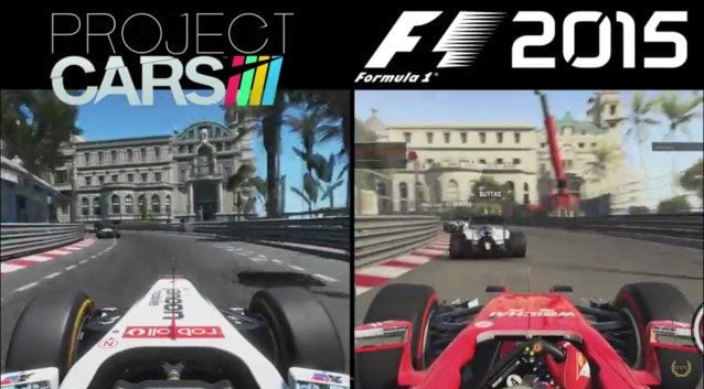
Our friends over at Team VVV have done just that, pitting the current race sim darling Project CARS against the recently-released official Formula One game F1 2015. The circuit in question? That’s the iconic Monaco street circuit, home of one of the Blue Riband events of world motorsport and part of racing’s Triple Crown.
So, two games and one track – but which one’s best (and which one includes David Coulthard’s cone of shame)? Over to Alan Boiston:
See more articles on F1 2015 and Project CARS.


To bad there wasn’t a third split screen with a lap of the actual track. Then we’d really see how these games fare
DigiProst and AdrianF1esp are usually pretty good with that stuff. Keep an eye on their Youtube channels and it might pop up.
This doesn’t make any sense to me. The rack in Project Cars it’s not even named Monaco, but a similar track. Just like in Gran Turismo where they don’t have the appropriate licence, therefore they call it something else and adjust a few things to make it look different, yet the same.
Played niether game, but did F1 2010. F1 here wins imo. I didn’t like pCars’ fisheyed view. Why in the world would they lock a steering wheel!? Confounding…
The “fisheye” view and locked steering wheel are due to in game settings which are fully adjustable.
Since we’re just comparing visuals, I prefer F1 2015, the movement of the suspension & tires looks better ‘translated’, in a word. P.CARS just looks a bit stiff & lifeless for my tastes.
As for the tracks, I never really liked modern-Monaco – too little track for too much car IMO, but the P.CARS one looks prettier, yet I actually prefer the look of the environment in F1 2015, it looks more like what I’d see through my TV watching the race, just a slight blur and fade to everything, rather than everything being crisp and clear – because when you’re driving, your eyes are totally going to be looking at the mountains – /sarcasm
But I haven’t played either game, though I’m still partially interested in F1 2015, after the mods come out, haha.
Depending on how realistic the suspension models are. In Project CARS the Formula A is based on the 2011 F1 cars. Where as the ones in F1 2015 are based on, well.. the 2015 models.
So the way the suspension moves is likely to be different.
Nothing will beat the standards.
pCars blows it away just based on lighting alone. The surrounding mountains look better, the reflections on the windows look a lot better, the trackside objects and trees look better, and the buildings are much more detailed. A lot of the buildings in F1 just look painted on while most in pCars look fully 3D.
I’m sure F1 looks amazing. The PC versions of the last few F1’s look gorgeous but just judging by this overly compressed youtube video, pCars just looks a lot better. Especially the lighting. pCars lighting is much more advanced and realistic so it makes sense that it would look better here.
Wheres GT6 comparison? ooh. i forgot, they still use version from Gran Turismo 3 released 2001. Lol.
For a game running on a console from 2006, it looks absolutely incredible.
I actually was just playing GT5 and hopped over to pCars after. pCars really doesn’t look that much better. It’s kind of surprising how good GT looks
Tup Tom ;)
In Project Cars the steering wheel does not move?
There is an option to lock the steering wheel, remove it altogether, and with the standard animation. VVV must have locked it.
CM. No contest.
True the codemasters f1 does look nice… But that’s the problem with CM. it looks nice probably adequate to play but will receive no significant updates as they are probably working on new season already.
Another hit and run title from CM!
^ +10k
If your sole focus is going to be F1, year after year, there would be no reason to update anything unless you missed or screwed up something. A plus in my book.
I whish CM had made a game engine that would last three or four years with the seasons being DLC or subscription based. I don’t think a year is long enough to produce a truly great game. I wonder if you can use more than 200 degrees of lock on a wheel in this one? the saturation controll worked properly in 2012 it’s been broke since then. Real f1 cars have around 370 ish
Coulthard’s cone of shame? Cone of genius I’d say. it’s sadly absent from most models of the track but it needs to be there as it helps you sight the apex properly.
PC is better that F1 for sure.
The steering wheels on the Formula A and B annoy me in Project cars in cockpit view. They just look a bit low quality. I prefer the cockpit in F1.
Honestly I’ve got both of these games however and they’re both good at what they do, F1 I have to say is a more fun game but PCars is generally better on the graphics and physics side.
Are there new helmet design in career/professional mode??
I don’t have either game, and this was probably the first full video of PC I’ve seen. Overall, I’d give it to CM, not just because they specialize in the F1 circuits, but the overall mood of it.
PC obviously looks flat like GT, and there’s little to no movement of the camera when it rolls, as it is fixed to the car. The color is too cool, and almost no haze through the mountains. Buildings do not quite accurately represent the city, and the pavement seems a bit off..
CM did good. As far as how the cars drive, that’s different, and I’d need both to form an opinion, but visually, CM wins it for me.
The camera and all it’s movements and shakes is fully adjustable in PCars. You can make it do almost anything you want. Not sure about F1 2015.
The accuracy of the city itself is one thing. That can’t be changed. Codemasters did a really nice job with the details. It seems more “alive” I suppose with the yachts/boats and stuff. With their official licensing, CM can also have better signage for sure. And I also like their lighting in the tunnel. PCars has really good lighting, but that tunnel in particular just looks……last gen I guess.
But as for the atmoshphere itself, that all could have been adjusted to match perfectly for a better comparison. The PCars vid’s colors are so “cool” as you say because it pretty much looks like high-noon, and the air is perfectly clear. It’s set to pretty much look like GT’s Monaco. If you set project cars time to earlier in the morning or later in the day it would have a “warmer” look to the lighting and you could set the atmosphere to HAZY and the two would look identical in that way. I believe the direct angle of the lighting is also flattening out PCars textures as well.
ahh okay…. I knew it resembled GT in a way…
Verr nice!
Excellent, always like these side by side comparisons!
(Not starting a fight hopefully)
GT5! best f1 simulator.
How do you figure?
Gt best driving game for console …Stop.:)
because there was only ferrari, and ferrari haz faztist kars evar!!!11!11!11!!!
You had to ask, T-12!!
@ALeftRighter
Absolutely correct.