You are using an out of date browser. It may not display this or other websites correctly.
You should upgrade or use an alternative browser.
You should upgrade or use an alternative browser.
2016 Audi R8
- Thread starter GTboyz
- 273 comments
- 26,398 views
- 24,066

- It/It
- GTP_TheCracker
Looks all right to me. Nice to see that they've resisted the urge to give it the massive silver grill surrounds that plague all the other new/facelifted Audis of the last couple of years.
- 13,300

- GTPlanet
- Street-King-07
- Quattro Saltire
Facelift finally revealed


- 11,953

- Marin County
I think the first gen car is better looking and will probably age better too. Same is true for the TT and it's subsequent generations. Audi has this problem of designing a real standout car and then not knowing what to do with the 2nd and 3rd act, in my opinion.
boiltheocean
Premium
- 7,756

- Samoa
I really hope you can get black trim pieces instead of those garish silver/grey bits. The exhaust surrounds are way too much.
- 6,425

- KCCO
actually, if anything, GM copied Audi.. The carp mouth has been with them for eons..Wow. They Camaro'd it.
Maybe, if they felt they needed to get this out within two years, VW will get the hint to stop making cars that look like copies of ones they designed15 years ago with a steady eye trained on removing as much of the character in the process.
Still my favorite model though, sans the front plate holder:

- 467

- Australia
- daniel_gokssj3
The spider version looks a bit like a Lamborghini gallardo.
Also by making it look more aggressive, it’s looks less like an R8. Should just call it an R10 or some other number. But hey I’ll just pretend it was an aftermarket bodykit by some customs shop. It does look okay though just not as good as the R8’s before it IMHO, the front end is the most different, the rest still seems very R8 like.
Also by making it look more aggressive, it’s looks less like an R8. Should just call it an R10 or some other number. But hey I’ll just pretend it was an aftermarket bodykit by some customs shop. It does look okay though just not as good as the R8’s before it IMHO, the front end is the most different, the rest still seems very R8 like.
- 236

- United Kingdom
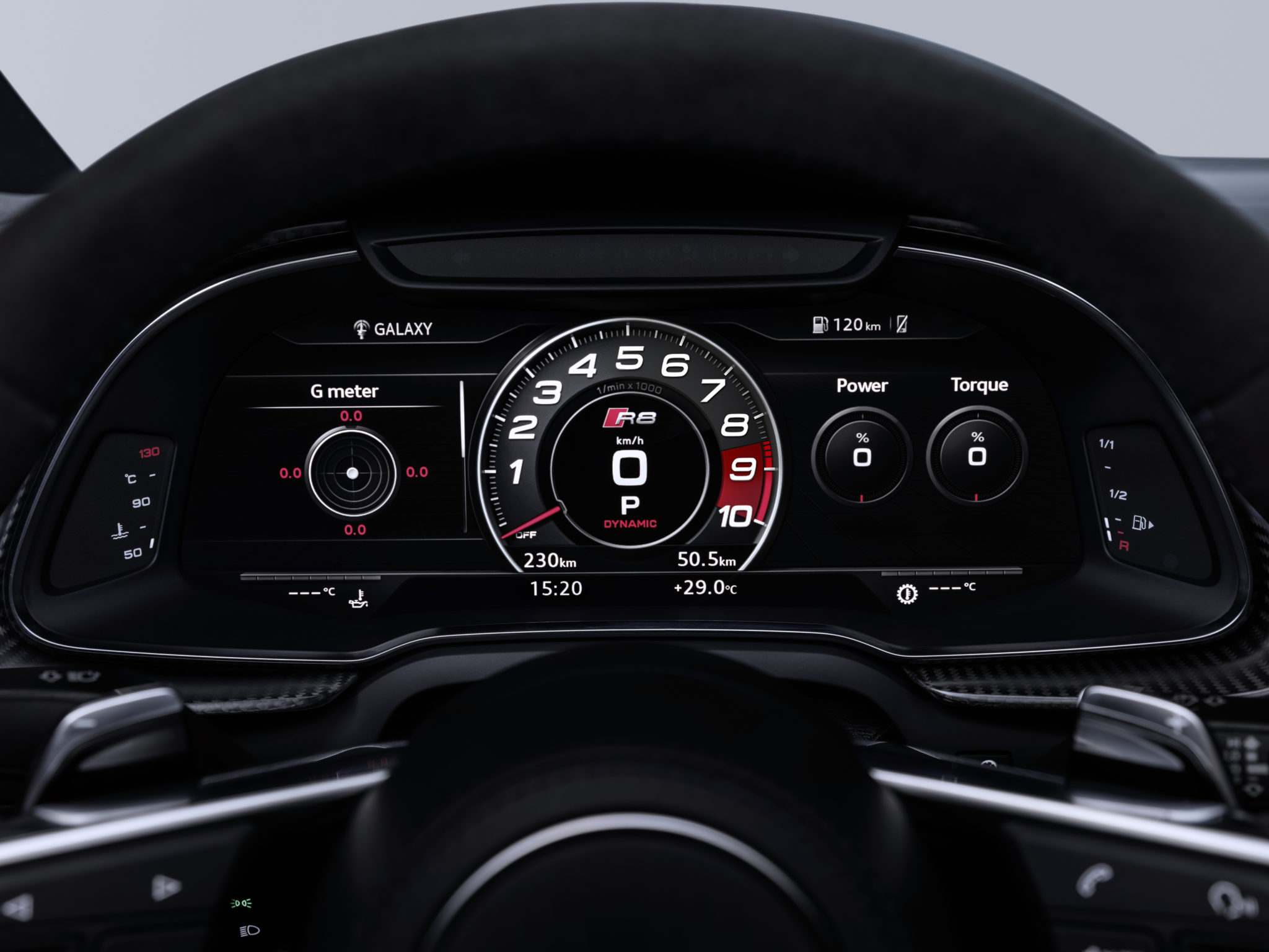
No screen in the middle of the car seems very odd especially for how much it costs.
- 243

- Southeast US
- amazeCRAZE
Mmm, still not a beautiful car. I can't help it but I don't like the profile of the R8 and the TT models.
My problem is just that it’s STILL the same overall body shape as the original R8, which debuted nearly 10 years ago (if not even later!). It’s time to replace it.
- 236

- United Kingdom
They might overtake the 370Z at this rate.My problem is just that it’s STILL the same overall body shape as the original R8, which debuted nearly 10 years ago (if not even later!). It’s time to replace it.
Joey D
Premium
- 47,576

- Lakes of the North, MI
- GTP_Joey
- GTP Joey
My problem is just that it’s STILL the same overall body shape as the original R8, which debuted nearly 10 years ago (if not even later!). It’s time to replace it.
The R8 first came out as a 2006 model year. But the design actually goes back to the Le Mans Quattro concept from 2003.
- 87,885

- Rule 12
- GTP_Famine
That's because it's here:No screen in the middle of the car seems very odd especially for how much it costs.

- 5,065

- Fort Worth
- That_sneaky_azN
If you think that's odd, think of the Veyron.No screen in the middle of the car seems very odd especially for how much it costs.
Over $1m and no infotainment whatsoever.
- 6,425

- KCCO
I actually love the body style of the R8. It's not a teeny tiny wedge shape or filled with excessive lines.
Just a pretty simple bubble design.
Just a pretty simple bubble design.
- 3,202

- Hong Kong
- Hybrid_Tifoso
Prefer it to the original 2nd-gen R8, but then I’ve never found that car attractive. Really digging the wheels as well, unlike some other supercars they look more complex (and in a good way), but not overly so. They really suit the overall look of the car. 👍
But somehow the car looks rather wide to me. Wider than the outgoing R8, even if it only appears so.
Also seeing a bit of Zenvo ST1 at the front.
But somehow the car looks rather wide to me. Wider than the outgoing R8, even if it only appears so.
Also seeing a bit of Zenvo ST1 at the front.
- 171

- Brazil
I liked this new Lamborghini! 

- 385

- Hawkes Bay
- davidb_165
No pictures of the back?
- 1,321

- The Pool Of Life.
From the front it is starting to morph into a Lamborghini imho. It's distinctiveness is starting to get watered down too.I liked this new Lamborghini!
- 1,970

- United Kingdom
From the front it is starting to morph into a Lamborghini imho. It's distinctiveness is starting to get watered down too.
My initial thought was that it looks more Lamborghini-ish, particularly with that front bumper. In some ways it looks like an inverted version of the one on the Aventador S with those vertical strakes.


- 6,425

- KCCO
absolutely notDo you think I'm crazy when I say that I'd prefer an Audi RS6 over this R8?
It's a shame however they're not available in the US, nor will they be for much longer probably...
McLaren
Premium
- 45,737

- Texas
Good catch. I was just thinking the 3 front slats in the nose reminded me of the Jota's.My initial thought was that it looks more Lamborghini-ish, particularly with that front bumper. In some ways it looks like an inverted version of the one on the Aventador S with those vertical strakes.


The vertical stakes you mentioned also look directly from the SVJ's side strakes as well. Probably wouldn't be surprising if the 2 share these kind of designs for better aero.
- 236

- United Kingdom
Thats nice and all but the same system from the RS5 which has a center screen. I guess they have to cut a few features to keep the price lower.That's because it's here:


- 87,885

- Rule 12
- GTP_Famine
More likely to let you see out of the car. Any kind of screen on top of the dash in an R8 blocks out a huge chunk of windscreen.Thats nice and all but the same system from the RS5 which has a center screen. I guess they have to cut a few features to keep the price lower.
Similar threads
- Replies
- 11
- Views
- 1K
- Replies
- 2
- Views
- 1K
- Replies
- 1
- Views
- 2K


