
You are using an out of date browser. It may not display this or other websites correctly.
You should upgrade or use an alternative browser.
You should upgrade or use an alternative browser.
Fonts that you love and hate: Typographical discussion.
- Thread starter Pupik
- 276 comments
- 39,364 views

- 7,719
Not to single you out -- because many typographers share your opinion, it seems -- but how can a ripoff of a good font not be a good font on its own? Okay, Microsoft ripped off Helvetica, and Arial is lame because of that. I get it. But Arial being an ugly, useless font because MS made tiny tweaks to some of the letters, most noticably on only one -- the capital "R?" Where's the logic?
neema_t said Helvetica and Arial are like a Ferrari 355 and an MR2 with a bodykit (presumably made to look like the 355), respectively. As a car enthusiast with little to zero interest in the study of typography, I'm going to have to borrow that analogy.
In my opinion, if Helvetica were a 355, Arial would be a handbuilt 355 replica that is almost completely indistinguishable from the real thing, its only flaws being slight variations in body curvature and somewhat goofy "Rs" on the Ferrari logos. There are certainly instances where a real Ferrari, or Helvetica, are preferable over a fake kitcar or ubiquitous font knockoff -- a track day, professional design work -- and if it's available, there are few reasons to not use the genuine article. However, in an everyday instance where the choice of car/font is beyond your control -- borrowing a friend's Ferrari knockoff to commute to work because your car is in the shop, or posting on a forum that uses Arial, or taking a class that requires Arial for papers -- what's the big deal?
I said it's a ripoff of a better font - but I still don't think it's pretty. To continue the 355/MR2 analogy, I'd also prefer a 348 over said 355: I'm not a big fan of Helvetica, either. Arial/Helvetica for English is not pretty, but in Hebrew, they're absolutely terrible. I dislike reading texts with Arial, even though it became the de-facto standard over the internet. Teachers don't complain when presented a neat 16px-spaced paper written in Times, though.
- 3,534

- London
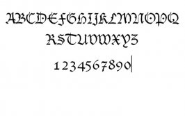
Slightly off topic but what font is this?

V1P3R
(Banned)
- 6,310
Growing up my parents well... mom taught me to write CLEARLY. Of course I was blessed with the ability to be not so great about that, but what ticked me off especially as I got older is trying to read the damn hand writing of relatives which she excused as "ok" since they were "adults". That logic makes sense. 
So in conclusion I have wayyyyyyyy more irritation with hand writing I CAN'T READ than even the worst computer generated font ever could.
And... yes Pupik is a little anal about this. Don't banned me. Please?
So in conclusion I have wayyyyyyyy more irritation with hand writing I CAN'T READ than even the worst computer generated font ever could.
And... yes Pupik is a little anal about this. Don't banned me. Please?
- 12,993

- USA! USA!
That looks like Courier, Slick.
GilesGuthrie
Staff Emeritus
- 11,038
- Edinburgh, UK
- CMDRTheDarkLord
Any font can be awful. For example, if one sent out Christmas cards with the writing inside in Helvetica, it would be deeply wrong. Comic Sans is more awful than most fonts more often, but more important than the explicit font itself is the appropriateness of the selected font to the situation.
Sadly, it's something that few people seem to understand. It does mean that good typography stands out, and is a joy to see.
My favourites? Well, pretty much all of my website is set in Trebuchet MS (or at least any part that's been edited in the last 8 years), because I think it's great as a screen font. I'm loving the Calibri that's standard in Office 2007, but mainly as a screen font.
For print, an Arial variant for headlines and captions (but I'd use Helvetica if I had a Mac Sage) and Garamond for body text. It's like Times only more graceful. Garamond is emphatically not a screen font though.
This post is now offending me because it has too many fonts. I should randomly underline something to complete the heresy.
- 2,007
- Los Angeles
- GTP_DrivingPark
- Finetales
My favorite font of all time would definitely be Arial Narrow. Because it's simple, clean, and you can fit a lot of it into one page. My other favorite fonts are as follows:
Verdana (because of GTP)
Arial Black
Copperplate Gothic Bold
Comic Sans MS (sorry, but there you go; i love it)
Georgia (I think Georgia is the best Roman-type font, simply because of the way it does numbers, like this: 1234567890)
Trebuchet MS
Courier New (I've always had a thing for Notepad font)
Broadway (it's just awesome)
Impact (the classic)
Kristen ITC (it's funny)
Matisse ITC (ditto)
Papyrus (always loved it)
Viner Hand ITC (it's just awesome)
All the rest are just ok, and there's no fonts I really hate, although I'm getting pretty close with Times New Roman because it's used so much.
:-)
- 38,956
- Application hell
- MP-Omnis
For print, an Arial variant for headlines and captions (but I'd use Helvetica if I had a Mac Sage) and Garamond for body text. It's like Times only more graceful. Garamond is emphatically not a screen font though.
Why Garamond instead of Book Antiqua? I find BA makes the most handsome essays.


Rotary Junkie
Premium
- 9,810
- Canton, MI
- RJs_RX-7
Your Helvetica example appears to be Arial.
GilesGuthrie
Staff Emeritus
- 11,038
- Edinburgh, UK
- CMDRTheDarkLord
Why Garamond instead of Book Antiqua? I find BA makes the most handsome essays.
Nothing wrong with Book Antiqua. I really love the below-baseline action on Garamond. It's lowercase 'j' is a thing of beauty.
- 12,901
- Cambridge
- Moglet85
- Moglet
I forgot to actually mention the fonts I do like.
^This post is full of win^
Cap'n Jack
Premium
- 10,144

- South of the South
- GoldMineGutted
Your Helvetica example appears to be Arial.
I think you may have killed Sage.
- 5,987
Some neat graphic type play by Jama Noor.


boiltheocean
Premium
- 7,756

- Samoa
I dont particularly hate any fonts but been as its to do with fonts I have a beef with the chapter at the end of "Stupid White Men" by M.Moore explaining a not very funny story about the font in his book. Honestly I never knew anyone really cared that much.
Last edited:
- 7,956
- BradleyH131
One thing the drives me insane is people who don't capitalise with the shift key. So when they have to type in 'P@sSw0rD', it takes about 50 thousand key strokes.
To be perfectly honest I can't even remember the last time I used the CAPS LOCK key, I just hold Right-Shift with my Right-Hand-Pinky finger and type like normal if I have to use All Caps for whatever reason.
To be perfectly honest I can't even remember the last time I used the CAPS LOCK key, I just hold Right-Shift with my Right-Hand-Pinky finger and type like normal if I have to use All Caps for whatever reason.
boiltheocean
Premium
- 7,756
- Samoa
one thing the drives me insane is people who don't capitalise with the shift key. So when they have to type in 'p@ssw0rd', it takes about 50 thousand key strokes.
To be perfectly honest i can't even remember the last time i used the caps lock key, i just hold right-shift with my right-hand-pinky finger and type like normal if i have to use all caps for whatever reason.
+1
- 35,447
- Downtown North Dakota
- Cy-Fi
I'm the opposite at work - everything is all caps.To be perfectly honest I can't even remember the last time I used the CAPS LOCK key
Then I come here and forget to take it off.

- 7,956
- BradleyH131
I'm the opposite at work - everything is all caps.
I didn't know people still used Fortran!

- 8,707
- Utah
- ceiling_fan
I never ever use the caps lock key. It's in very good keyboard real estate too. ") (I think there was a thread about this.)
(I think there was a thread about this.)
(I think there was a thread about this.)Rotary Junkie
Premium
- 9,810
- Canton, MI
- RJs_RX-7
I don't use caps either... If I'm screaming at someone over the internet, I'm furiously holding down left shift with my PINKY WHILE I TYPE.
That and I can't not use shift to capitalize first letters in sentences so stuff looks like... tHIS WHEN i TRY TO USE CAPS LOCK.
That and I can't not use shift to capitalize first letters in sentences so stuff looks like... tHIS WHEN i TRY TO USE CAPS LOCK.
- 7,719
Pinky-shifter here too. ")
Actually, it's quite reasonable on my keyboard. I use an old (pre-Windows key!) OmniKey board with some nifty locations: Ctrl is where Caps used to be, Alt is where Ctrl was, and Caps where Alt was. Ctrl-somethings are so much more comfortable now.
That missing Windows key is the Tag-open and Tag-close on the left, and asterisk on the right instead.
- 17,865
- 509
Why does everybody hate comic sans?
Actually I hate it to when people use it for documents and other stuff like that.
So what do you like it used for then?
Turbo Lag
Premium
- 6,525
- Melbourne
One thing the drives me insane is people who don't capitalise with the shift key. So when they have to type in 'P@sSw0rD', it takes about 50 thousand key strokes.
Yep, it happened back at Primary School alot. People don't know that you can use Shift instead. I use left pinky to capitalise when I talk normally, and I never ever use Caps either. Sometimes I accidently press Caps when I Alt+Tab.
Similar threads
- Replies
- 6
- Views
- 1K
- Replies
- 3
- Views
- 938
- Replies
- 24
- Views
- 6K
