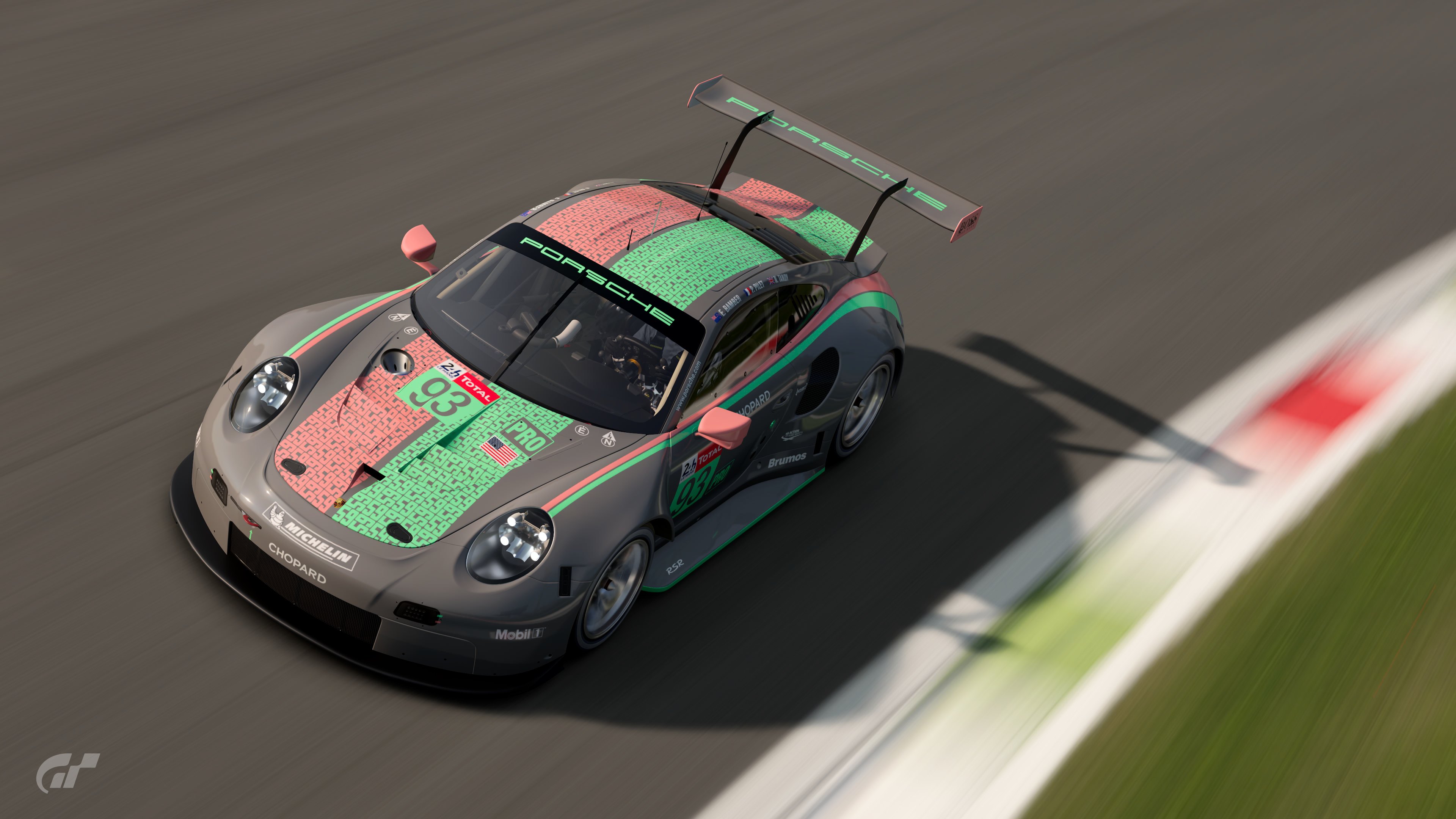
POLL: The GT7 Livery Editor Competition #07 (Colour Crimes) - CLOSED

  • Thread starter Nuschel01
  • 38 comments
  • 6,353 views

Colour Crimes


  • Total voters
    77
  • Poll closed .

Nuschel01

Enjoy Car Life
Premium
6,753
Germany
Fürstentum Lippe
GTP_Nuschel
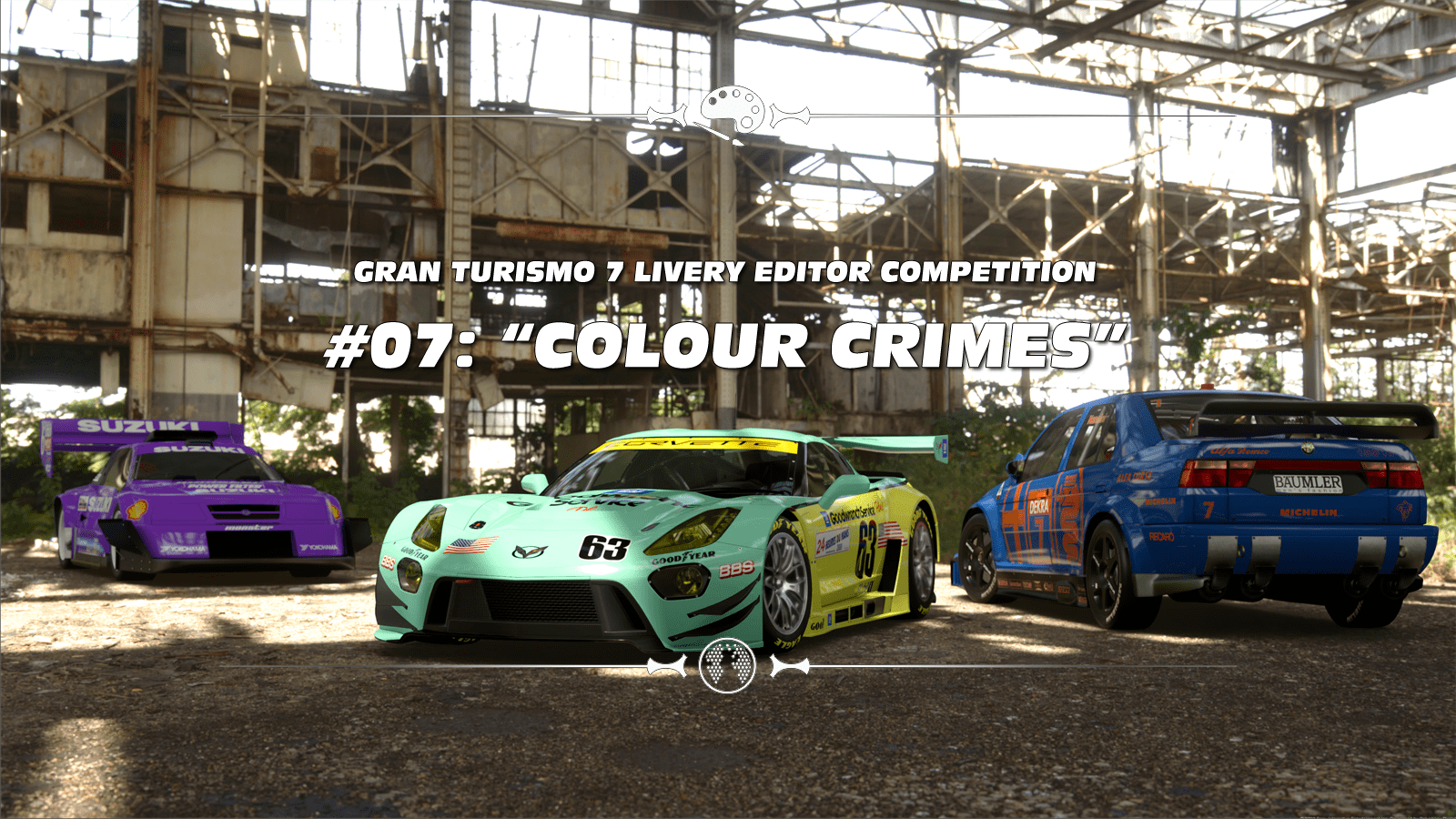
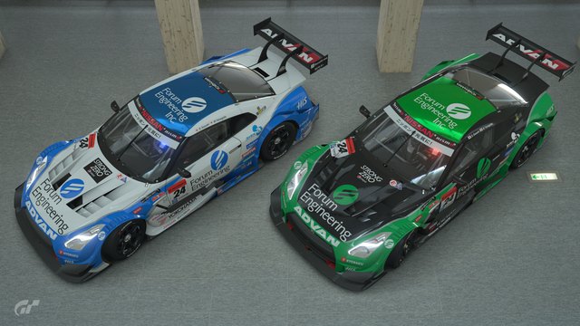
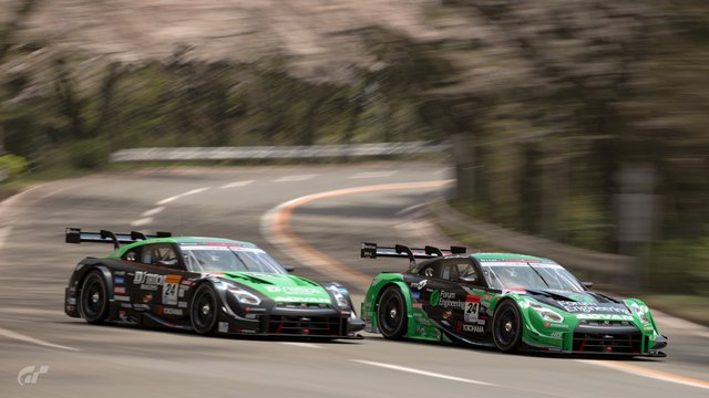
COLOUR CRIMES
full

THIS MONTH'S THEME:

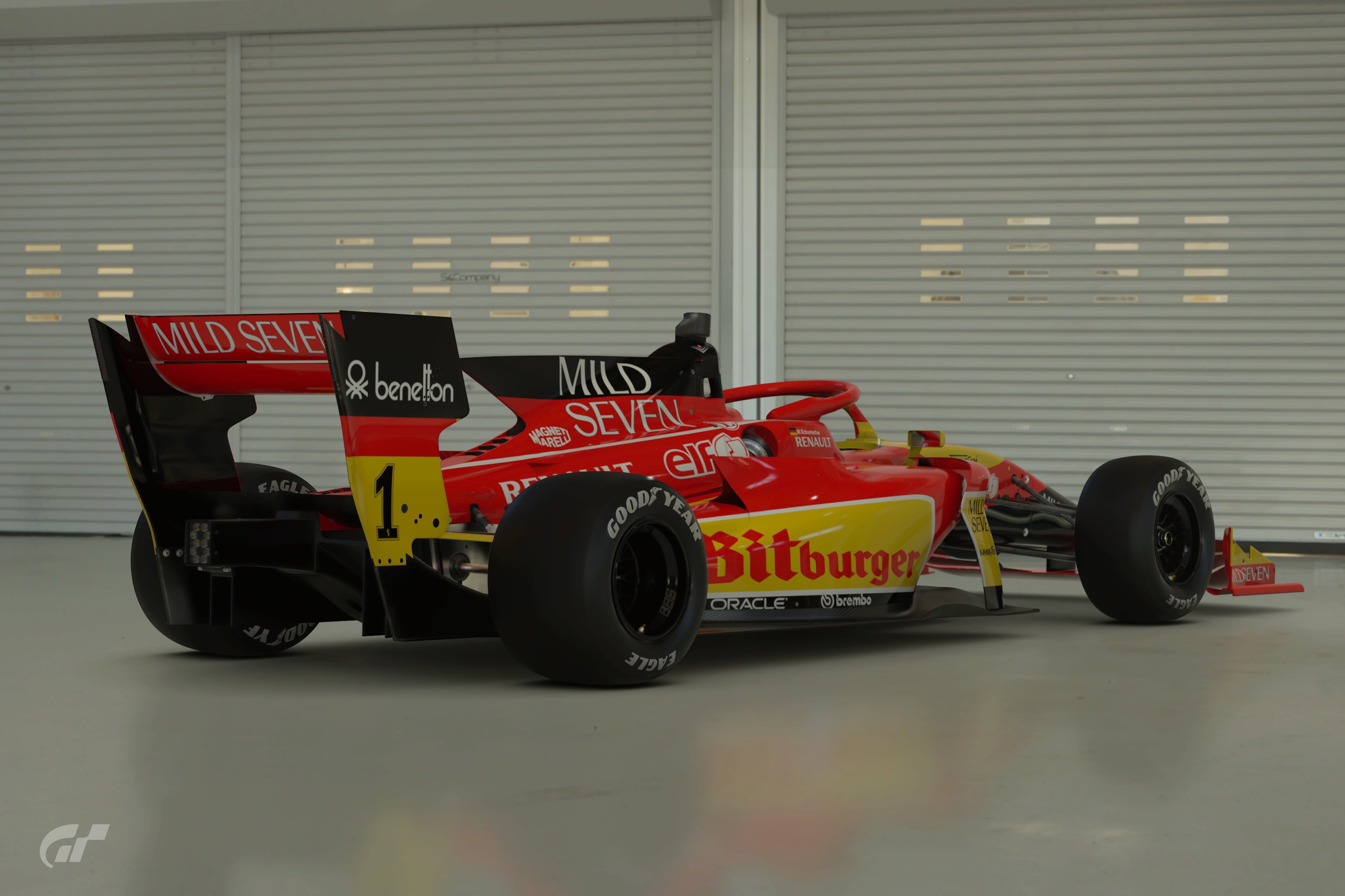
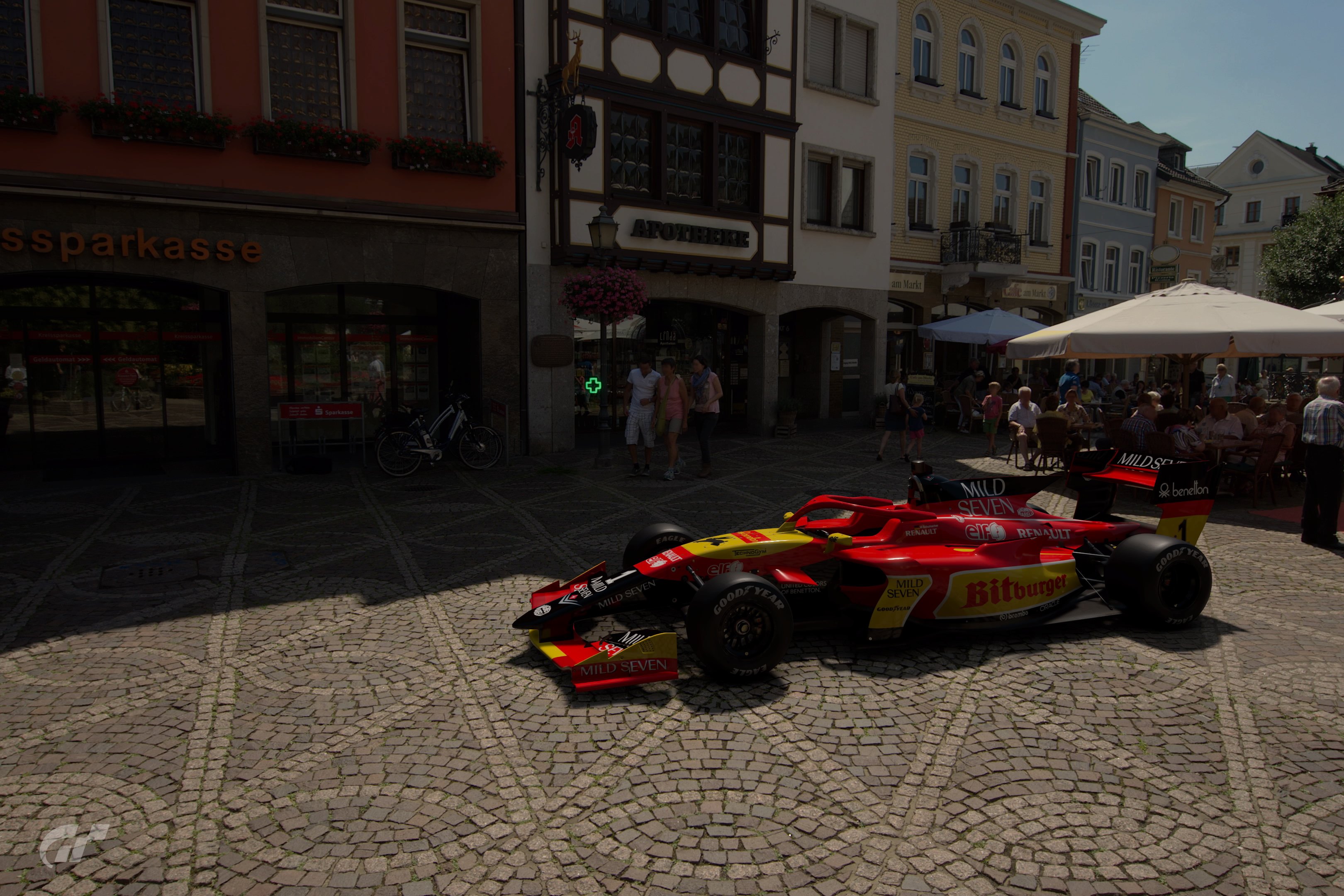
This time we get ourselves into deep criminal trouble, because as the lab rat for the new theme selection procedure @Raphaele got to chose one of three sugestions made by the GTP LEC community drawn by @MatskiMonk. From those three themes he chose the theme "Colour Crimes", submitted by @Nuschel01. The crime to commit is taking a more or less iconic livery and completely mixing up its color scheme; but let's hear what exactly the submission is all about and why it was chosen:

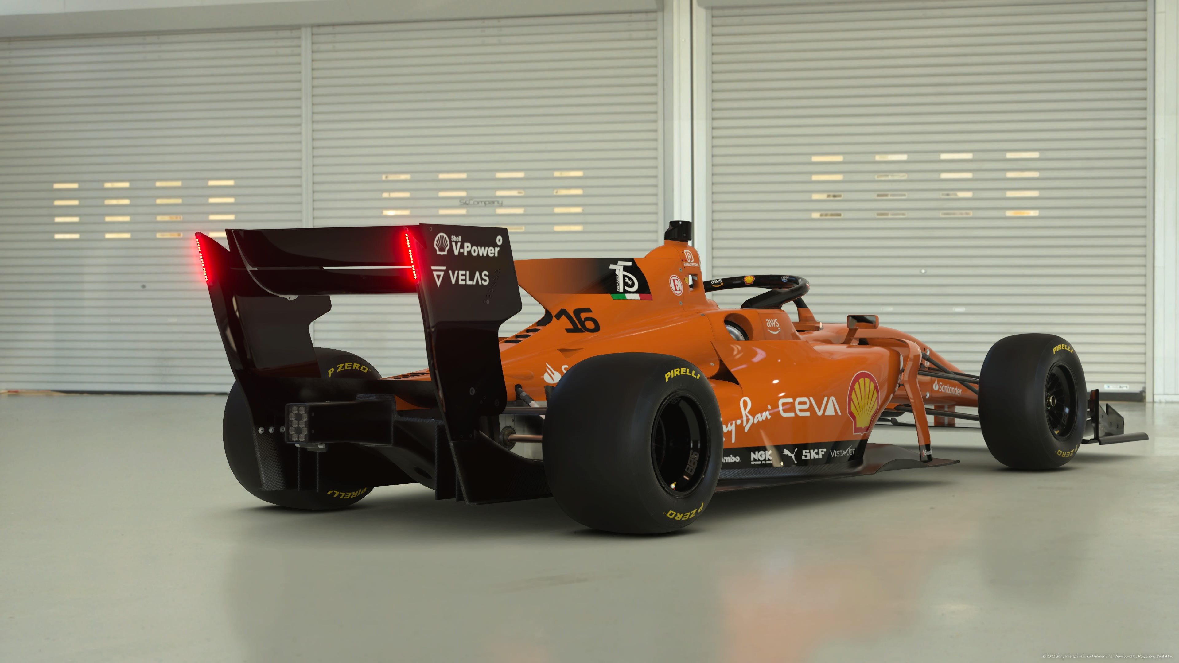
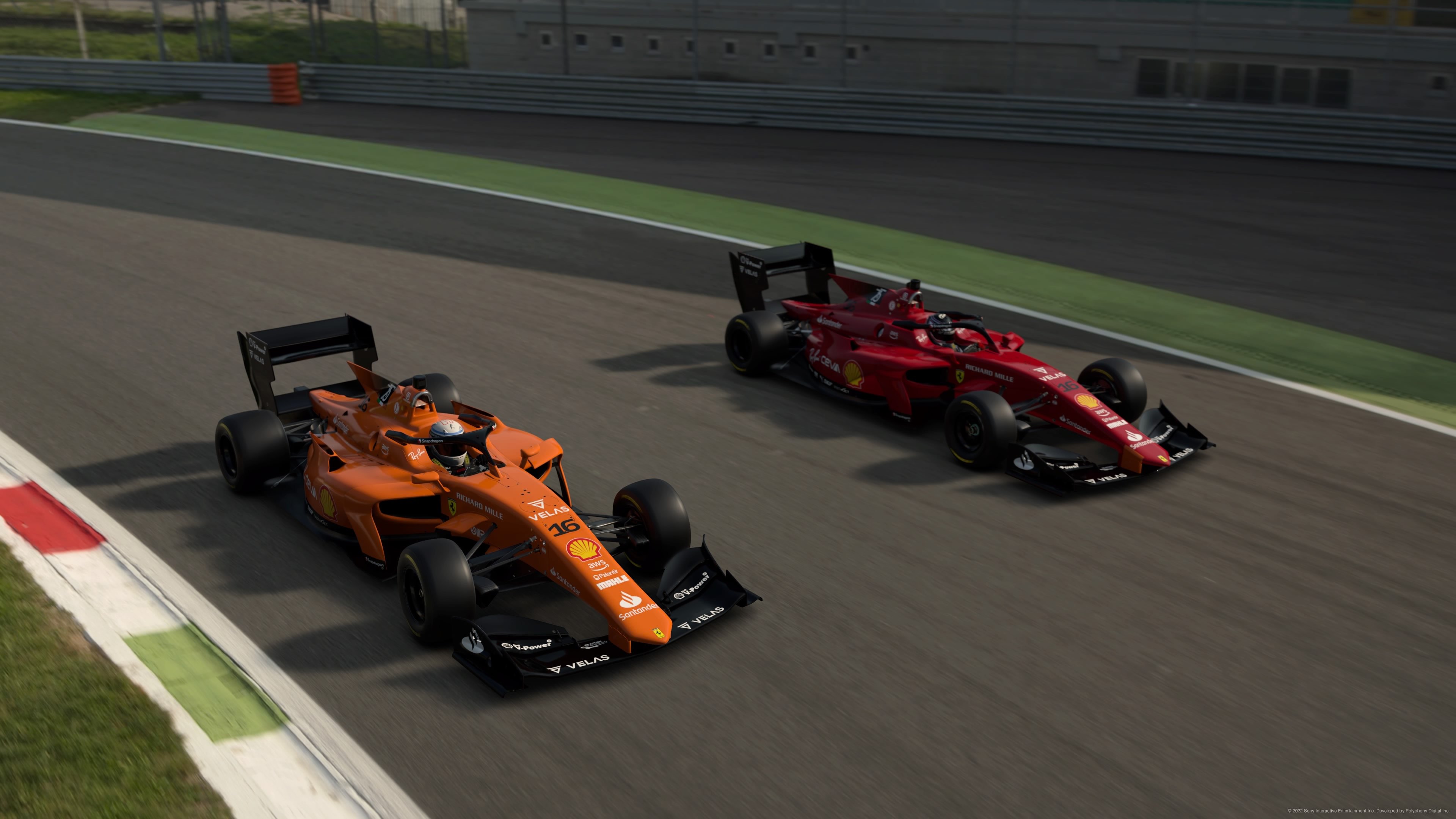
"Another replica based competition this time, thought with a rather weird twist regarding those replicas. We all know the bright orange Jägermeister liveries, the iconic white, blue and red Martini wraps or bold pink BWT designs, but what if those companies had chosen different colors for their color schemes back when their corporate ID was first developed? Maybe Jägermeister would've taken on green, Martini might have embraced a more italian color scheme of red, green and white and BWT could've chosen something in the blue spectrum of colors? Either way, I want your liveries to be in different colors than what they're known for.
You can go for something that is actually good looking or, closer to the theme's name, is an absolute crime to the eyes. Of course you can take whatever you have already laying around in a drawer, but I'd personally like to see something I haven't seen from you here. So yeah, bring it on and get ready to face the court room!"
- Nuschel01

"This sounds like a funny theme; I'm just imagining a yellow-green Marlboro livery or Gulf in purple-golden in front of my eye. A lot of people could also easily jump onto this theme and without too much work change up the colors of designs they already made. I think there are a lot of surprises in the bag for us and that's really exiting. So go after the old GT5 PMC motto: Be creative and have fun!" - Raphaele


CARS:
  • All Cars

LIVERIES:
  • Replica Liveries only

UNIQUE RESTRICTIONS:
  • Liveries cannot use their real world's color schemes
  • If you put older liveries on a modern car, please have it match the modern car's racing series number boards etc.

BONUS PICTURE SETTINGS:
  • Not mandatory, but a picture alongside the correct livery would be cool


POLL - THE RULES

The poll will end on September 7th, 2022 at 23:59 UTC.
This means you have one week to decide which entries to vote for. After the winner is decided, they will decide the next Livery Editor Competition’s theme from a random selection three themes that were suggested via the Theme Suggestion form.

Please note:
  • You can vote for THREE - 3 - entries.
  • You can NOT vote for your own work.
  • Most, if not all entries have spoilers, they definitely show the liveries in the way the creator intended, be sure to view those as well.
Take your time, and vote away!


Without further ado, here are the entries:


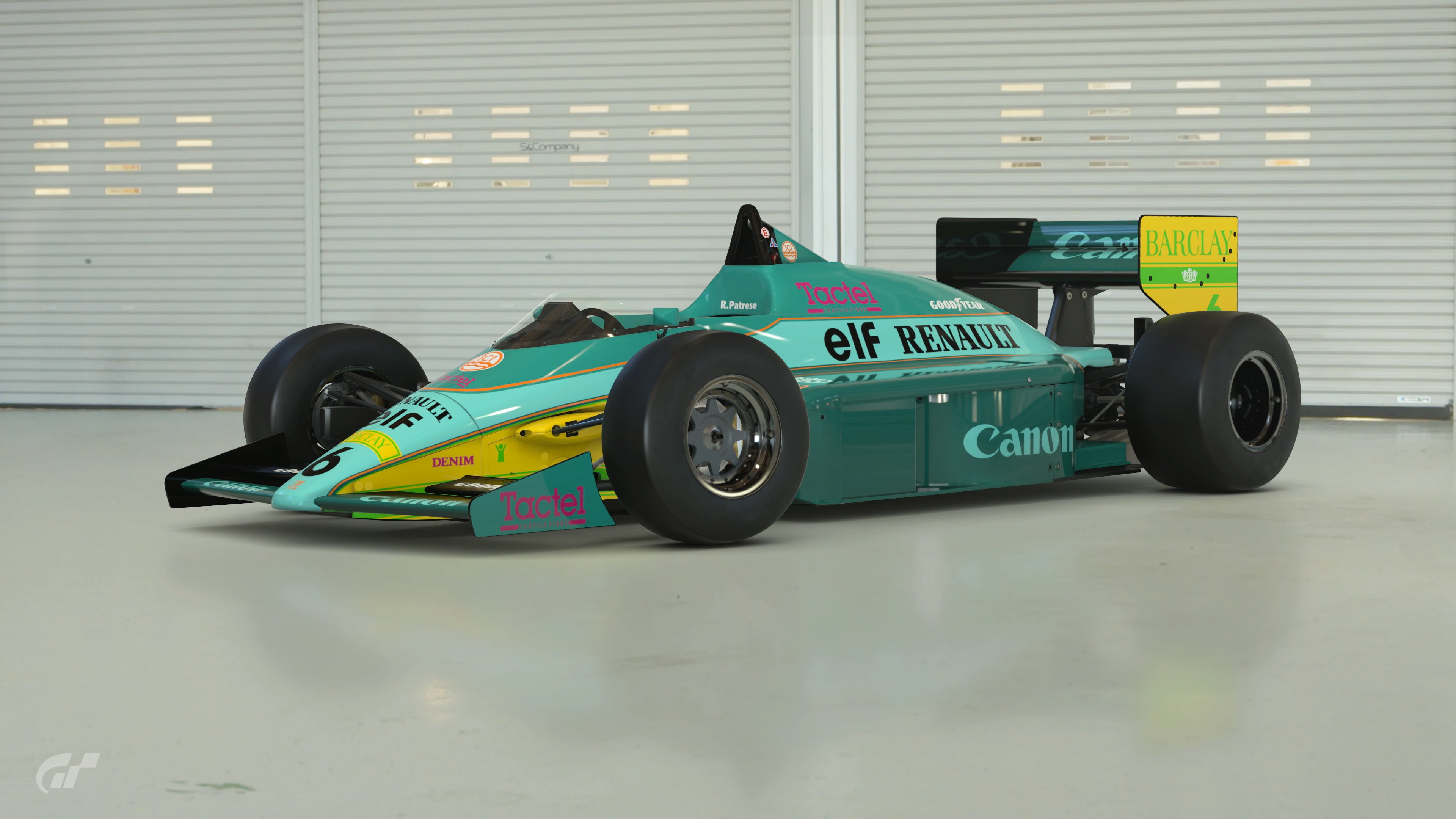
Poll Option #01 - PS5 Raytracing
full

full

full

full

8qTbOTv.png


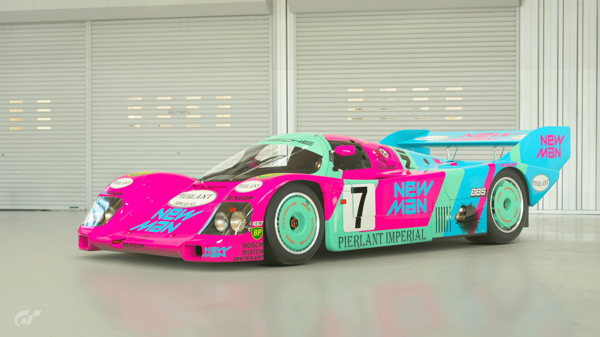
Poll Option #02 -PS5 Raytracing
full

full

full

full

8qTbOTv.png


Poll Option #03 - PS4 Base
full

full

full

full

8qTbOTv.png


Poll Option #04 - Playstation
full

full

full

full

8qTbOTv.png


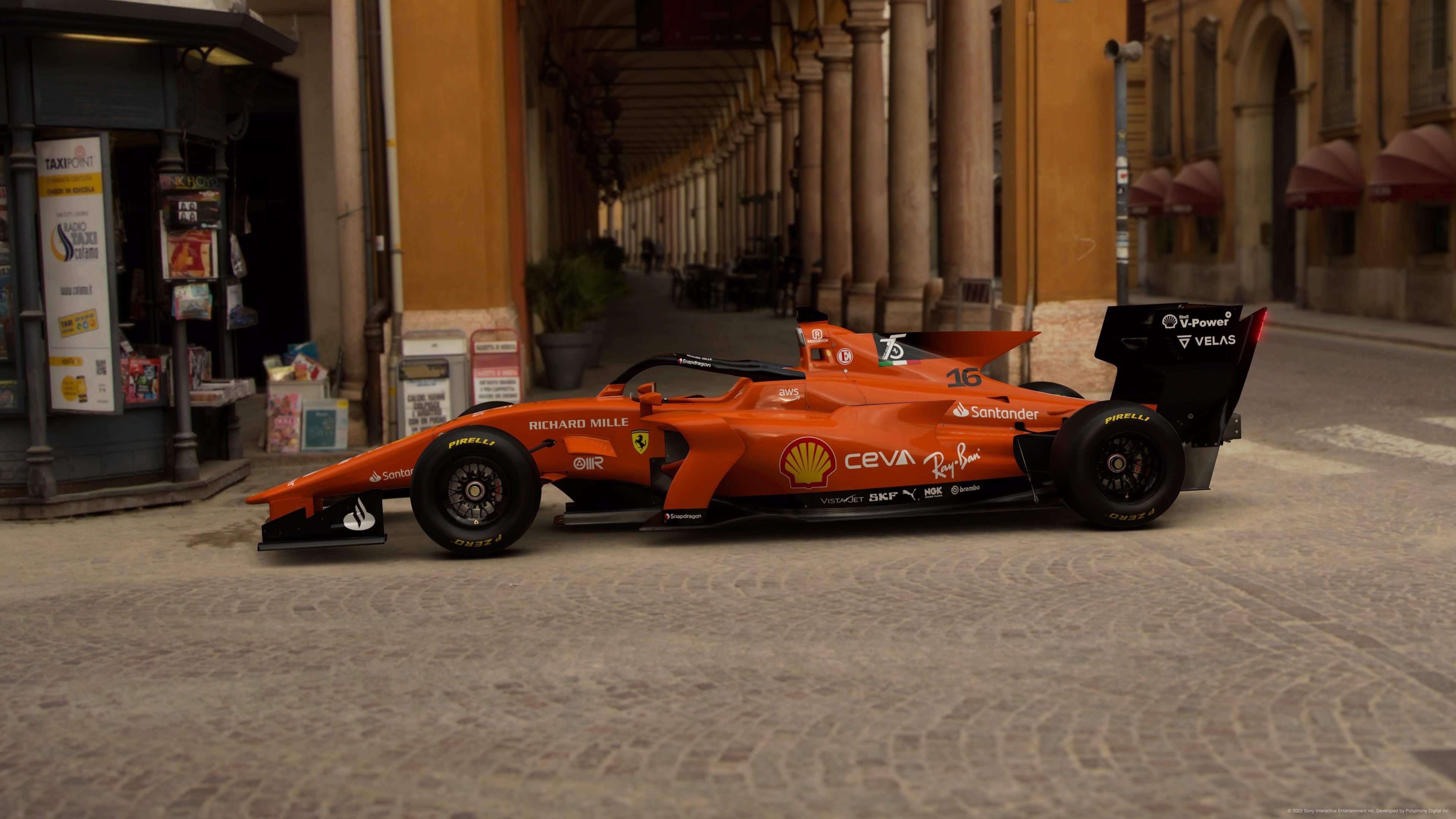
Poll Option #05 - PS5 Framerate
full

full

full

full

8qTbOTv.png


Poll Option #06 - PS5 Framerate
full

full

full

full

8qTbOTv.png


Poll Option #07 - PS5 Raytracing
full

full

full

full

8qTbOTv.png


Poll Option #08 - PS5 Raytracing
full

full

full

8qTbOTv.png


Poll Option #09 - PS4 Base
full

full

full

full

8qTbOTv.png


Poll Option #10 - PS5 Raytracing
full

full

full

8qTbOTv.png


Poll Option #11 - PS5 Raytracing
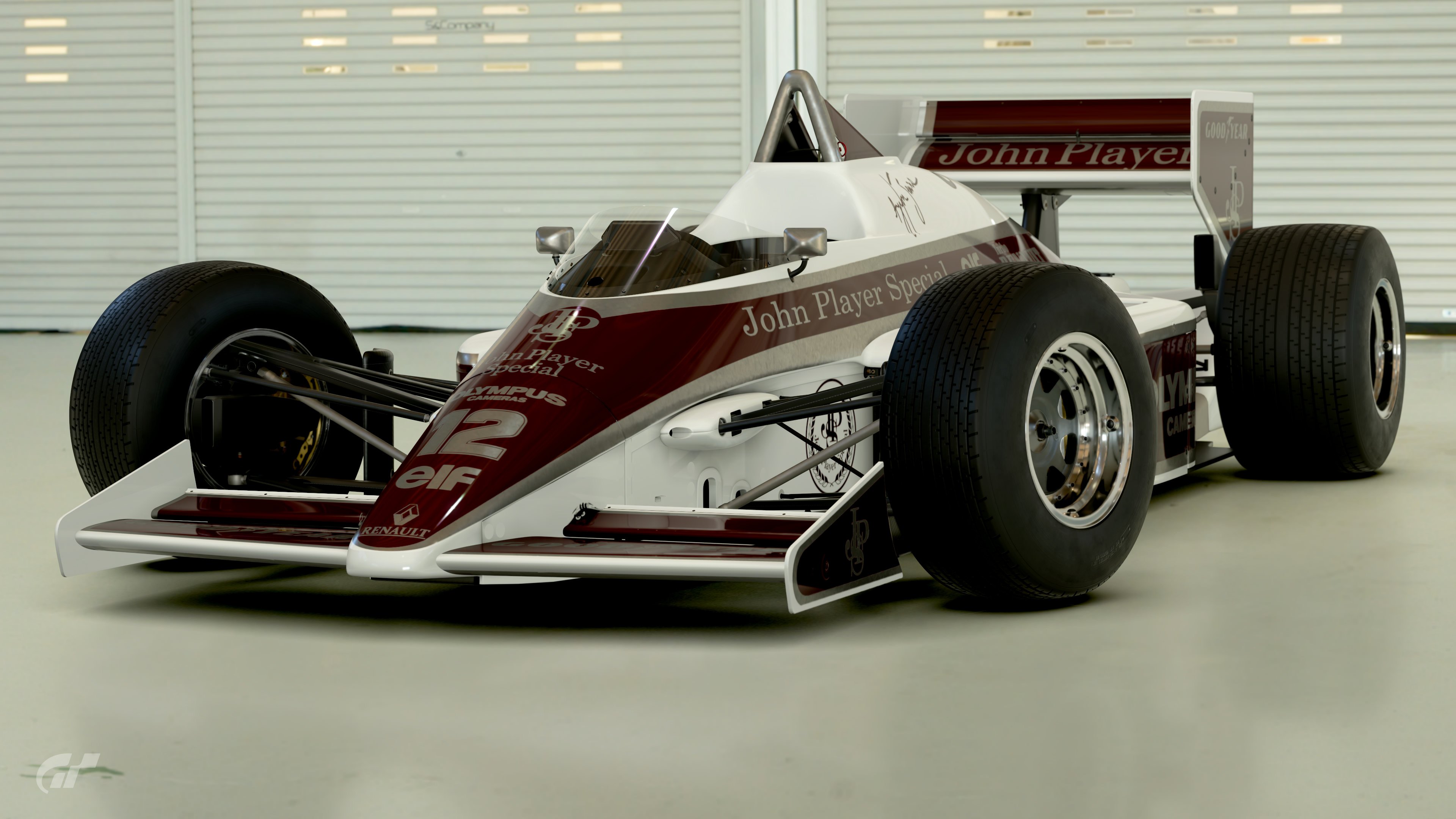
full

full

full

full

8qTbOTv.png


Poll Option #12 - PS5 Framerate
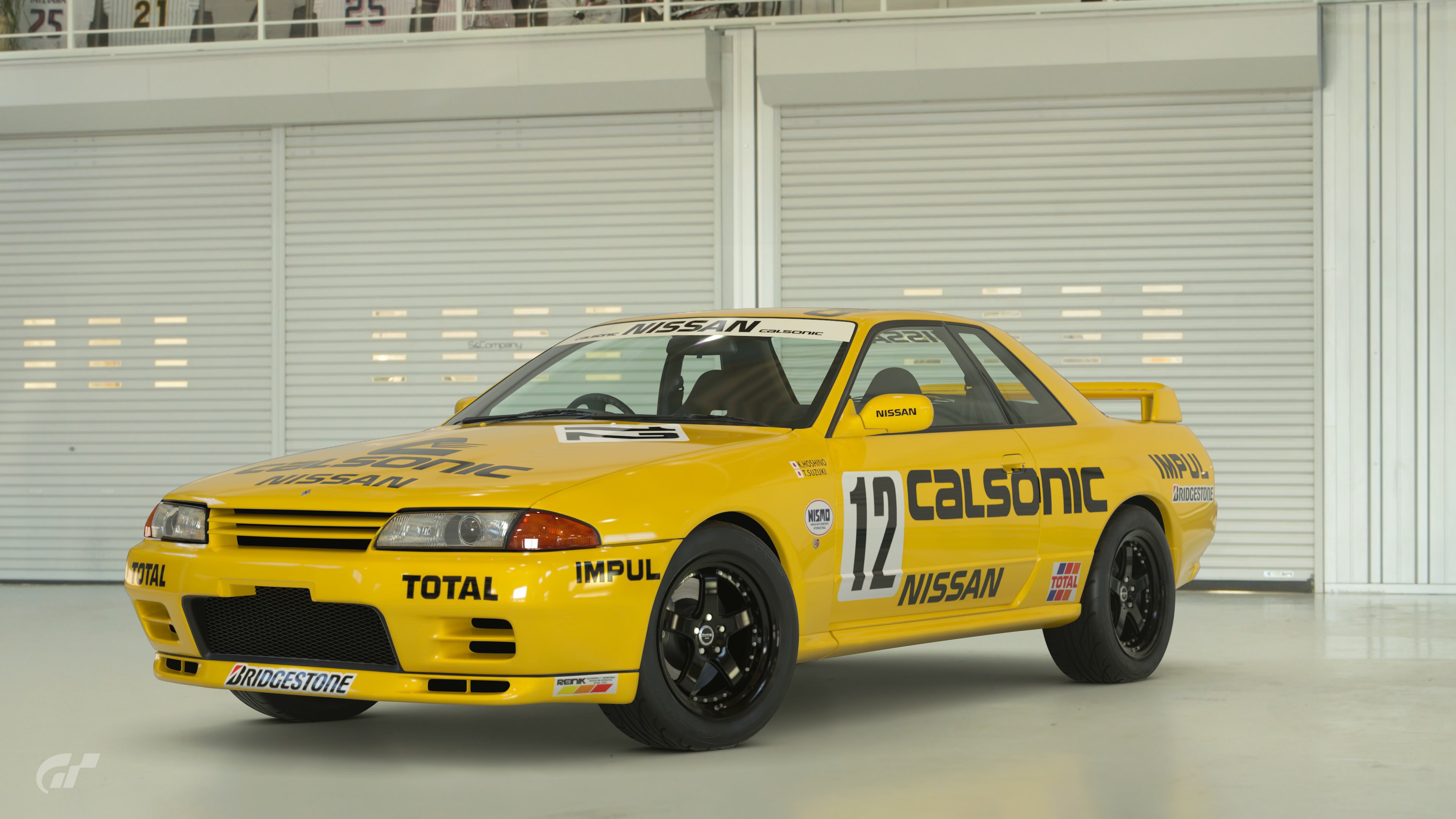
full

full

full

full

8qTbOTv.png


Poll Option #13 - PS4 Base


8qTbOTv.png


Poll Option #14 - PS4 Base


8qTbOTv.png


Poll Option #15 - PS4 Pro
full

full

full

full

8qTbOTv.png


Poll Option #16 - PS4 Base
full

full

full

full

8qTbOTv.png


Poll Option #17 - PS5 Raytracing
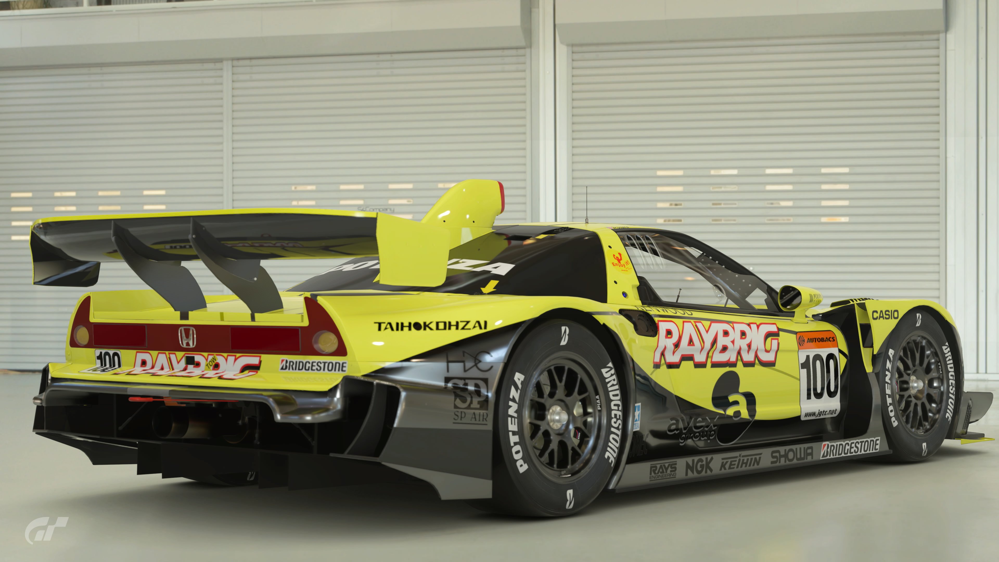
full

full

full

full

8qTbOTv.png


Poll Option #18 - PS5 Framerate
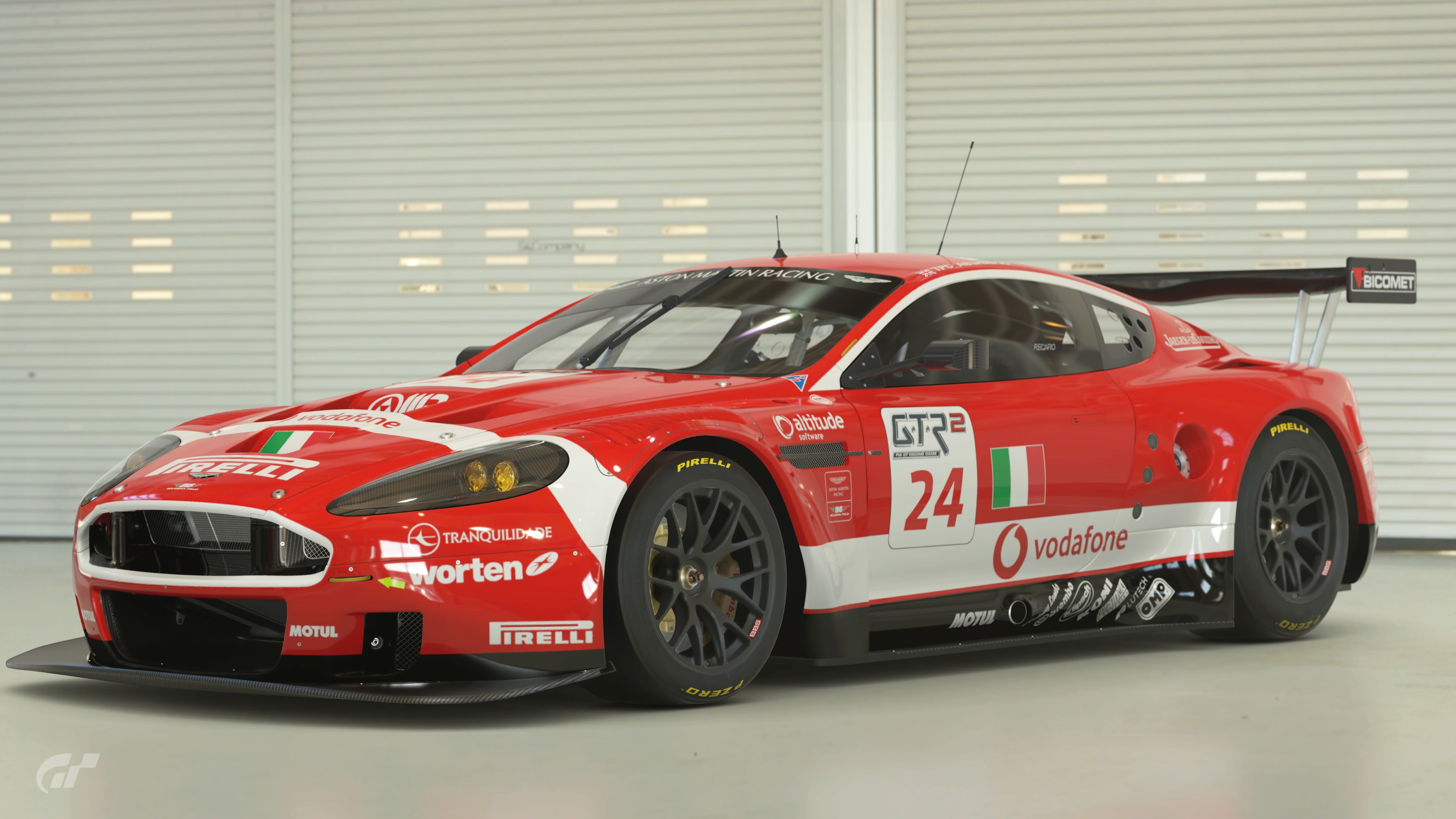
full

full

full

full

8qTbOTv.png


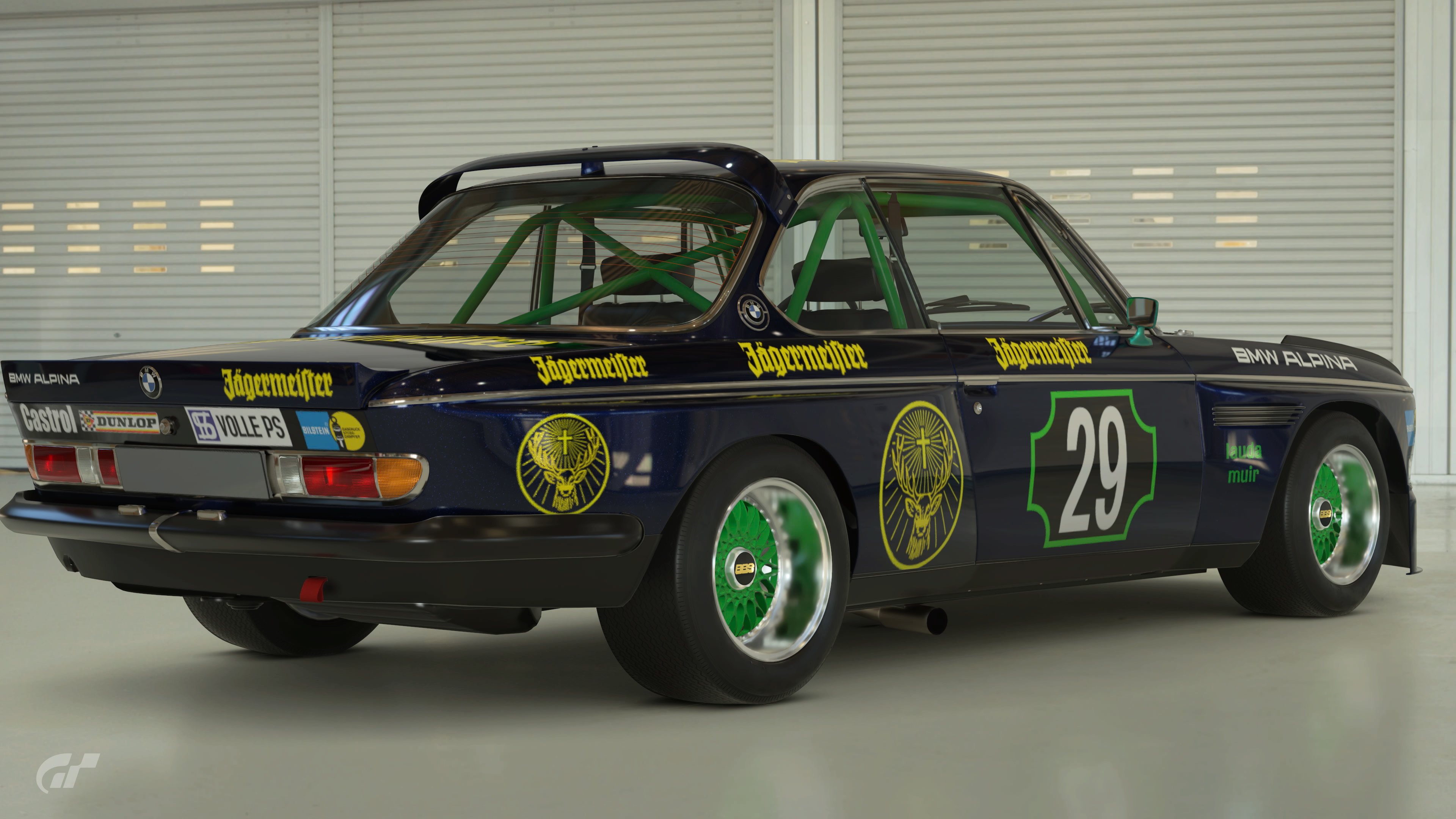
Poll Option #19 - PS5 Raytracing
full

full

full

full

8qTbOTv.png


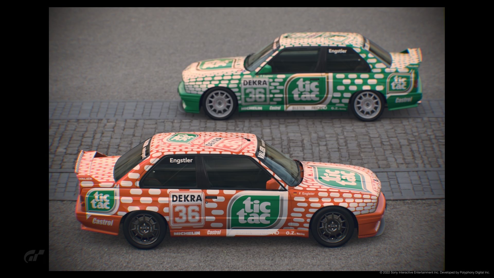
Poll Option #20 - Playstation
full

full

full

8qTbOTv.png


Poll Option #21 - PS4 Base
full

full

full

full

8qTbOTv.png


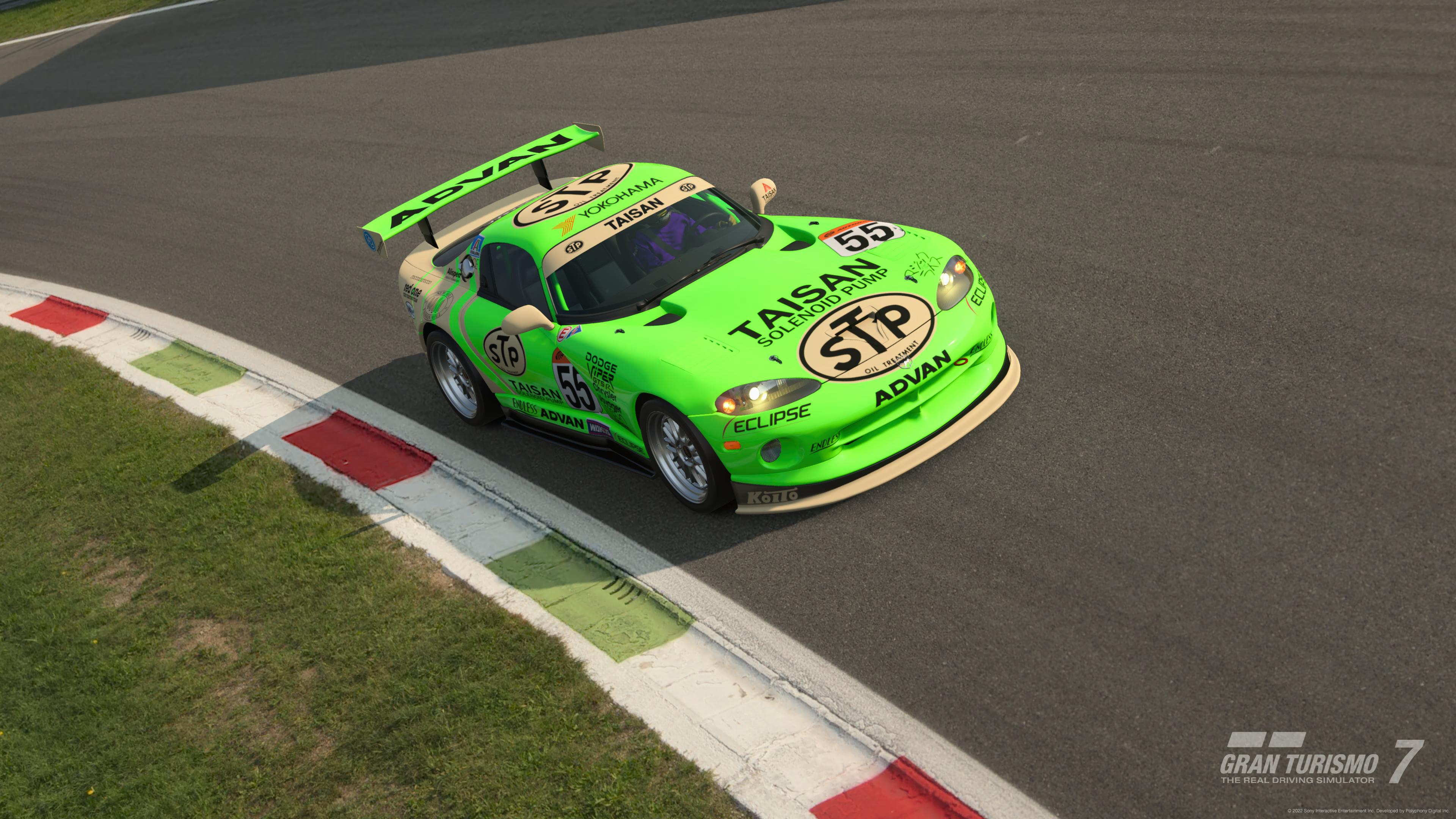
Poll Option #22 - PS5 Framerate
full

full

full

8qTbOTv.png


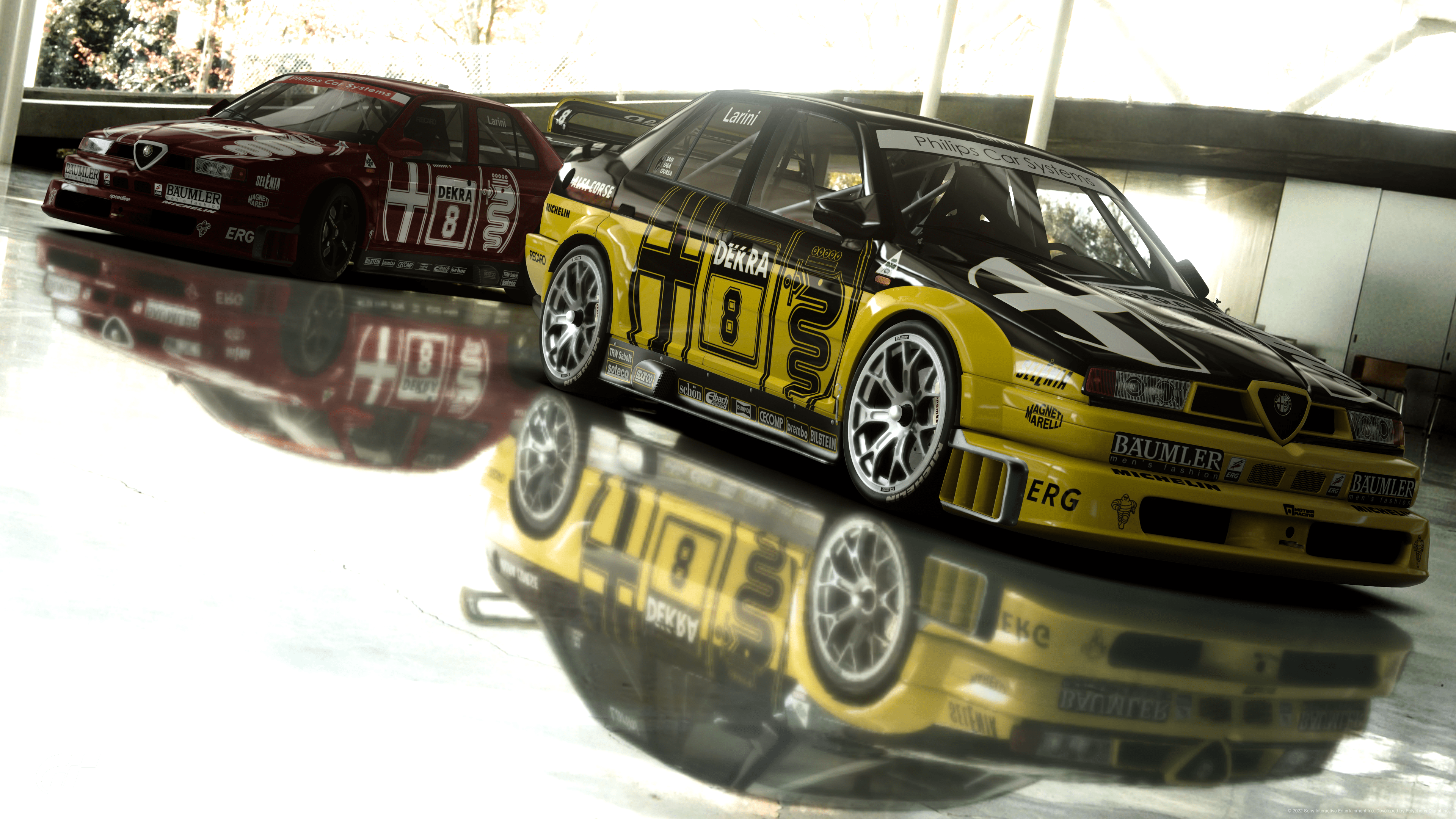
Poll Option #23 - PS5 Raytracing
full

full

full

full

8qTbOTv.png


Poll Option #24 - PS5 Raytracing
full

full

full

full

8qTbOTv.png


Poll Option #25 - PS4 Pro
full

full

full

full

8qTbOTv.png


Poll Option #26 - PS5 Raytracing
full

full

full

full

8qTbOTv.png


Poll Option #27 - PS4 Base
full

full

full

full

8qTbOTv.png


Poll Option #28 - PS5 Raytracing
full

full

full

full

8qTbOTv.png


Poll Option #29 - PS4 Base
full

full

full

full

8qTbOTv.png


Poll Option #30 - PS5 Raytracing
full

full

full

full

8qTbOTv.png


Poll Option #31 -
full

full

full

full

8qTbOTv.png


Poll Option #32 - Playstation


Good luck to everyone who entered :gtpflag:
 
I forgot to set the checkbox for seeing who voted for what and had to reset the poll. So everyone who already voted, please vote again.
 
Great entries this time around. My votes ended up going to 3 of the most iconic liveries entered, with the creators putting a distinctive spin on them, without making it too over the top.

#11 F1- This looks proper classy. Very prim, proper and mature. Nicely done.
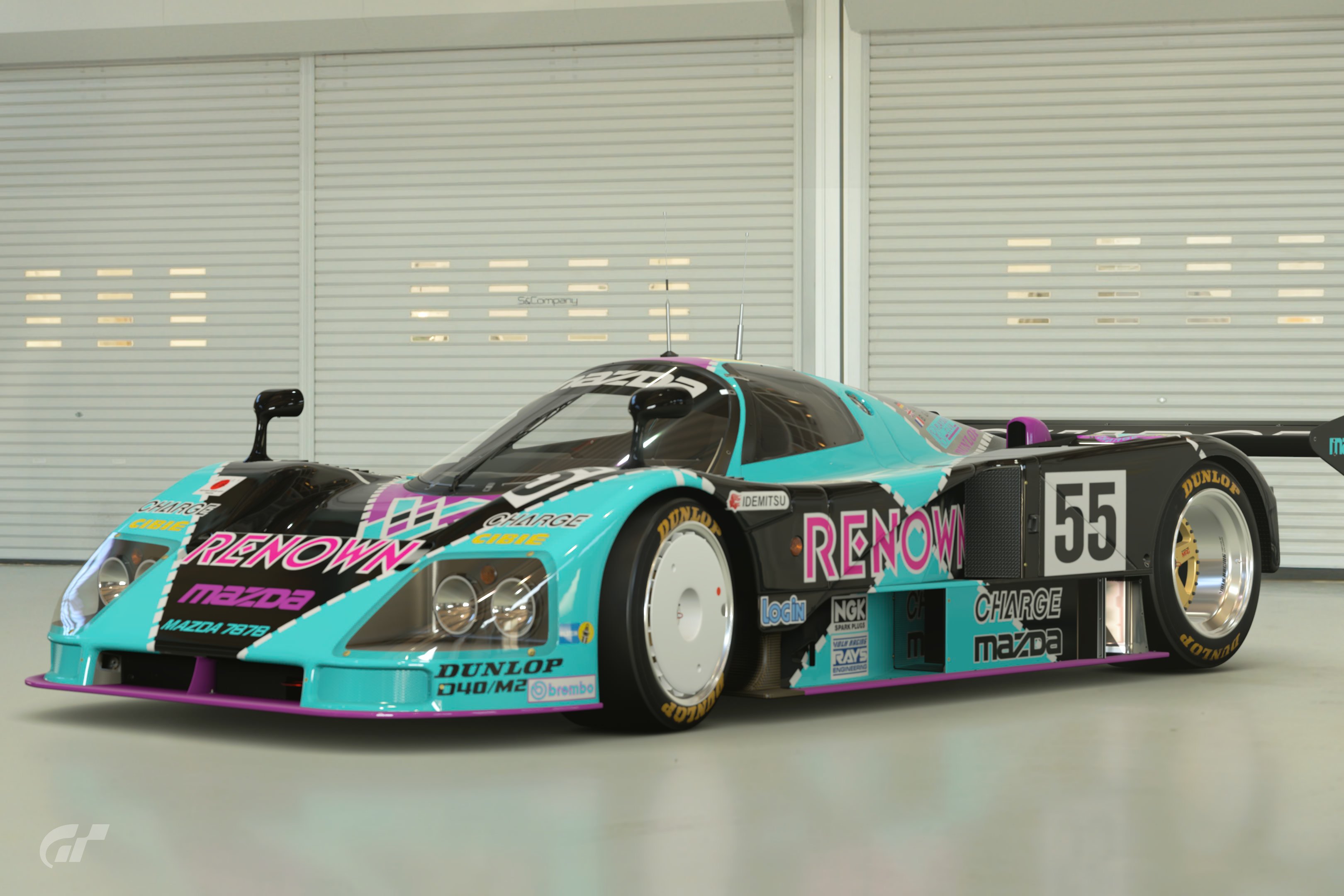
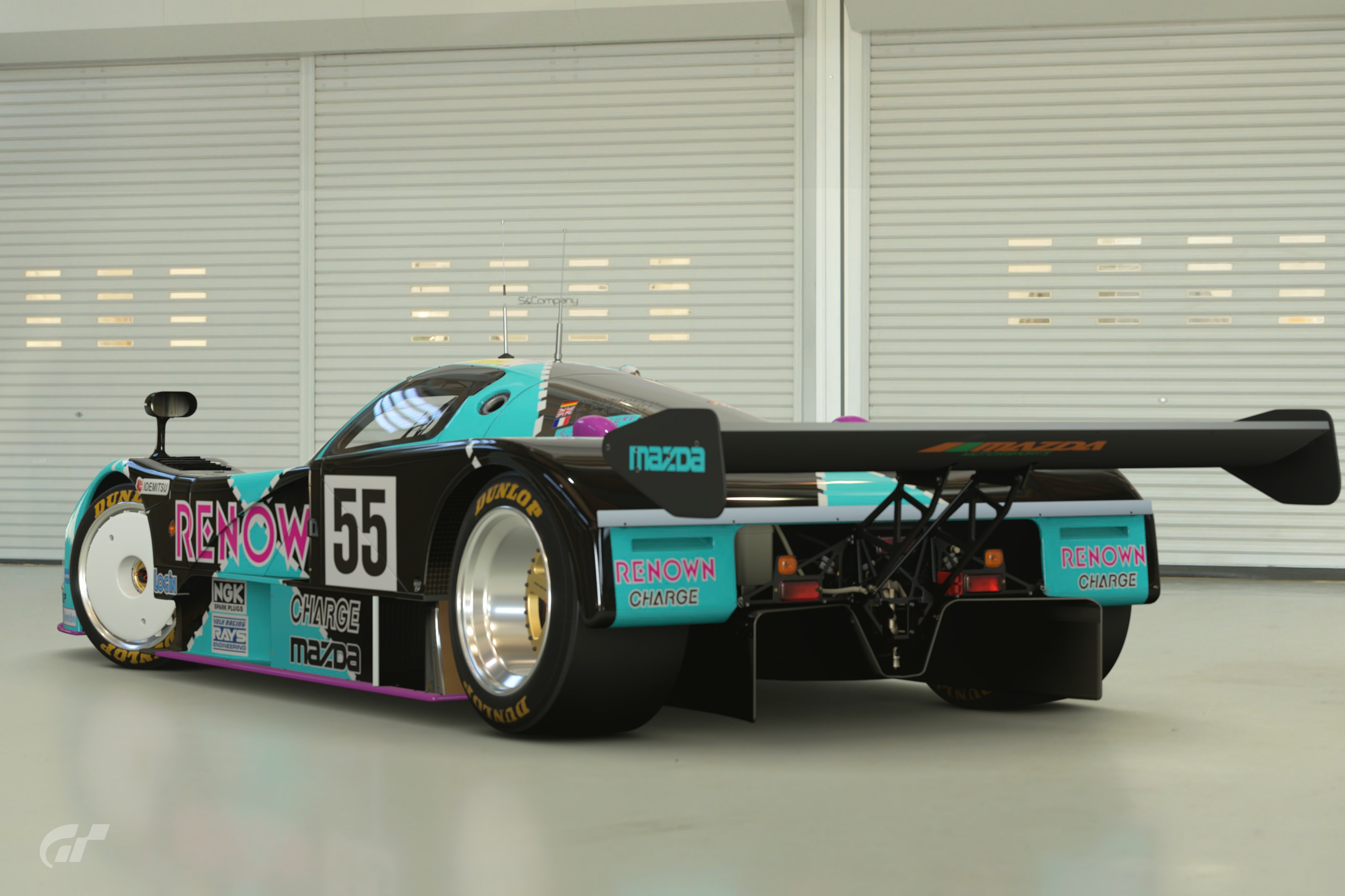
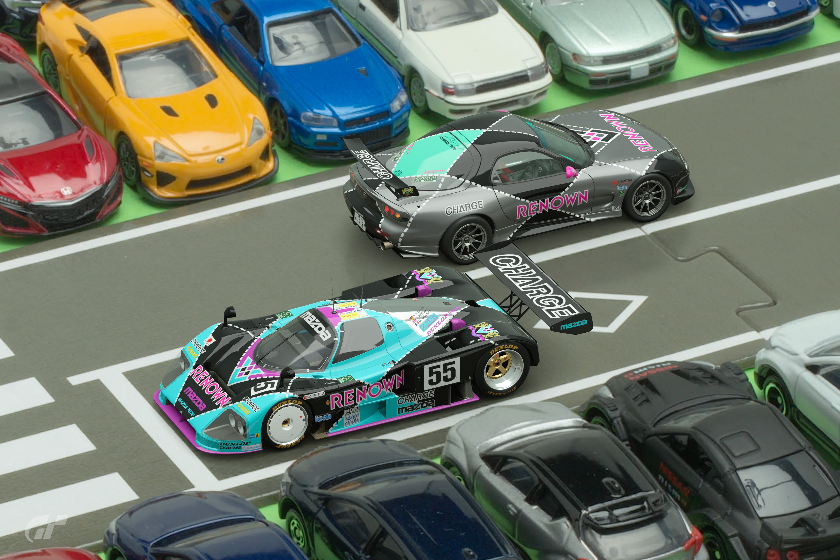
#15 787B- outrageous colours, but in real terms so are the originals! This shouldn’t work but it definitely does.
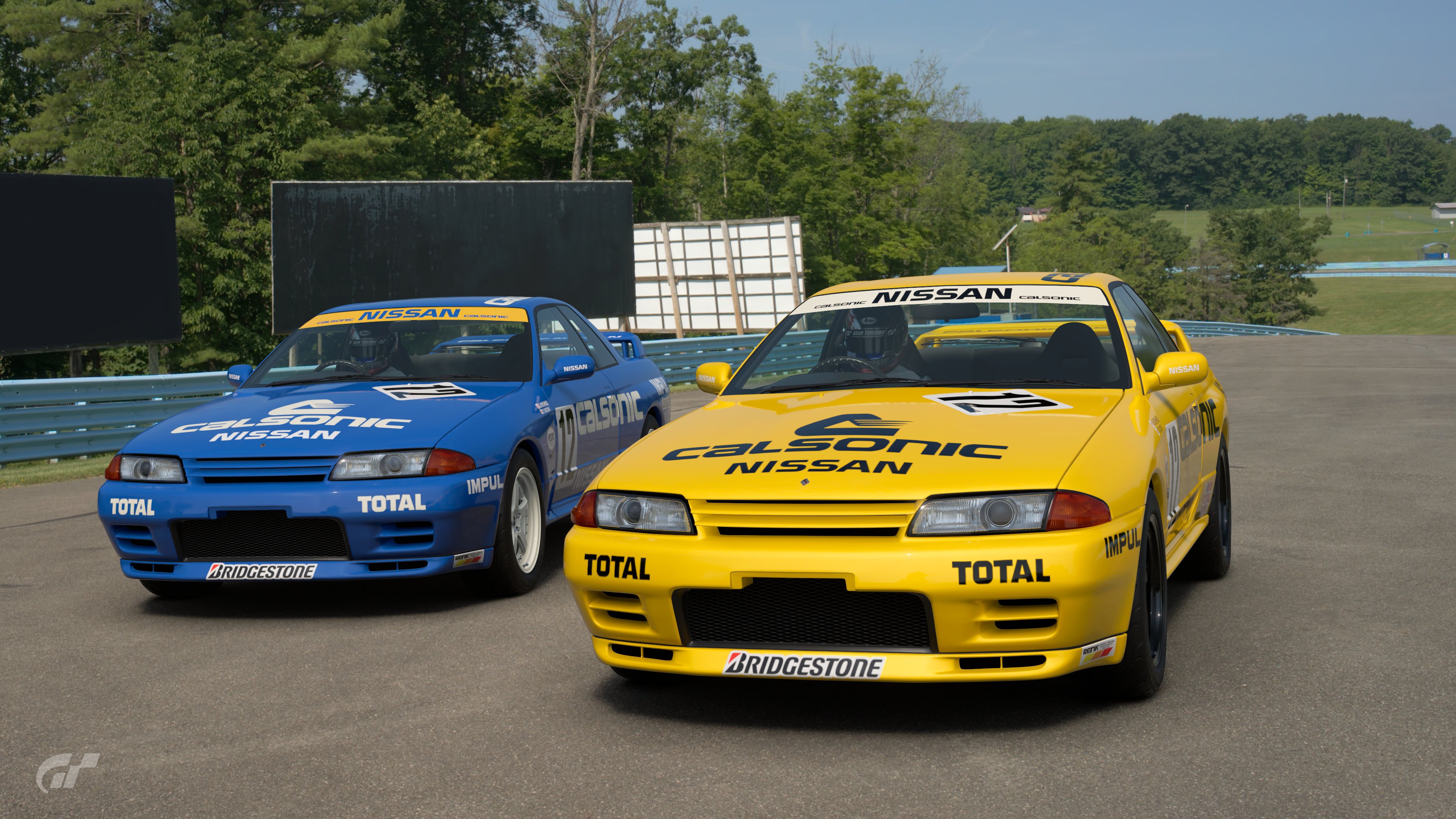
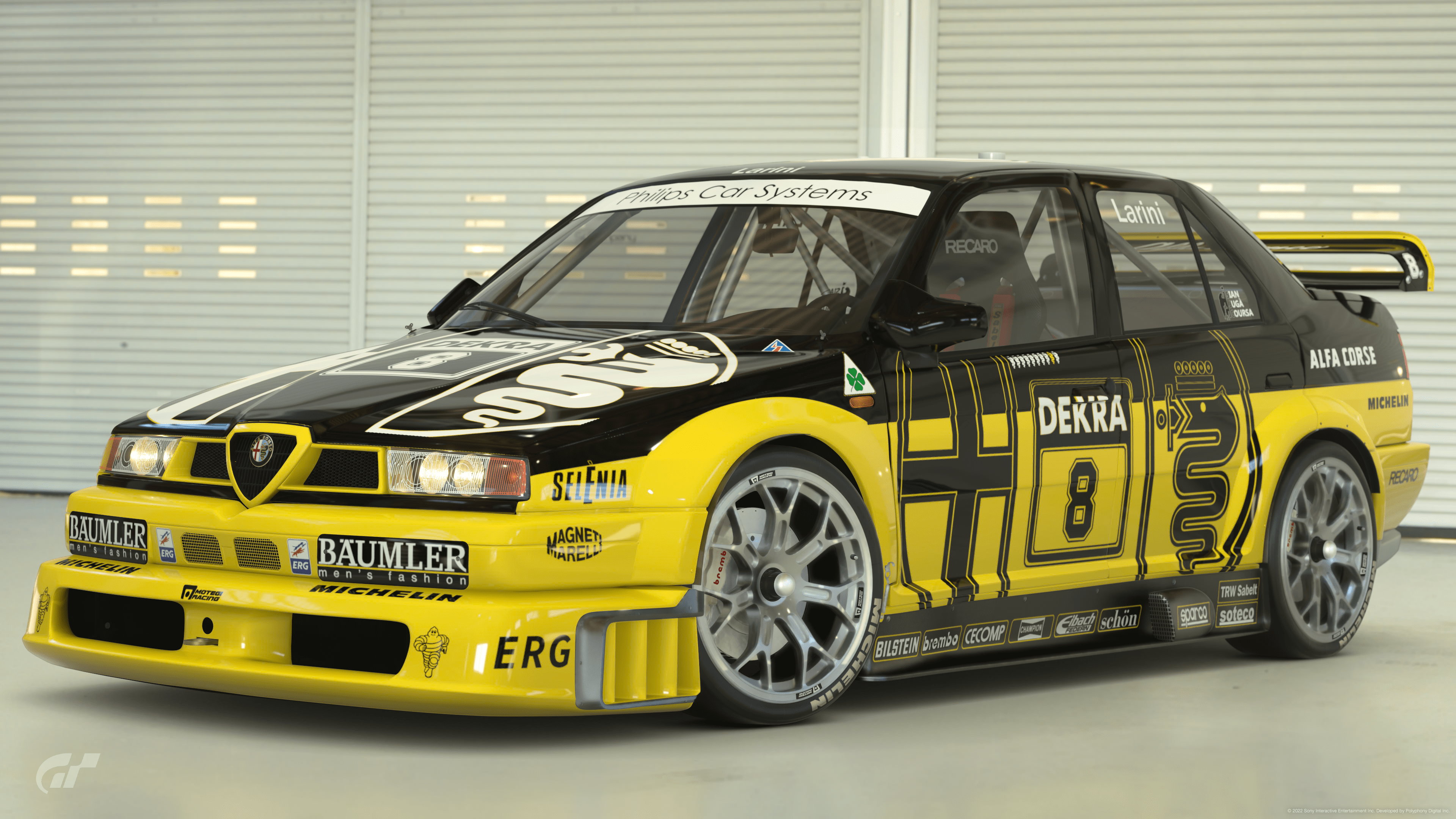
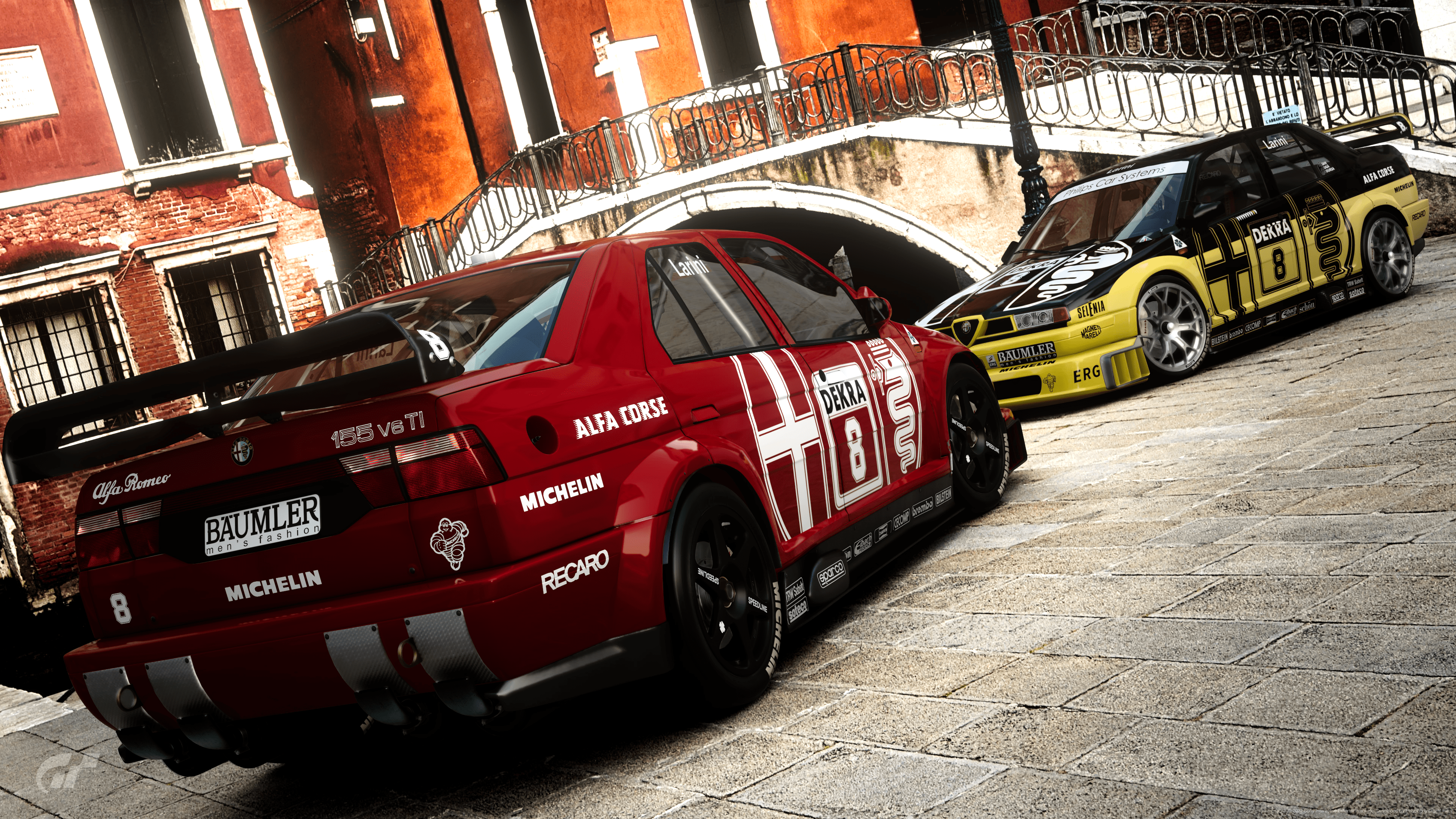
#23 Alfa- My favourite. Such a simple change to a pretty simple livery but it looks tough and it just looks right. I think this best fits the theme to me. A yellow Alfa race car shouldn’t work, but IMO it looks better than the original. Top job 👍
 
Last edited:
Man this was hard.
In the end I chose the following:
#02: Colour crime at its best but then again it does work.
#08: This one as well, for some reason it just works. They could have driven around like that back in the 90's and it might have become just as iconic as the blue one.
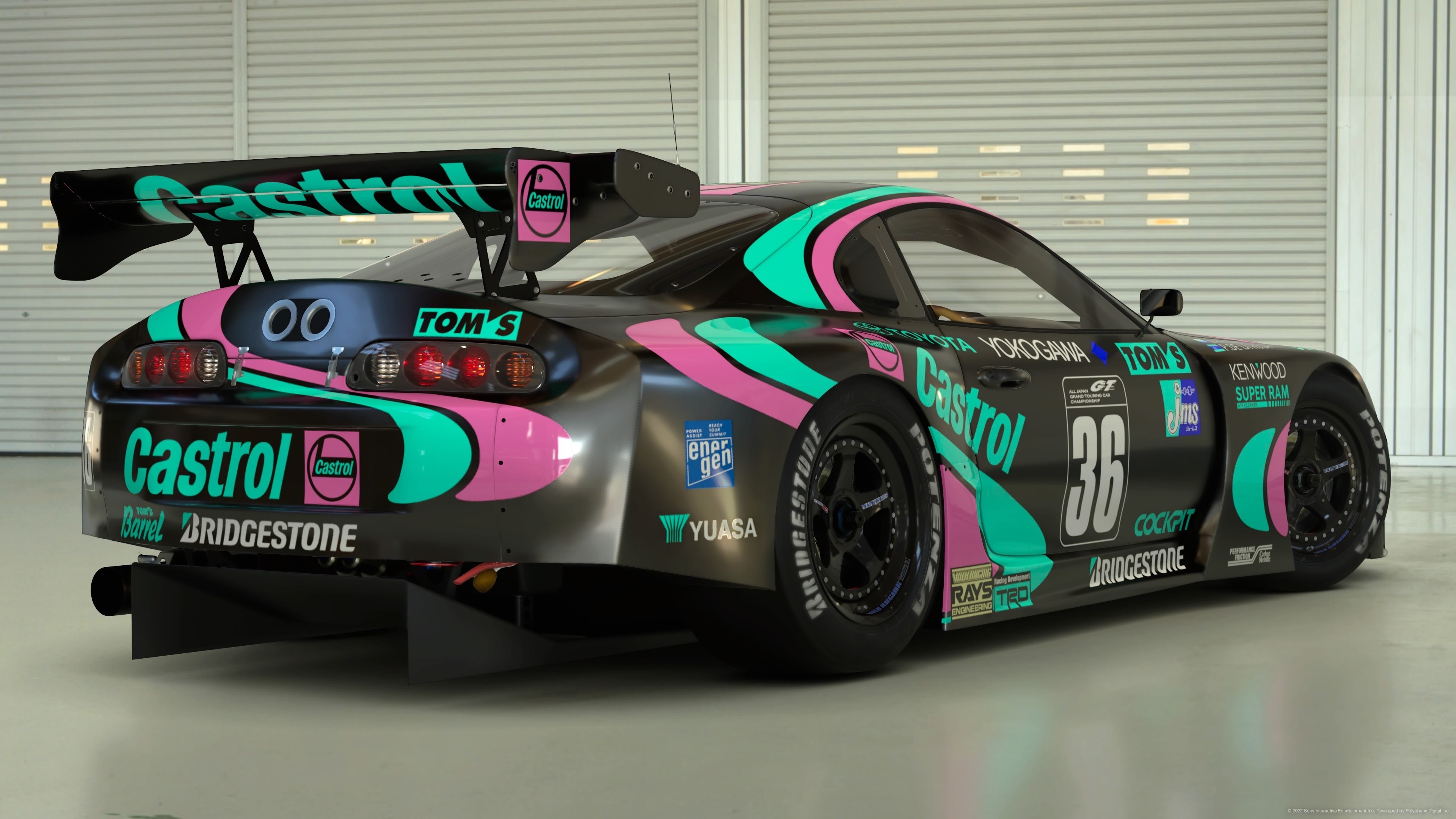
#28: I think it's hard to make that one work, other combinations might not have popped that much but this one, amazing

Runner ups, feel sorry that I can't give you a vote:
#22: so hideous that it's awesome
#23: And again an amazing choice and it looks great and nearly better than the original....at least just as great as the original
 
#3 - Ferrari - A fairly conservative original livery turned completely wild, I think it was very well done and fits the theme perfectly (for me).
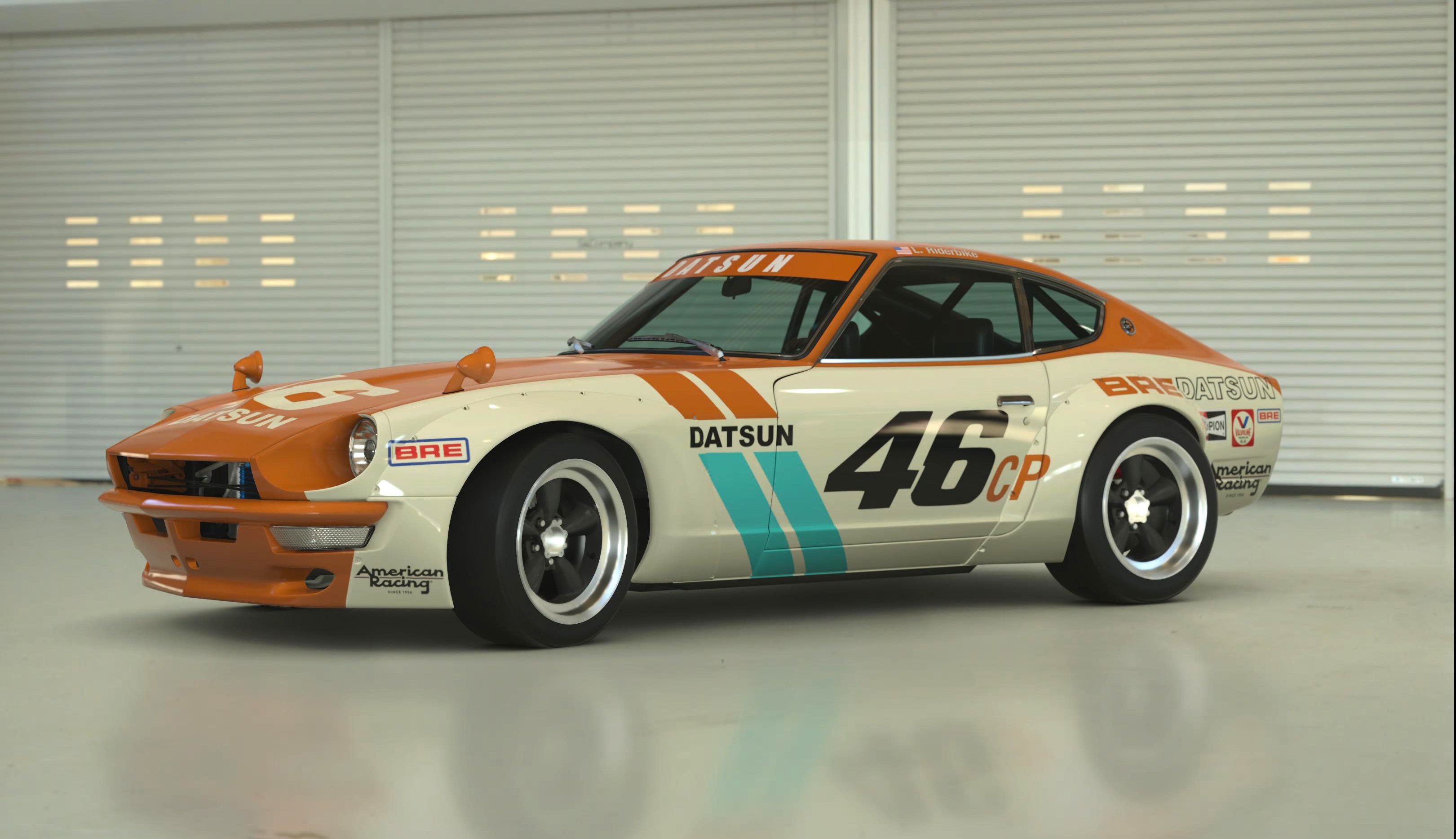
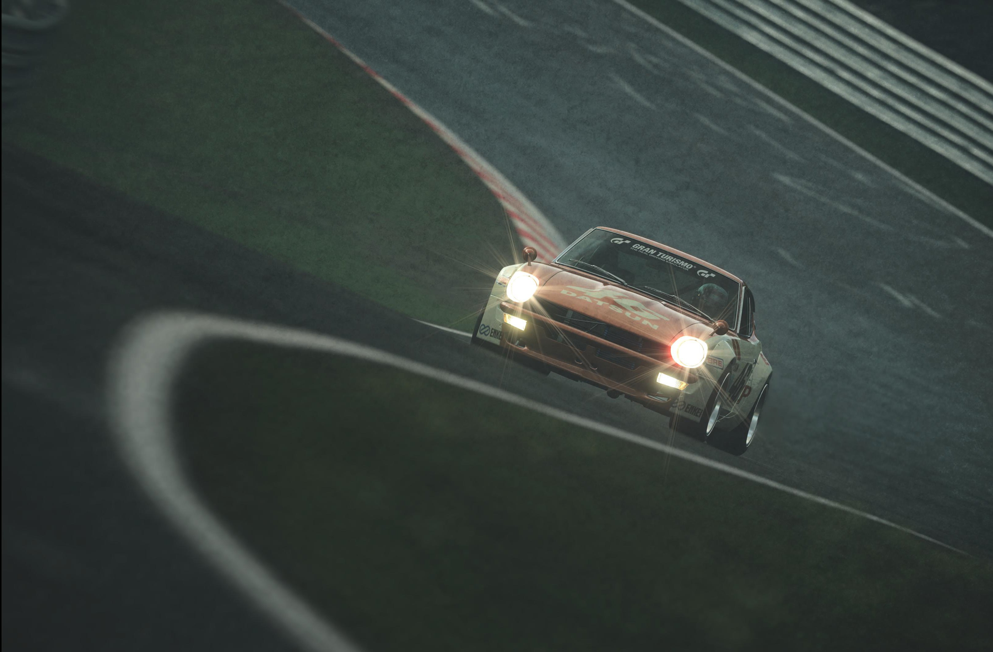
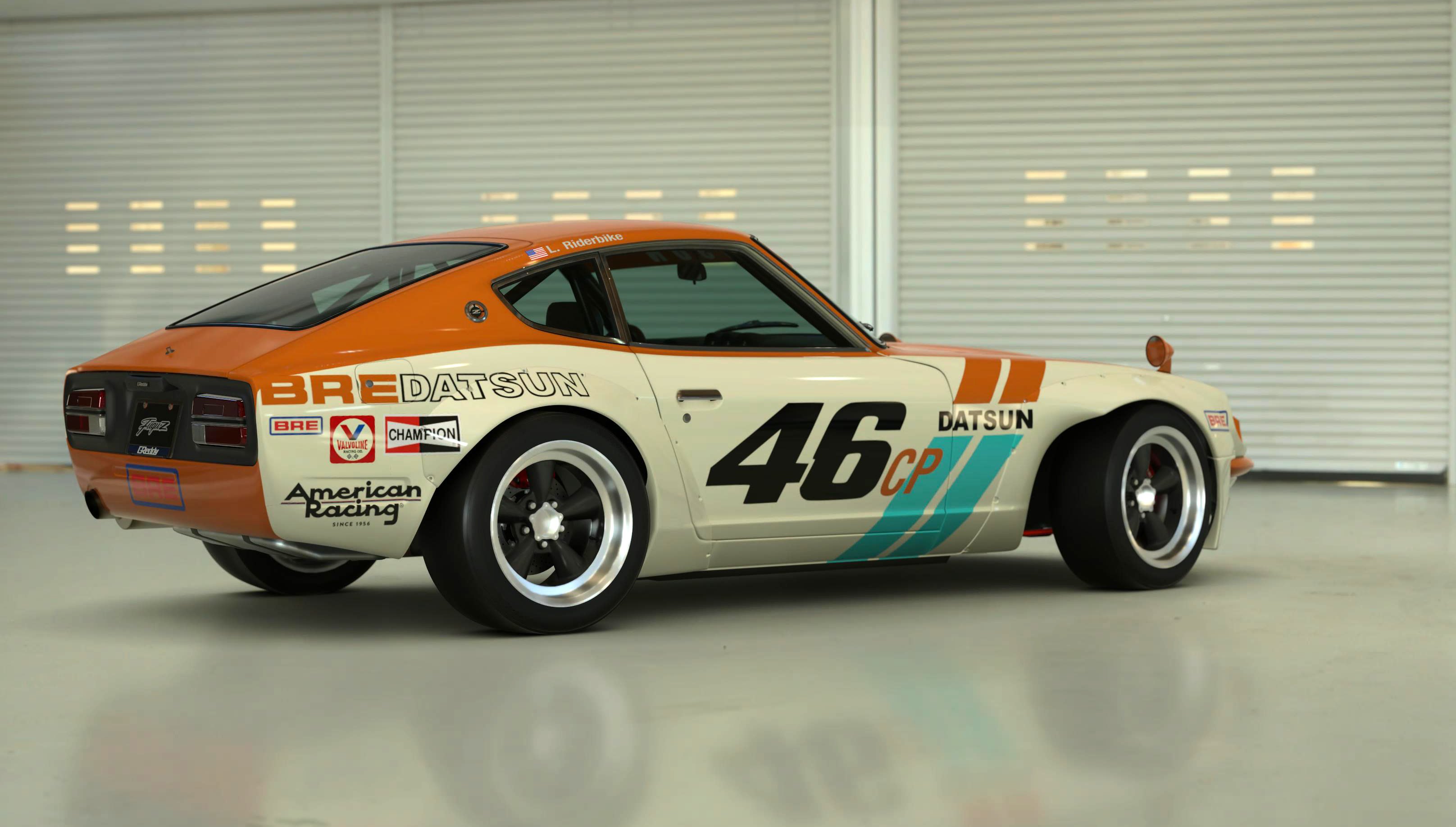
#10 - Datsun - I have a soft spot for this car, the 70’s colorway did it for me.
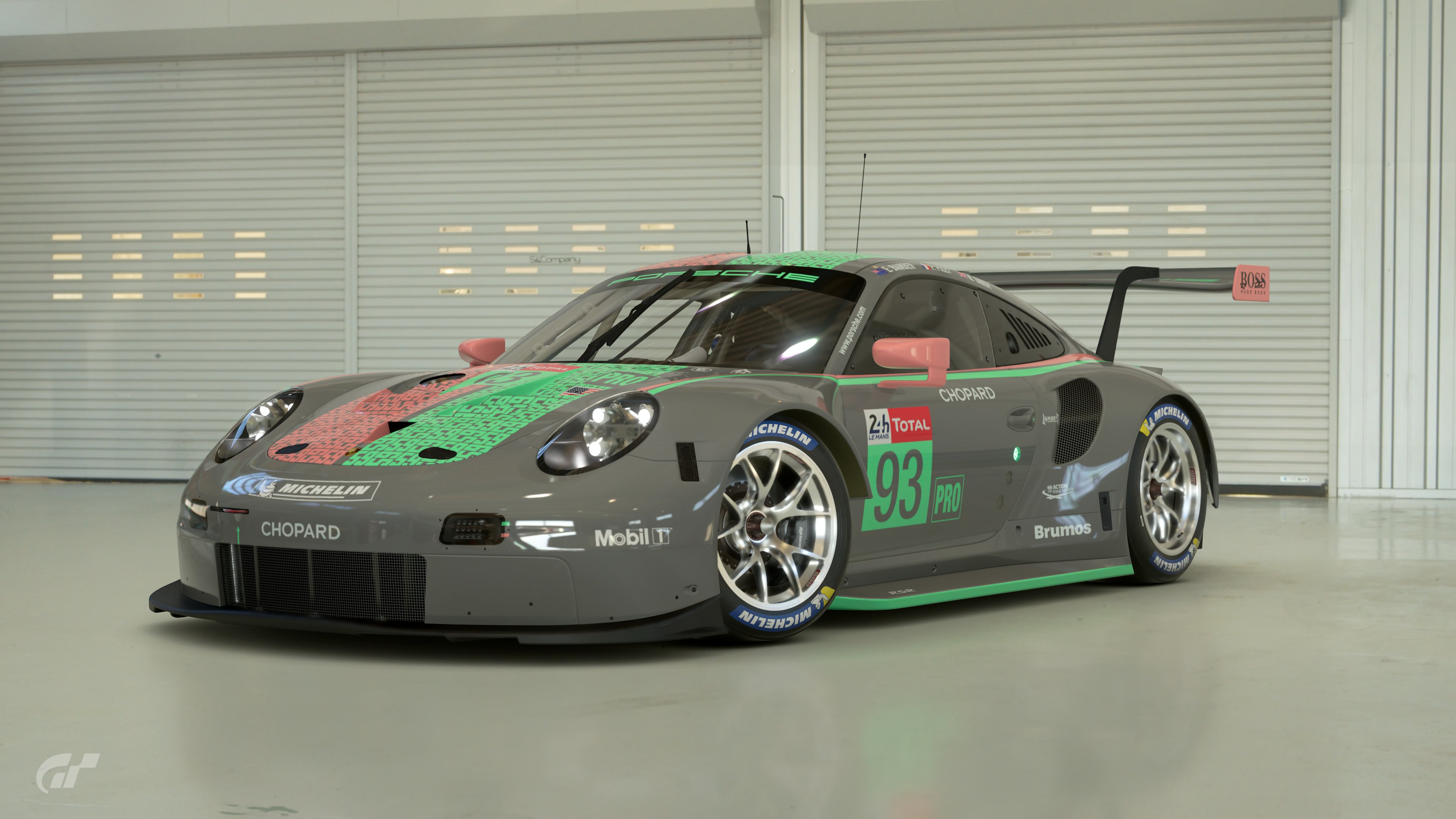
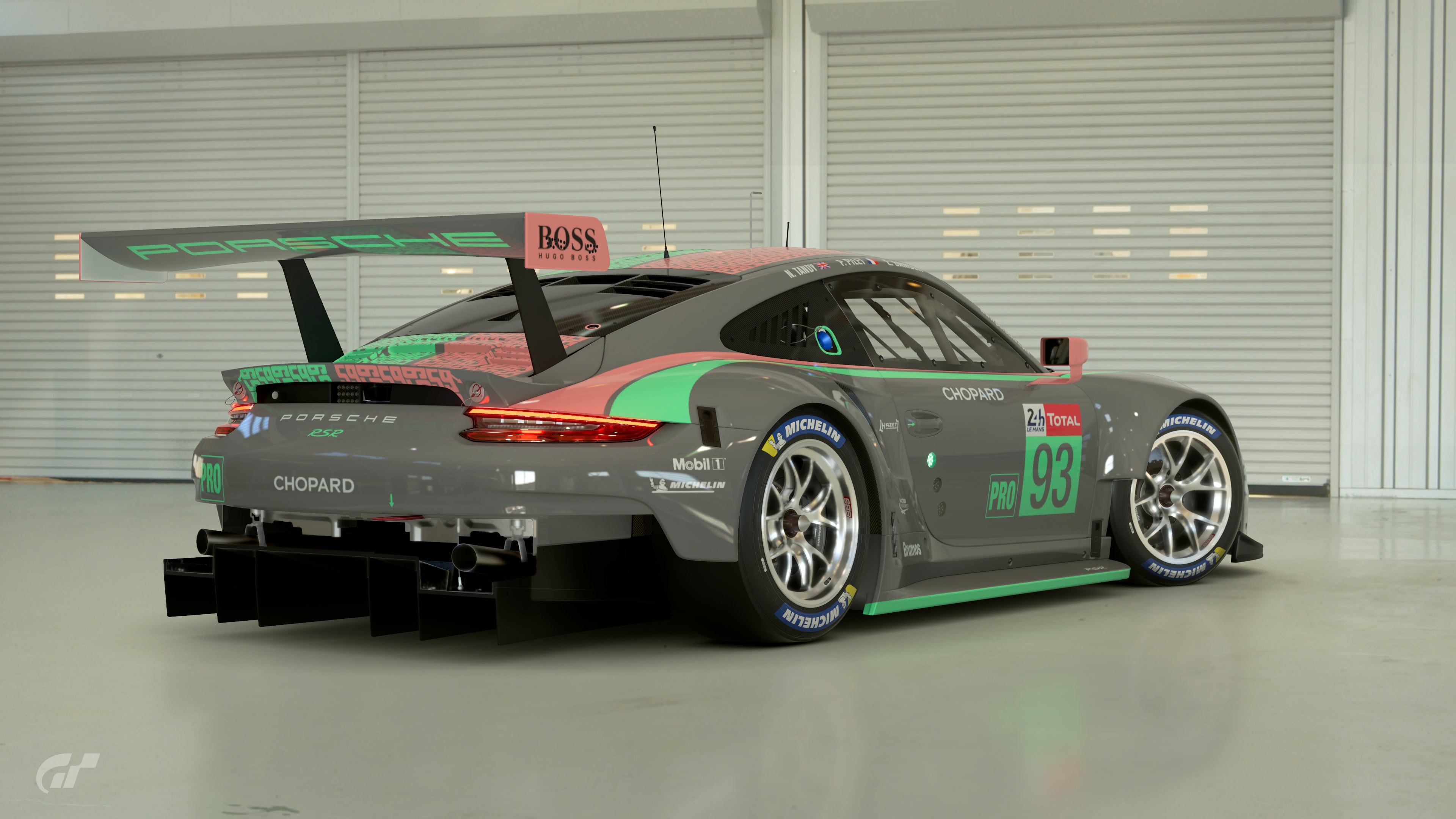
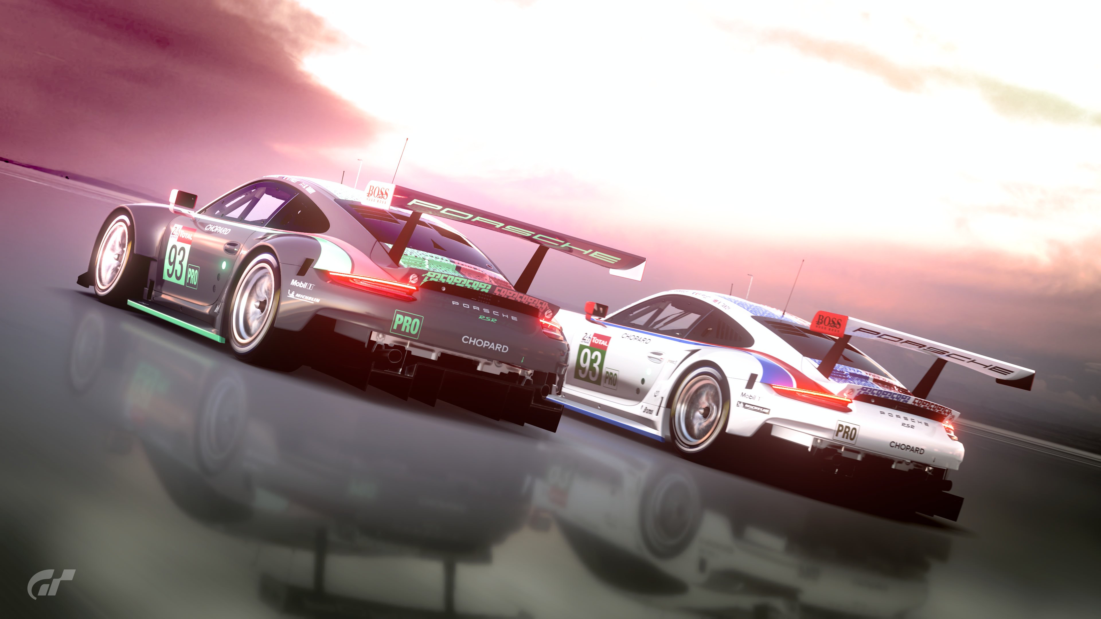
#31 - Porsche - an iconic livery that should only be red white and blue, but I still like the outcome here.

This was the first time I really had to think about my votes, nice job everyone!
 
Awesome Liveries guys!

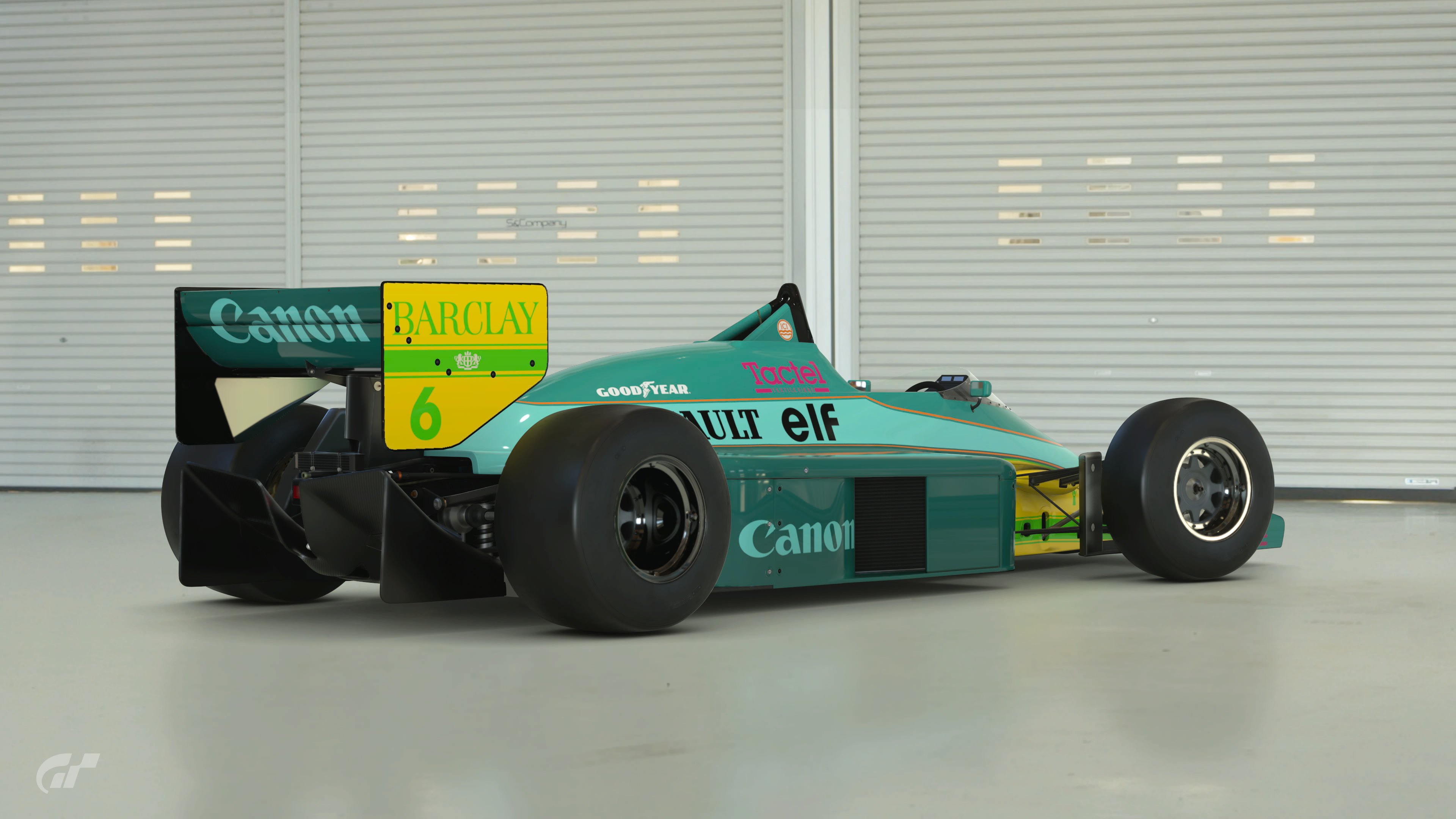
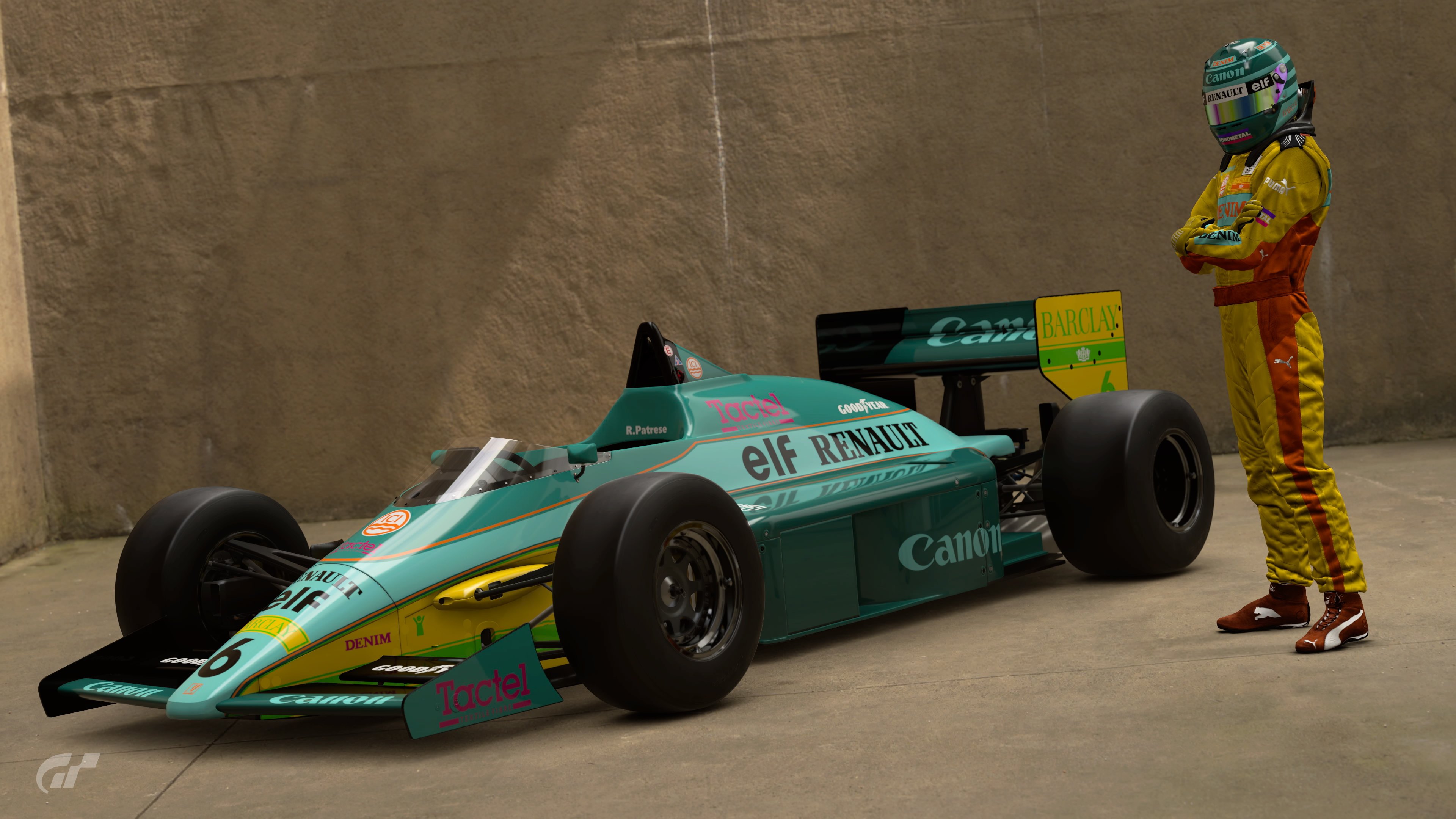
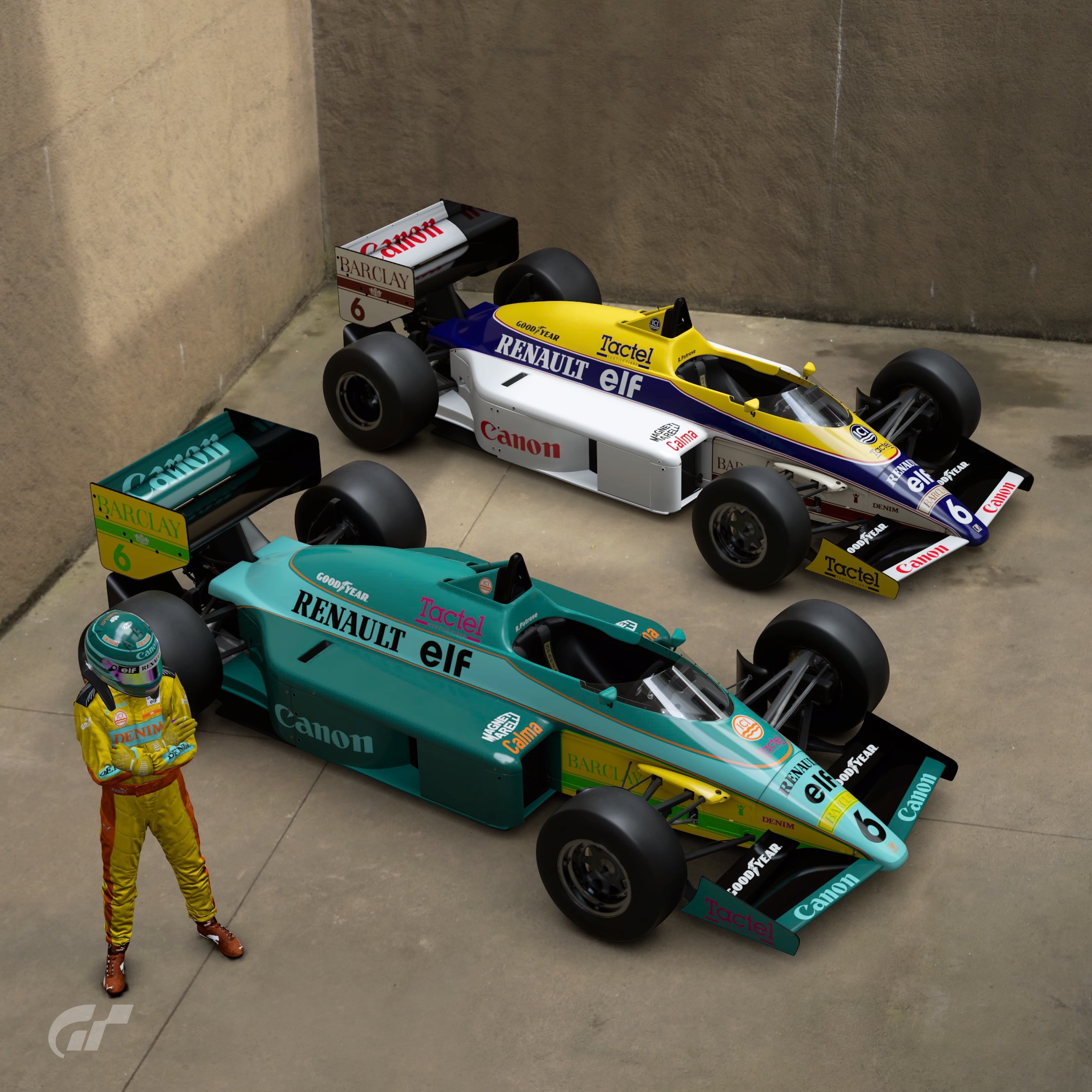
#13 Lotus F1 - I know it's simple but I'm digging the dark purple with fluorescent sea foam. Great combo on this icon.
#15 787B - I love this livery and the colorway used here works perfectly for it!
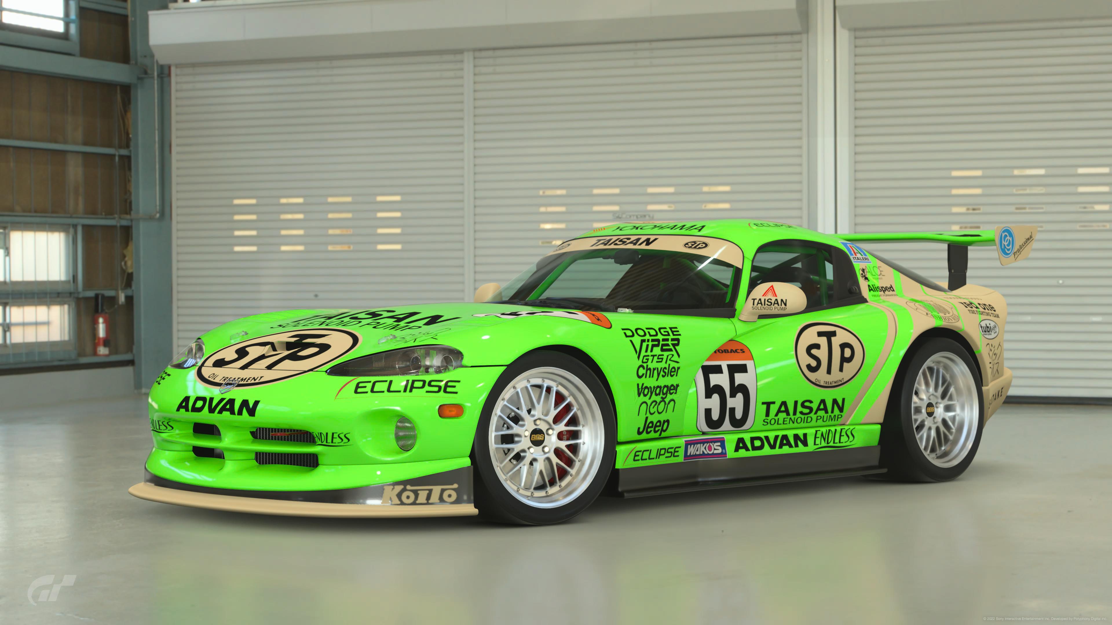
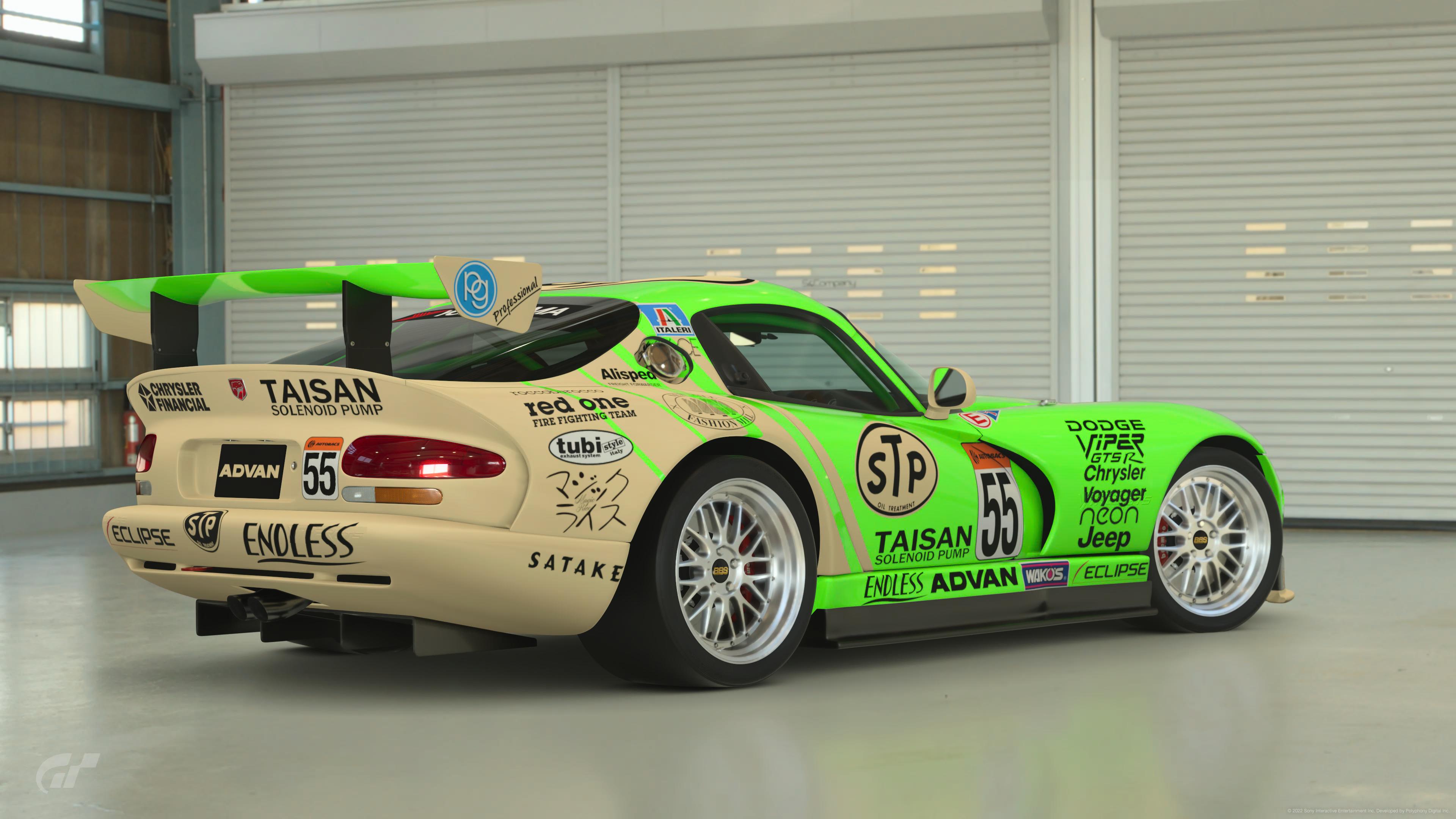
#22 Viper - I went back and forth with my last pick but the more I look at it the more I like it. It's weird but these colors started growing on me.
 
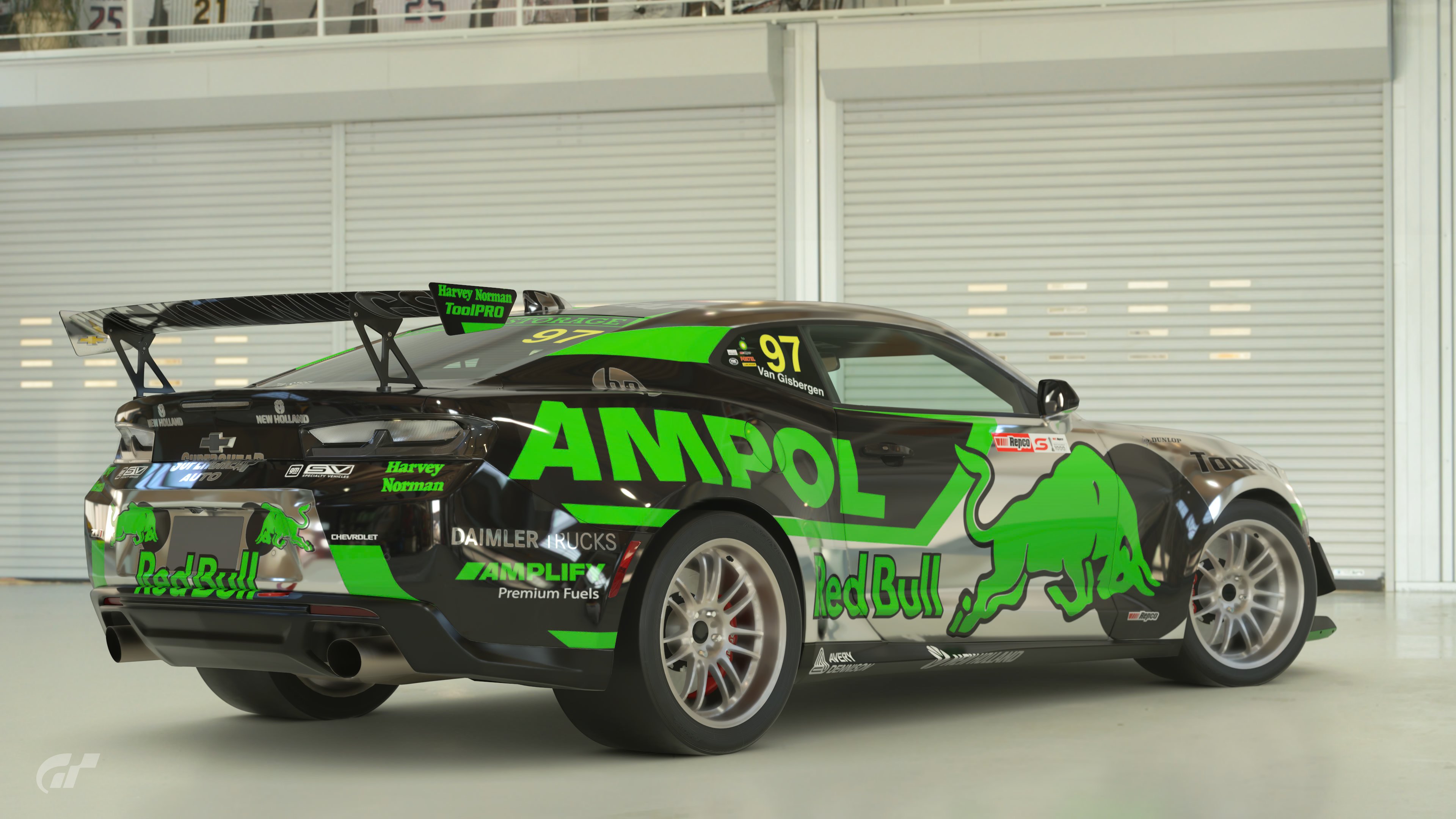
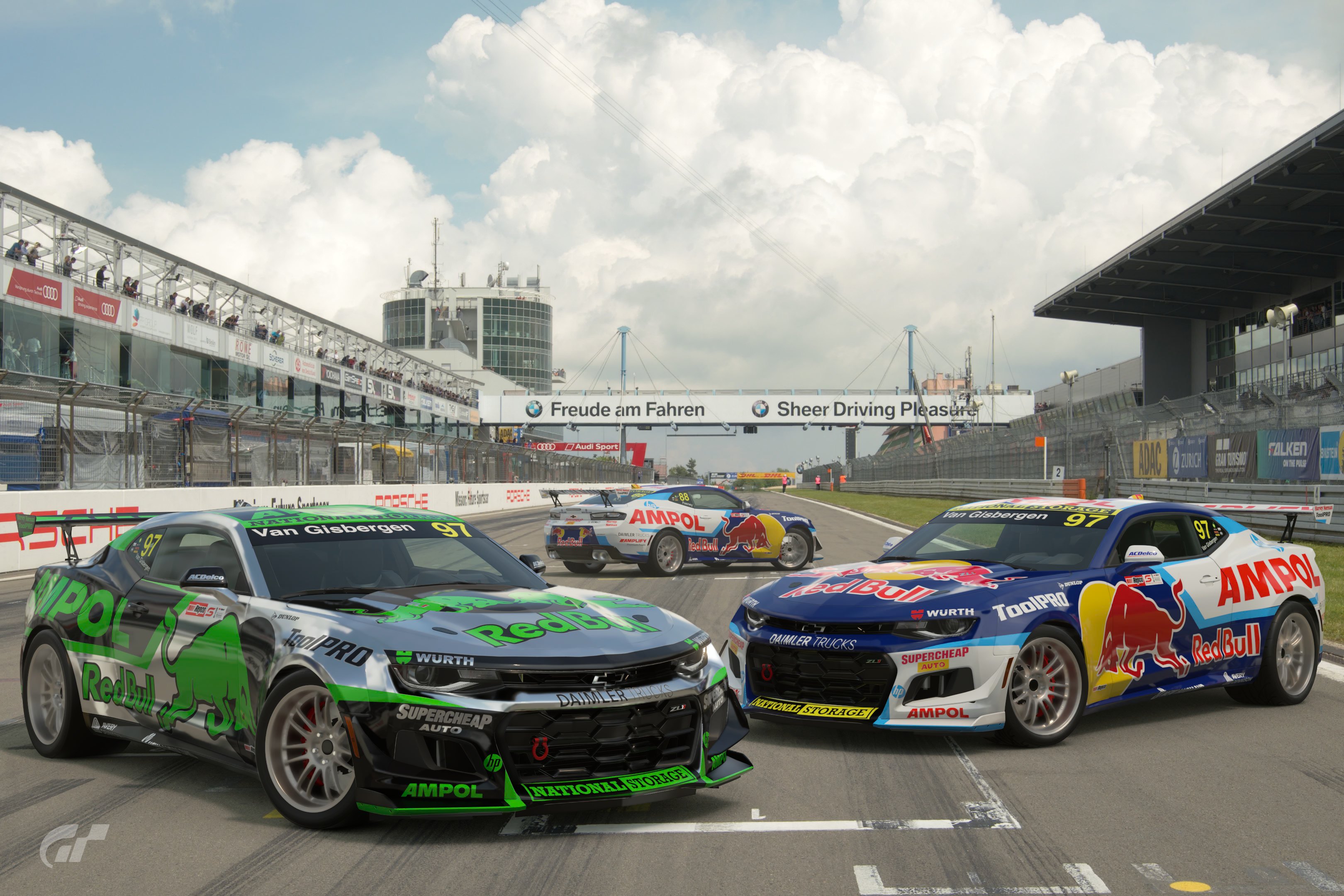
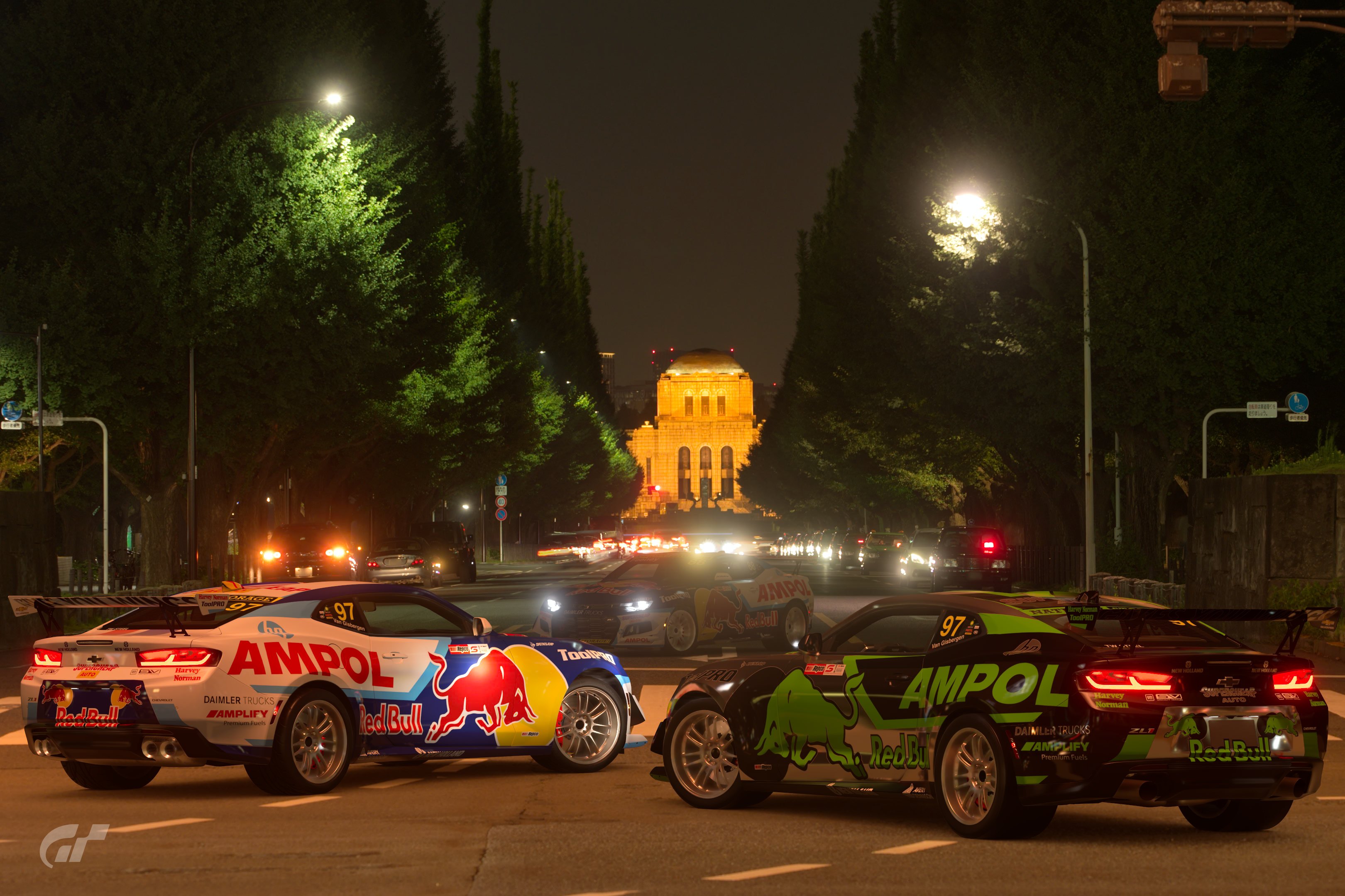
#4 - I’m a sucker for Aussie Supercar liveries….. great colour combo that works really well, but is far removed from the brands original whilst still utilising the aluminium can colour.

#19 - iconic livery. Such a bright original colour and you’ve swapped that to a very subdued blue. Really well done getting blue and green together to work so well, when it also doesn’t work at all.

#22 - Disgusting. My favourite of all. Beautiful.

Spoiler below is an observation only and does not contain any critique or feedback.

I’ve noticed a lot of combos utilising green/blue with pink/purple as a colour crime….. I propose that the fact that it is used in so many entries shows that they are actually colours that somehow compliment each other……

My first design had a baby blue, lime green and pink theme.

It’s interesting how the colours work so well, but are also pleasing and shocking at the same time.

Just an observation.
 
Last edited:
First of all, some incredible entries this time around! For me there's a few which fall slightly short of the mark, and a few which absolutely nailed it. Pinning it down to only three in the end was tough, but I decided to go for:

#1 - this was the first brave entry and while it's not the wildest, it's a good mix of garish colours which don't work but do at the same time. I like the pops of bright yellow and the pink Tactel logos which stand out against the base colours.

#15 - as I stated when this was originally posted, I wanted to make an alternatively coloured 787B, but wasn't able to work out a suitable colourway. This absolutely smashed it. Terrible colours working in perfect synergy.

#28 - this was also one of my early ideas, but I didn't have the energy to create all the custom decals in order to make it work. The end result is absolutely epic. I actually like this better than the original!

Round of applause all round for your efforts on such an interesting brief! I would LOVE to see a custom race or two comprised of only these liveries!!
 
Last edited:
#19 - iconic livery. Such a bright original colour and you’ve swapped that to a very subdued blue. Really well done getting blue and green together to work so well, when it also doesn’t work at all.
I went with some green because, part of the motivation for this combo was because Blue and Green are traditional Alpina racing colours.

Just an observation.

Even if you swap colours entirely, there's still complimentary colours

1662124240265.png


My first attempt was this... Based around the NSU TT Jagermiester cars.

1662124442566.png

1662124781404.png

To set the colours I literally went 180° around the Hue value of the colour - if you do that with all the original colours you should still end up with something that works. I didn't think the colours were strong enough here though.
 
I guess i set a trend, my goal was never to make a hideous livery, just different colours.
 
p78
I guess i set a trend, my goal was never to make a hideous livery, just different colours.
I was shooting for this as well. I can’t pour time into something I wouldn’t want myself, so it became a balancing act between pleasant and jarring. I think I finished more or less in the middle.
 
It has been a privilege for me to choose this theme and I am overwhelmed with the results of this competition: so surprising, so creative, so much fun!
It’s quite plain and obvious that selecting three out of 32 isn’t that easy if you take it serious.

I couldn’t help to select these most colour-criminal designs:

Poll Option #03: The most terrible Ferrari I’ve seen.
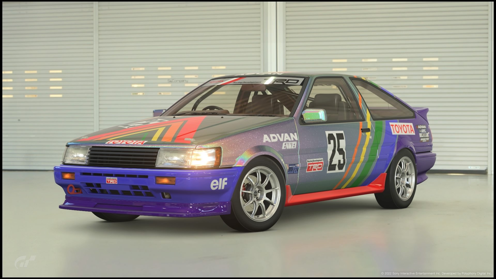
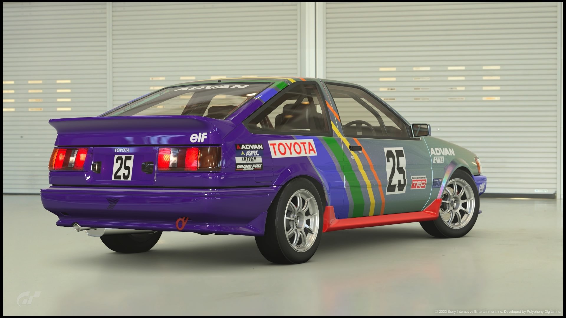
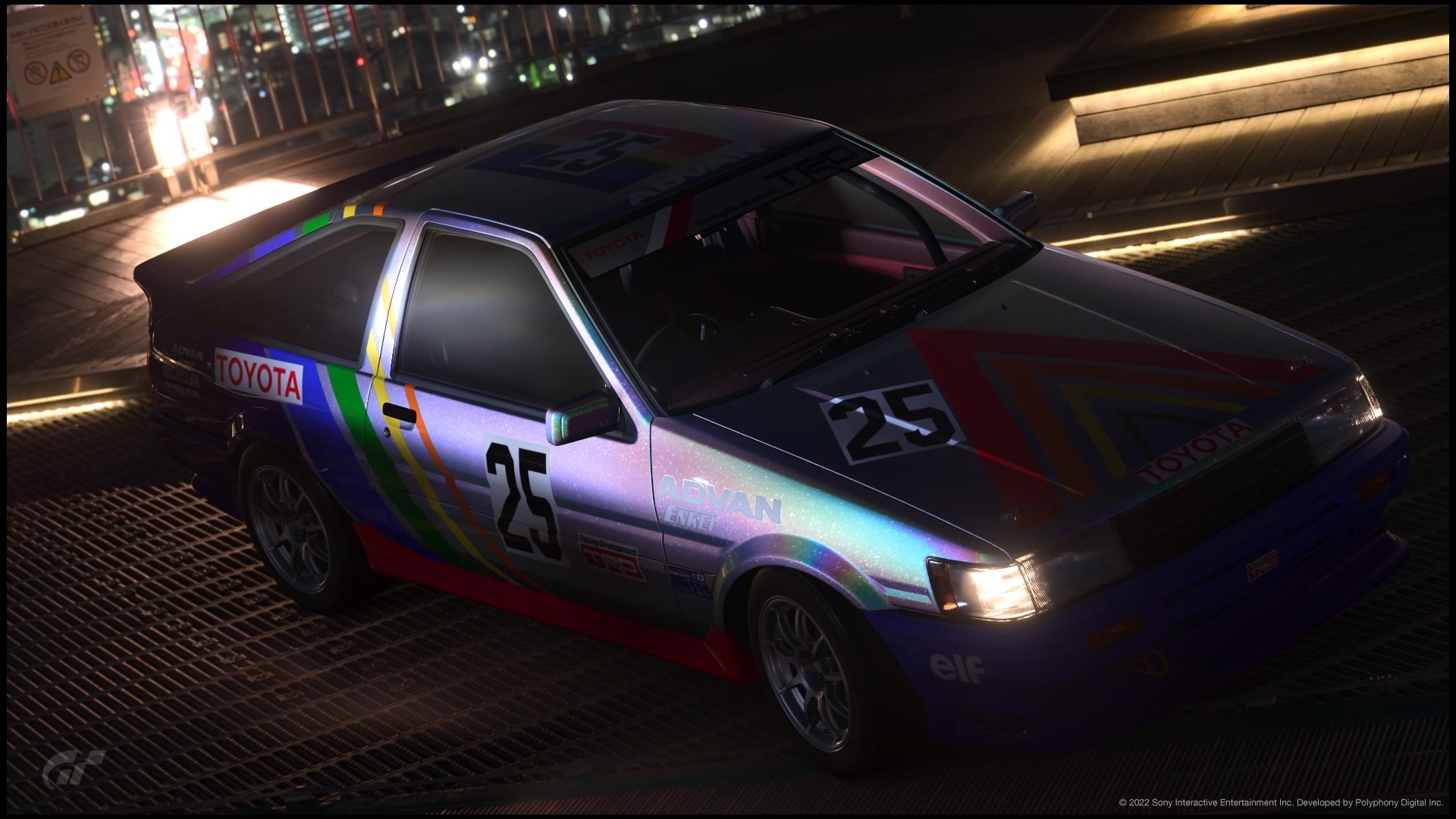
Poll Option #16: A Toyota abused by a disgusting livery design.
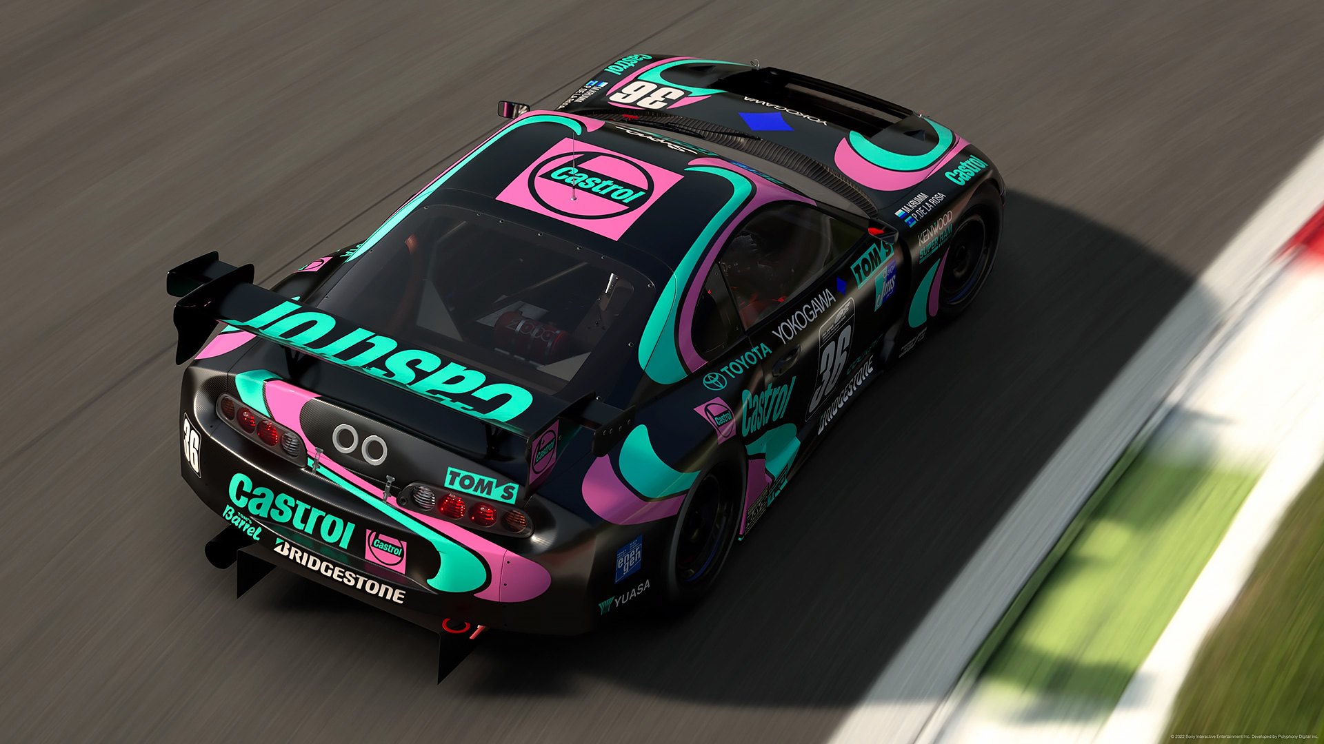
Poll Option #28: A clear podium entry. At first glance my favourite. Had the idea for my own entry but hesitated to do it. Well done!
 
That was too difficult but too cool. What talent !!! All the designs were over the top. #11 F1 First class to the creator. It's in a tie for my fav. #10 The Datsun made me sit back and smile. Thought I saw Paul Newman hanging around the back of the car. I had the honor of working with Newman / Haas at the end of my run. Mr Newman, nicest guy I ever met. 2005 Mexico City GP ChampCar put our team up in the 4 Seasons Hotel. Well done on the Datsun. #19 The Beemer, cause I'm a Beemer owner? No, the iconic grill, air dam, car stance and rake are just flat out sexy. Tied for # 2 on my list w/ the Datsun.

Beauties, every one. Too cool, bravo !!!
 
I went with some green because, part of the motivation for this combo was because Blue and Green are traditional Alpina racing colours.


Even if you swap colours entirely, there's still complimentary colours
This is a much better description of what I was getting at.

I initially went for “crime” colours on my first attempt, but they weren’t displeasing to look at on their own, only in the context of “that livery shouldn’t be that colour”

Some incredible colour and hue combos have made some of these liveries really pop.
 
Well the theme is "colour crimes" so I voted for 3 liveries that looked particularly garish. Not sure if that's the right criteria but anyway.
 
#23 Alfa- My favourite. Such a simple change to a pretty simple livery but it looks tough and it just looks right. I think this best fits the theme to me. A yellow Alfa race car shouldn’t work, but IMO it looks better than the original. Top job 👍

#23: And again an amazing choice and it looks great and nearly better than the original....at least just as great as the original
Thank you so much guys for these comments, I really appreciate! 🤗

There were two ways to go for this LEC and both of them have been greatly interpreted imo.

I've tried to make an ugly colour crime but I couldn't look at it and tell myself "ok let's go with it and make their eyes blood!" 😅

I knew the votes would be split between these two options but I had to go for something I could believe in AND tell me I like it. :)

My first attempt was with the '87 Civic design I reproduced on the '15 one some time ago but it wasn't as iconic as the 155 livery (at least in my mind) so when I saw my 155 and thought about the "what if they chose a different colour scheme at the beginning" thing I decided to simply change it but keeping an Alfa Romeo official colour and I was happy with the way it was. :)


Sorry now it's late, I forgot to post this message I started in the end of the afternoon, I'll try to explain how and why I voted within one of two days (hard choice once again, I wish I had 5-6 points to give... 😕).
 
Last edited:
Well, after a few days away on vacation I finally got around to finishing my breakdown. As always, much respect given to all that entered. This theme didn't really lend itself to "beautiful" designs, but there is certainly a lot of great work showcased here!

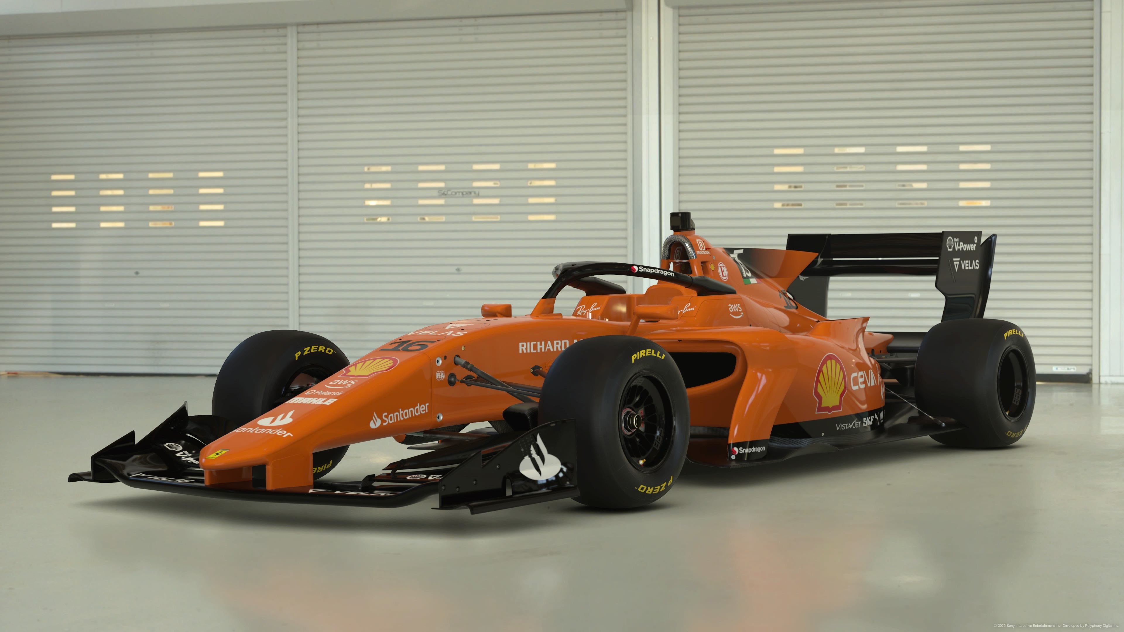
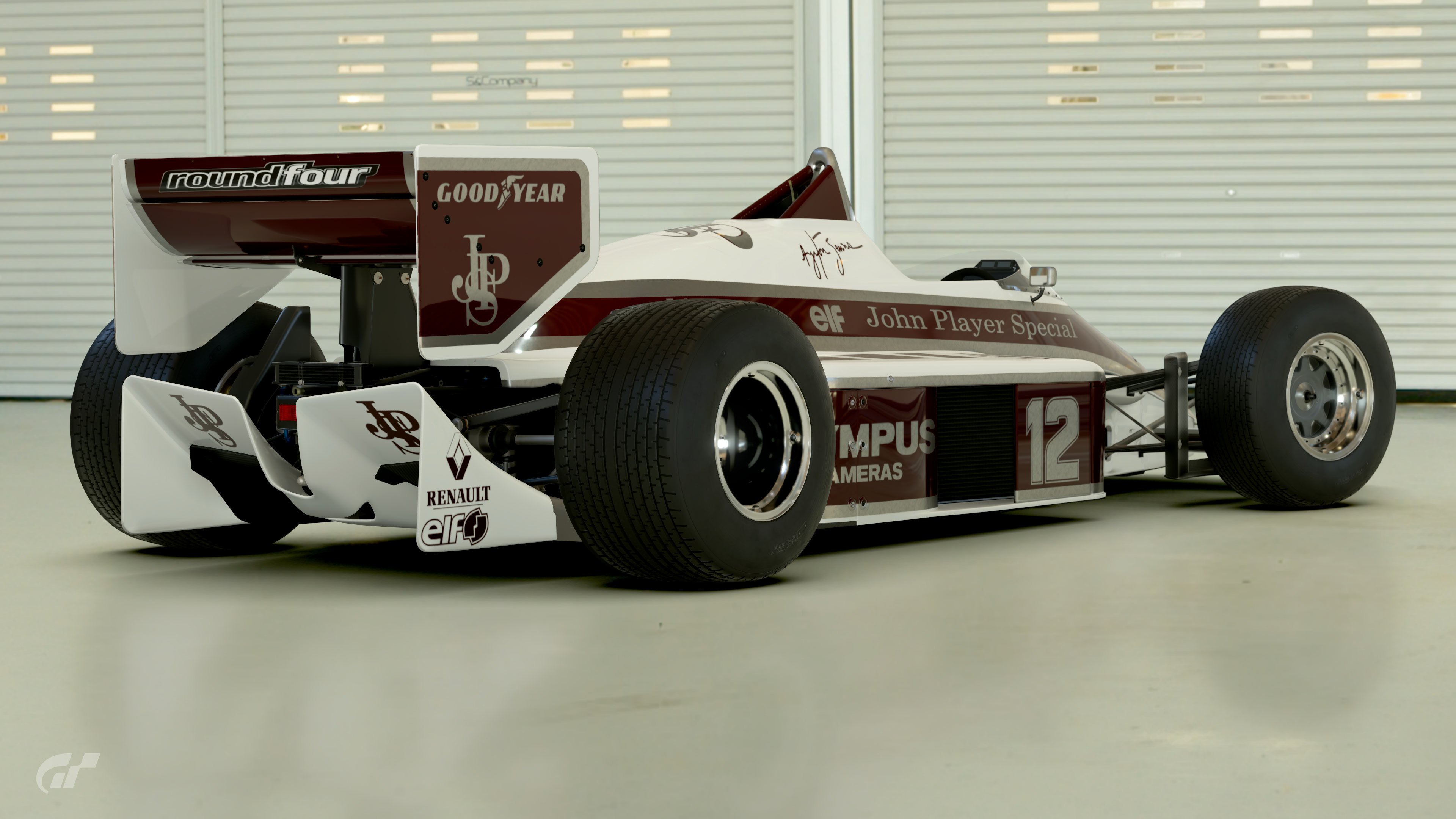
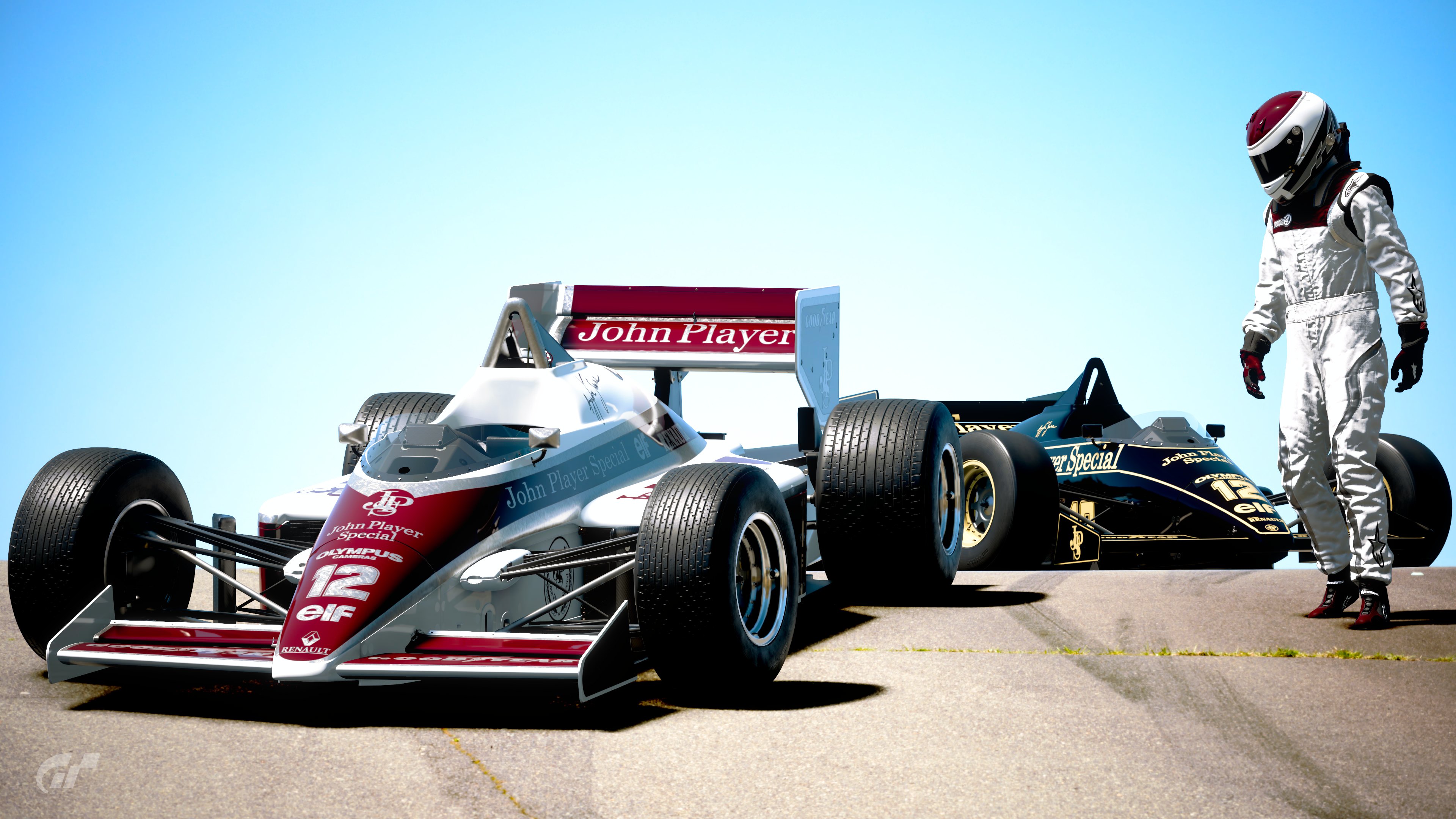
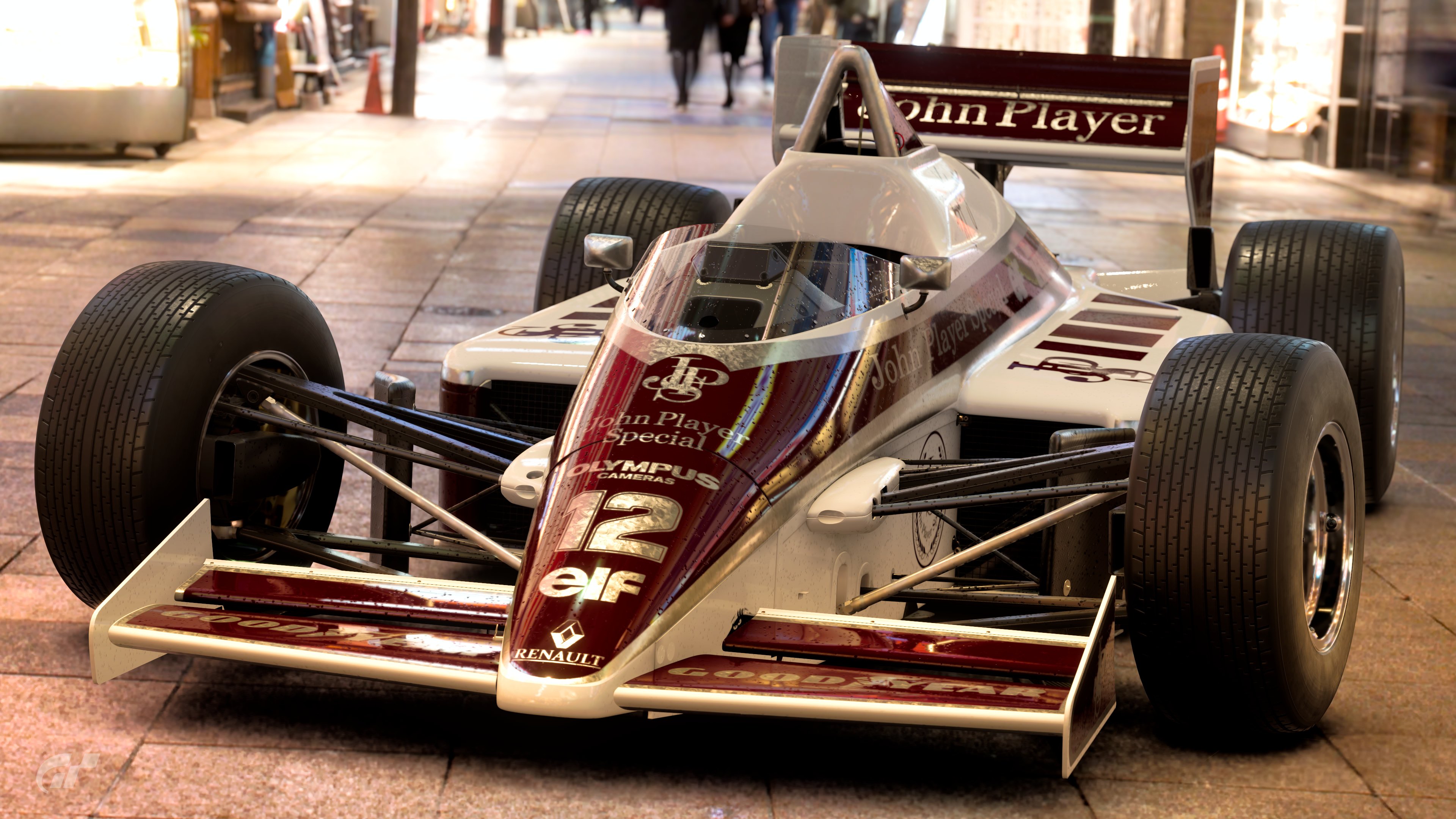
#1 F1500 A little too mono-tone for my taste. The red in your suit was a good choice, would have liked to have seen it in the livery. Well executed though.


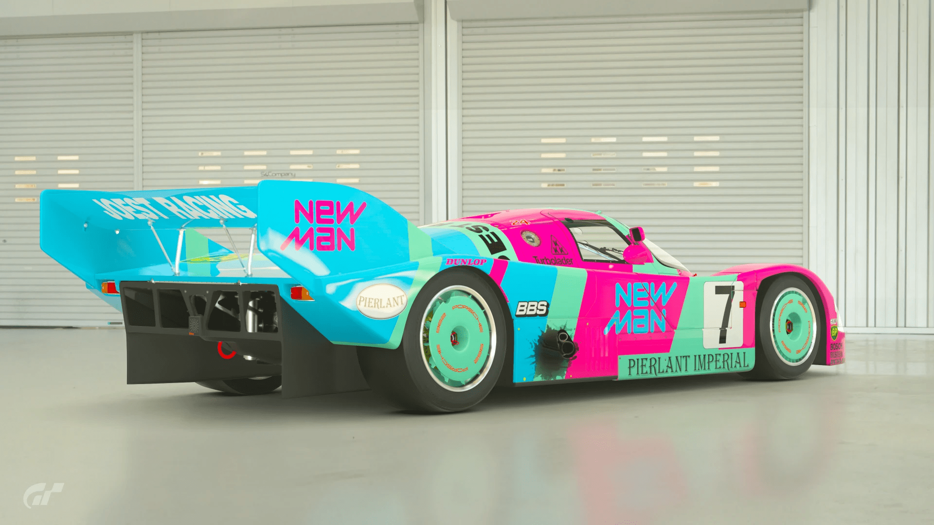
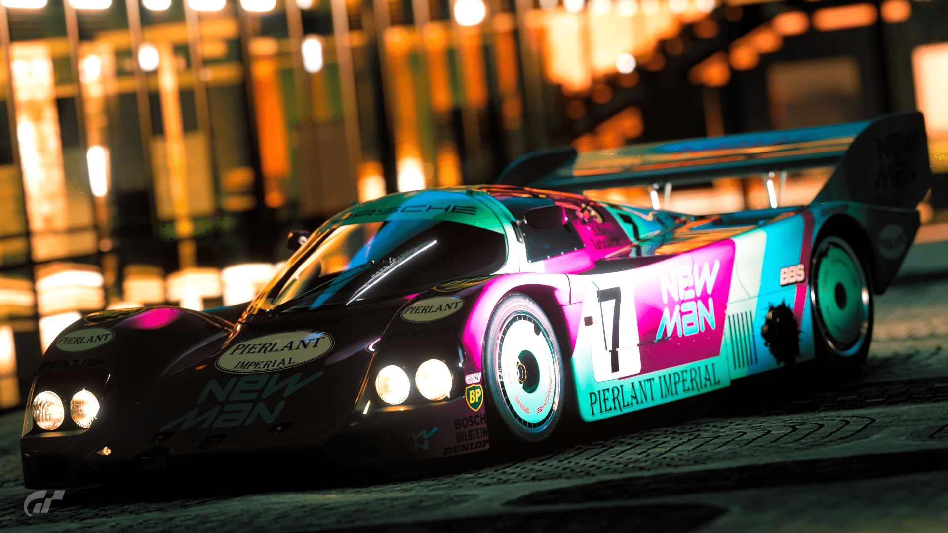
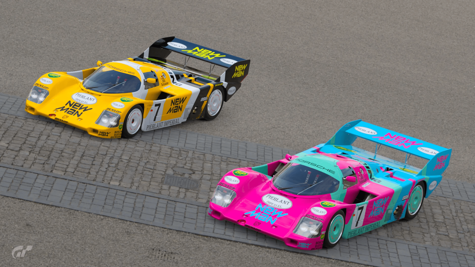
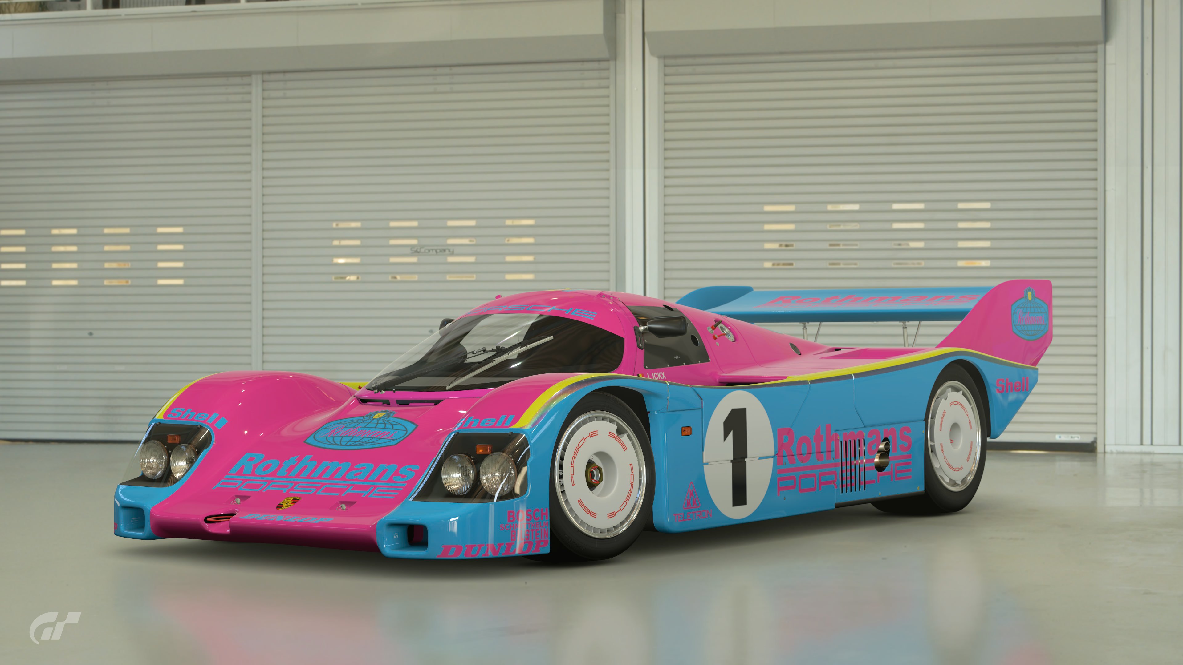
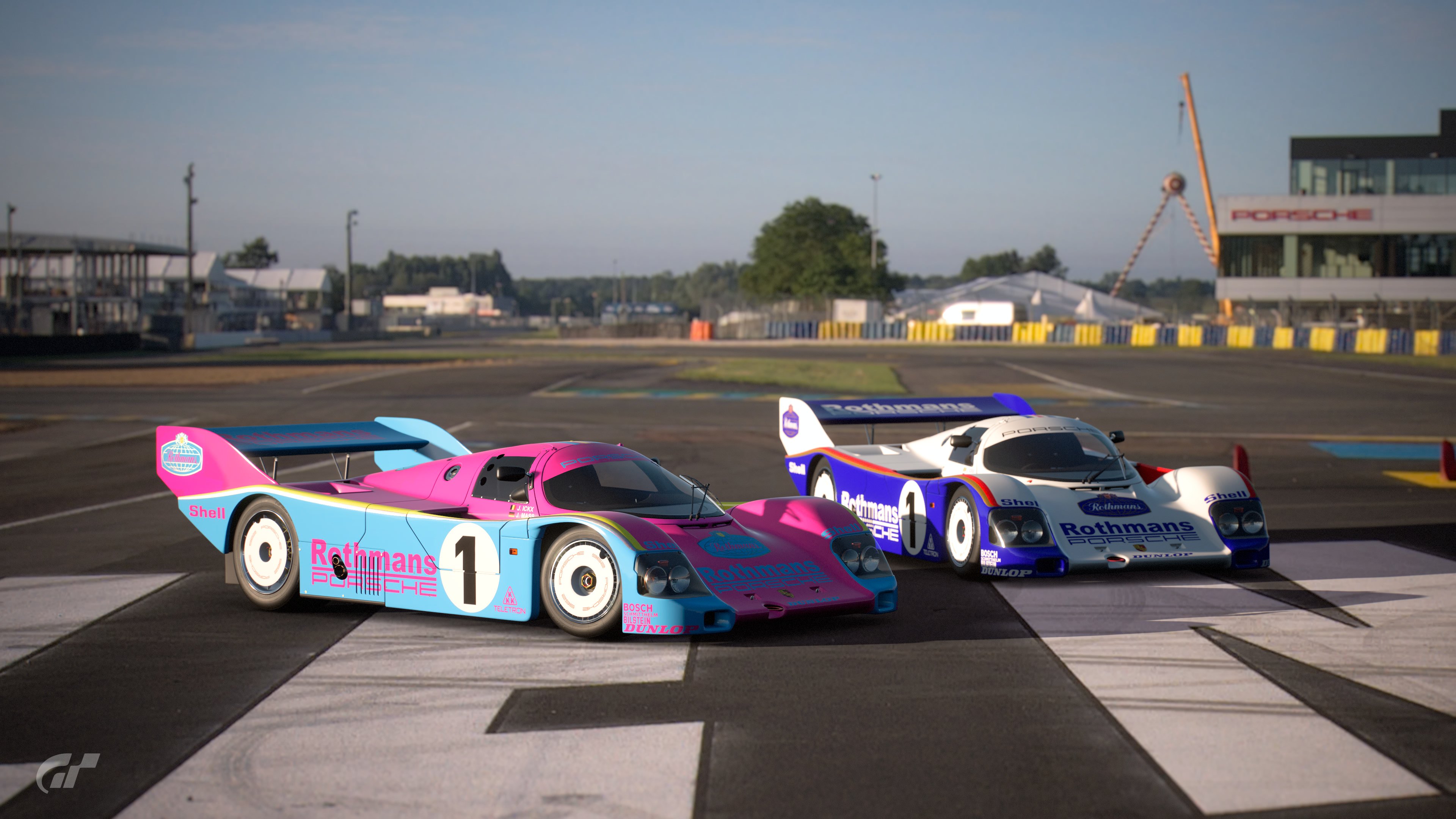
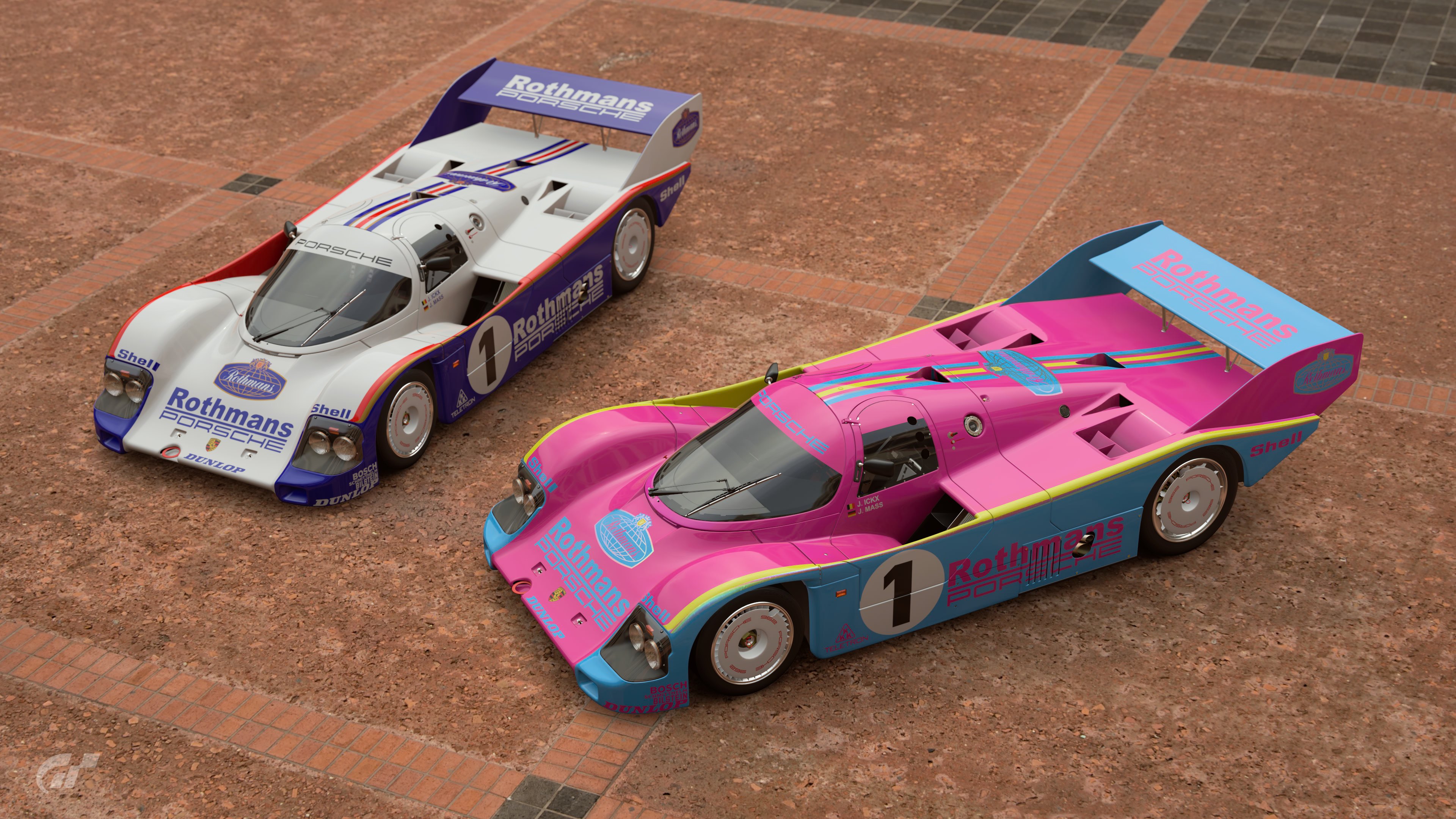
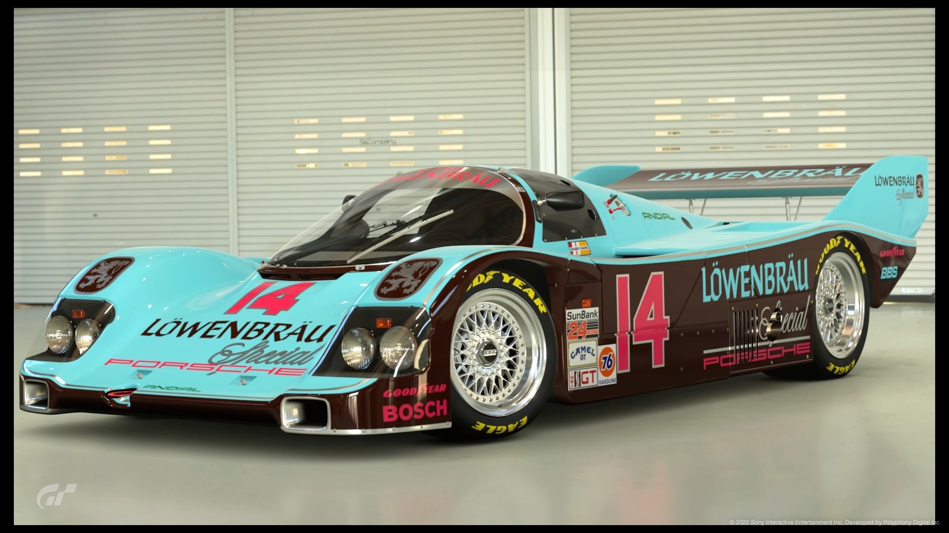
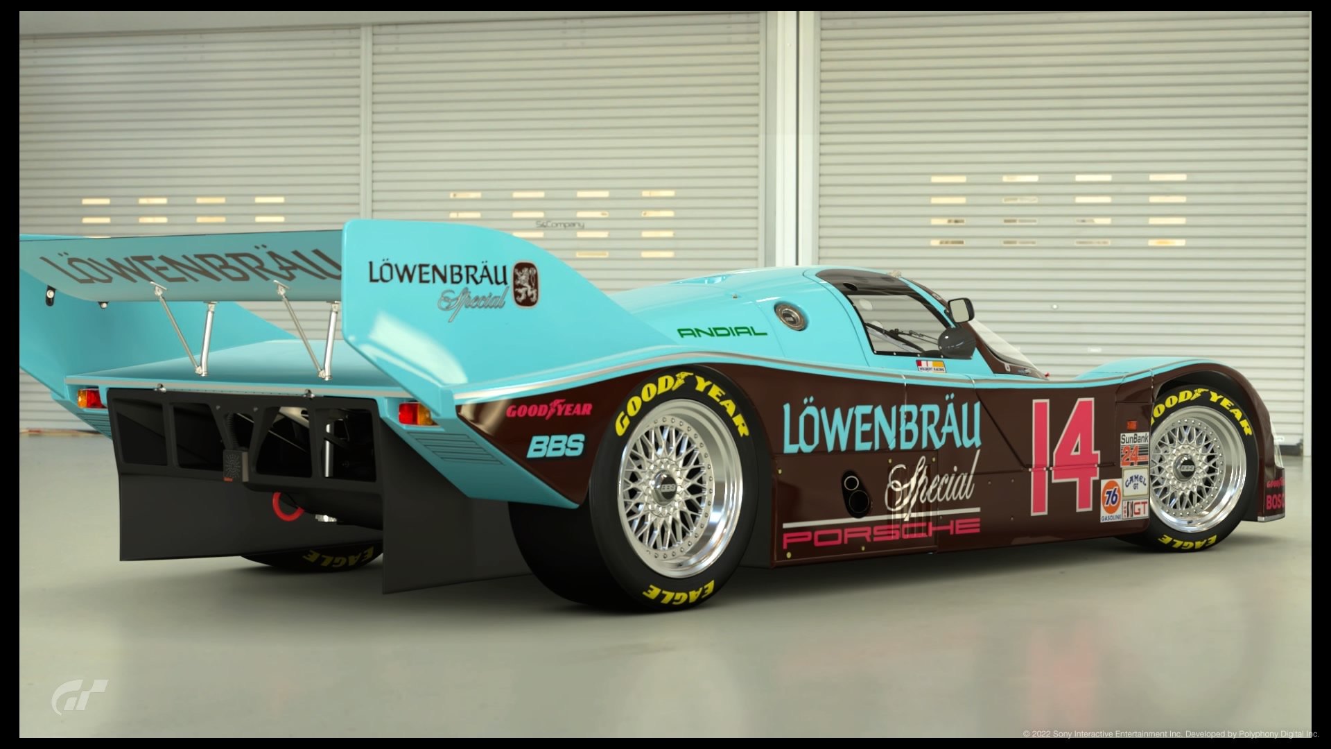
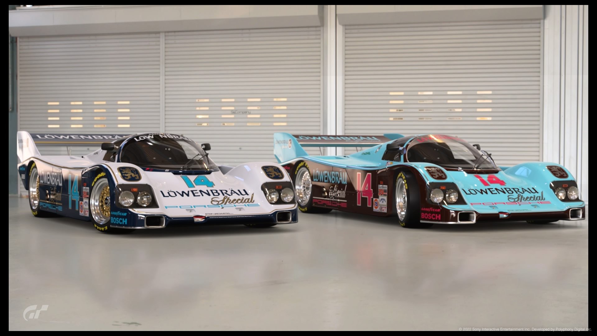
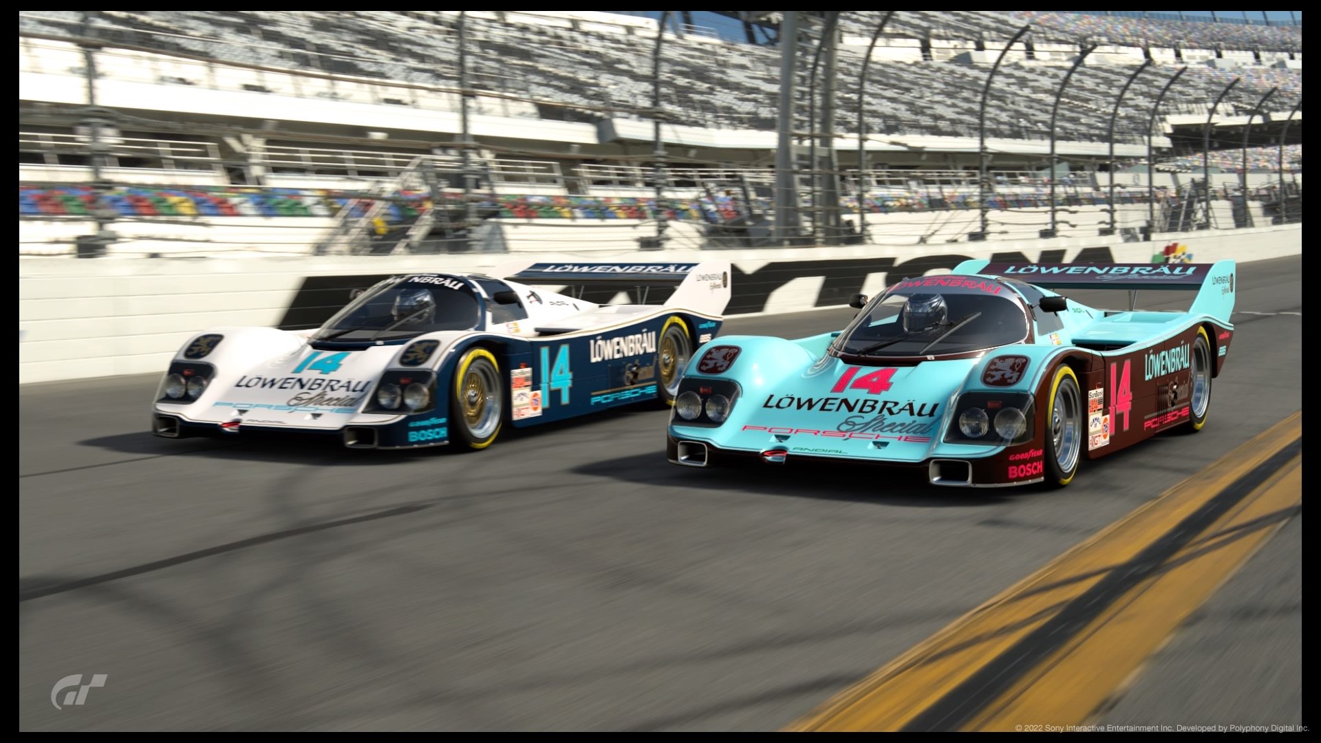
#2 962 A bright, all pop livery. Not wild about the wheel color choice, but this is a nice entry. 1st bonus shot is sweet.


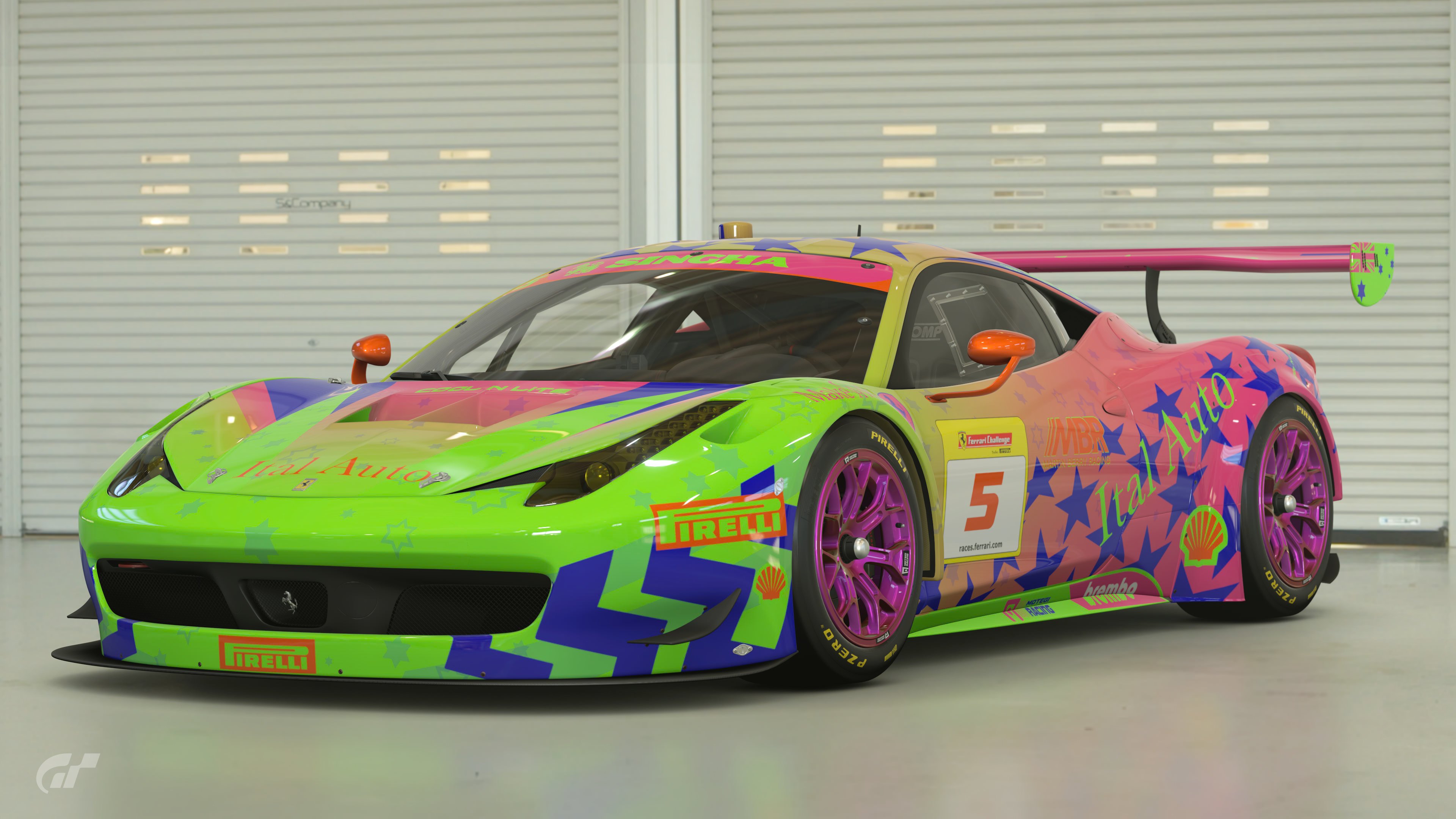
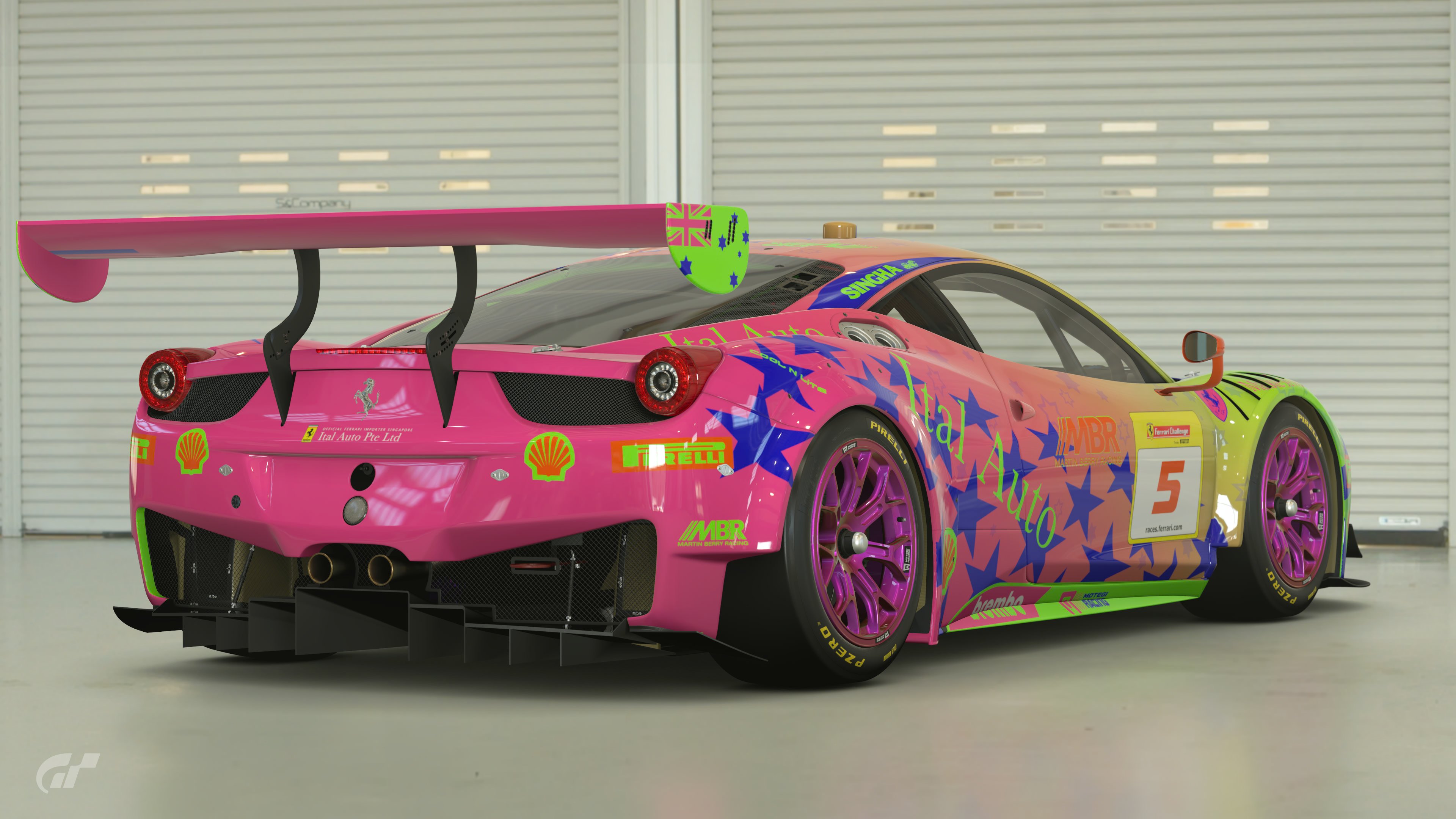
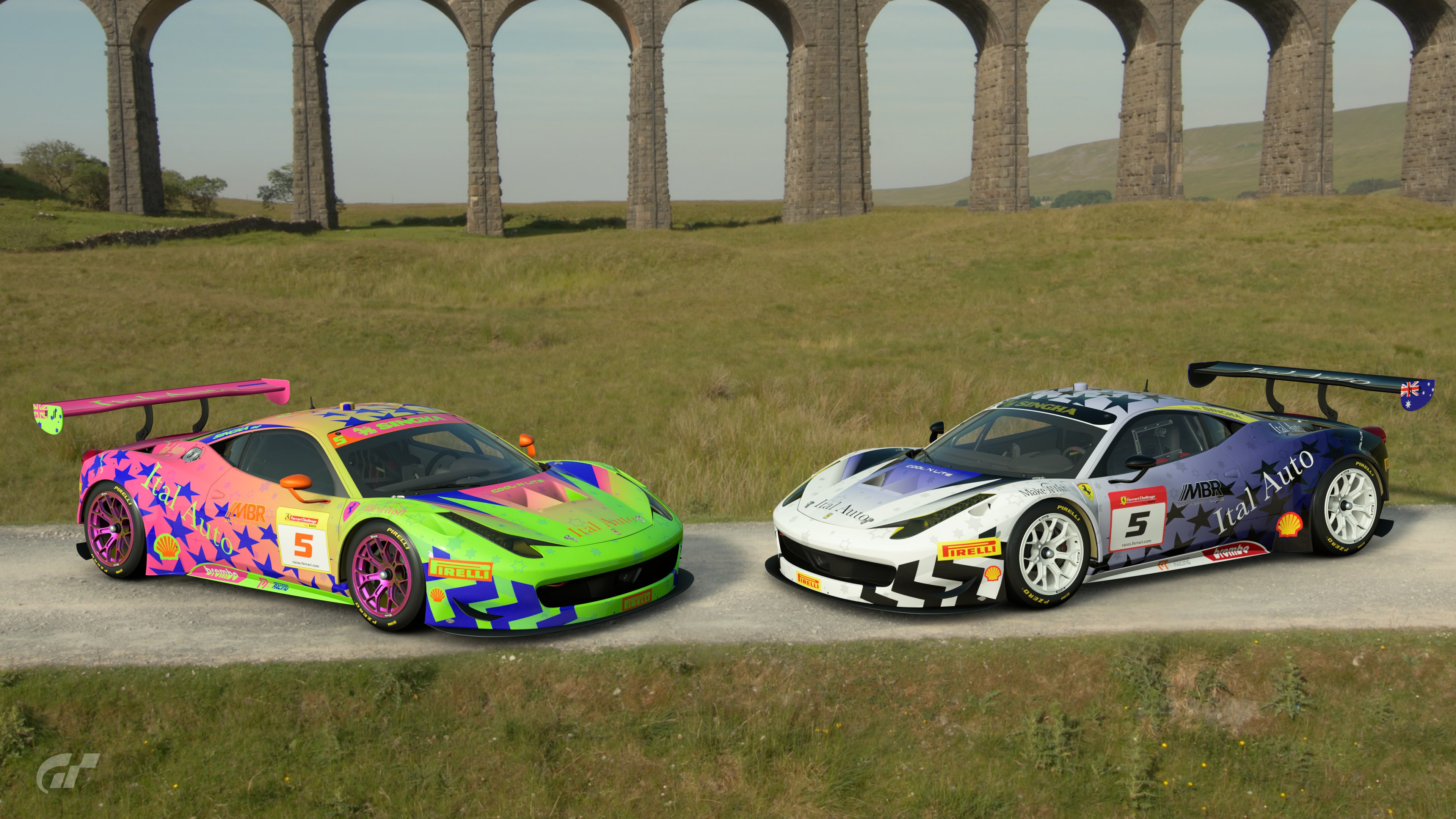
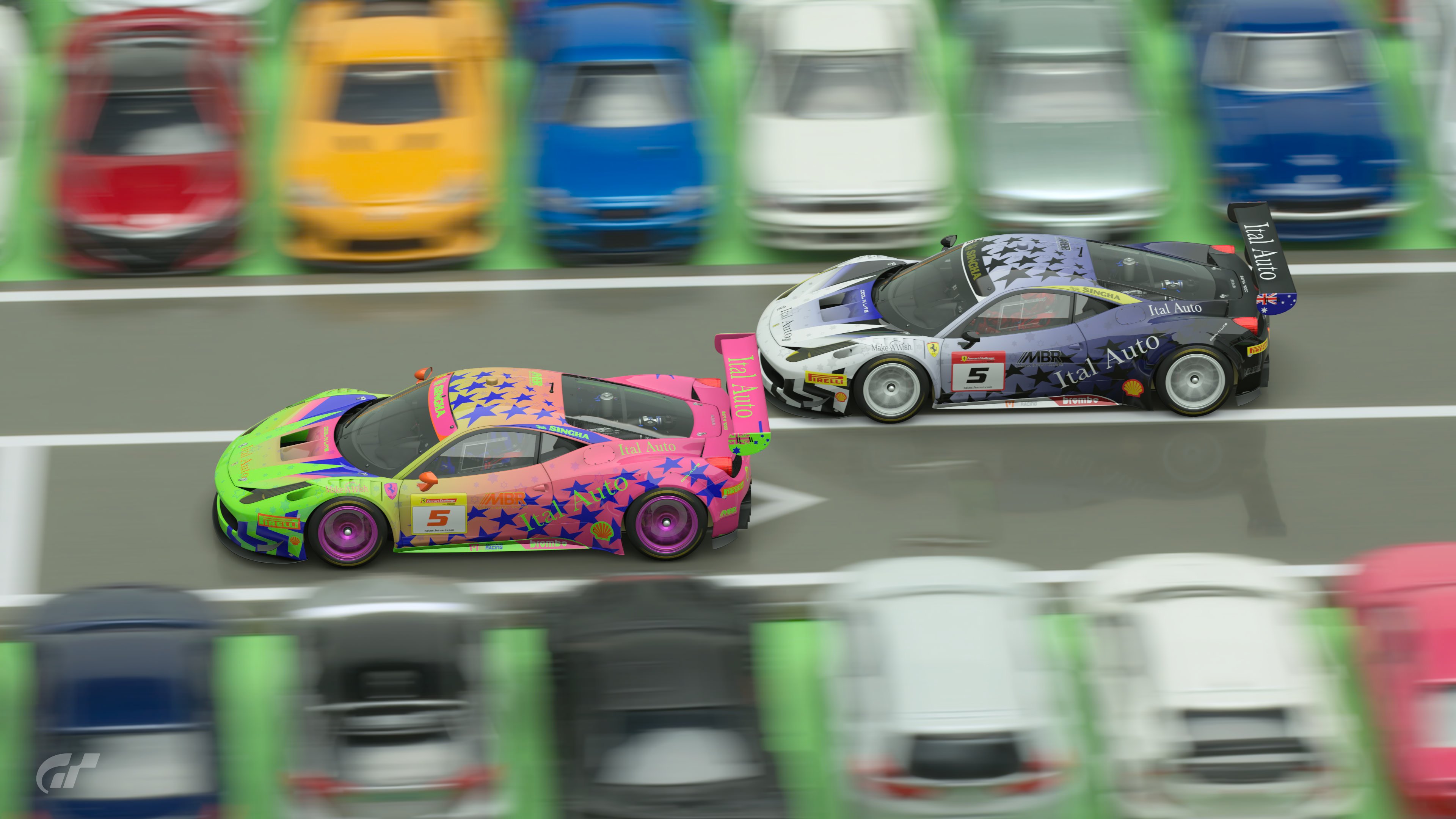
#3 458 Solid design work. Excellent recreation, but some of the decals get lost in the color choices.


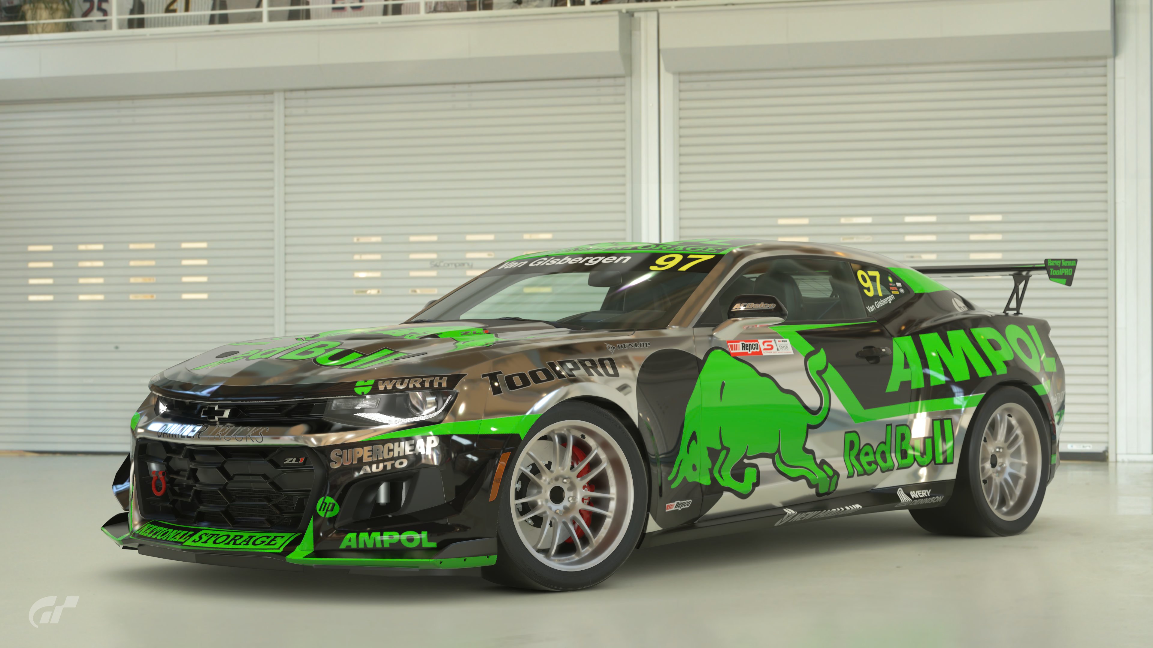
#4 Camaro Good use of chrome. I can’t say that I like chrome cars, but the color pallet is quite pleasing overall. Great bonus pics!


#5 Ferrari Well done livery, but unfortunately the original design is pretty bland – it really only works because it is a red Ferrari. 2nd bonus pic is hot!


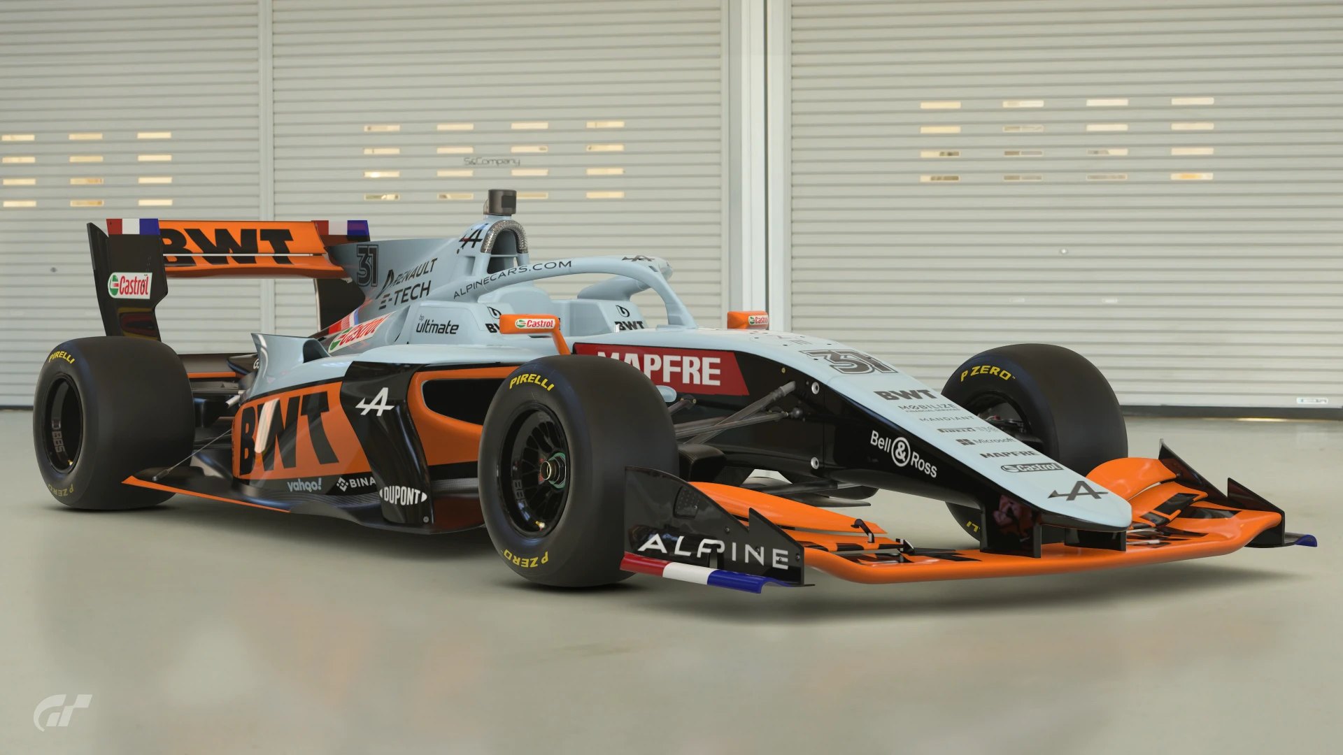
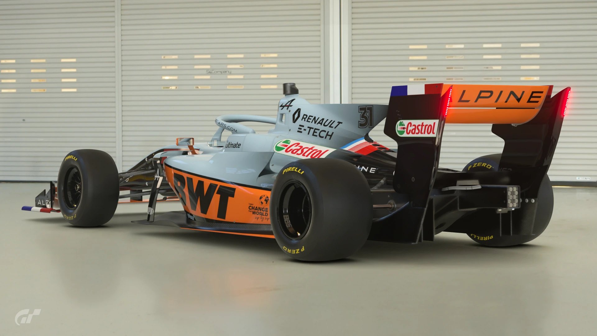
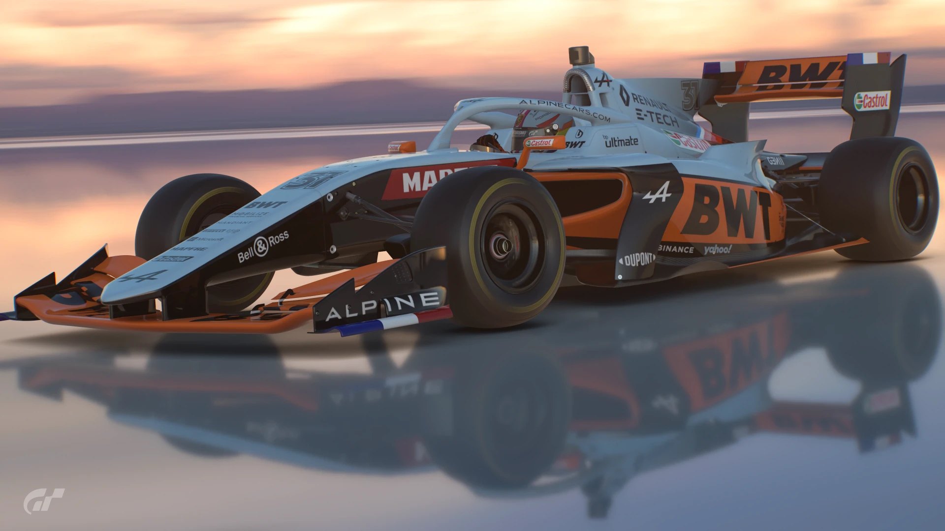
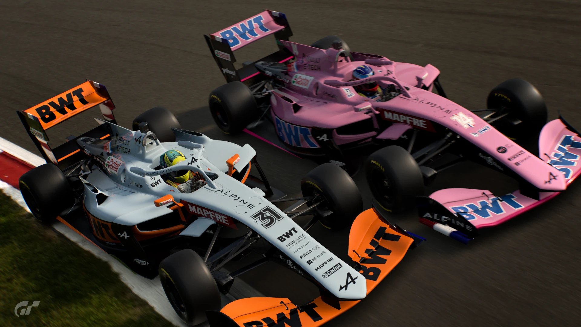
#6 Alpine I really like this color combo, it’s considerably better than the original. Only criticism I can muster is the non-matching helmet in the 1st bonus shot.


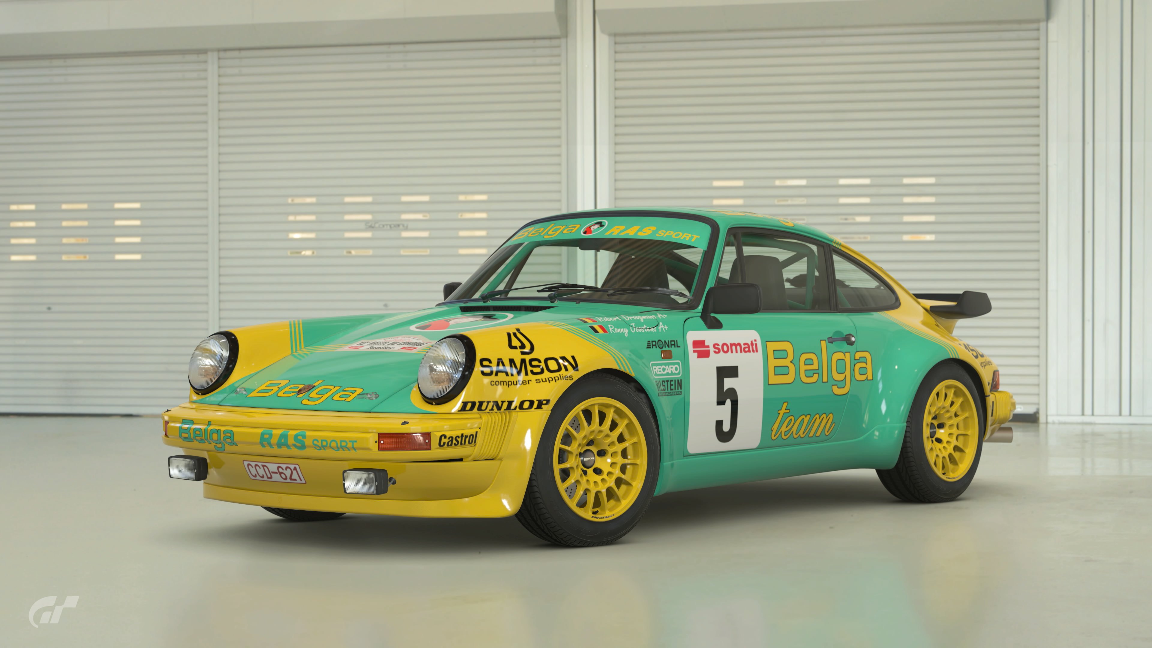
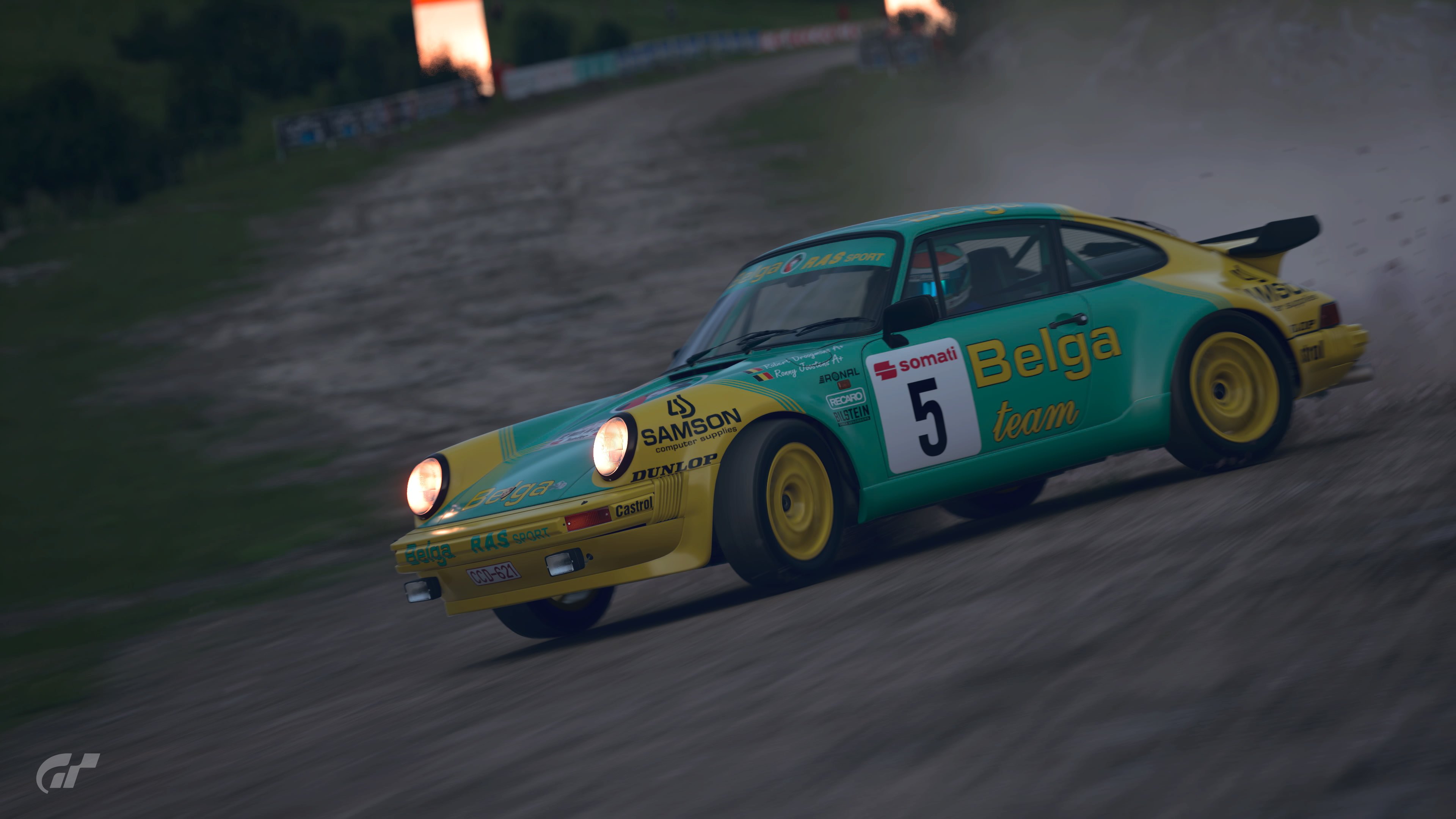
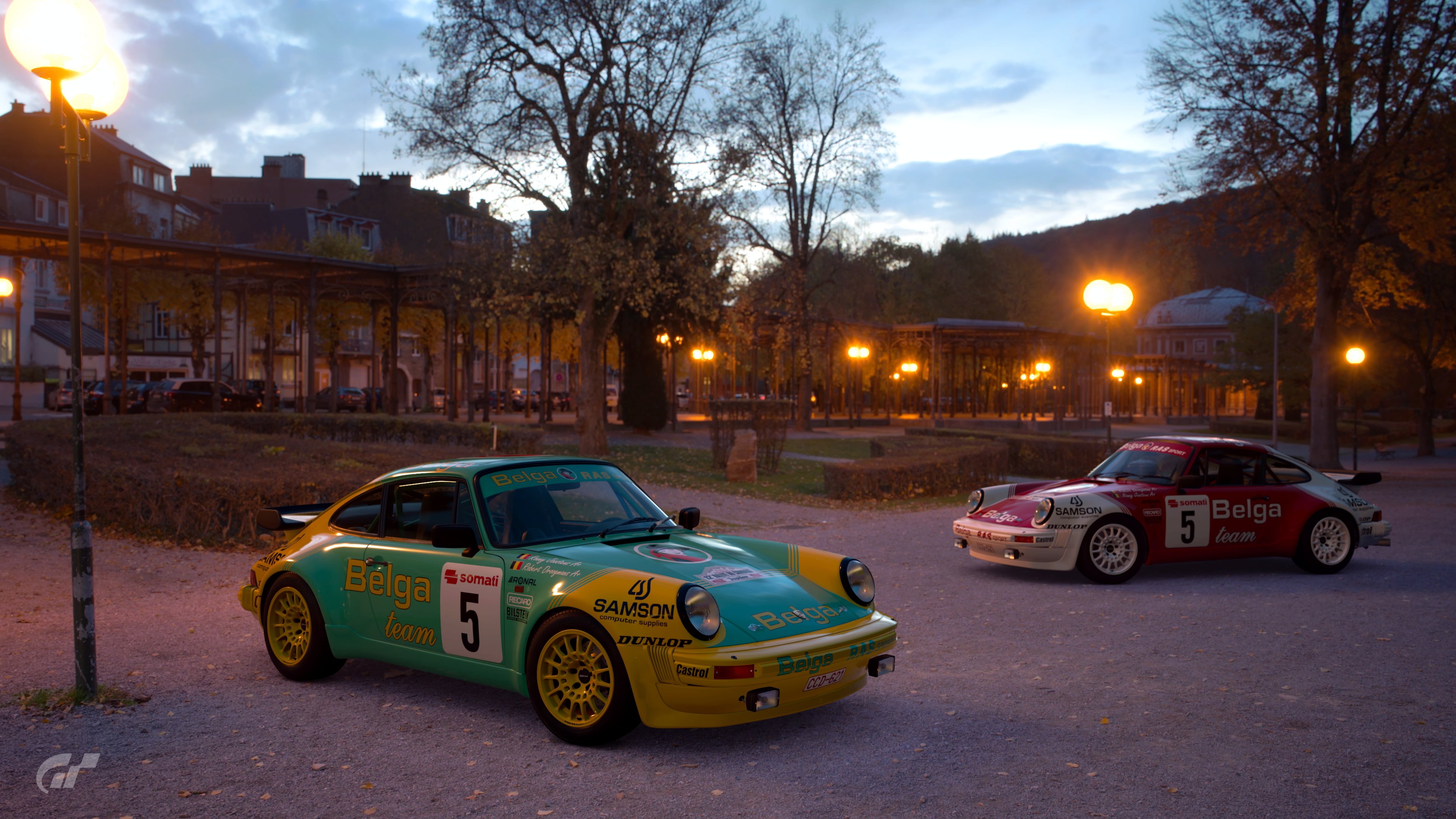
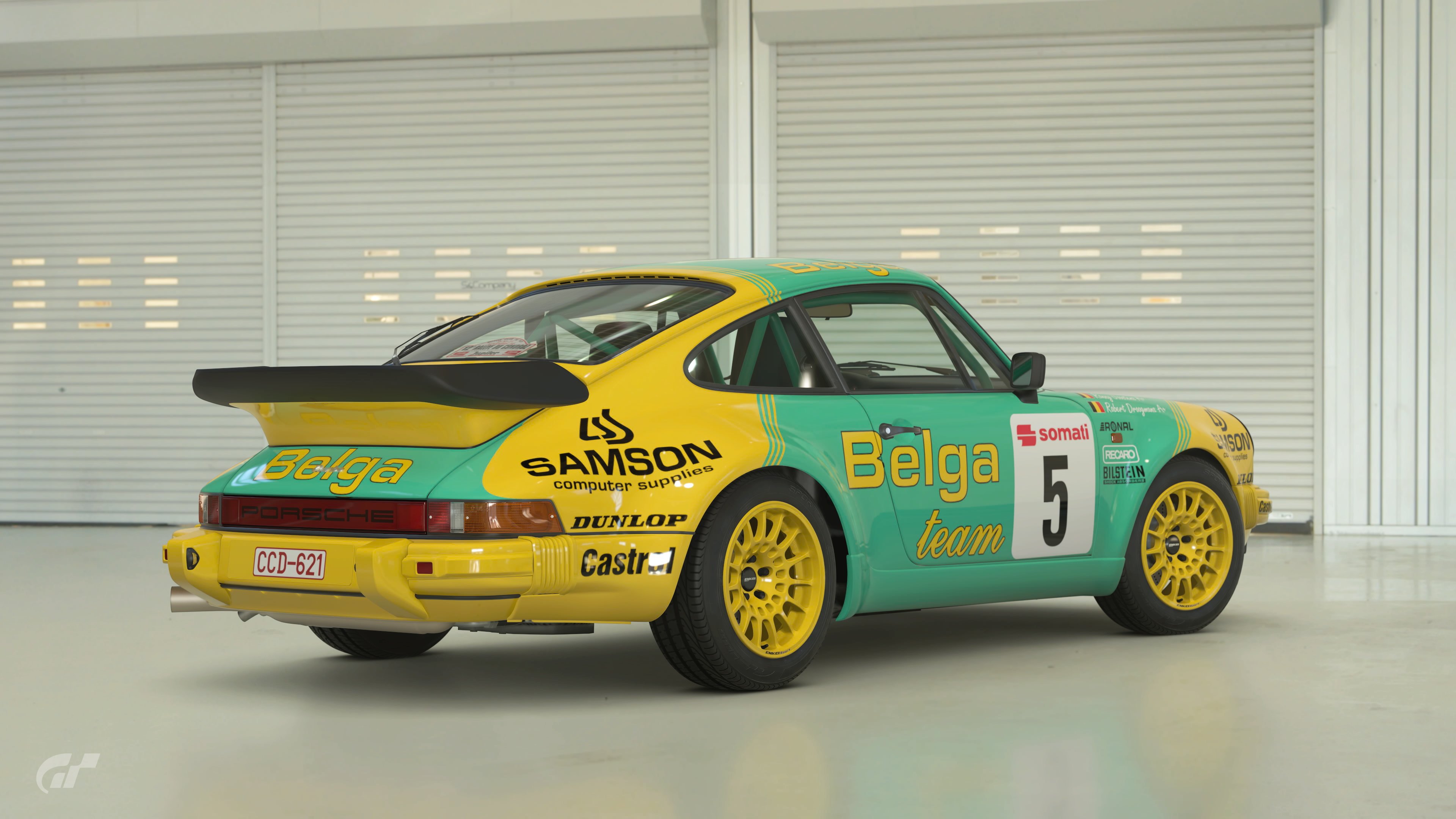
#7 911 I like all classic 911’s, and this one is no exception. A set of silver colored wheels would have made this fabulous looking livery look even better.


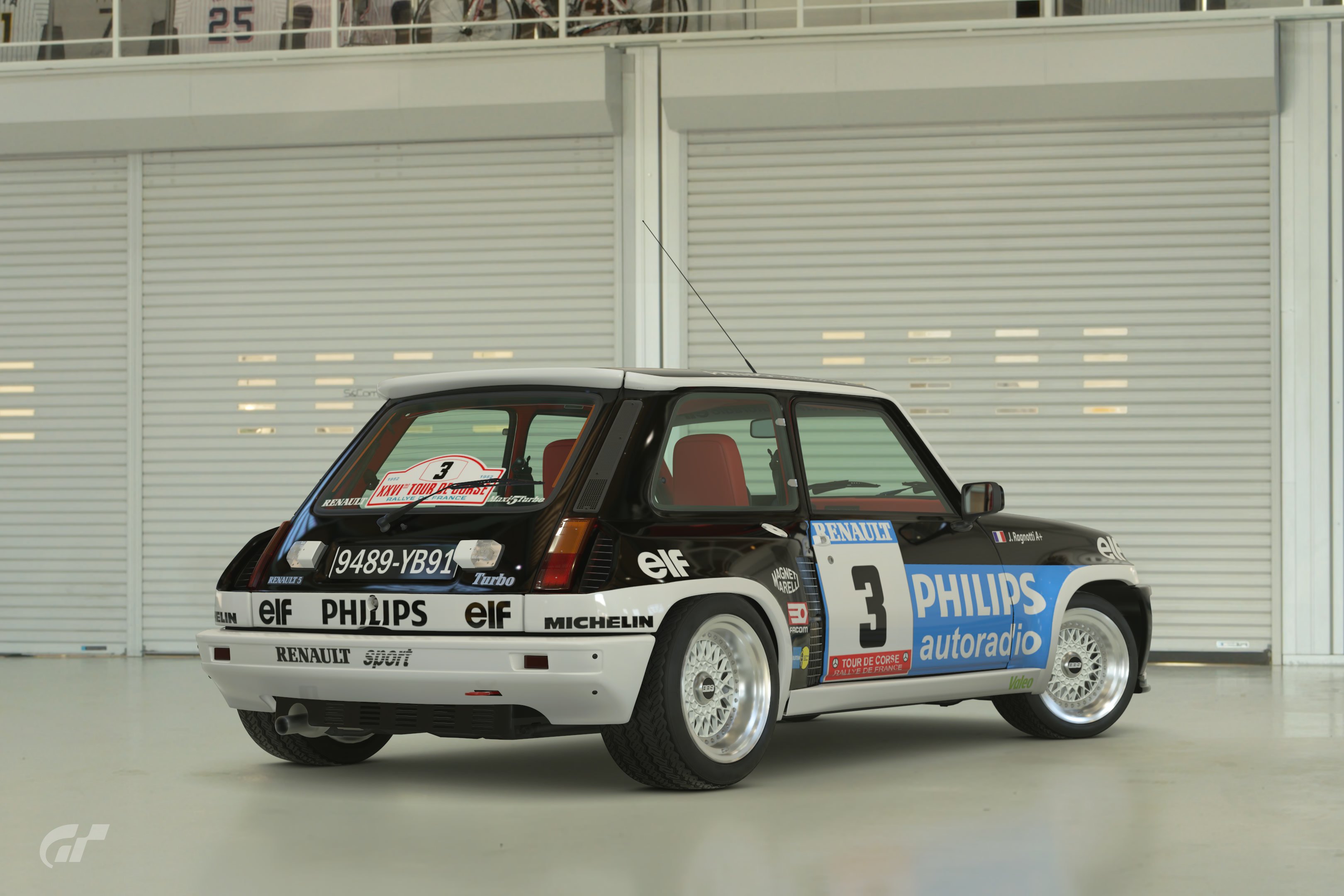
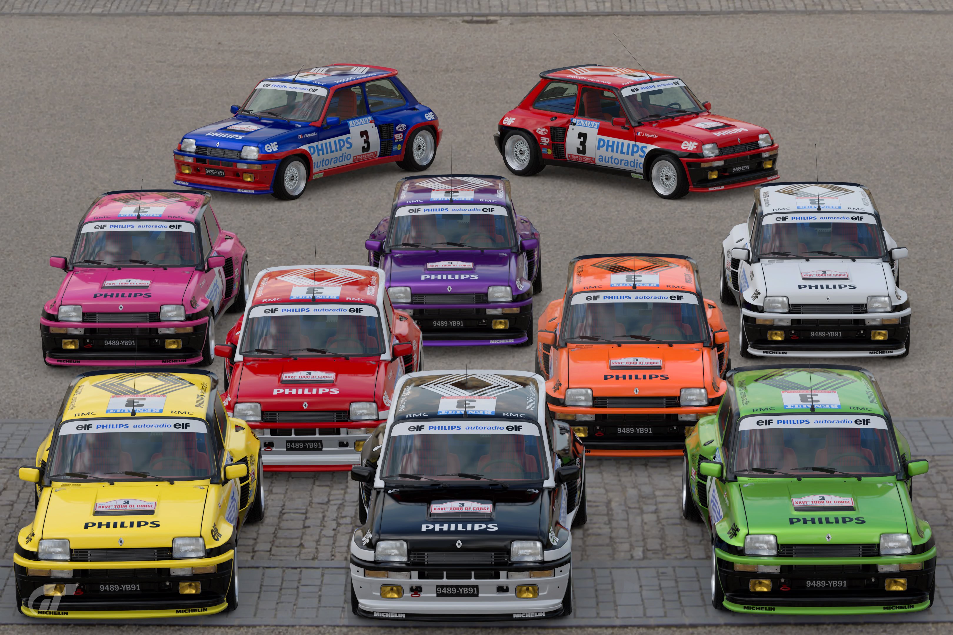
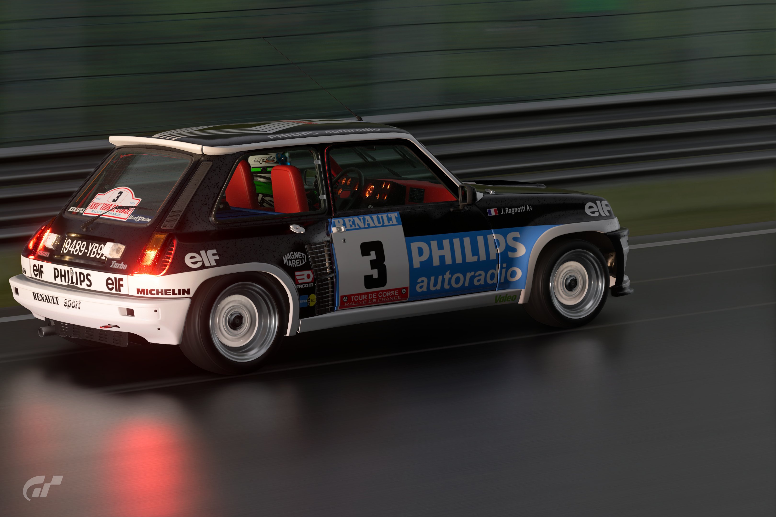
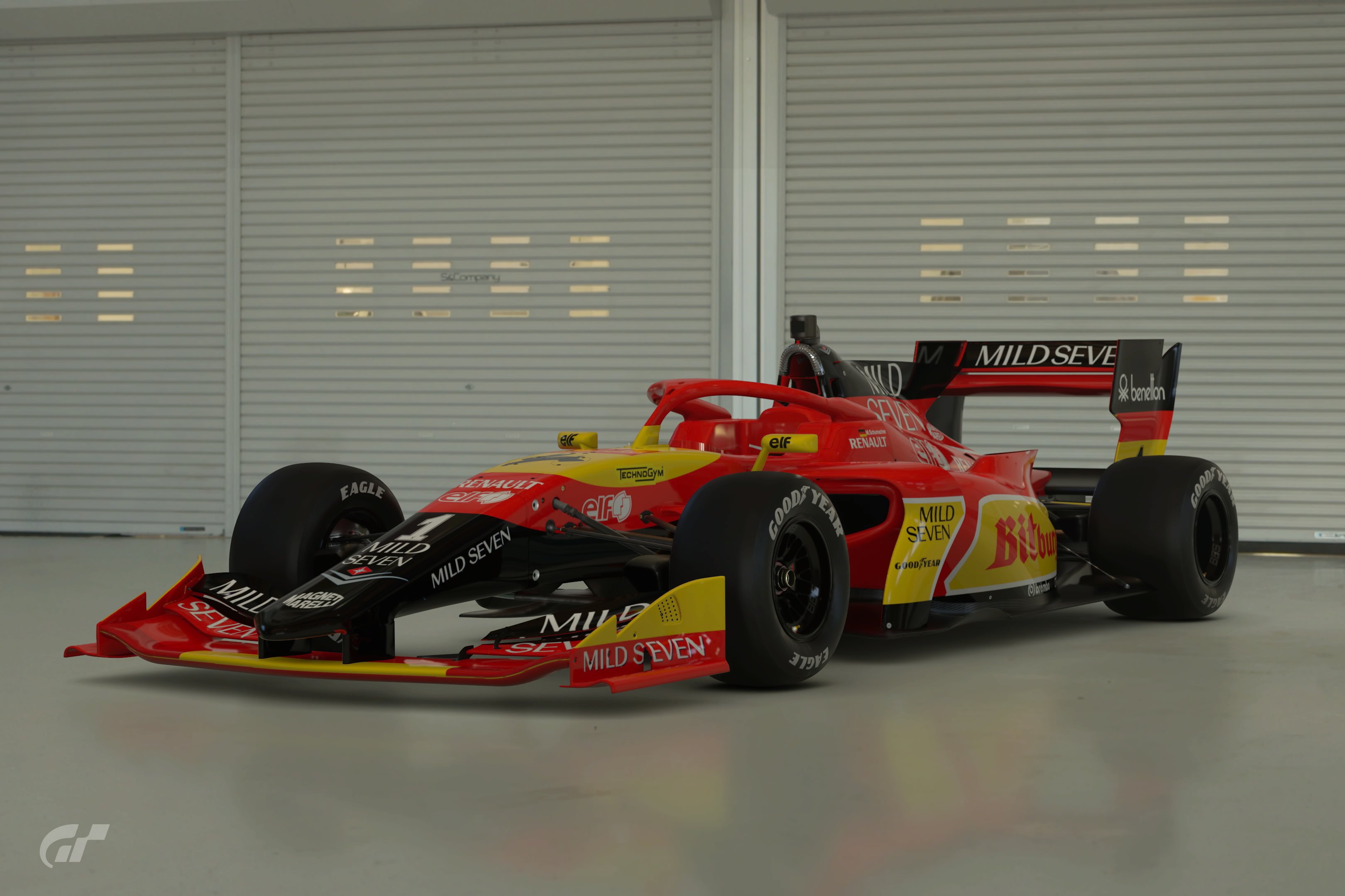
#8 Renault Sharp, sticker quality look. Colors look great, decal work is excellent. 1 bonus shot, and not one with the original… probably the only reason I didn’t vote for it.


#9 GTR For as many decals are on this livery, it still looks clean and tight. Big fan of the color choices, and bonus shots are excellent.


#10 Datsun I don’t actually know the original, but this one has a great classic look to it. Would love to have seen a bonus pic with a side by side, or that showed off the livery.


#11 F1500 This one is mine, so I’ll just say that I’m happy with it.


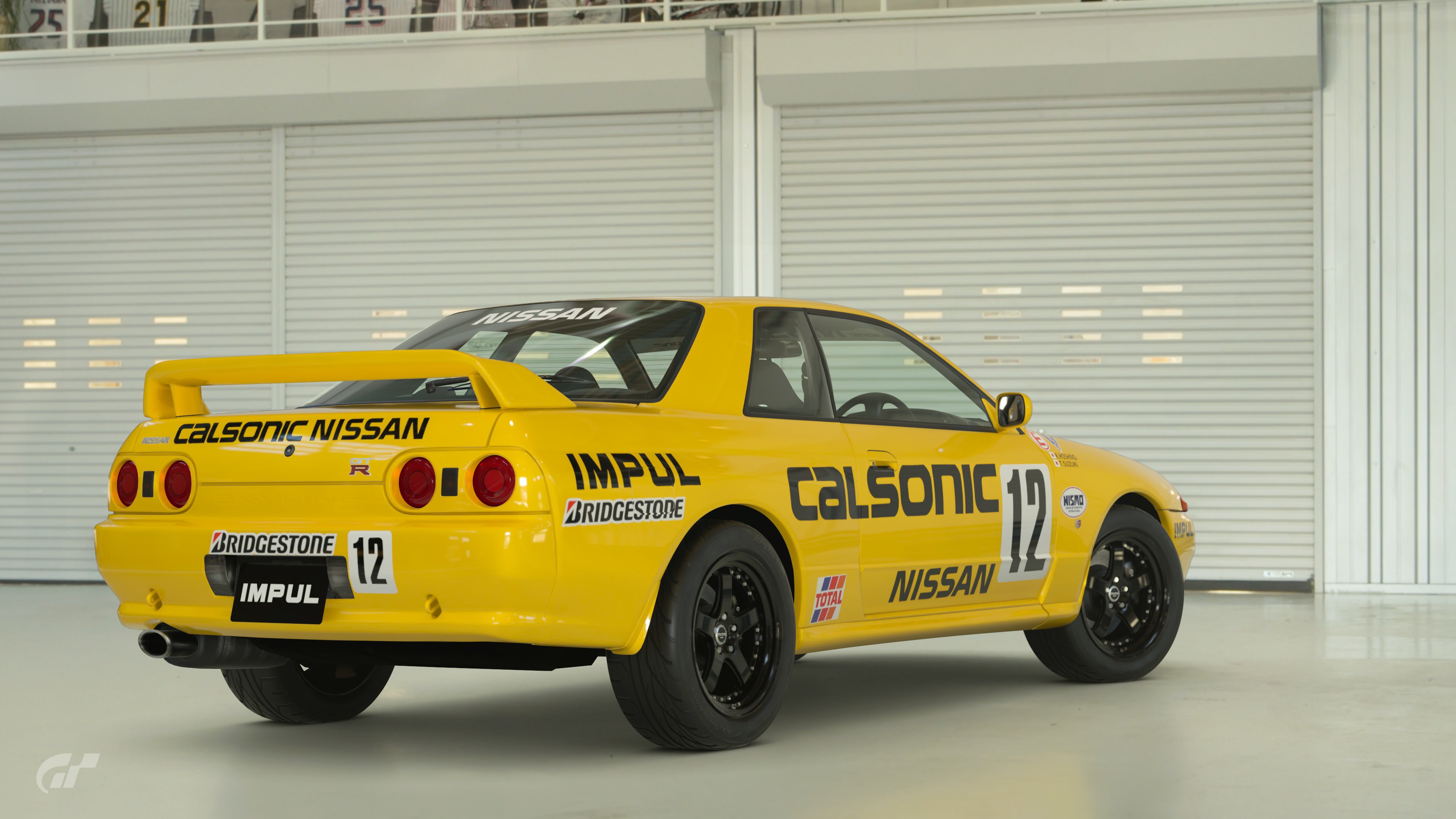
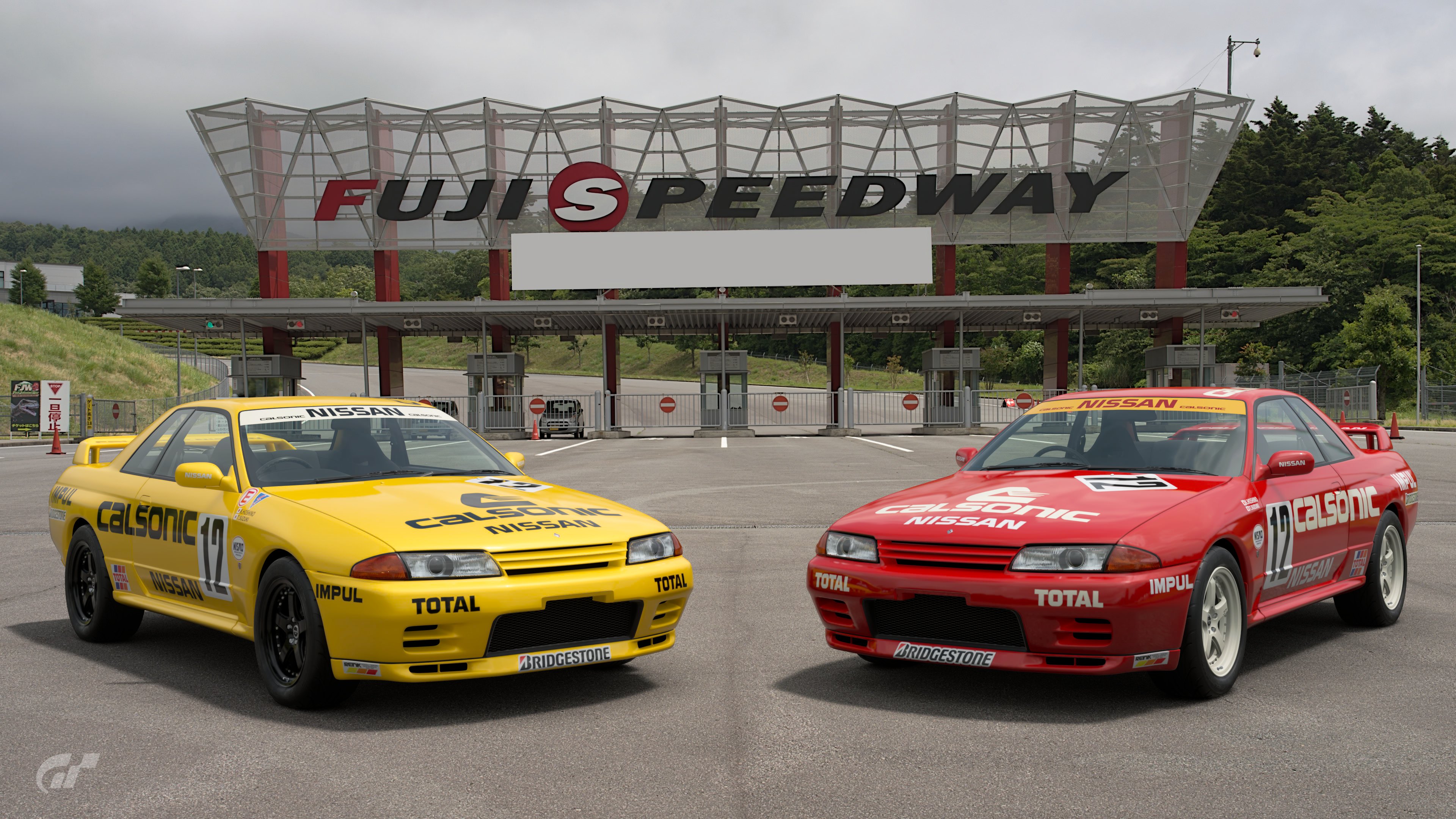
#12 Skyline The original is a bit bland, but mainly it is the black wheels that kill it for me. Maybe white would have worked? Bonus pics have a very realistic look to them.


#13 F1500 When I saw this originally I was like noooo, this color crime actually hurts me lol. Great choice though, that yellow is iconic. I think some white highlights would have made it more to my liking.


#14 WRX I really like this one, great color (and car) choice. Probably would have gotten my vote, but the original design is a bit bland in this field. Clean and sharp though, I’d drive it.


#15 787 Well executed, and the colors work surprisingly well in the design. 2nd bonus pic looks great. If I’d only had 4 votes…


#16 AE86 The rainbow isn’t really my thing, but is well executed. I’d like to see it in just 2 different colors, perhaps white and blue?


#17 NSX I think in a brighter yellow it would have gotten my vote. Well, brighter yellow and silver colored wheels anyways. Nicely done though!


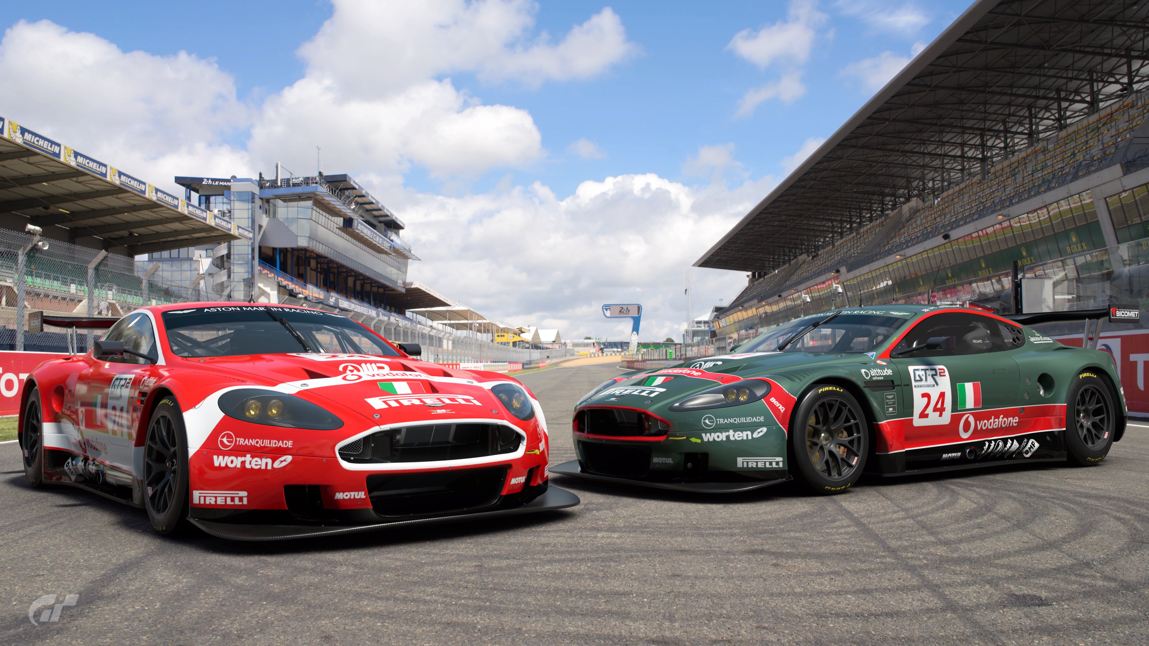
#18 Aston Sharp, sticker quality livery! I like it better than the original, and it is certainly in my top 5. Why the obsession with flat black wheels everybody?


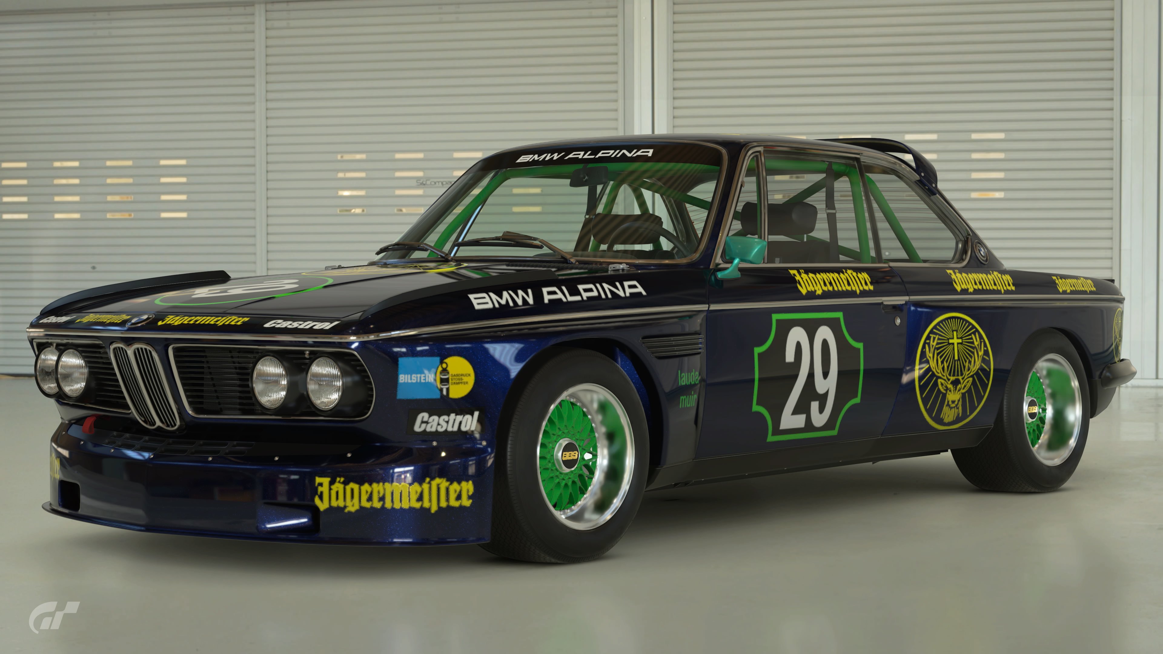
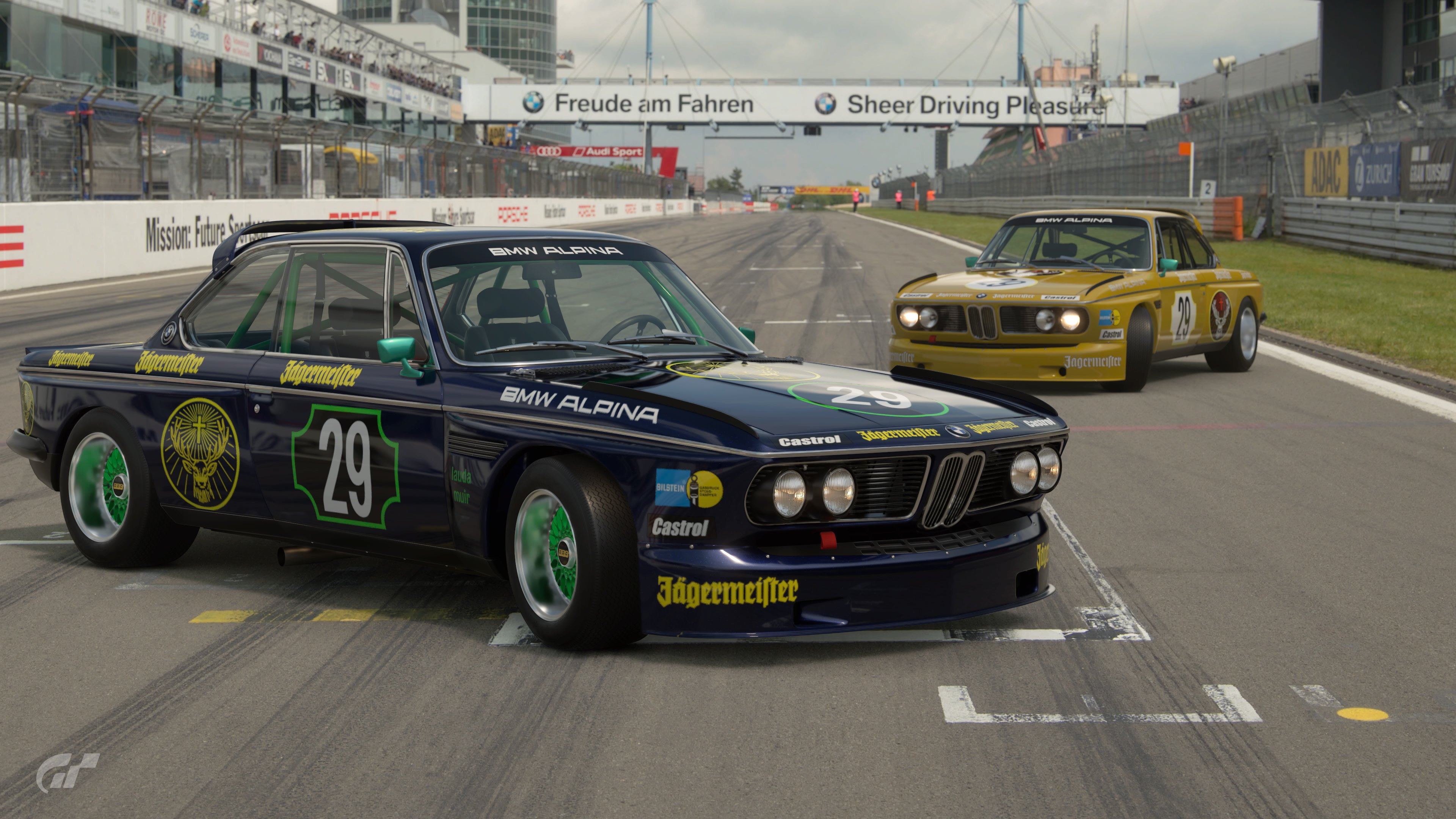
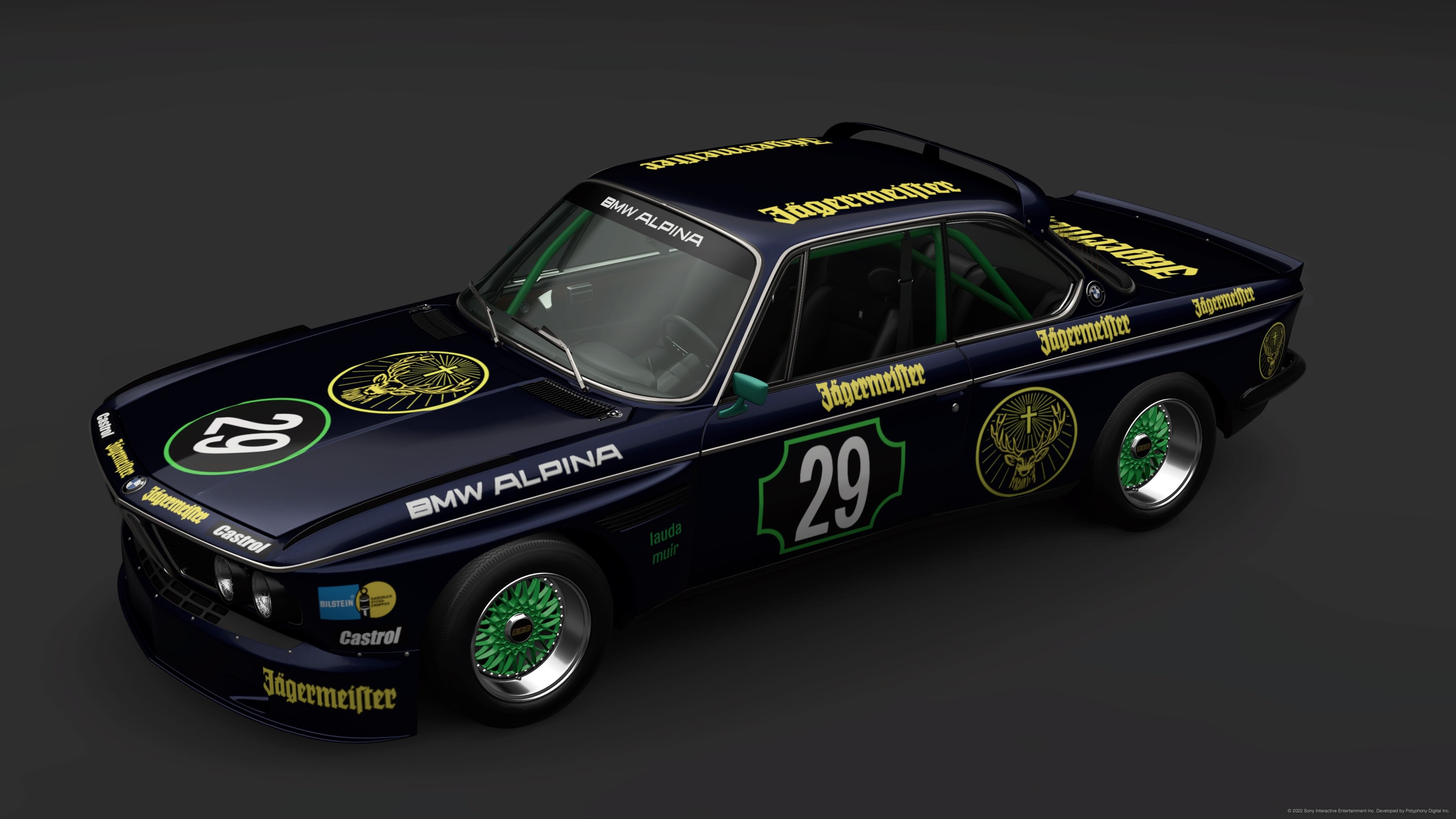
#19 BMW Nice look, even if it is relatively simplistic overall. I like the blue and green choices, but probably would have picked white for all of the yellow decals.


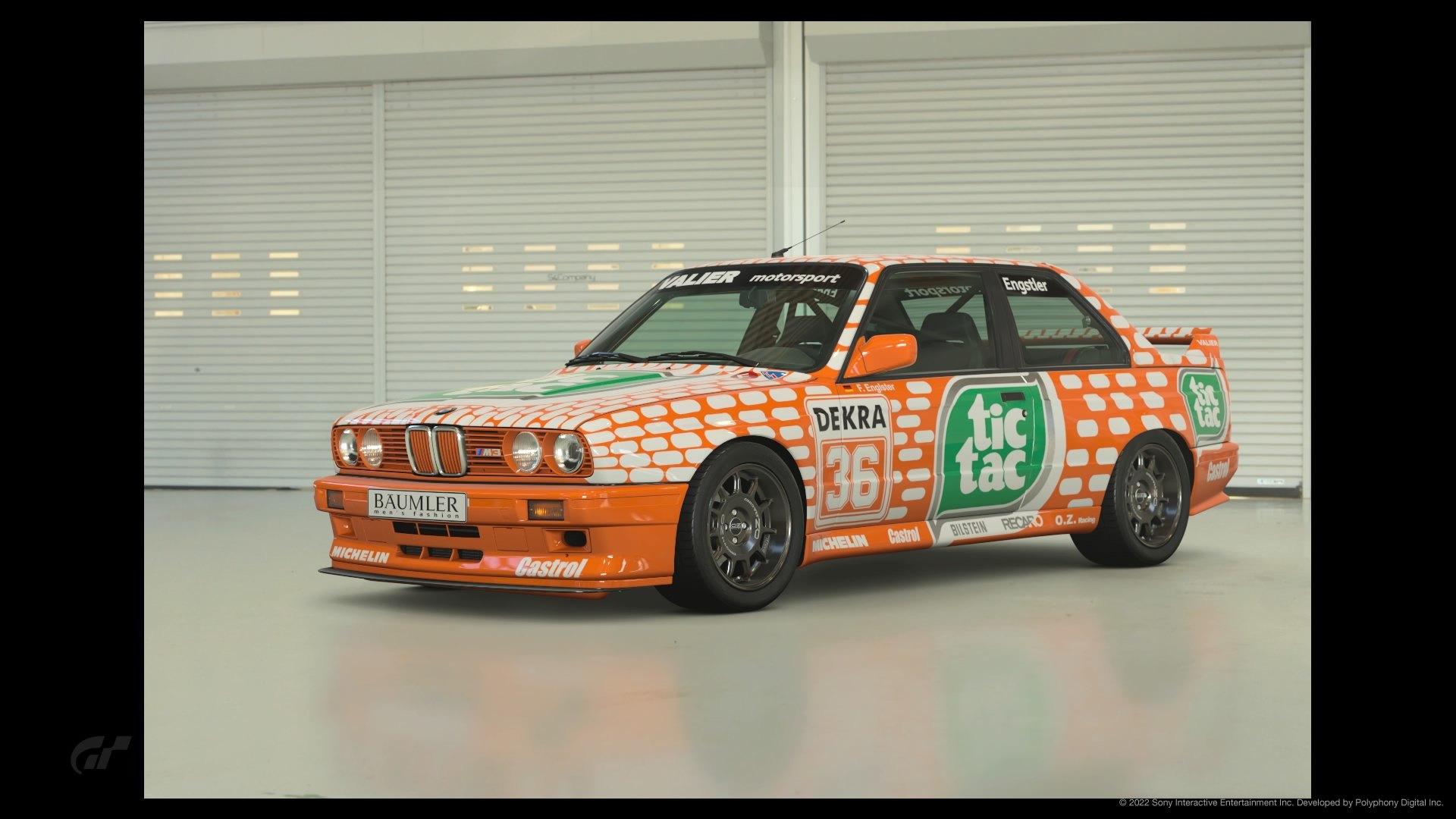
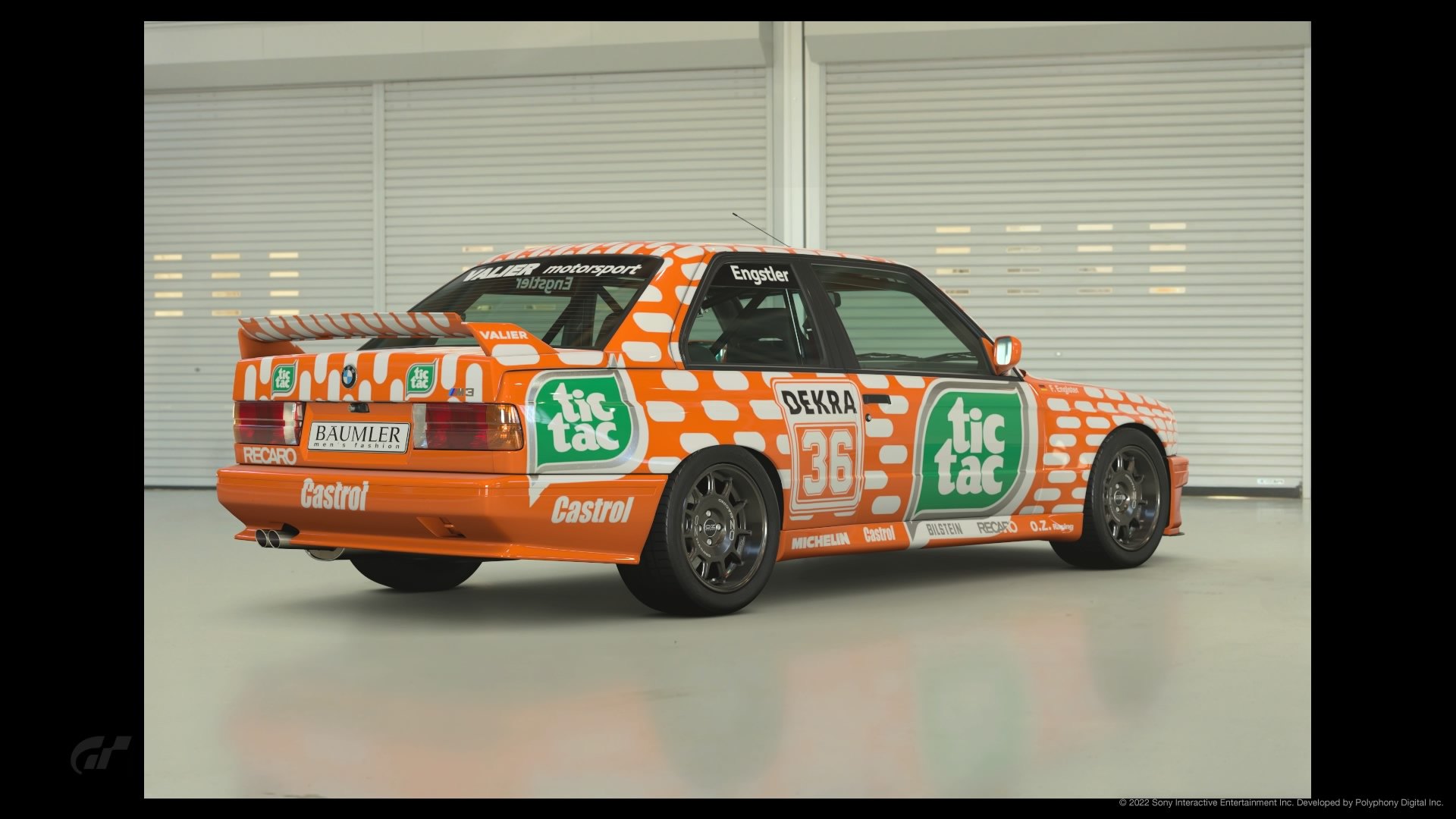
#20 325 Having made a Tic Tac livery before, I can appreciate the effort required. That said, the shade of orange looks a little dull (I almost always make my own oranges from the color selector). Would like to have seen another bonus pic.


#21 962 This is another one that literally hurt my eyes – great job though. I just can’t bear to see this classic livery abused like that lol. I think this livery would really work in grey/black/white tones.


#22 Viper Crisp, clean livery with lots of pop! I think you’d have a winner if you could put in some black lines in the transition. Would like to have seen a bonus pic with a side by side.


#23 155 This one got my vote. Looks super sharp in the black/yellow, thank you for not putting black wheels on it. Bonus shots are fire!


#24 205 Great color combination, it looks nice and tidy! Definitely made the right choice, though I also like the orange. Awesome work!


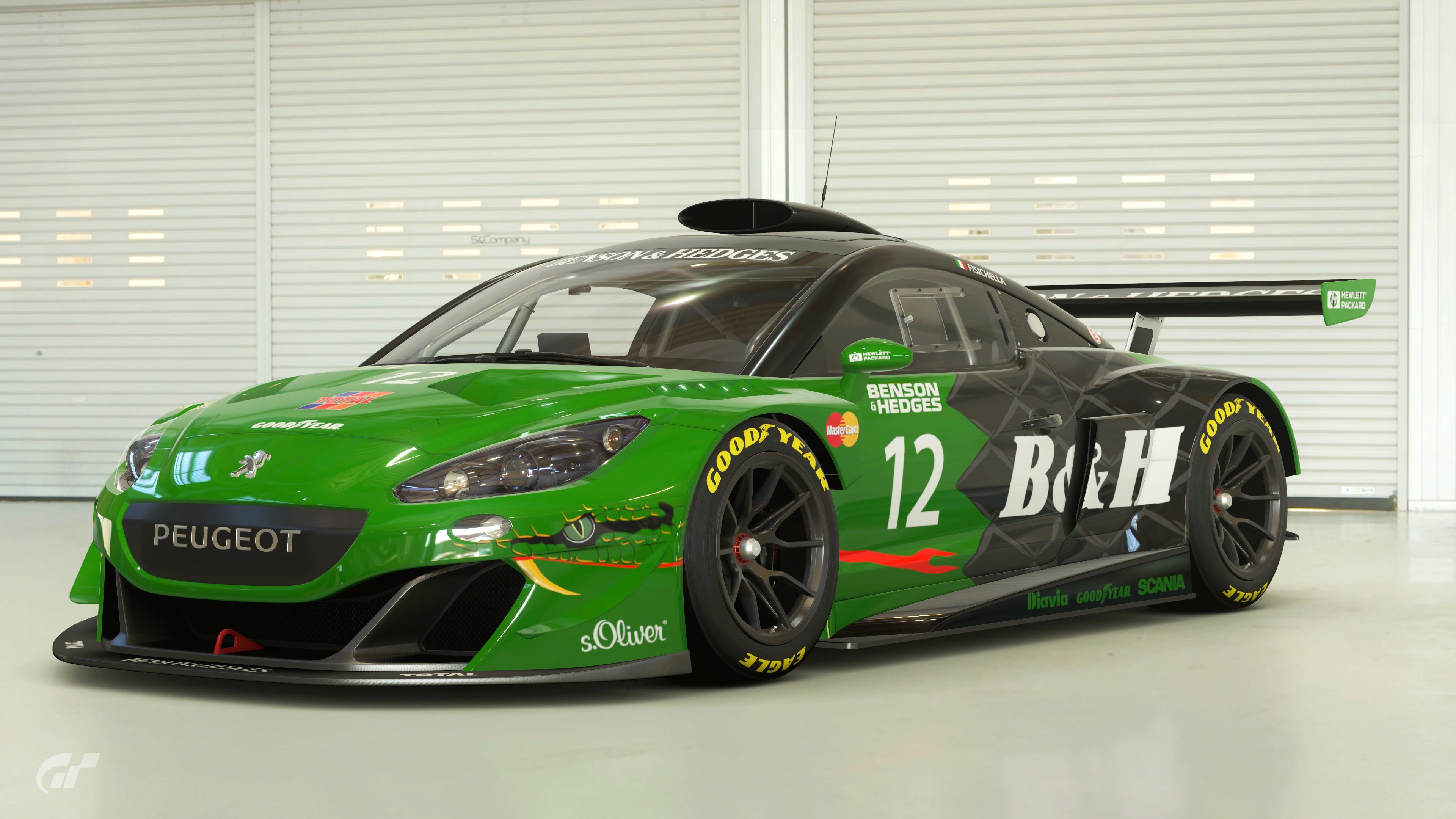
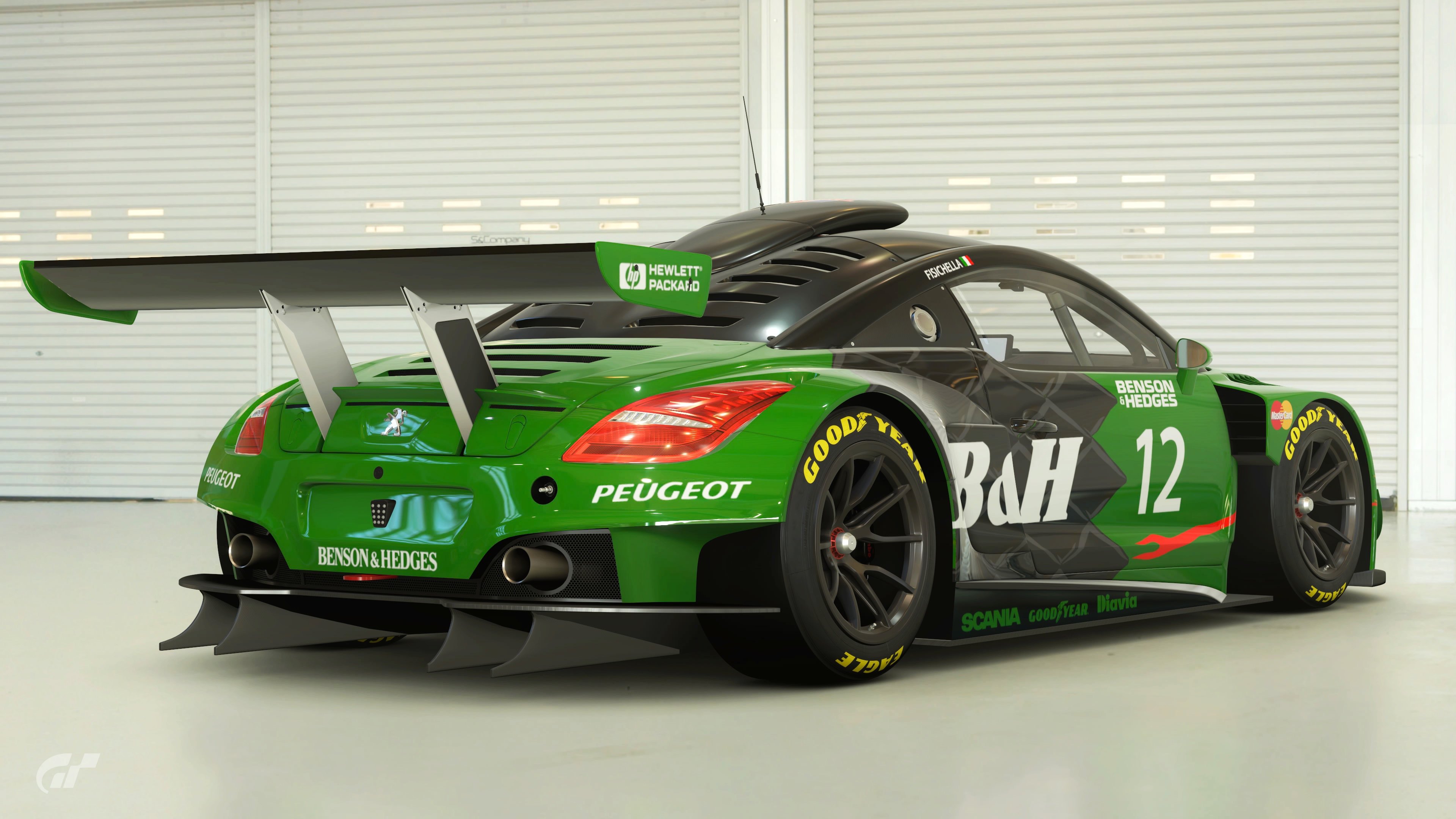
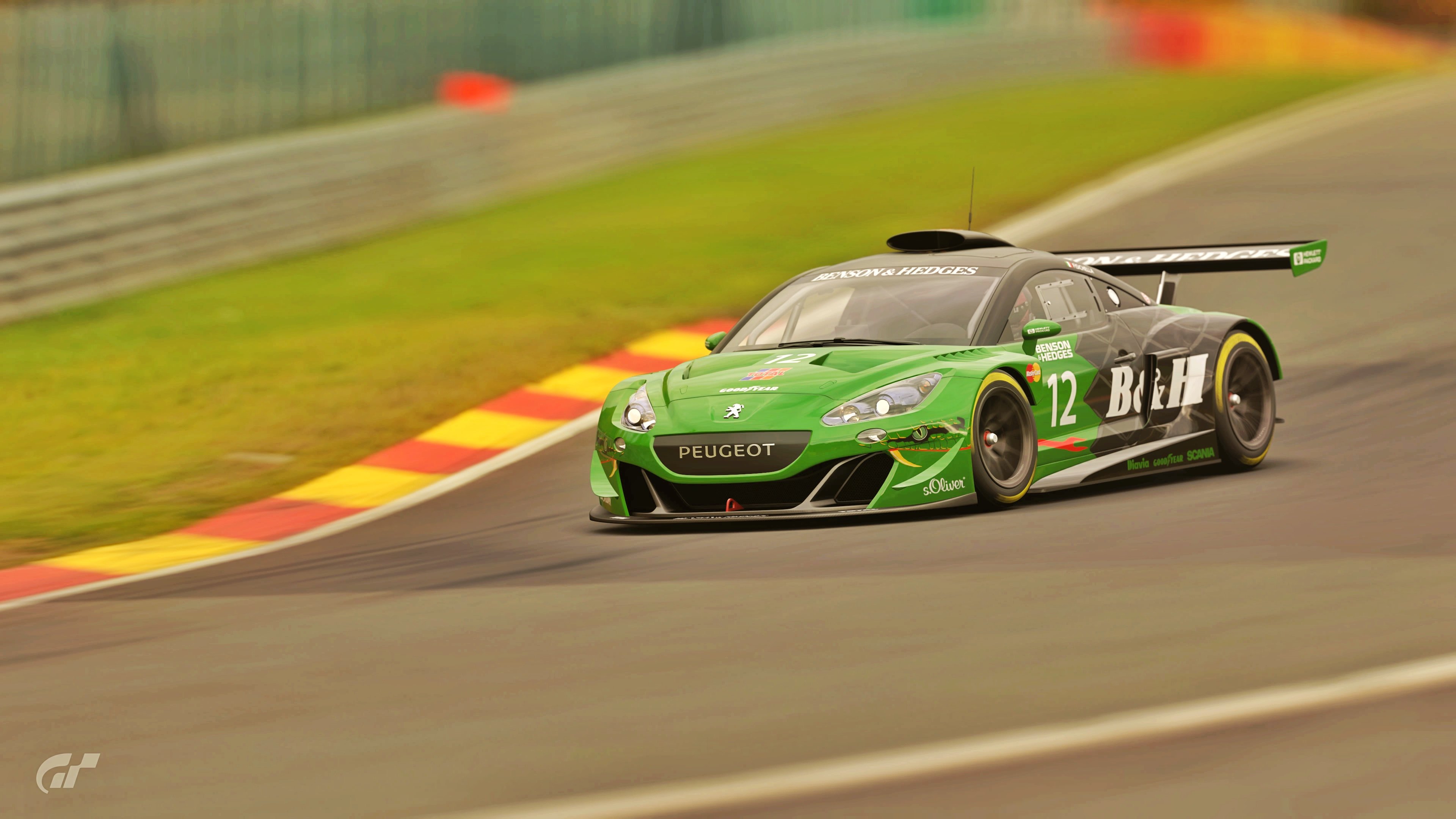
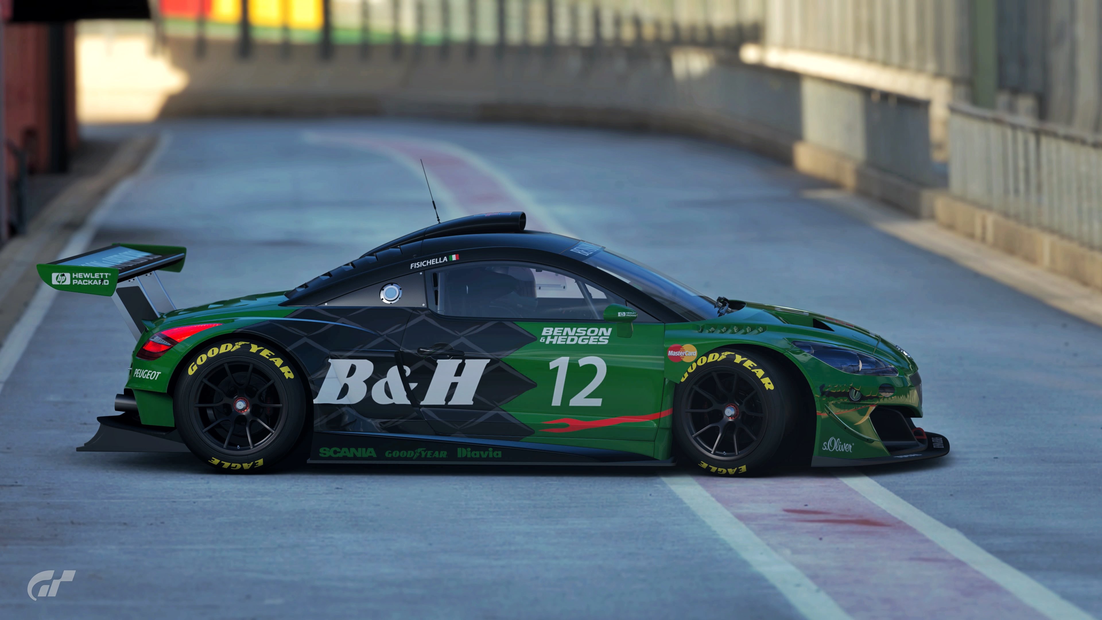
#25 RCZ Green and black give the Peugeot a nice contrast. I would have liked to have seen a side by side in the bonus pics though.


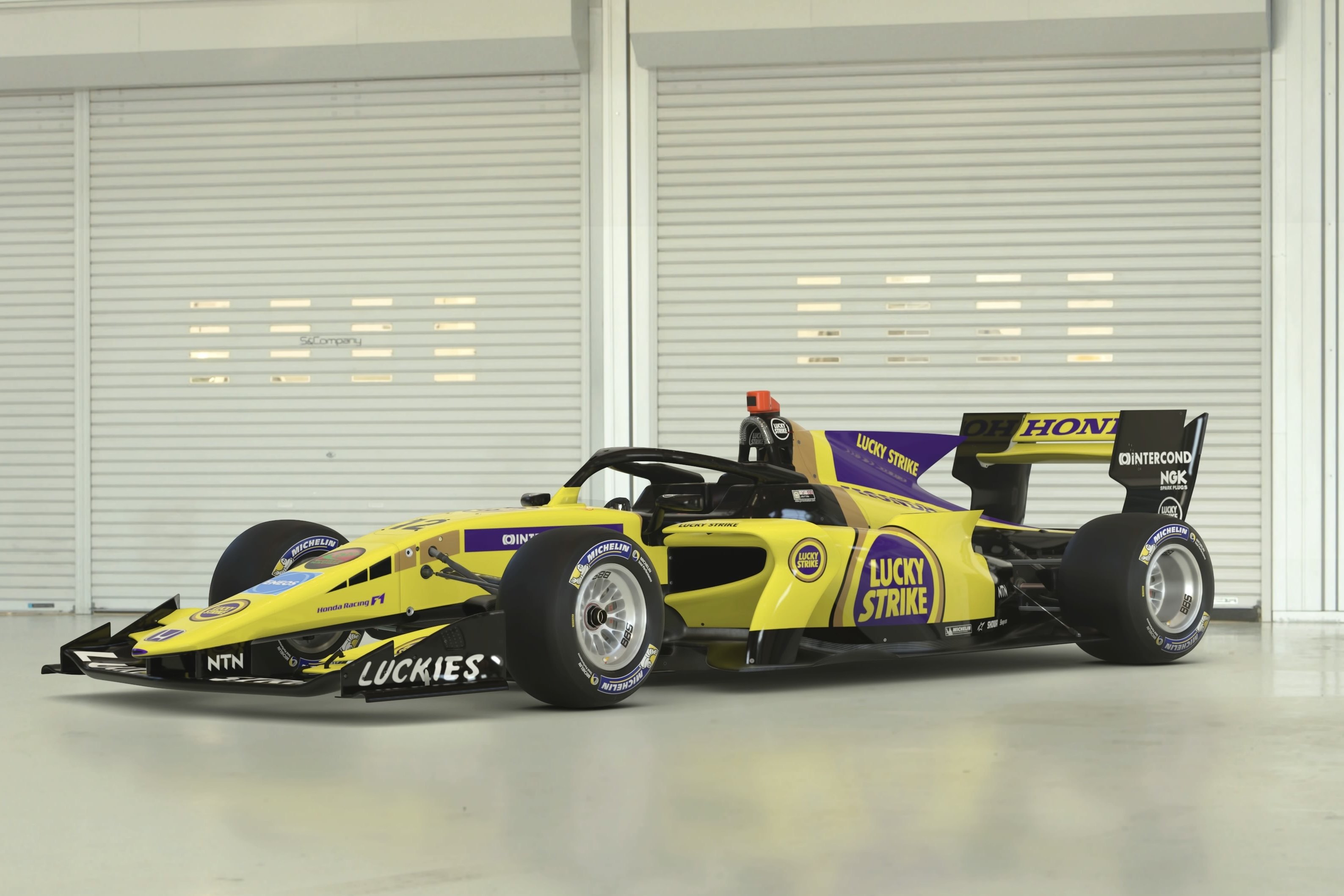
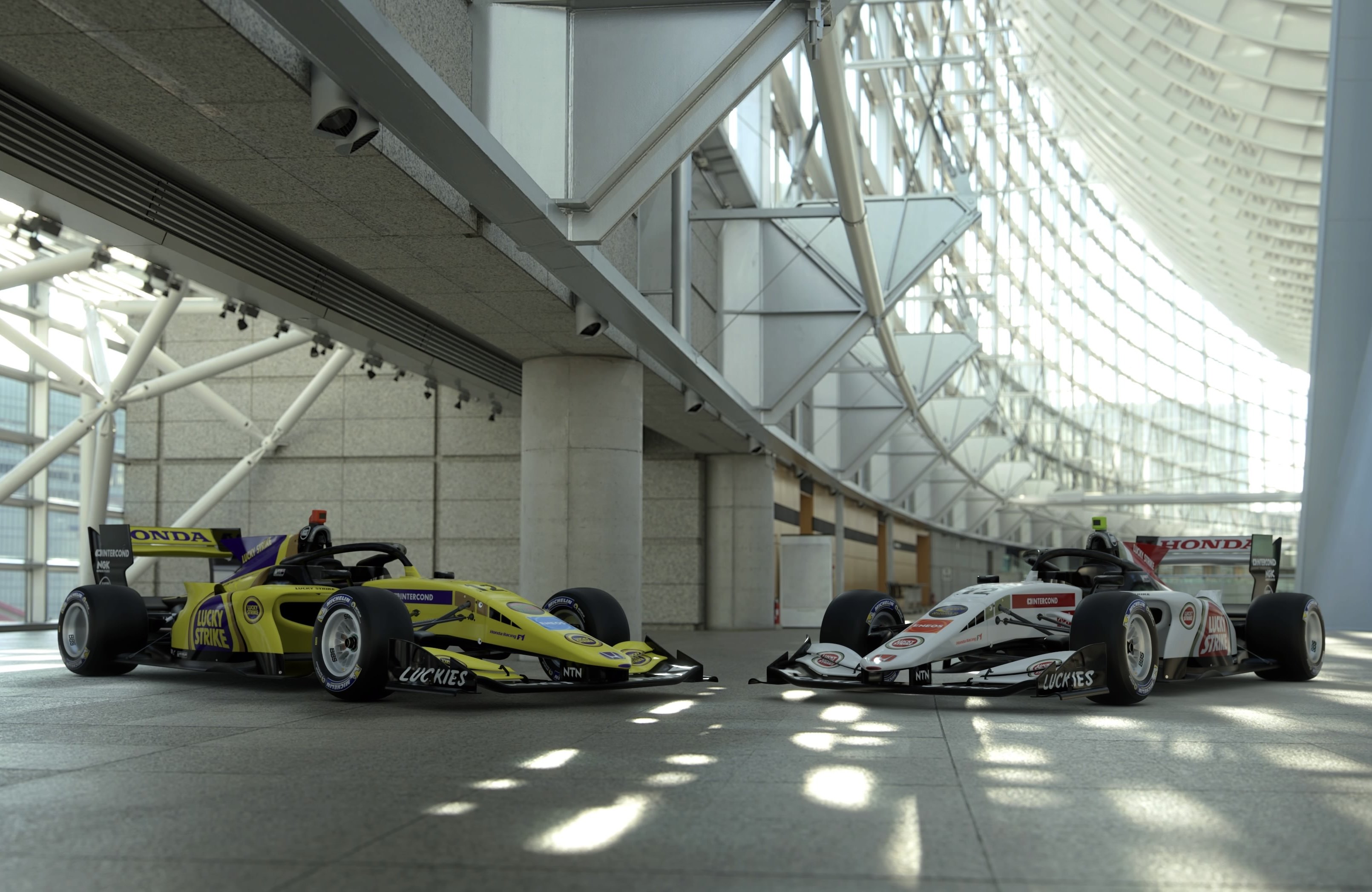
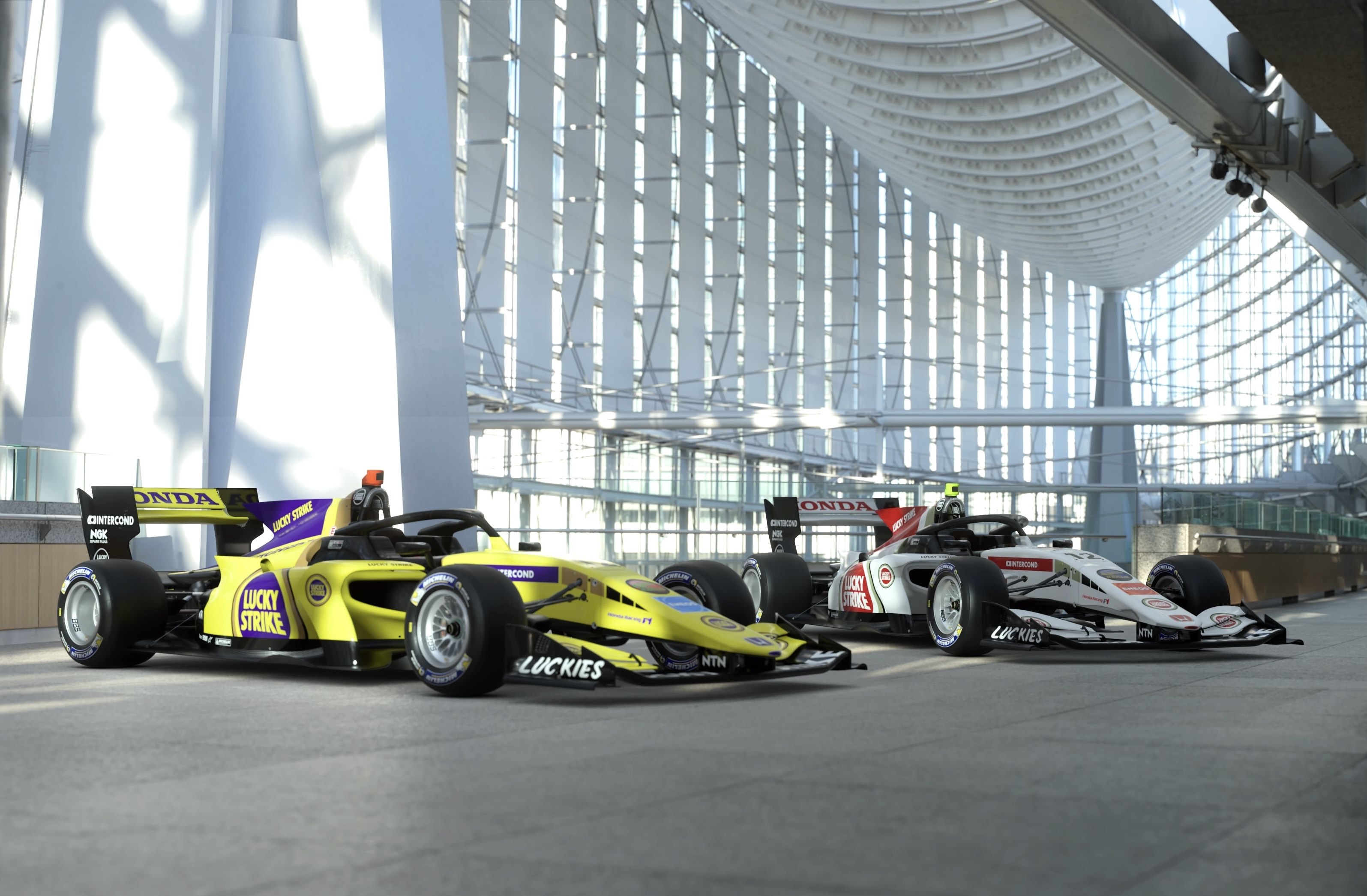
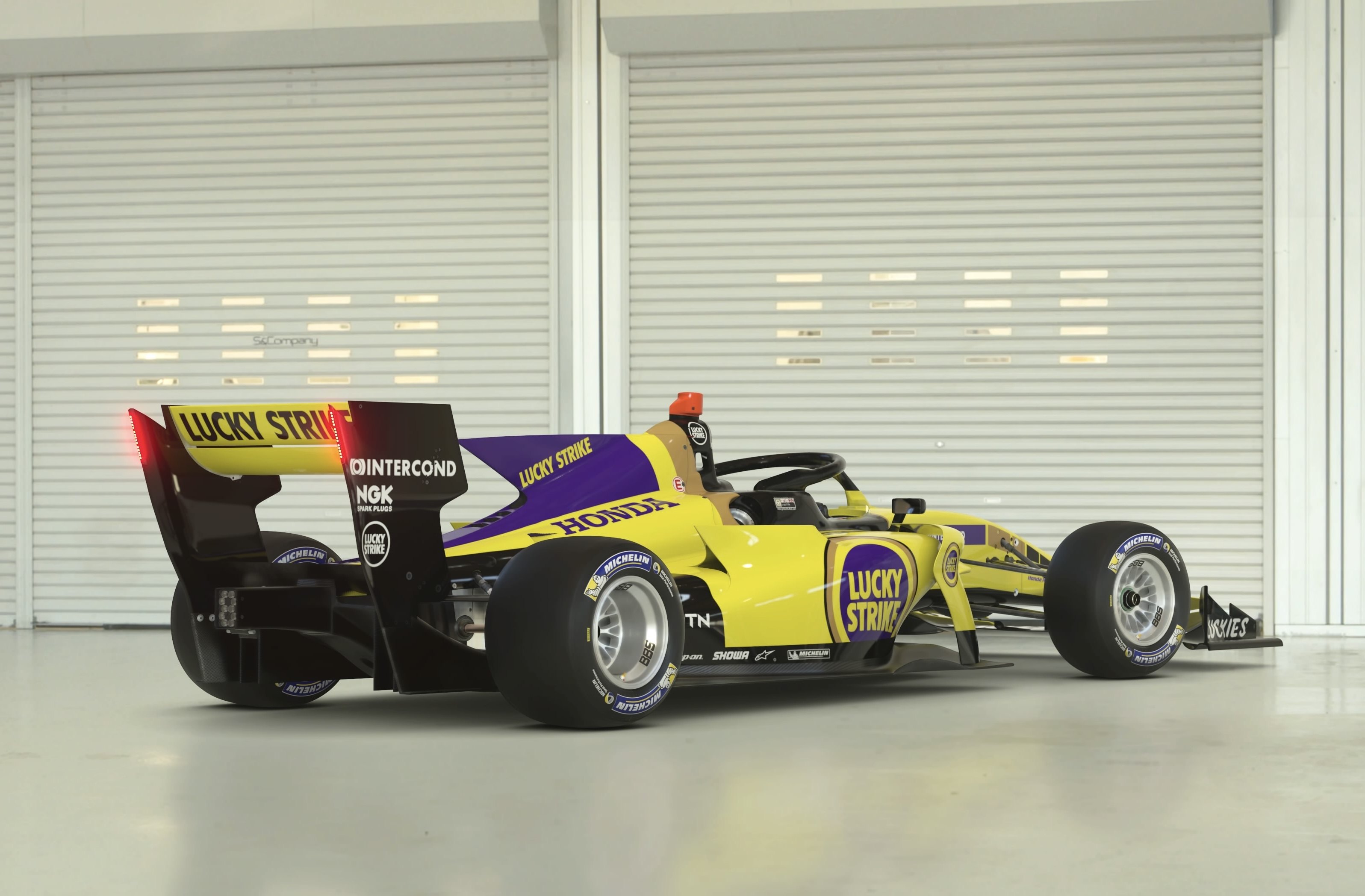
#26 Lucky Strike This one got my vote. I could see this livery being used for a special occasion, it really is a nice combination of colors. Bonus shots look great too!


#27 Skyline Great livery! The black and yellow looks great, as does the grey highlight. Thanks for something besides black in the wheels! Nice bonus pics.


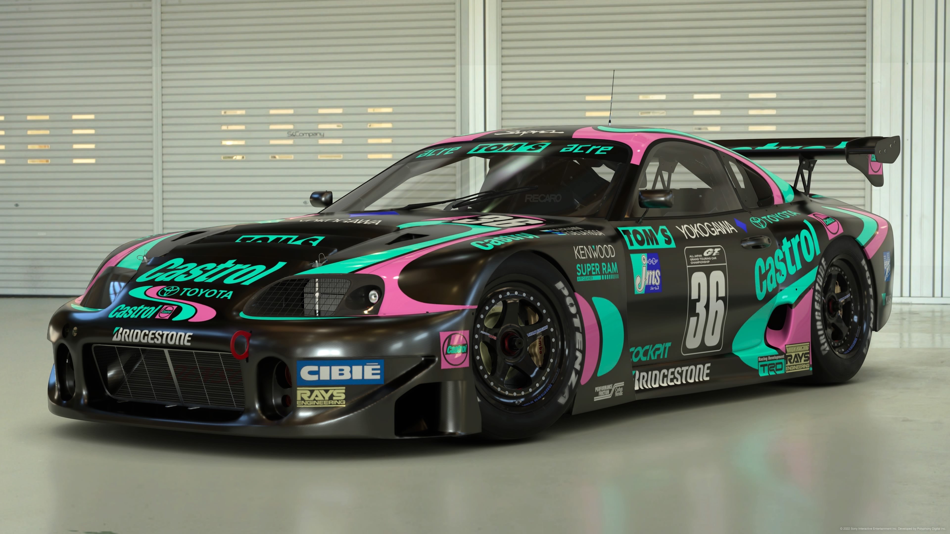
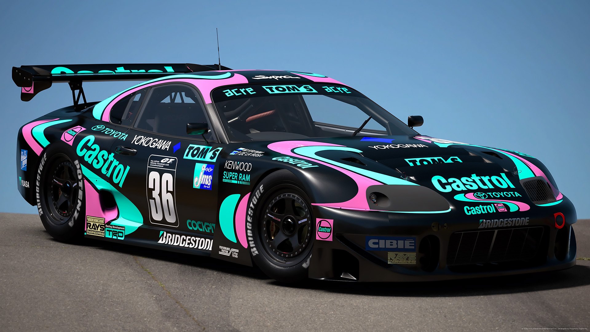
#28 Supra This one got my vote, and was my #1. I knew someone would do a version of this, and yours doesn’t disappoint. Love the colors (and carbon), and the design work is top notch too. Bonus pics are hot!


#29 962 Nicely done, though the color choices aren’t my style at all – love the wheels though. Bonus pics look fantastic!


#30 S2000 Unfortunately the original design is pretty bland, just doesn’t give a chance to really showcase it.


#31 911 Really cool livery, great choices in color and design. Love the details in the stripes. 1st bonus pic is hot.


#32 962 Another one that truly is a color crime, but the biggest issue I have is that some parts of the design seem to be a mirror image of the original, while others aren’t. Appreciate the overall effort.
 
Last edited:
Congrats to the podium guys, @996rick @huff @ziggedzag and @p78! Your colour crimes are masterpieces! And awesome work by everyone else as well. Thanks again for those who dropped a vote on my entry, always appreciated! This was a particularly tricky brief so it's nice to see the massive variation in approaches to creating colour crimes. I really enjoyed making horrible combinations of an iconic livery, but can't say I want to do that again in a hurry...

Query on the podium: if there's a tie for 2nd place, does that technically mean there's no third place and therefore no bronze? Or does the bronze go to 4th place? Not trying to take @p78 bronze away from him or anything, but just unsure how ties work in this regard...
 
Points for P2 are awarded twice, points for P3 once.
So I'm taking it then, if 5 people tied for first, second place would still exist regardless? Hypothetical of course, because when is there ever going to be a 5-way tie for first?! But just so I understand it right, if there were 5 entries, two people tied for first, two tied for "second" and the last person would still be "third"?
 
Back