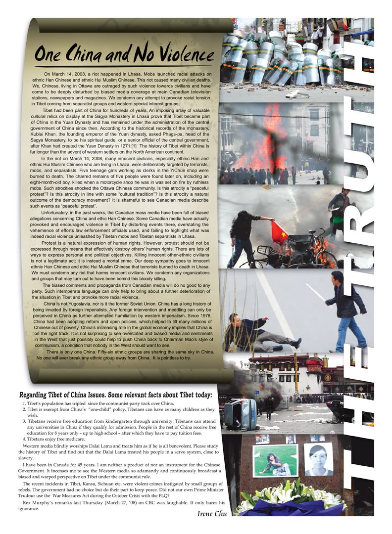
that's pretty cool f1GTR, the colors being the same so it looks like the floral and the words are one piece, yet the floral is "above" the text.
However since the center of the work seems to have "the light source" shining there, shouldn't the shadows on the right of this be on the right and not the left?


") what did you use a program, quark or indesign or?
what did you use a program, quark or indesign or?


")


