zoxxy
(Banned)
- 4,334
Good morning, all WRS Racers. Have anyone ever been so in love with the WRS event that you just HAD to get it in your avvy?
Well, this week I fell in love with the beautiful combo with a S2000 LM and Côte. :heart:
Anyways, point being that we should make a logo for the WRS!
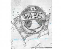
Here's a really bad, and ugly example:

Anyone who thinks the same?
Well, this week I fell in love with the beautiful combo with a S2000 LM and Côte. :heart:
Anyways, point being that we should make a logo for the WRS!
Here's a really bad, and ugly example:
Anyone who thinks the same?
")