zzz's | Digital painting practice | 31/8

  • Thread starter zzz_pt
  • 240 comments
  • 22,813 views
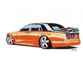
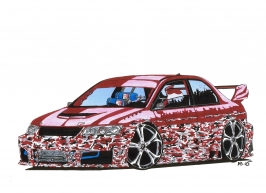
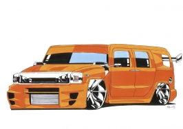
Nice looking sketch. Last time I drew something was quite long time ago too, think it was back in 2005 or so. Here are 3 examples. (Hope you dont mind if I post them in your gallery, will remove them if it's not ok ;) )
 

Attachments

  • Rolls Royce Phantom.jpg
    Rolls Royce Phantom.jpg
    340.5 KB · Views: 18
  • Mitsubishi Lancer Evo VIII Camo.jpg
    Mitsubishi Lancer Evo VIII Camo.jpg
    483.9 KB · Views: 19
  • Hummer H2 LOW.jpg
    Hummer H2 LOW.jpg
    340.8 KB · Views: 18
Thank you Geroge, Nicolas and Jérémy for your feedback. :) I'm trying to make a few shots instead of huge sets.


I haven't made any sketch in a long long time... Today I got the mood and made a quick one by hand. :)
Very rough I know...


View attachment 162457

Very nice one. Looks a little bit like an hybrid of the RCZ (front) and the CRZ (rear). The Posche one is also very nice :)
 
Nice sketches @zzz_pt & @NBDESIGNZ . It's been over 6 months since I've drawn anything by hand. I was going to share one of my older drawings but I didn't want to clog up your gallery.

On another note, I also love your recent edits. Especially Bloody Tears with it's clean isolation.
 
Last edited:
I've always been around; just didn't have as much time to comment - that's changed now, though. ;) That 'Bloody Tears' shot and your sketches are looking great!
 
wow! Almost 6 months without posting here. :scared: Time flies.


I'll be posting some pictures of my UI concept for the next GT game (GT7). If you have any comments or suggestions, be free to share it.

I begun to think about this in the last few days since I'm currently unemplyed (yes, it sucks :/).

These images aren't final. I think I'm gonna re-design the layout since it's too similar to GT6. The major difficulty will be to design all the icons. :D


1.My Home (default/no background)


2. My Home (you can chose a picture to set as background
or chose the option to see images of the car you currenlty have.
You can hide the menus and take a shot if you see a good angle or composition as well)


3. Open World (speaks for itself doesn't it? You could chose between 2 or more environments and drive wihout any limitations).
ps: the city in the picture would be nice but it's just an example. I wouldn't mind to have a "fake" city.


4. Yes! In this "concept" GT, you would be ablre to drive motorcycles as well.
And one of the Special Events would be the amazing Isle of Man TT.


...

I'll be uploading more images in the next comming days/weeks as I find the time to do it.
 
Lovely concept shots, @zzz_pt. Really looking forward to seeing what you'll come up with regarding the icons. 👍

And far more importantly, I hope you'll be able to sort out your current situation as soon as possible, buddy. :)
 
Thank you! :) I'm doing a completely different design now. Not so GT6-like.

I hope that as well. :cheers:


A sample from my "license" icons. :)

View attachment 250372


I've been using Illustrator. It's so much faster to use vectors instead of pixels! I'm doing everything in Ai and then I'll use Ps to make some "enhancements" and the sections with images.​
 
Thanks Nicolas and Nenad. :cheers: I have "Licenses", "Speacial Events", "A-Spec - Amateur", "Tuning & Servicing" Menus with all the icons and I'm making the "Online" main menu now.

@Y00PAY Thank you mate. Would be nice to have London or any other big city. But I'd be happy with a "imaginary" one.

Ah! I have the "My Home" page as well but it's not as I want it to be so I'll be changing it. I'm really pleased with the looks. I hope you guys like it as well. :P It might take a week or so to finish the main menus and then I'll be sharing them here. :)


One more icon just to tease. ^^


iconsample.png


...​
 
You're welcome! 👍 Really digging the background texture you added to the menu. I would personally tone down the saturation of the green accents a tad bit, but it's your call. ;)


Bikes might sway me to giving the GT series another go. For now, though, I'll patiently wait for pCARS. :)
 
Last edited:
took a while wondering whether to give you a "like" in all your photos because there is no bad. Excellent work, a good place to get inspiration :D:tup:
 
You're welcome! 👍 Really digging the background texture you added to the menu. I would personally tone down the saturation of the green accents a tad bit, but it's your call. ;)


Bikes might sway me to giving the GT series another go. For now, though, I'll patiently wait for pCARS. :)

Yes! The green was in fact exagerated. I've tone it down :) Thank you.

ac1
took a while wondering whether to give you a "like" in all your photos because there is no bad. Excellent work, a good place to get inspiration :D:tup:

When I saw 30+ likes I thought it was some kind of mistake or bug. lol Thank you for your kind words mate. :cheers:

I like the ideas behind each and every shot in post 216.

Thank you. I'm trying to put them into nice pictures now. 👍


DEALERSHIP SHOWROOM


NOVITEC F12 N Largo
 
That looks awesome.

Small suggestion: Why not have the key icon represent/match the colour of the selected vehicle? ;)

I was also wondering: Did you try out other fonts, as well?
 
Last edited:
That looks awesome.

Small suggestion: Why not have the key icon represent/match the colour of the selected vehicle? ;)

I was also wondering: Did you try out other fonts, as well?

I've tried another 2 or 3 fonts that I have in this PC yes. I wanted a good font but not very artistic or expressive. This is a nice one that do the job. Reads well and doesn't get much attention. The purpose is to convey information and not to catch attention.

About the color in the icon, I'll try :) The icon is very small though. And for a lot of cars it would get akward. For example the Koenigsegg one:1 has orange, grey and black.

I don't think people really miss that info (the color of the car they have at the moment). But I can only speak for myself. ^^ Maybe there are people who forget the color and want to know without going to the garage.


Thanks again for your feedback Nenad. :cheers:
 
I wished GT7 was like that. Seriously. SUPERB job!
Clean menus, great new ideas (bikes, purchasing multiple cars by adding them to the cart...) just pretty sure that PD won't add the open world feature, that is asking way too much from them ;) but it still would be an awesome feature.
 
@cruzthemaster Thank you mate :) I'll be adding some more menus in the next days hopefully.


On a more personal note, I had an interview last friday via skype for a company from the gaming industry in germany and they sent me an e-mail today to schedule a second interview. Lets see where this leads me.
Boa sorte!
 
On a more personal note, I had an interview last friday via skype for a company from the gaming industry in germany and they sent me an e-mail today to schedule a second interview. Lets see where this leads me.


So, I'm going to Hamburg, Germany next January. :) Don't know if I'll take my PS3 yet but probably not.
I guess I won't be participating in the next Photomode Tournament.

But I'll still be here. :P

ps: If you're there, just let me know. :cheers:
 
Last edited:
Thank you N! :)


Thanks mate :D


Hi! Where have you been? I'm glad you like it. It's always nice to produce a shot that draws your attention :cheers:


Bloody Tears


///

Damn. 2 years and 1 week since I posted my last photomode picture here.


GT Sport come quickly please!
 
Back