- 6,696

- Frederick, MD
The exotic rides are looking smooth with their need for speed. 👍
Your shots are really clean and don't really have many 'unpleasant' points about it except that it might get just a little repetitive. Maybe try new, bold angles, framing, composition, and new ways of toning if you edit your photos. The freshness of work is what keeps most going. 👍


Some nice work once more in theses last two sets. In the Gllardo one I think the first and the fourth are the best ones. In the LFA set my fav' are the #6, #13, #14 & #16
 .
.


 Keep at it :cheers"
Great composition and lighting Andy, in all your shots. Though in my honest opinion, the one area where I feel you should work on is your angles. Your SC430 set contains shots that are superb individually. But once you look at the entire set, one can see there's 7 shots or so with the same Camera position at the rear of the car. I suggest you experiment , and don't rush it.
Take it positively, because you are definitely headed in the right direction.Keep at it :cheers"
The composition of the snaps in the latest set of the SC430, is magnificent altogether, although it's a bit shame that you didn't work on much the angles to let the shots have more diversity of view allowing us to appreciate the works in various lights as rambo points out.
I agree with my comrades, you should try to have more diversity on your choice of angles but this set is quite good, with a nice light 👍


This last set offers more various angles and some of them are quite original and nice. Keep it up mate
Good stuff Andy:tup:
 .
.


Various and original angles, great speed effect, good use of the light and shadows of the city background : this is a good set !
Now you should try to work more on toning with balance / saturation and light with the curves to make even better pics


Wow great use of the Monaco scenery in the last shot ! 👍
 .
. 


While I like the last, I feel it could of been improved in the following area:
*Depth of Field
There are not much "unpleasant" points where I'm dissatisfied with appraising your photoworks in the latest updates either. Love the scenery of the track, the usage of toning you've brought in, and the blur in the background which all make the rendering the images still picturesque. 👍
I like a lot this last set Andy, nice use of the b&w, it give the set a specific atmosphere 👍
While I like the last, I feel it could of been improved in the following area:
*Depth of Field
I agree with this. It's certainly the strongest shot of the bunch to me and it's still pretty good. It's also helped by the fact that it's the only b&w shot that doesn't seem a bit overexposed to me. 👍


And YOU sir...well, I love your work as it kinda reminds me of my own sometimes (Damn the trees, LOOK at this hot car I made).
You have made quite a composition influence on me, your work is far cleaner, imaginative, and awesome-er than mine, but I love where you coming from.
I fought the Furai many times (And Lost), then you come along and post what I only imagine. That set (Like your others), is Big, Proud, and not to be missed.
Shot 3 from the set is my Hot Pick. Just look at her.
Smoothest gallery ever, full of passion. You get right to the point.👍
I'm hitting your Flickr tonight, so I can see what the fuss is about.
A strong misty atmosphere in these shots with some very original angles 👍
 . However, I'm just doing the best I can and learning how to improve as time goes by. Also, your photos also gives me some inspiration to take some shots of my own.


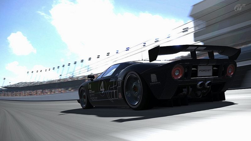
The exposure looks really nice in the last GT shot. Plus the angle/framing is pretty solid as well. Good job for an unedited shot.
I agree with Jaden about this last shot. I also like a lot the curvy composition and sense of speed of the first, too bad the sky looks a little bit surexposed.


