- 1,709

- GDL, Mexico
- Insomniac_driver
FINAL ENTRY

Click for Full Size
I wasn't implying anything was wrong (though the text looks slanted at the bottom because of the guard rail). I thought the tag plate was a good show of attention to detail. I'd have played with the cloud cover (that is the dead giveaway). But outside of that, I don't see anything I would change were it my piece.
It's kind of like watching really rich 4th graders sling "your mom" jokes.

I did some burning and dodging on some of the clouds. I dunno, I just can't seem to figure out what's wrong.
Is it just me, or does GT5 use some pretty low-resolution textures for the sky on some of the tracks, particularly the Nürburgring?
I know i'm being a dick by saying this, But the Prius ad is bassicaly a copy of the Emission ad with the sheep from India or something. Everyone else used GT5 for most of it, but that is mostly Toyota's actual ad, including the pixel bleed on the red and the smushed text.


Actually, that's not a dick thing to say if it true, it's a dick thing to plagiarize material and concepts.
(...)
So, harsh and without remorse - sure... but it's also a valid observation, I'd say.
I know i'm being a dick by saying this, But the Prius ad is bassicaly a copy of the Emission ad with the sheep from India or something. Everyone else used GT5 for most of it, but that is mostly Toyota's actual ad, including the pixel bleed on the red and the smushed text.

Wow hold on guys.
I have to say that I have mixed feelings about this.
First of all, I am sad about all this. Sad because I obviously can't use that picture anymore althought I was pretty satisfied with it. I need to make things clear, I didn't know that an actual ad with that same concept already existed and I'm sorry if anyone thought I was stealing someone's idea. So obviously, I'll change my entry.
Though I'm also pretty satisfied to see that an actual person had that same idea for an official ad. Perhaps I should consider a reconversion
Again, sorry for all the fuss, I'll edit my entry.

Yeah cheers, I just gave Flickr a go and it's doing exactly the same thing as Photobucket - it won't let me maintain the full size of the image and also goes a little overboard with the JPG compression. Usually that wouldn't bother me but I've got a reasonable amount of small text on there so it ends up looking pretty poor.
Call me fussy but I think I'll just go ahead with my own hosting!
Final Entry:

Wow hold on guys.
I have to say that I have mixed feelings about this.
First of all, I am sad about all this. Sad because I obviously can't use that picture anymore althought I was pretty satisfied with it. I need to make things clear, I didn't know that an actual ad with that same concept already existed and I'm sorry if anyone thought I was stealing someone's idea. So obviously, I'll change my entry.
Though I'm also pretty satisfied to see that an actual person had that same idea for an official ad. Perhaps I should consider a reconversion
Again, sorry for all the fuss, I'll edit my entry.
") Nice ad btw!
Nice ad btw!Hey, I wasn't calling for you to change it, I was just noting the similarities.
(...)
Anyway... thats just my personal input - no hard feelings intended mate.
")

Here's my entry. And Do not knock it cause of the low quality picture of Hiromu Naruse, I looked over everywhere for a picture and that was the best I could find. As some know, Hiromu was Toyota's top test driver and gave us alot of the Legendary Toyotas and Lexus' we have today. He died this past June in the Nurburgring LF-A just outside of Nurburgring. I felt this was kinda fitting entry/Memorial.
FINAL ENTRY
Glad you like it. I'm not too good with filters, so I airbrushed and blended and paint brushed. I did use diffuse glow though, I think that's a filter.
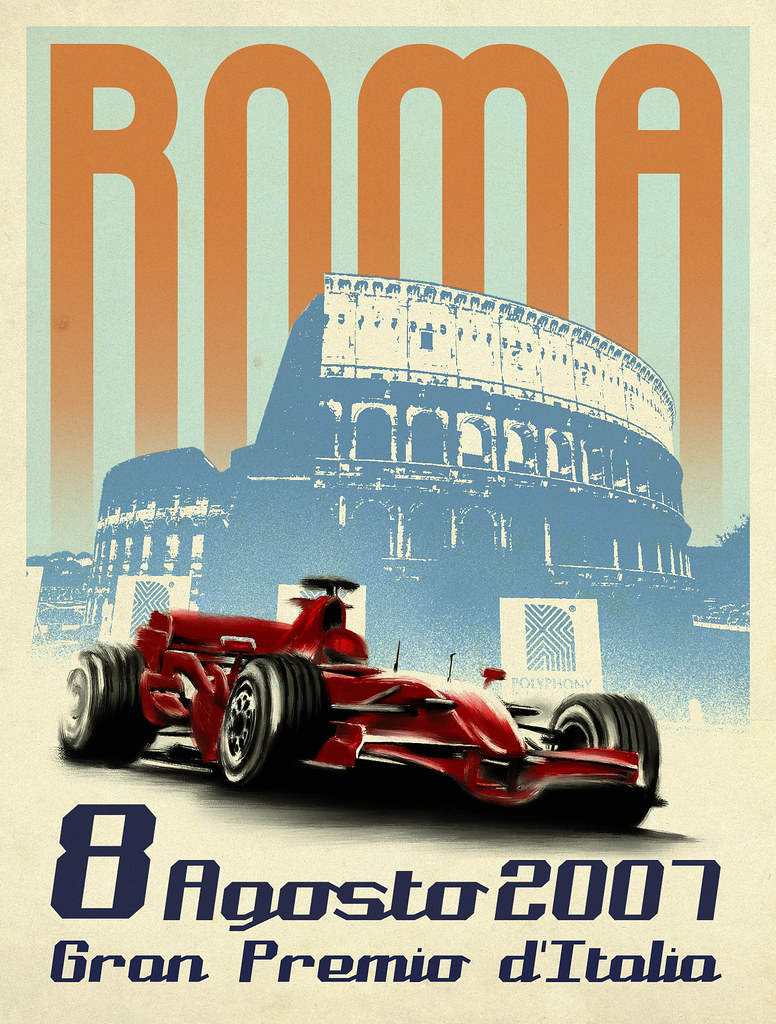
and I just realised Roma is Italian and aout is french for august.
About the similarities in style, it's quite simple really. I used the same style as the actual Toyota ads (used for almost every Toyota car), like the other guys used the same style for their VW and BMW ads. The point is to make an ad so it's just obvious to make it look like a real one. Now, my entry was just too close to the real deal so I'll change it, and it's completely normal IMO, even if the judges see no issues with it, I don't wanna take the risk of being accused of cheating. And I already have another idea anyway, but not as funny