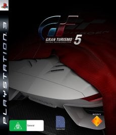
Gran Turismo 5 Box-Cover Competition- Open until June 15

if you were talking about me, then thank you very much :). All i did was i got a picture of a ps3 box, then got a picture of the lp560, cut and resized the picture, pasted it on the box, then i found some gt logos and then i selected the edges and moved it into the box, it wasnt that hard.

haha- they way you said it doesn't make it sound hard! I haven't used photoshop since my freshman year of HS (senior this year!) But yea, I'm sure it would be easy like that- after getting use to the autocad program here- I think its hard for me to get into something so easy again! :P
 
haha- they way you said it doesn't make it sound hard! I haven't used photoshop since my freshman year of HS (senior this year!) But yea, I'm sure it would be easy like that- after getting use to the autocad program here- I think its hard for me to get into something so easy again! :P

every version of photoshop is getting better, it detects edges and all that stuff for you and makes it easier. Lol :sly:
 
Sorry it's a bit late:

gt5cover.png


Lamborghini Murcielago SV
 
i think it would be great if there was a picture of a car that was made up of a bunch of small pictures of cars.
yeah I love the concept, I was originally thinking of a big GT5 logo made up of hundreds of small car pics
 
The thing that makes the nurburgring box art look so good is the beautiful contrast of colours. They really look quite nice. Of course it had to be a race track, or cars. A picture of an ocean with the same colours obviously wouldnt work.

I understand rusty's frustration though, his boxart, while lacking some artistic flare has had a large amount of time and effort put into it.
 
Some great entries here. Great to see people getting creative.

My design uses text already coined on this forum by another user. Once I heard it though, I thought it would make a great direction for something I already put some work into. :-)

GranWaitismo_cover.jpg
 
Back