Lot of great example in this thread. Thought it would be interesting to give a brief take on GT's UI:
GT3 has a very early 2000's look. Bright colours, oversized buttons and text, simple font face, simple iconography. A lot of early PS1/2 games had a similar look, similar to web 2.0
GT4 had a much cleaner look due to its colour scheme of light grey and white. Everything from the cover design to UI design was meant to give off future modern look. Its icons seems to be like skeuomorphism: making icons look like their real life counterparts.
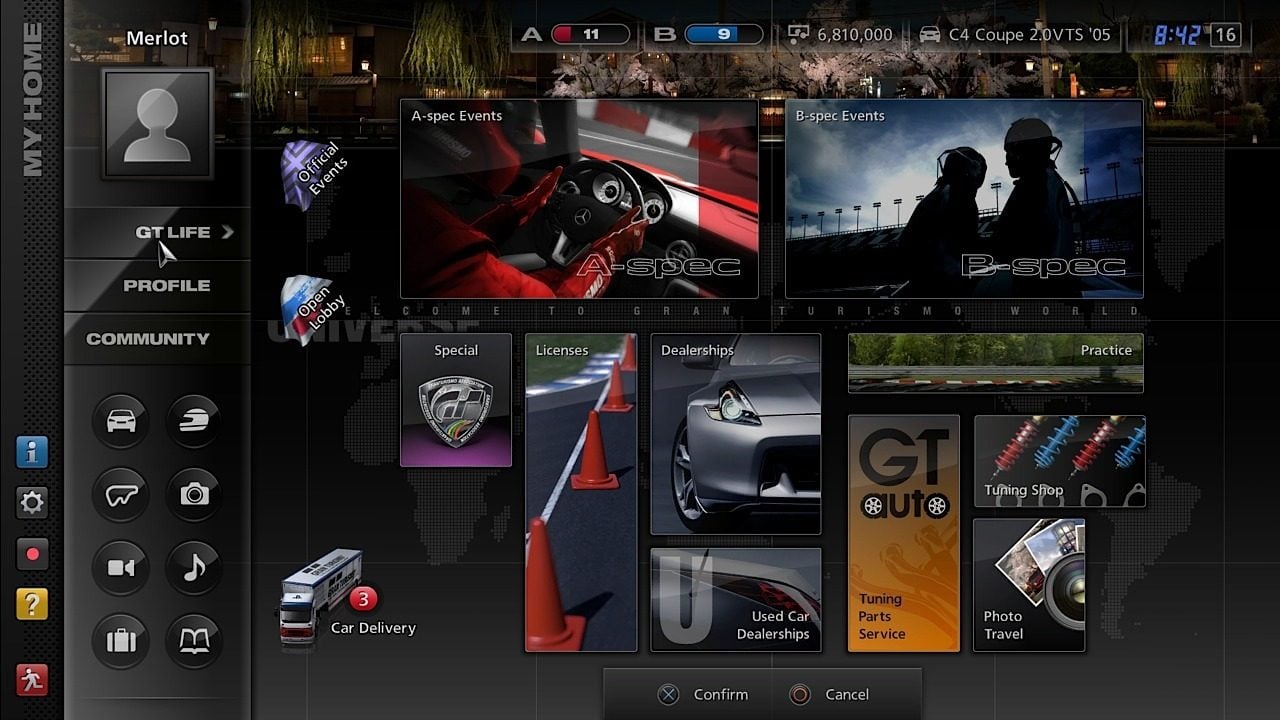
GT5 was a big departure, leaning more into modern graphic design. A grid based layout, sleek black theme with a slight gradient for a shiny look, minimalist icons, honestly it felt like how web graphic design graduated from 2.0 to 3.0, going for a subdued modern look rather than bold and colourful.
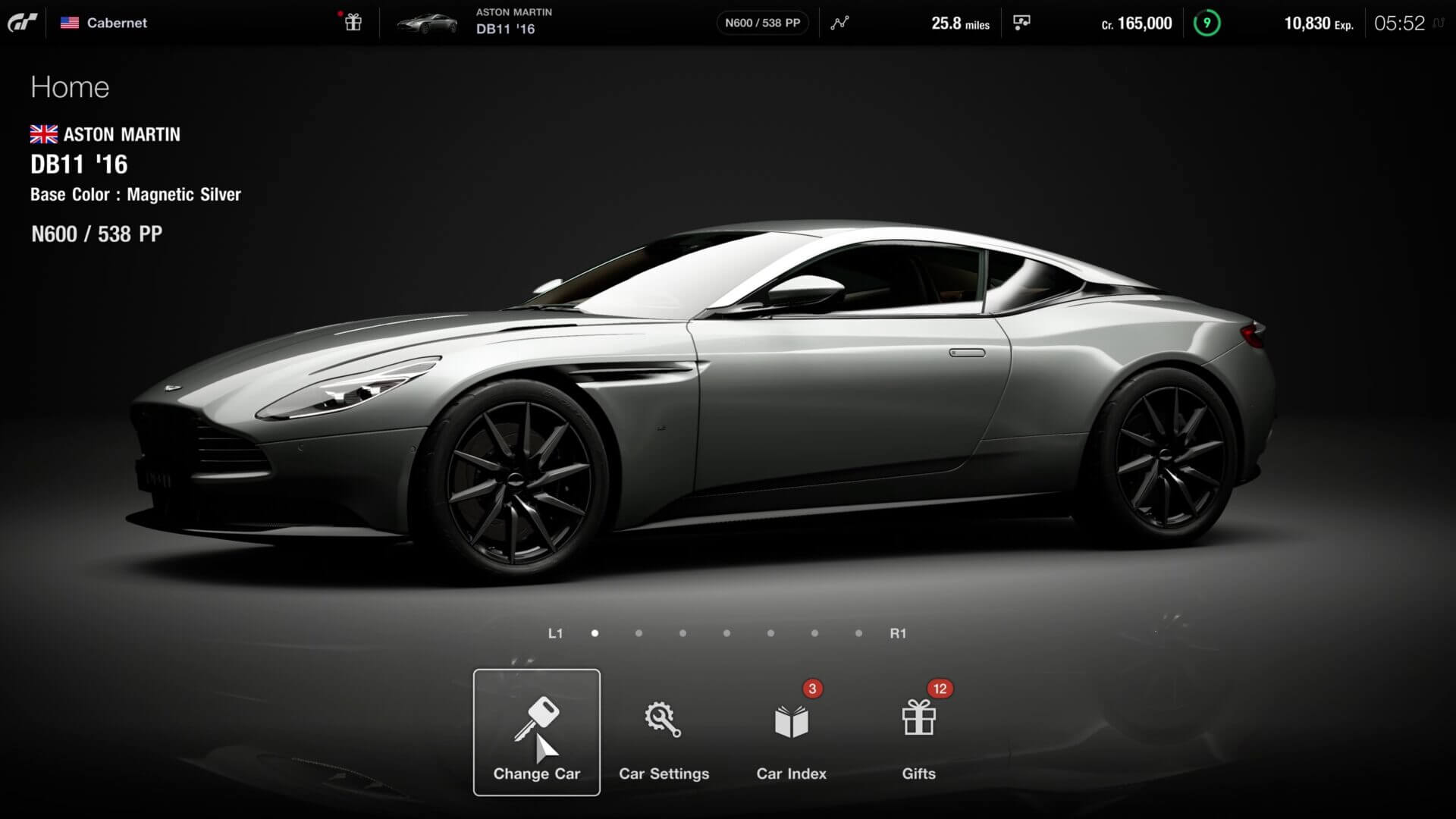
Perhaps the cleanest UI of them all. GTS truly looks like a next generation website. Vidoes playing in the background showing the beauty of the game taking most of the space, with a clean monochromatic menu. Very easy on the eyes and still striking. Icons are minimal and the whole thing looks very modern. This is my favourite design.
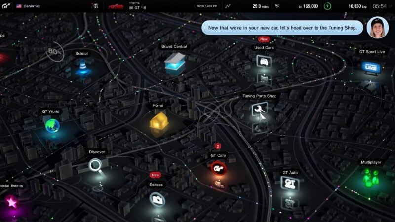
GT7 seems to be a merge between GTS and GT4 design philosophies. It maintains areas of bright and bold, while the greater menu has Sports subdued modern look. I honestly think its a downgrade from Sports wholly minimal design however its clear a lot of it is placeholder.
If I were to choose, I would want GT7 to go for a more maximal minimalist look: bold colors, typography or iconography, to give that personality but with the simplicty, spatiousness and regularity of minimalism.
Btw PD did hire the artist behind Ridge Racer 4's UI. I really do hope the final UI is a lot different to what we saw (not the home screen).
Also for you guys making designs. You should check out figma, its what most UI/X designers use and it might be easy to make menu graphics with it.


