Gran Turismo 7 and GT Sport User Interface Fan Art

Personally for map, I've always wanted to see a modernized version of it (I have imagined a modern version of it in my thoughts, but when it actually happened, the building blocks in GT7 are much smaller than I thought), also I want to see it being utilized as more than just menu background (probably the light trails on it are a start), like the map adjusting itself to the time, where it's brighter at daytime, and darker (like currently in trailer) in night time. And more importantly, use the map as the setting for open world (I want GT to also cover another aspect of "driving" - cruising on the street is obviously driving too, but for GT instead of driving like maniac every other open world games have, in GT you obey the street rules, with its own license for open world which consist of something like avoiding traffics. Kaz also already had thoughts on this).

Though you seem to only cover for the main menu, how about their other menus individually? Personally I want the other non-main menus in GT7 to resemble GT5's Tuning Shop in styling. I do think I wonder where's the implementation from the artist behind R4's UI currently, or the current menu is already his work (in typical GT fashion instead of his previous sthick in Ridge Raacer).
maxresdefault.jpg


The thing is, for GTS' Top Screen, it takes a small amount of space, which also reminds me of something that is left out from GT1/GT2, the shortcut menu.
I think they should implement the Top Screen again in GT7 outside of the main menu map for GT7 (if going to Brand Central, GT Auto, GT World, etc.), where it acts like GT1/GT2's shortcut menu.
Unlike in GTS where the top screen changes to write down the title of the menu you're in (ex: Going to Home replaces the Top Screen with a writing "Home")

Iirc PD did dip their toes into open city levels. In GT5/6/S (can't remember which one) there was a home screen that showed a 3D model of a city that cars would go through. Many thought it would hint at open city levels. To add to that, many photomode locations in GT5 had the entire town or city modelled, perhaps even with enough fidelity to have a car go around. I do hope PD look into the free roam driving one day.

We also did get that tech talk on procedural generation of cities by PD
https://www.gtplanet.net/polyphony-digital-procedural-landscape-generation-cedec/

The R4 dev only joined in 2019, so his work would be seen in GT7. I don't know his position however, he could be on the cinematography team as he was also experienced in replay cameras.

GT5's tuning menu is nice but its a bit outdated now. The one side gradient, large grid design is kind of plain looking. I think the parts being overlayed is a very nice affect though.

I'm not a big fan of havign realistic objects on a background that is highly minimal, I think it can be a bit too off looking. For stuff like track select I would do a 3D CAD model view

HD_GUI02_1280.jpg


or something like Modern Warfare's main menu: a real video feed with some simple graphics showing measurements

PDeX-pot0U23hgqx.jpg


For autoparts, I think PD should flex their graphics skills and do something more visually stimulating like this:

yj6isrN.gif


I agree with the last part, GTS UX design is flawed in how many screens you have to go through.
 
Lot of great example in this thread. Thought it would be interesting to give a brief take on GT's UI:


GT3 has a very early 2000's look. Bright colours, oversized buttons and text, simple font face, simple iconography. A lot of early PS1/2 games had a similar look, similar to web 2.0
Good post but that's GT2's West City map not GT3's map, which is this:

maxresdefault.jpg


Though your description still fits :).
 
Iirc PD did dip their toes into open city levels. In GT5/6/S (can't remember which one) there was a home screen that showed a 3D model of a city that cars would go through. Many thought it would hint at open city levels. To add to that, many photomode locations in GT5 had the entire town or city modelled, perhaps even with enough fidelity to have a car go around. I do hope PD look into the free roam driving one day.

We also did get that tech talk on procedural generation of cities by PD
https://www.gtplanet.net/polyphony-digital-procedural-landscape-generation-cedec/

Yeah, but only because "driving" isn't only racing and it's "the real driving simulator" that I want free roam (sometimes this suggestion gets shot down because "GT has always focused on racing") where "driving" part is also teach driving on the streets like that, and note because of that I want it to follow traffic rules and drive like normal driver (stopping at red light, staying at the right path not at oncoming traffic's, etc.), even if that possibly sounds unfun to others that you're restricted (perks of open world is the freedom to do as you wish). And add free roam license (obviously you need licenses to drive on streets!) where you do stuff like avoiding crashing to traffic, parking cars, etc.

And I think the map in the menu can be a step towards that (drive to Scapes, School, Tuning Shop, etc. in your car), and one of the reasons I want it back, even if you think its a downgrade from Sports, a placeholder, and possibly that you want it removed.

GT5's tuning menu is nice but its a bit outdated now. The one side gradient, large grid design is kind of plain looking. I think the parts being overlayed is a very nice affect though.

I'm not a big fan of havign realistic objects on a background that is highly minimal, I think it can be a bit too off looking. For stuff like track select I would do a 3D CAD model view

HD_GUI02_1280.jpg


or something like Modern Warfare's main menu: a real video feed with some simple graphics showing measurements

PDeX-pot0U23hgqx.jpg

Oh it's obvious, if it can, I definitely would prefer to use the actual 3D CAD model or interactive menus (for starter, though this always happens, cars appear and shown in its 3D model instead of just a picture showing the car) in any menus, But I think that not all menus can utilize that and if those can't utilize that, I think of using GT5's styling to make it elaborate too, and I mean for the parts overlaying part obviously.

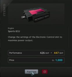
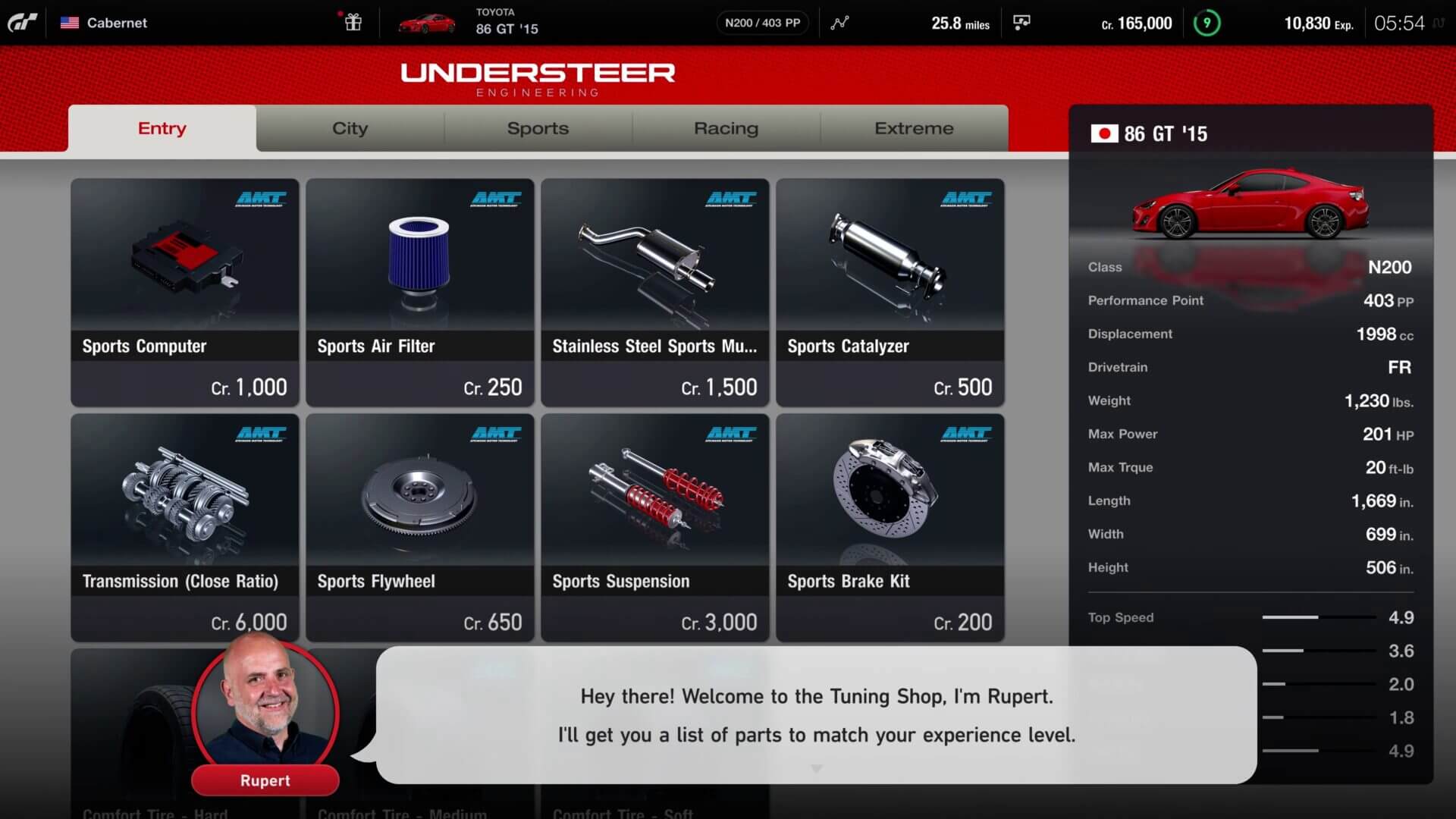
GT7 shows the 3D models for the parts, but it's like this part of for example, GT5's Tuning Menu (the parts confirmation of GT5 and GT7 respectively).
upload_2020-7-17_1-55-50.png upload_2020-7-17_1-54-34.png
(the GT7 part of Purchase/Cancel got obscured by Rupert dialogue placing the descriptions like ECU part there).

For autoparts, I think PD should flex their graphics skills and do something more visually stimulating like this:

yj6isrN.gif

Where would you put these kinds of something visually stimulating like this for PD to any part of the game? GT Auto animations where you show the car actually treated would come to my mind personally. Would you think, the Tuning Shop too with newly generated 3D models for the part? Also regarding making the menus this elaborate either animations or models (and for map menu, other than free roam I also had thoughts of turning it into functioning city; putting moving cars on it, dynamic setting of it being lighter at daytime, darker at night time, etc.), would you think this can potentially slow down the game by a lot (and that menus are unimportant, just focus on gameplay)? Because GT5 had a case of this, and GT6 removed for example, the animations and the game was faster.

I agree with the last part, GTS UX design is flawed in how many screens you have to go through.
I thought the complaints for something like map menu that I heard is that? (how many screens you go through). But because GTS also had a case of this I thought it's not the problem within the map menu, and if the game wants full nostalgia like I said before, the map returned, but not the shortcut menus yet, which GTS Top Screen resembles (but not utilized properly with it changing to the name of the menu you're going) so if that returned, the map menu is actually like GT1/GT2's and it gives advantages too in navigating.
 
Yeah, but only because "driving" isn't only racing and it's "the real driving simulator" that I want free roam (sometimes this suggestion gets shot down because "GT has always focused on racing") where "driving" part is also teach driving on the streets like that, and note because of that I want it to follow traffic rules and drive like normal driver (stopping at red light, staying at the right path not at oncoming traffic's, etc.), even if that possibly sounds unfun to others that you're restricted (perks of open world is the freedom to do as you wish). And add free roam license (obviously you need licenses to drive on streets!) where you do stuff like avoiding crashing to traffic, parking cars, etc.

And I think the map in the menu can be a step towards that (drive to Scapes, School, Tuning Shop, etc. in your car), and one of the reasons I want it back, even if you think its a downgrade from Sports, a placeholder, and possibly that you want it removed.

Driving to those locations to navigate the UI would be bad design. It would take too long. You want the UI to be quick for routes that users will frequently visit, like auto repair, upgrade, garage etc.

Oh it's obvious, if it can, I definitely would prefer to use the actual 3D CAD model or interactive menus (for starter, though this always happens, cars appear and shown in its 3D model instead of just a picture showing the car) in any menus, But I think that not all menus can utilize that and if those can't utilize that, I think of using GT5's styling to make it elaborate too, and I mean for the parts overlaying part obviously.

GT7 shows the 3D models for the parts, but it's like this part of for example, GT5's Tuning Menu (the parts confirmation of GT5 and GT7 respectively).

(the GT7 part of Purchase/Cancel got obscured by Rupert dialogue placing the descriptions like ECU part there).

Yeah the placeholder is pretty much GT5 with a bit of GTS font and colour. Hope it changes.


Where would you put these kinds of something visually stimulating like this for PD to any part of the game? GT Auto animations where you show the car actually treated would come to my mind personally. Would you think, the Tuning Shop too with newly generated 3D models for the part? Also regarding making the menus this elaborate either animations or models (and for map menu, other than free roam I also had thoughts of turning it into functioning city; putting moving cars on it, dynamic setting of it being lighter at daytime, darker at night time, etc.), would you think this can potentially slow down the game by a lot (and that menus are unimportant, just focus on gameplay)? Because GT5 had a case of this, and GT6 removed for example, the animations and the game was faster.

Similar to how you have a video play when you buy a car. I got to GT auto, click on brakes and see an exploded view of the wheels brake suspension etc, which then compacts once I leave brakes.

It doesn't even have to be real time, just play a video with some simple graphics over it, like the Modern Warfare menu.

If the videos are too intensive (they would only need memory and the PS5 has a lot of it), they could just uses still images of the exploded view.

But I don't think videos are too expensive for GT, considering GTS uses real time renders.

I thought the complaints for something like map menu that I heard is that? (how many screens you go through). But because GTS also had a case of this I thought it's not the problem within the map menu, and if the game wants full nostalgia like I said before, the map returned, but not the shortcut menus yet, which GTS Top Screen resembles (but not utilized properly with it changing to the name of the menu you're going) so if that returned, the map menu is actually like GT1/GT2's and it gives advantages too in navigating.

Honestly the GT4 style is quicker than a drop down menu simply because you can see all options in one page. It just stops there being those very nice looking scapes shots being played in the background.
 
Driving to those locations to navigate the UI would be bad design. It would take too long. You want the UI to be quick for routes that users will frequently visit, like auto repair, upgrade, garage etc.

Are you implying that I want them to drop the menu system and just go free roam as the only way to navigate? Hell no! Keep the main menu as it is, just that for free roam, use the map on the menu as the setting. So I mean there's 2 ways, the usual menu navigating or driving on free roam with those places available as bonus.

Similar to how you have a video play when you buy a car. I got to GT auto, click on brakes and see an exploded view of the wheels brake suspension etc, which then compacts once I leave brakes.

It doesn't even have to be real time, just play a video with some simple graphics over it, like the Modern Warfare menu.

If the videos are too intensive (they would only need memory and the PS5 has a lot of it), they could just uses still images of the exploded view.

But I don't think videos are too expensive for GT, considering GTS uses real time renders.

I want that to be implemented, and I want to have video play/exploded views type and not resorting to the "discounted" version like the MW menu (I hope PS5 is a system strong enough to handle that without long loading times, I want those to be implemented on menus but people loathe that if they slow down the game), but I don't think GT Auto handles brakes (it could be used on other things like the car's exterior parts right?). Probably that's suitable on tuning shop.
 
TRD Tune Shop
gtmenutuneshop.jpg

Icons and images are from google image search. Some with minor modification.
Home icon, car icon, TRD logo, tune part line up icons from GT2.
They should bring back the tuning car part's name back on the dealership.
They use fictional brand instead currently in GT7, it can be made GT3 way (the tuning name displayed depends on which car used; using Toyota displays TRD).
gran-turismo-7-ps5-screenshots-4k-32.jpg
 
They should bring back the tuning car part's name back on the dealership.
They use fictional brand instead currently in GT7, it can be made GT3 way (the tuning name displayed depends on which car used; using Toyota displays TRD).

You're right, I did some quick editing to see how it would look.

trd.jpg
nismo.jpg
sti.jpg
ralliart.jpg
 

Attachments

  • trd.jpg
    trd.jpg
    57.8 KB · Views: 17
  • nismo.jpg
    nismo.jpg
    56.5 KB · Views: 14
  • ralliart.jpg
    ralliart.jpg
    57.3 KB · Views: 14
  • sti.jpg
    sti.jpg
    57.7 KB · Views: 17
I think your classic Windows/Mac-inspired UI had me imagined of a GT1/2 HD remake, rather than GT7. It captures the nostalgic 90s racing game vibe perfectly in my opinion.
Thanks, good to hear that you like it. I was inspired by some old racing games for NES, PSX and others consoles. So I gave it a try to make this retro GT UI. If you ask me, I'm looking forward to see and try GT7, but remake of the old classic GT games would be nice.
 
Lot of great example in this thread. Thought it would be interesting to give a brief take on GT's UI:

739b3219461391.562dacf5bd57c.jpg


Btw PD did hire the artist behind Ridge Racer 4's UI. I really do hope the final UI is a lot different to what we saw (not the home screen).

Also for you guys making designs. You should check out figma, its what most UI/X designers use and it might be easy to make menu graphics with it.
Woww i thought i was the only one who knew that Behance account, Erica made a fantastic work into that UI :D Also, Dribbble is fantastic if you want to get some inspiration!
 
Back