- 1,917

- Binance:TSIDDLSA
- patriotzero
- please no
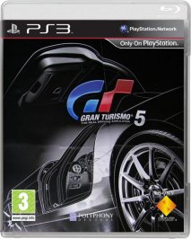
I think the cover is boring an a little amateur. GT covers are usually classy, this isn't.
so you`re the one...

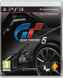
I think the cover is boring an a little amateur. GT covers are usually classy, this isn't.
Fair enough mate, I didn't look hard enough. I still think that given the nature of the game, coming up with an image that would be similar was inevitable. Even GT4 had a car with it's doors open! But fair play, I give you credit where credit is due 👍I can't blame you for questioning me, but it was not hindsight.
https://www.gtplanet.net/forum/showpost.php?p=3438729&postcount=363
As many people have said now, the initial EU release of GT4 had white cases, and that did more to set the look than the cover itself.what white case? The only thing white is the paper cover insert. My case, plastic box, is black.
")
For something to pass the time, I can respect that. However, printing it out and putting it on the game case that, for me, will be tucked away in a drawer somewhere...nah!Just make your own
I got 4 pure class cover art ones I've done which I'll be using one.
")
Too much going on?! Far from reducing what's going on, you whiting out the "T" just stands out like a sore thumb and looks right out of place (besides, it does not match the brand of the logo being blue and red when shown in colour).Too much going on in the cover. The car should not have been red in colour.Why?
just a quick one


Only with a white case. Seen it with blue and black cases, looks nowhere near as good.Is not ugly but it ain't what it could have been. GT4s cover is the prettiest so far.

Too much going on?! Far from reducing what's going on, you whiting out the "T" just stands out like a sore thumb and looks right out of place (besides, it does not match the brand of the logo being blue and red when shown in colour).
If the car should not have been red, what colour should it have been? Red has been a feature colour for SONY and the PS3 since launch. Makes total sense to me.
I never said the letters have not always been in blue & red. I am well aware that the GT logo is used in monochrome and greyscale. This is why I added, "when shown in colour" to the end of my sentence, meaning that when the G is blue, the T red.Exactly. Stands out of place. The whiting of the T was just to show how if the car was not red in colour it stands out (GT). It was easier for me to colour the letter than the whole car.
Talking about you mentioning brand of the logo The letters GT have not always been in Blue & Red as you can see from the previous colours.
Like you say it stands out like a sore thumb, We reconise this brand with those 2 letters and not the car.
Its a nice cover dont get me wrong but being in the Graphic Design/Advertising/Typography industry you may not see things that i see.
Nice! 👍 I actually like the black version more; looks menacing!Well I was bored, so this my half ***** attempt at using the black poster art for the cover.........
Well I was bored, so this my half ***** attempt at using the black poster art for the cover.........
500 miles better! 👍Well I was bored, so this my half ***** attempt at using the black poster art for the cover.........
 . Think I might actually prefer it better myself
But have they released only the american and european version of the cover?
- we have american rated by esrb
- we have european rated by pegi
- but i didn't saw the japanese rated by Cero

But have they released only the american and european version of the cover?
- we have american rated by esrb
- we have european rated by pegi
- but i didn't saw the japanese rated by Cero