
You are using an out of date browser. It may not display this or other websites correctly.
You should upgrade or use an alternative browser.
You should upgrade or use an alternative browser.
HORDE_R35 Photo Gallery - GT-R N24 GT Academy 12 - 07/06
- Thread starter Horde_R35
- 1,610 comments
- 90,432 views
- 3,046

- Ekaterinburg
- posauner
- ShaolinMast4
Great preview 👍👍👍
- 6,320

- Lisbon,Portugal
- IRT_hordeR35
- Whats an Xbox??
Great!
Nice angle, good lighting and a perfect amount of noise. 👍
What a great photo! Can't wait for more! 👍
Great preview 👍👍👍
Very nice:tup:
Nice preview Horde!
ps: I think you need a signature that matches your work standards, i.e a more personal and unic one.")
Thanks guys
 . The update will be up possibly tomorrow. 👍.
- 9,736
*cough*Thanks guyspossiblytomorrow. 👍.
Fixed that for you.

 . Thanks
  .
.


- 9,736
Even though this is a beautiful set, Tiago, I'm somehow missing the special touch which your pictures usually provide.
The composition is fine in every picture and lighting and shadowing are both fine, as well, but there's one thing I didn't like: It is the sky in the first picture. The green tones don't go with the blue ones (mainly found on the road), in my opinion.
Other than that, I liked the way you placed your signature in the second picture and hope to see a second part soon, where you'll be able to show us your true skills.
- 6,320
- Lisbon,Portugal
- IRT_hordeR35
- Whats an Xbox??
Beautifal set Horde, 1,5,7 are my favourites.👍
Mind-blowing photos!
Even though this is a beautiful set, Tiago, I'm somehow missing the special touch which your pictures usually provide.
The composition is fine in every picture and lighting and shadowing are both fine, as well, but there's one thing I didn't like: It is the sky in the first picture. The green tones don't go with the blue ones (mainly found on the road), in my opinion.
Other than that, I liked the way you placed your signature in the second picture and hope to see a second part soon, where you'll be able to show us your true skills.
Shots 3, 4, 5 and 7 are awesome !
Thanks guys:tup:. I wasnt inspired at the moment. Hope these couple of pics make it up
.Super Veloce
part 2
1. HD

2.

3.

4.

5.

6.

7.

8. HD

9. HD

- 3,622

- Slovenia
- csiApok
In this set your cars seem to be in the center of the pictures. How come?
I think it works nicely With the 3rd, 5th and 9th picture, but for example with picture number 8 it makes the shot look so generic. It's a centered car with a standard angle with almost no background to talk about. Though that is my least favorite of the pictures. It only goes up from there!
The first picture is a bit of a puzzle. I'm not really sure what I'm supposed to be looking at. There's the individual bright spots on the car which are nice, but on the front they get a bit too bright. Personally I would have prefered more detail in the area of the front right headlight. I'm partial to the flames around the picture. I can see why you'd add them as the background is just a road, but they're a bit much. It dpeends on the viewer I suppose.
Number 2 is sort of... erm... blue? Yes, it's very blue.
If you ask me number 3 is the highlight of that update. Nice warm tones the composition really make it very pleasant to look at. Great job, seriously. 👍
With number 4 it seems like you were going for a vintage sort of look? The car is a bit too new to pull that off.
Number 5 is quite nice. The more I look at it the more I like it. The bland road lets the image down a bit.
Number 6 is quite nice too though the bright background distracts from the car. I really like the reflections on the side of the car.
The 7th one is really nice. It's the kind of image where you can go with bright vibrant colours and go all out with the wow factor of the image. I really like how the wheel is the first thing that you see and then later you get to see the little details like the 'SV' on the side of the car and the reflections.
Number 9 is great. It's so simple yet so satisfying. Another of those the more I look at it the more I like it images.
- 4,771

- Paris
- Kodje75
If you ask me number 3 is the highlight of that update. Nice warm tones the composition really make it very pleasant to look at. Great job, seriously. 👍
Agree with that, really great light, tones and composition in this pic.
Really love the fifth also, and the last one looks quite real.
- 5,999

- Over there
- ask me
Definitely a great set.. #3 is my favorite.. excellent tones and really great shot overall
- 1,614
- Portugal
- ChaosControlPT

- 6,320
- Lisbon,Portugal
- IRT_hordeR35
- Whats an Xbox??
In this set your cars seem to be in the center of the pictures. How come?
I think it works nicely With the 3rd, 5th and 9th picture, but for example with picture number 8 it makes the shot look so generic. It's a centered car with a standard angle with almost no background to talk about. Though that is my least favorite of the pictures. It only goes up from there!
The first picture is a bit of a puzzle. I'm not really sure what I'm supposed to be looking at. There's the individual bright spots on the car which are nice, but on the front they get a bit too bright. Personally I would have prefered more detail in the area of the front right headlight. I'm partial to the flames around the picture. I can see why you'd add them as the background is just a road, but they're a bit much. It dpeends on the viewer I suppose.
Number 2 is sort of... erm... blue? Yes, it's very blue.
If you ask me number 3 is the highlight of that update. Nice warm tones the composition really make it very pleasant to look at. Great job, seriously. 👍
With number 4 it seems like you were going for a vintage sort of look? The car is a bit too new to pull that off.
Number 5 is quite nice. The more I look at it the more I like it. The bland road lets the image down a bit.
Number 6 is quite nice too though the bright background distracts from the car. I really like the reflections on the side of the car.
The 7th one is really nice. It's the kind of image where you can go with bright vibrant colours and go all out with the wow factor of the image. I really like how the wheel is the first thing that you see and then later you get to see the little details like the 'SV' on the side of the car and the reflections.
Number 9 is great. It's so simple yet so satisfying. Another of those the more I look at it the more I like it images.
Agree with that, really great light, tones and composition in this pic.
Really love the fifth also, and the last one looks quite real.
Pictures #3 and #5 definitely stand out from the rest for me. Good colour representation, composition and lighting. 👍
Great photos! Very good composition and lighting!
Definitely a great set.. #3 is my favorite.. excellent tones and really great shot overall
This set more than makes up for the last one!
I agreed with almost everything Apok said. except for the 7th shot. I think it's to burnt and overexpose.
3rd is the best shot in this update! 👍
Thanks for the feedback guys
. I didnt had much inspiration so why these results. I went with the flow i guess... They seemed good at the time.

- 6,320
- Lisbon,Portugal
- IRT_hordeR35
- Whats an Xbox??
Very intresting preview Horde! 👍
Nice clean up. Post the full set already!
Ooh, nice cleanup! 👍
Can't wait for the whole set!
Very nice preview! I want to see the full set!
After definitely looks more lively! Great work.
Thanks guys
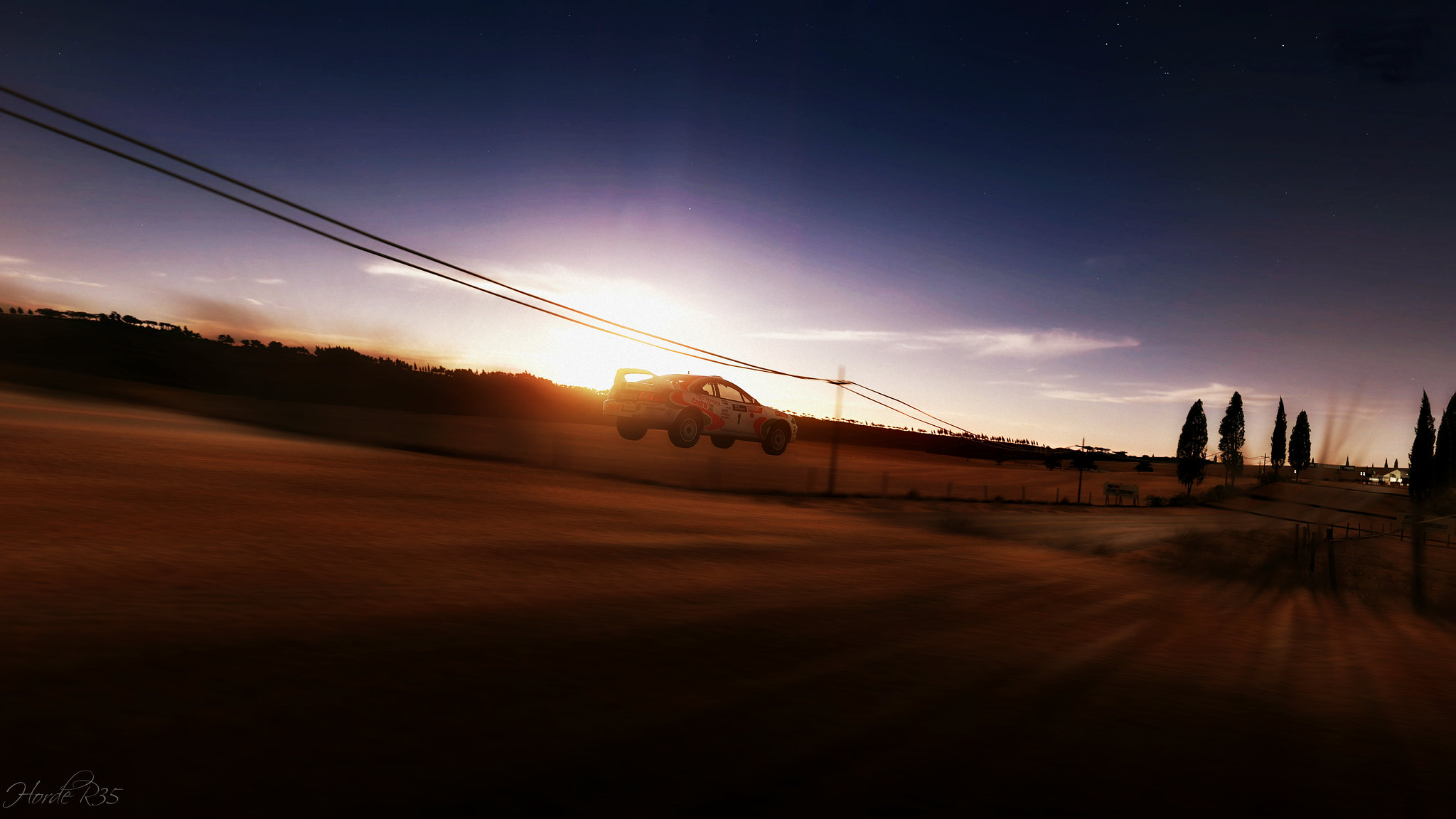
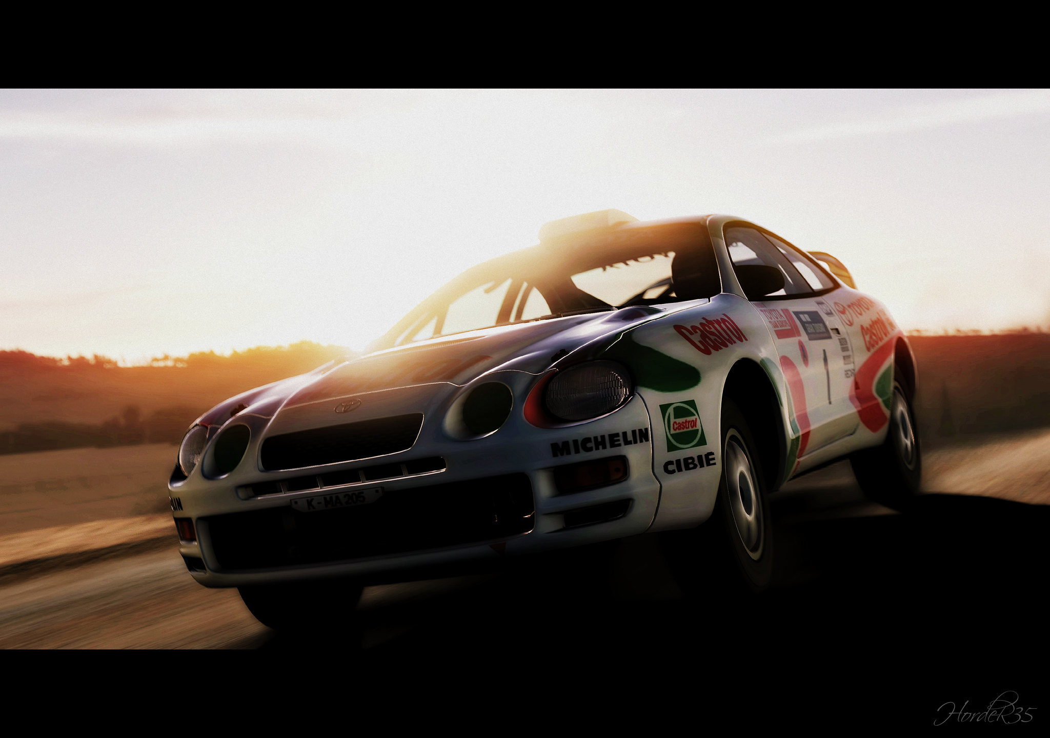
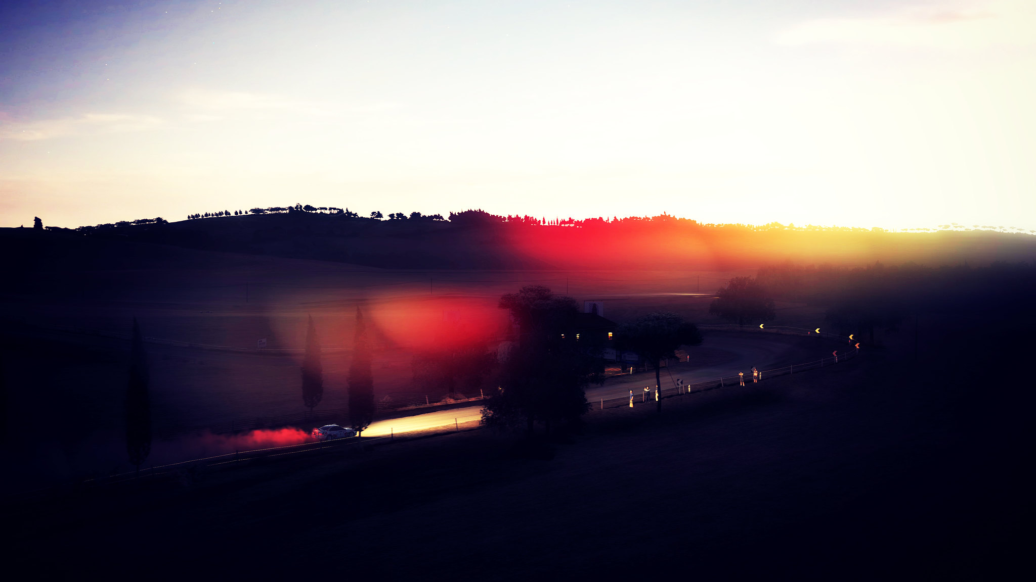
. Hope you like this set:tup:.Toyota Celica
1.

2.

3.

4.

5.

6.

7.

HD Wallpapers
8.
9.

10.
11.
12.

Similar threads
- Replies
- 7
- Views
- 5K
- Poll
- Replies
- 7
- Views
- 2K
- Poll
- Replies
- 16
- Views
- 2K
