POLL: The GT7 Livery Editor Competition #48: Heavy Goods (Open)

Which 3 (THREE) liveries do you think are the best?

  • Entry #1

  • Entry #2

  • Entry #3

  • Entry #4

  • Entry #5

  • Entry #6

  • Entry #7

  • Entry #8

  • Entry #9

  • Entry #10

  • Entry #11

  • Entry #12

  • Entry #13

  • Entry #14


Results are only viewable after voting.
17,600
United Kingdom
United Kingdom
Heavy Goods: The Poll!

1745188203390.png

A reminder of the theme...

I work in a port, and use freight company designs to make my own liveries, now I want to see what others can do. All decals used must be real companies, this goes for main, and secondary sponsors (E-Sport team decals are allowed, if you want to plug your team)

Poll Rules

  • As we have a good turnout of entries you will have THREE votes.
  • Do NOT vote for your own work
  • Do NOT try to sway the poll
  • Winner gets to pick the next theme
  • Ties will be decided by a second poll

The poll closes on: Sunday, 27th April

Good luck everyone!


Poll Option #1

full

full


full

full

_____________________________

Poll Option #2


full

full


_____________________________

Poll Option #3


full

full


full

full

_____________________________

Poll Option #4


full

full


full

full

_____________________________

Poll Option #5


full

full


full

full

_____________________________

Poll Option #6


full

full


full

full

_____________________________

Poll Option #7


full

full


_____________________________

Poll Option #8


full

full


full

full

_____________________________

Poll Option #9


_____________________________

Poll Option #10


full

full


full

full

_____________________________

Poll Option #11


_____________________________

Poll Option #12


full

full


full

full

_____________________________

Poll Option #13


full

full


_____________________________

Poll Option #14


full

full


full

full

_____________________________
 
Interesting selection of entries this time around, I wasn't sure how this one would go down, so I'm pleased with the turnout.

As I'm hoping to promote a bit more dialogue in these threads... these are my thoughts on all the liveries... Just my thoughts, tryna' be honest, if you disagree with something I've said, please mention it below....

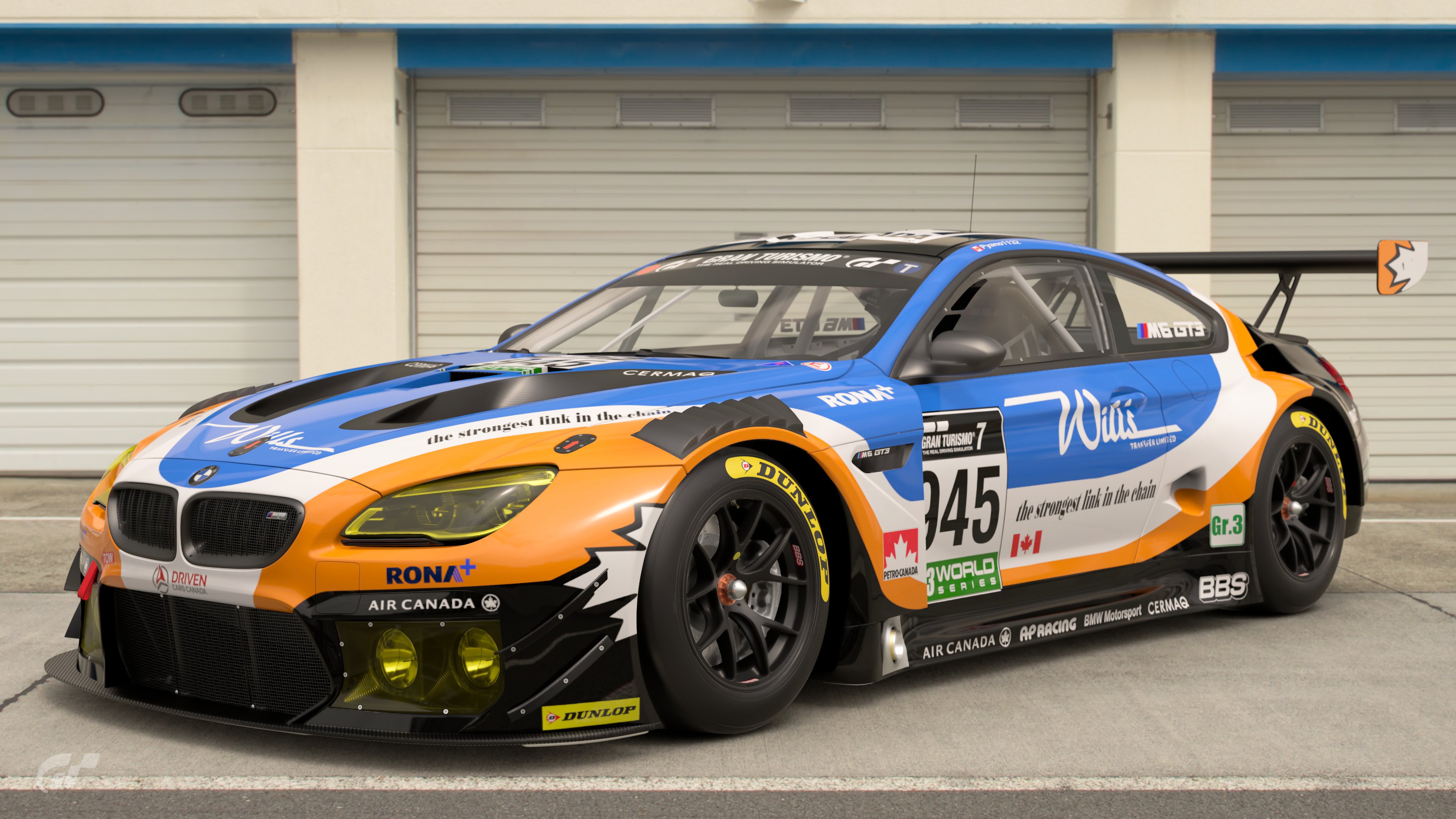
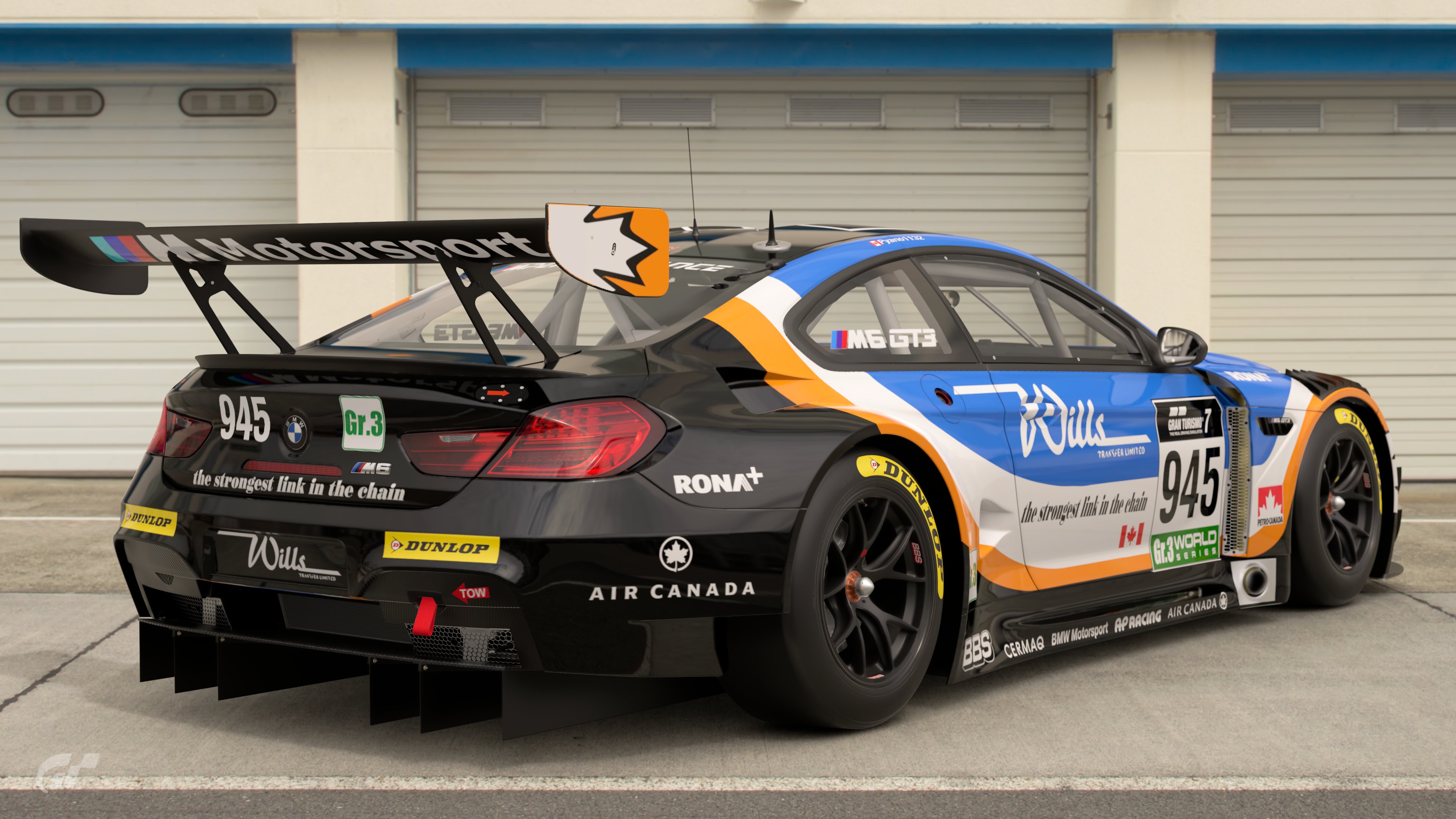
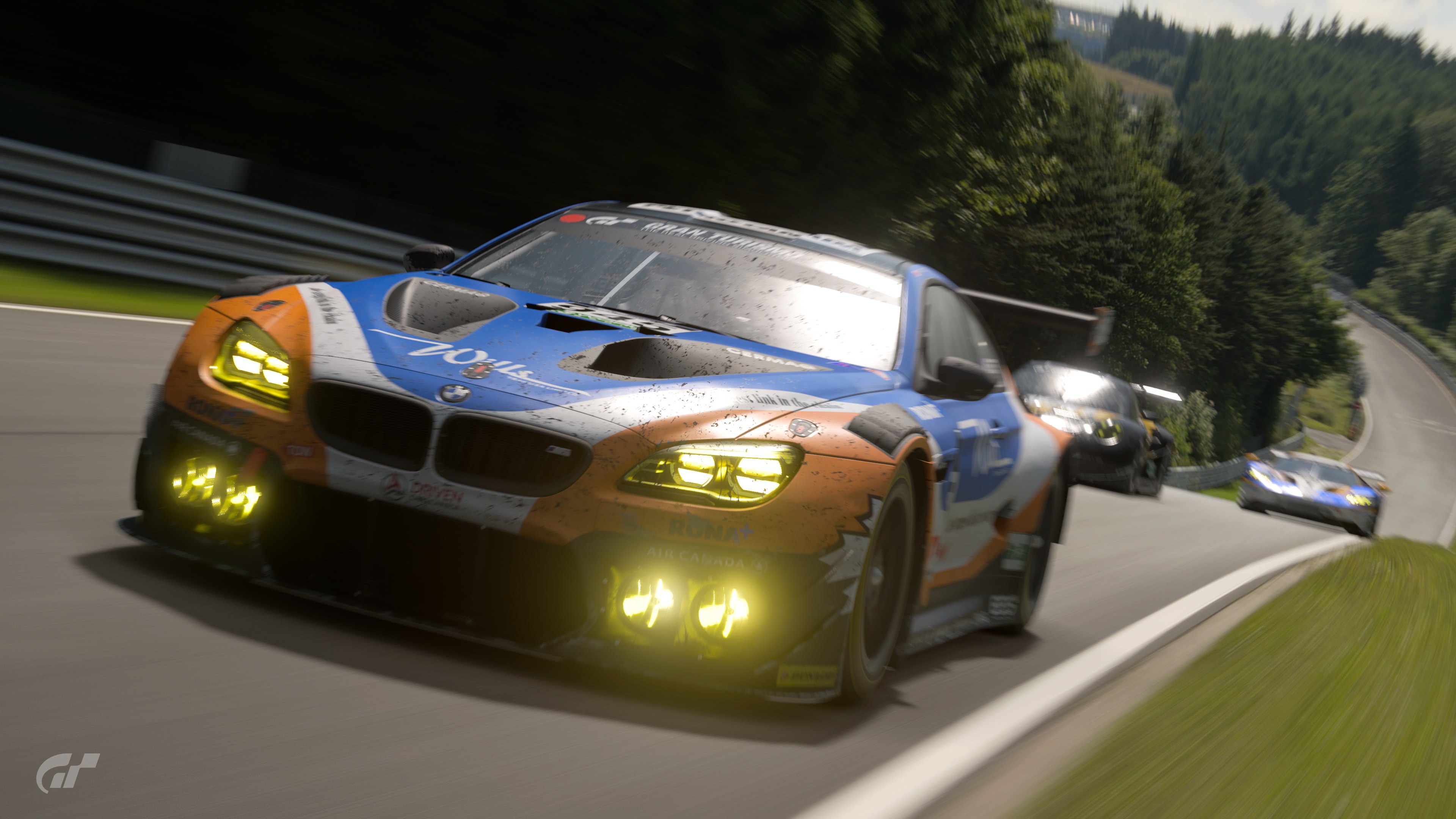
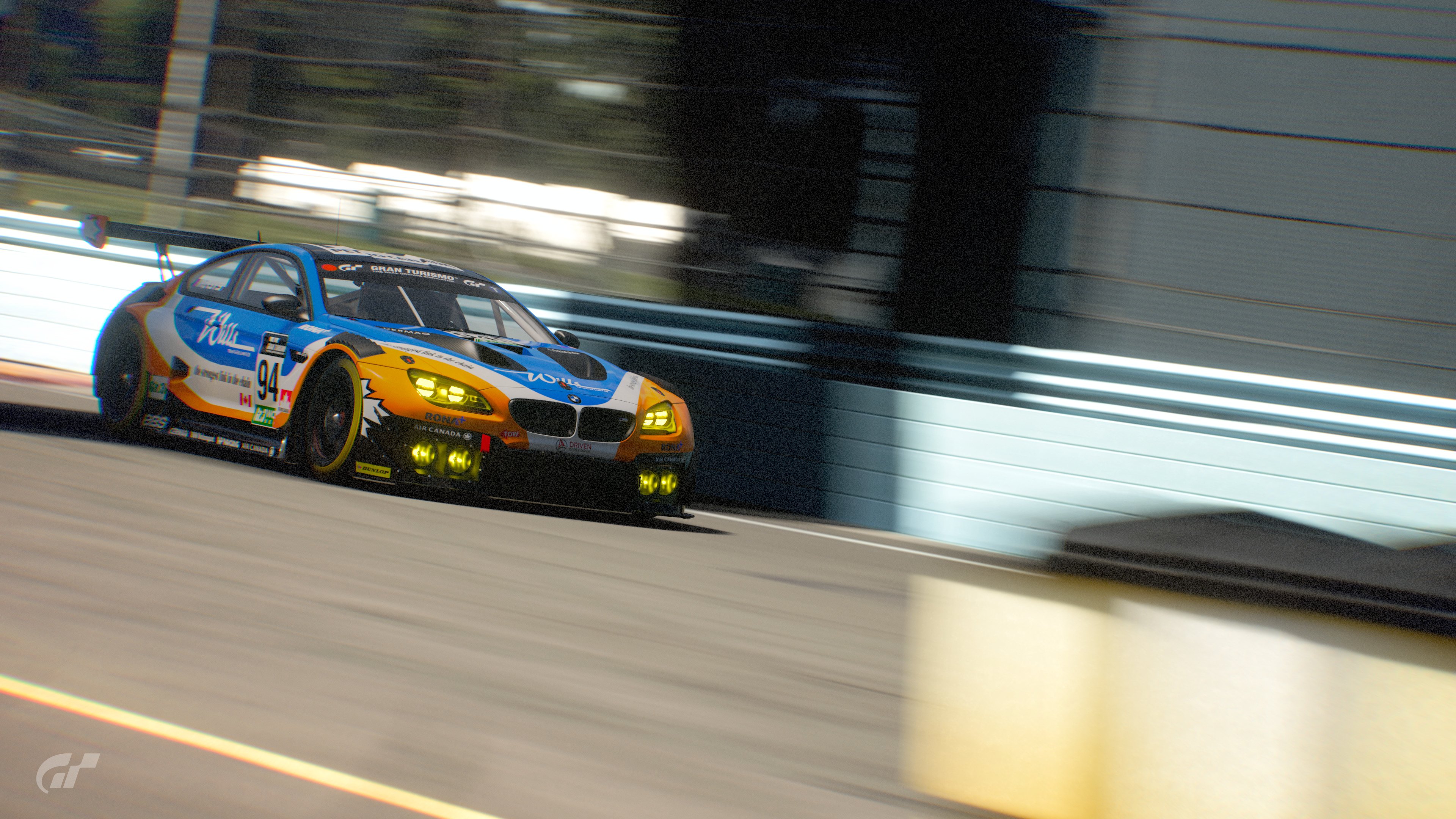
Wills Transfer M6
I don't know the brand, but it works as a livery - reminiscent of some of the early M6 GT3 liveries from Spa.

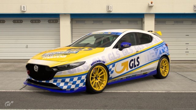
GLS Mazda
Looks fine, like it could be a Touring car from a small team, but it doesn't carry the details that would make it appear to be race ready in such a series.

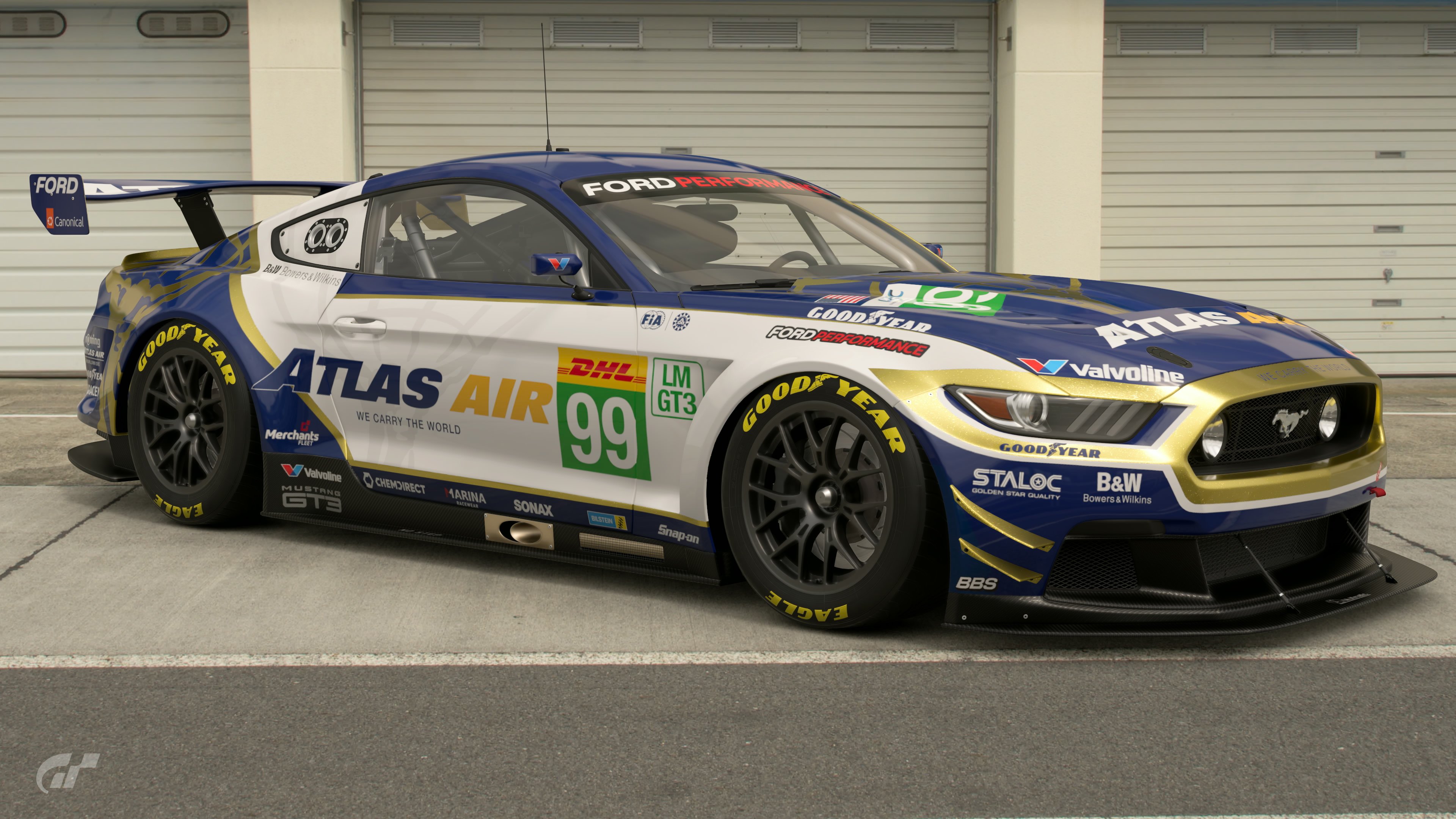
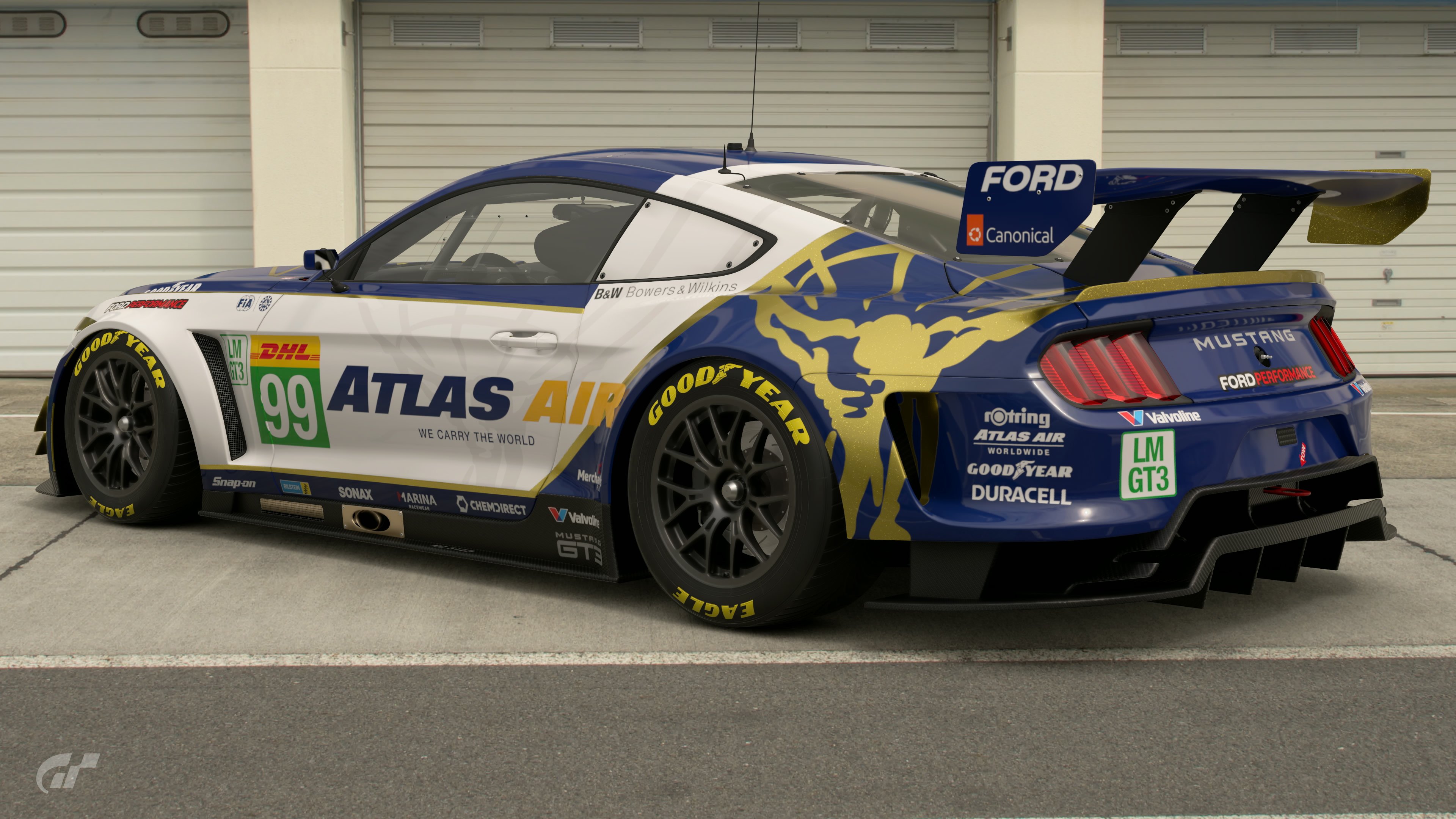
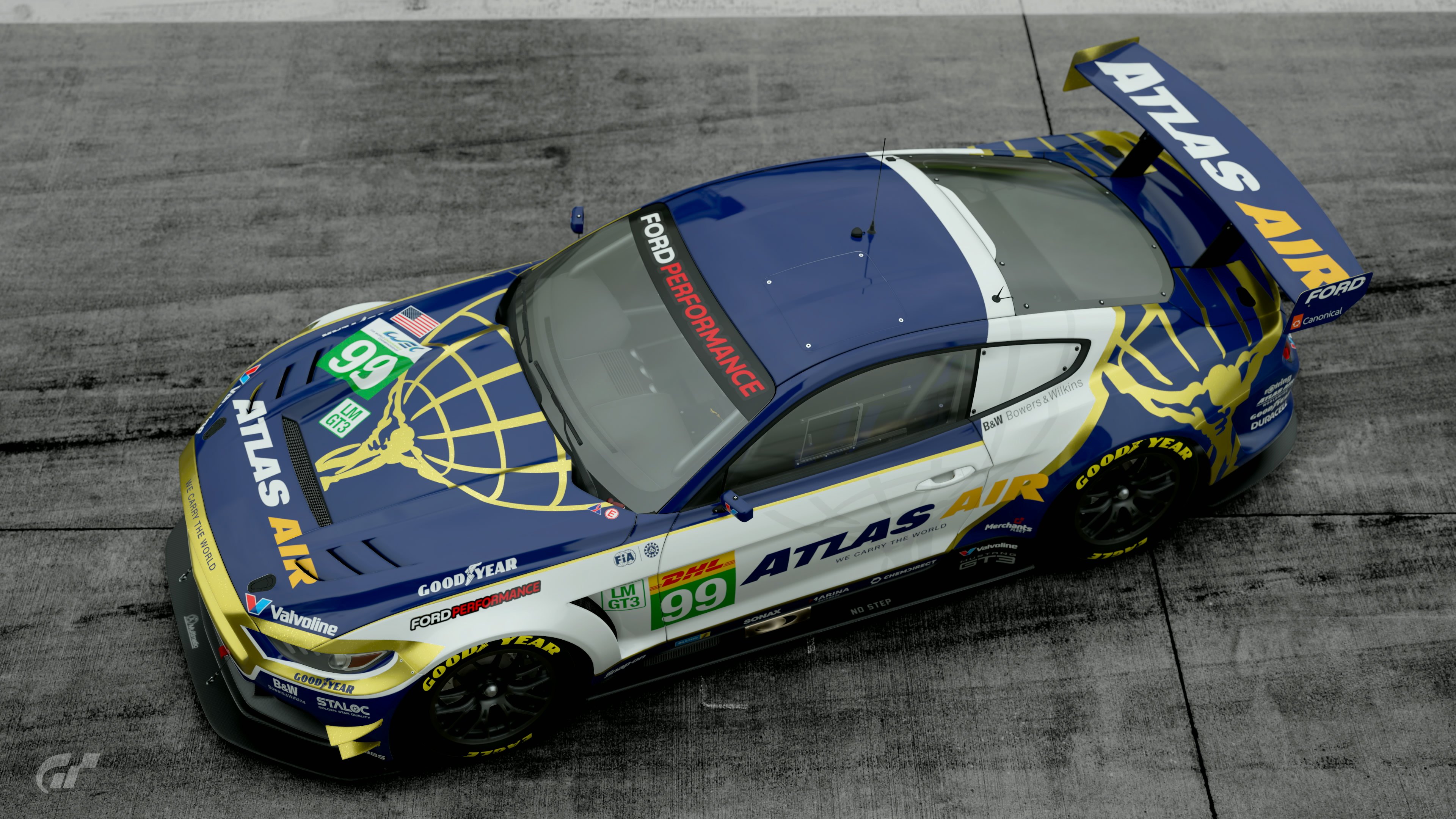
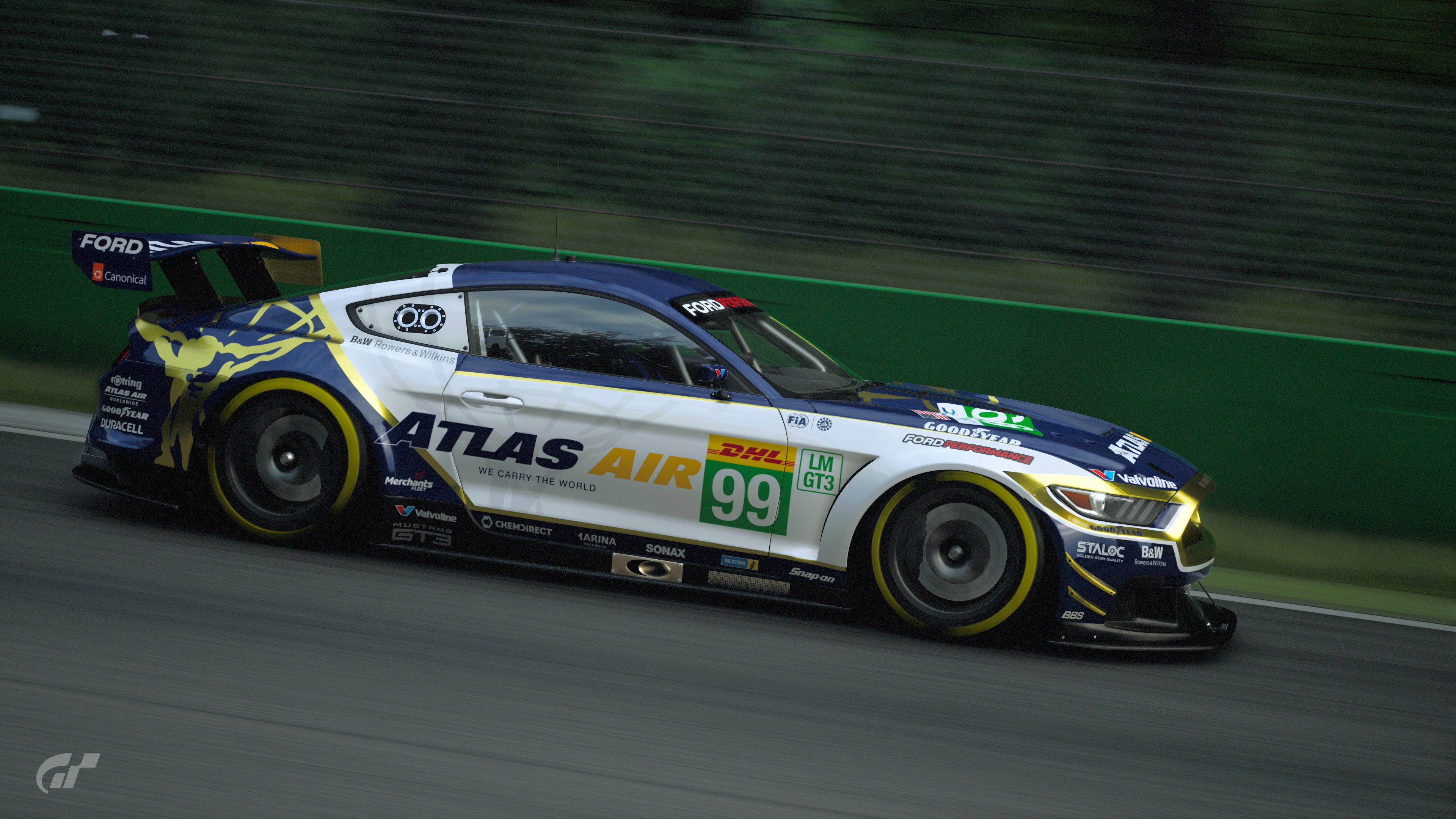
Atlas Air Mustang
Again, I don't know the brand. Looks good though and the the masking work earns it one of my votes.

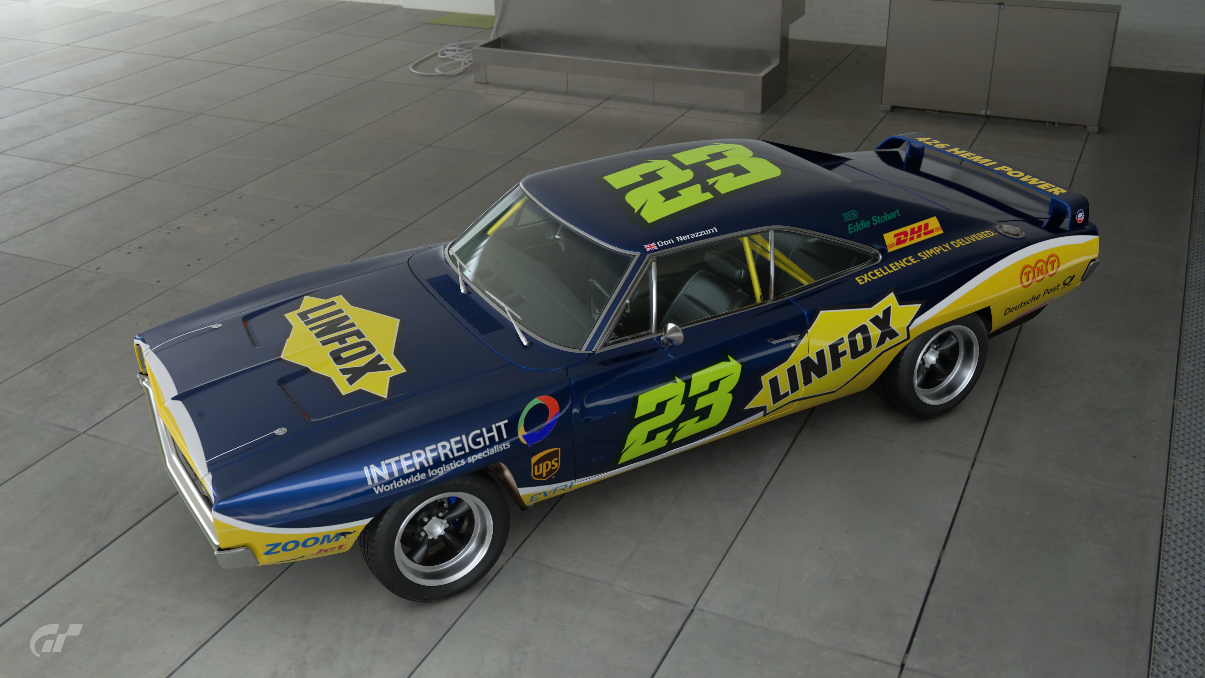
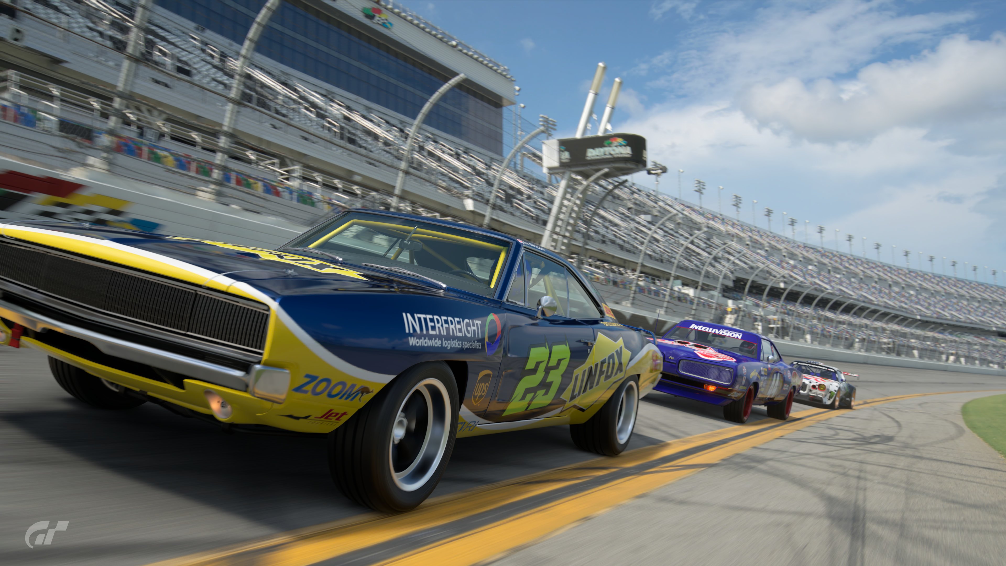
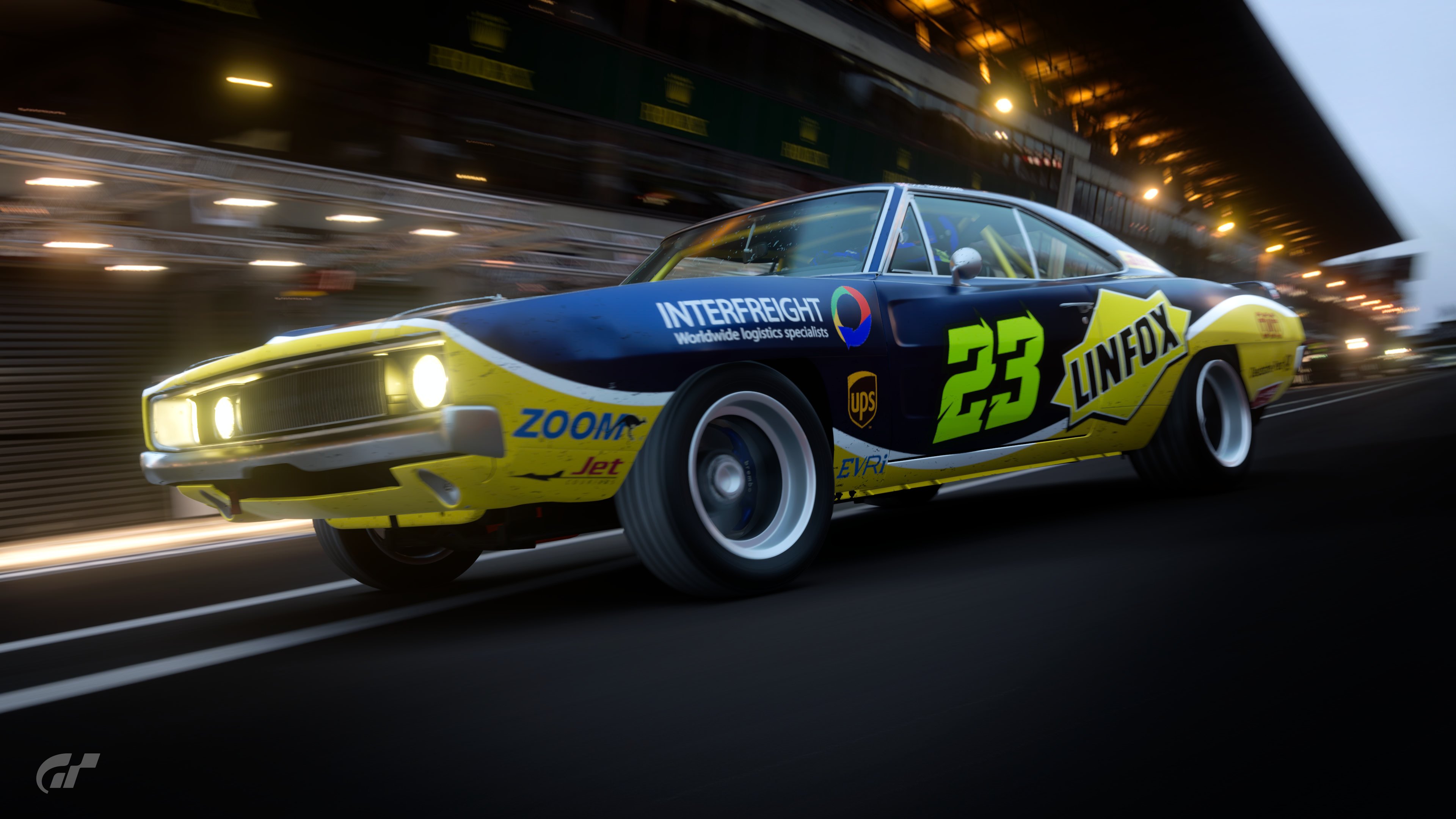
Linfox Charger
I really like this, but mostly the addition of the other freight companies as secondary decals made much less sense to me. I think also since it's kinda pitched as a NASCAR it would have had the clusters of series sponsors that might have helped carry the look.

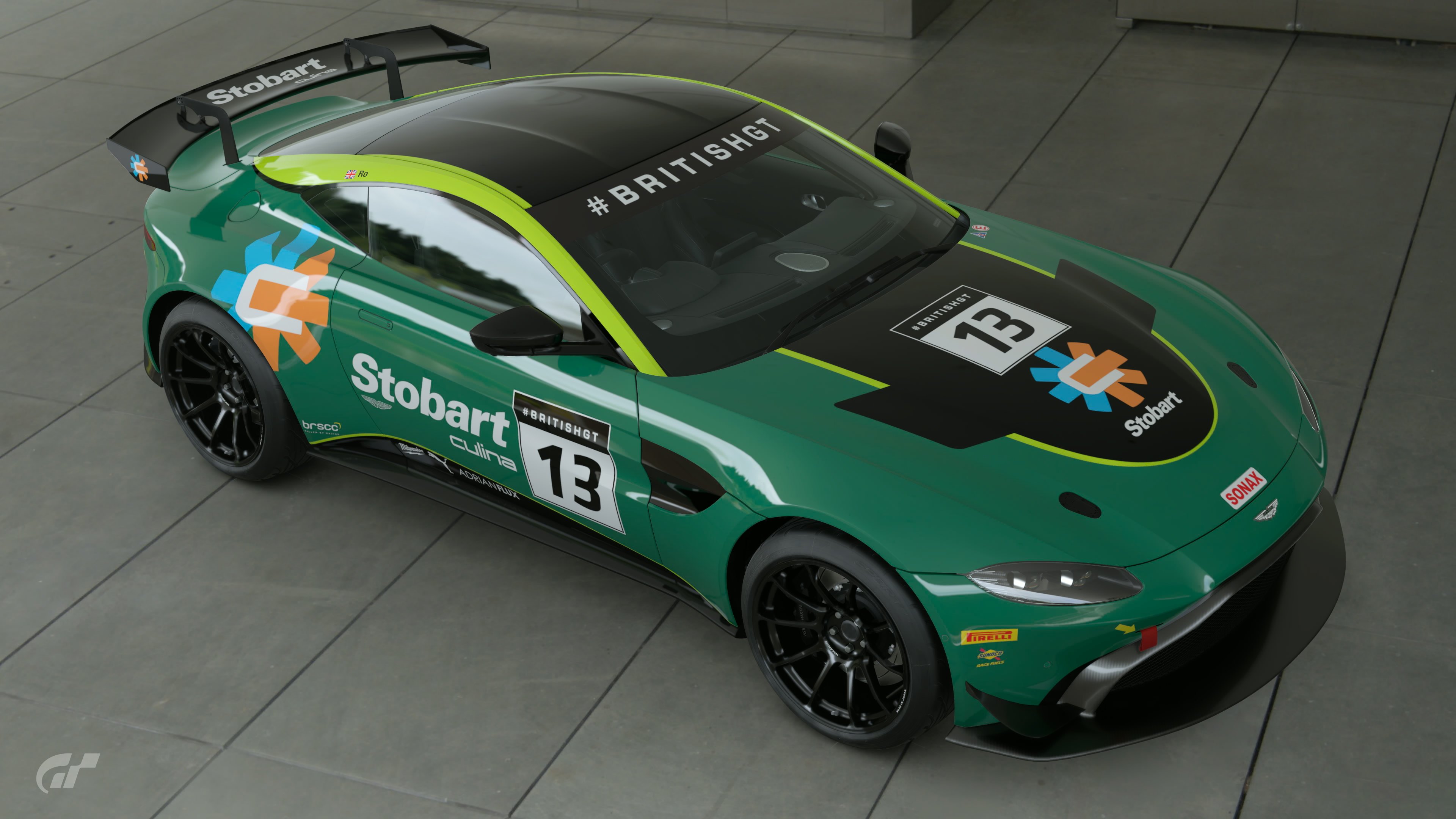
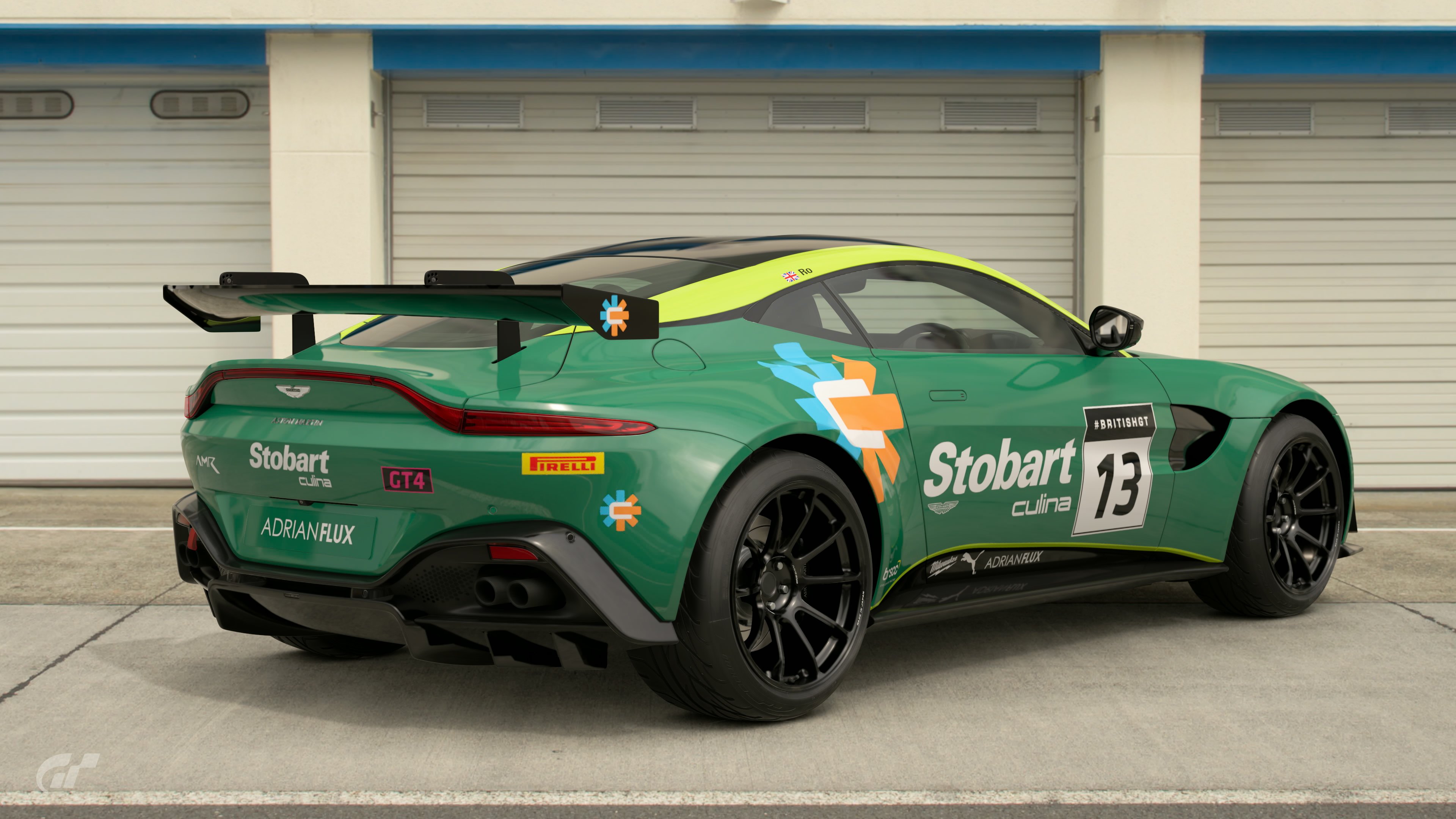
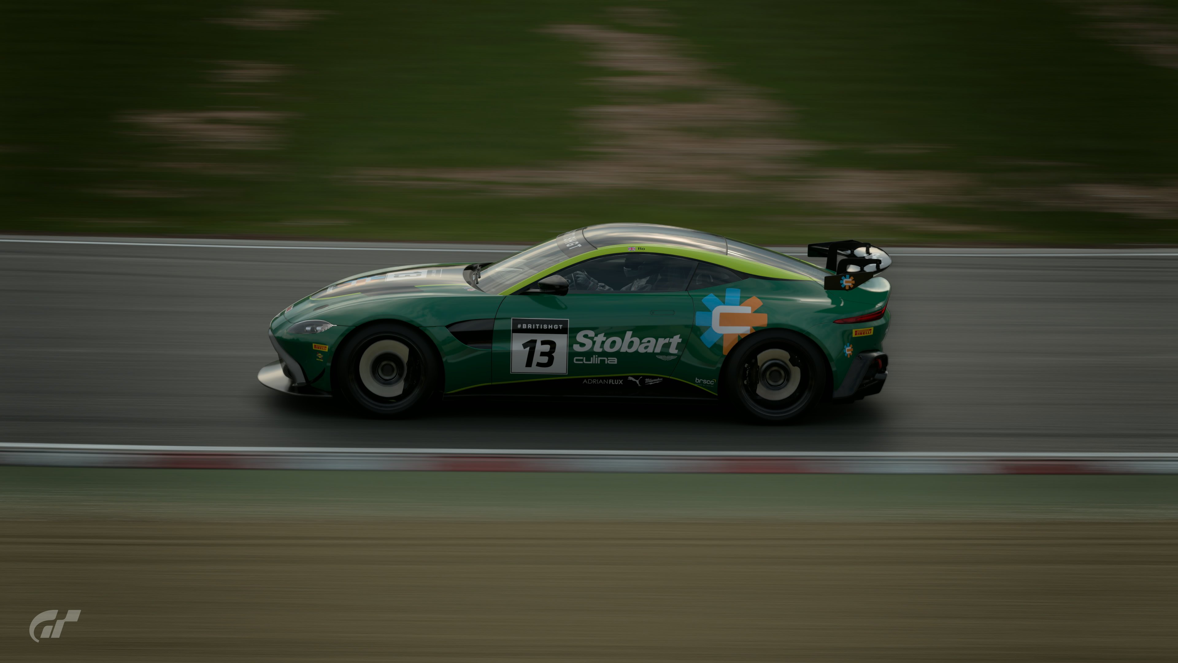
Stobart Aston
As someone that lives in the Midlands, it had occurred to me to do Stobart, I like the idea - it makes so much sense as a GT4, and the green works well with both Stobart and Aston, there could just have been a bit more to it.

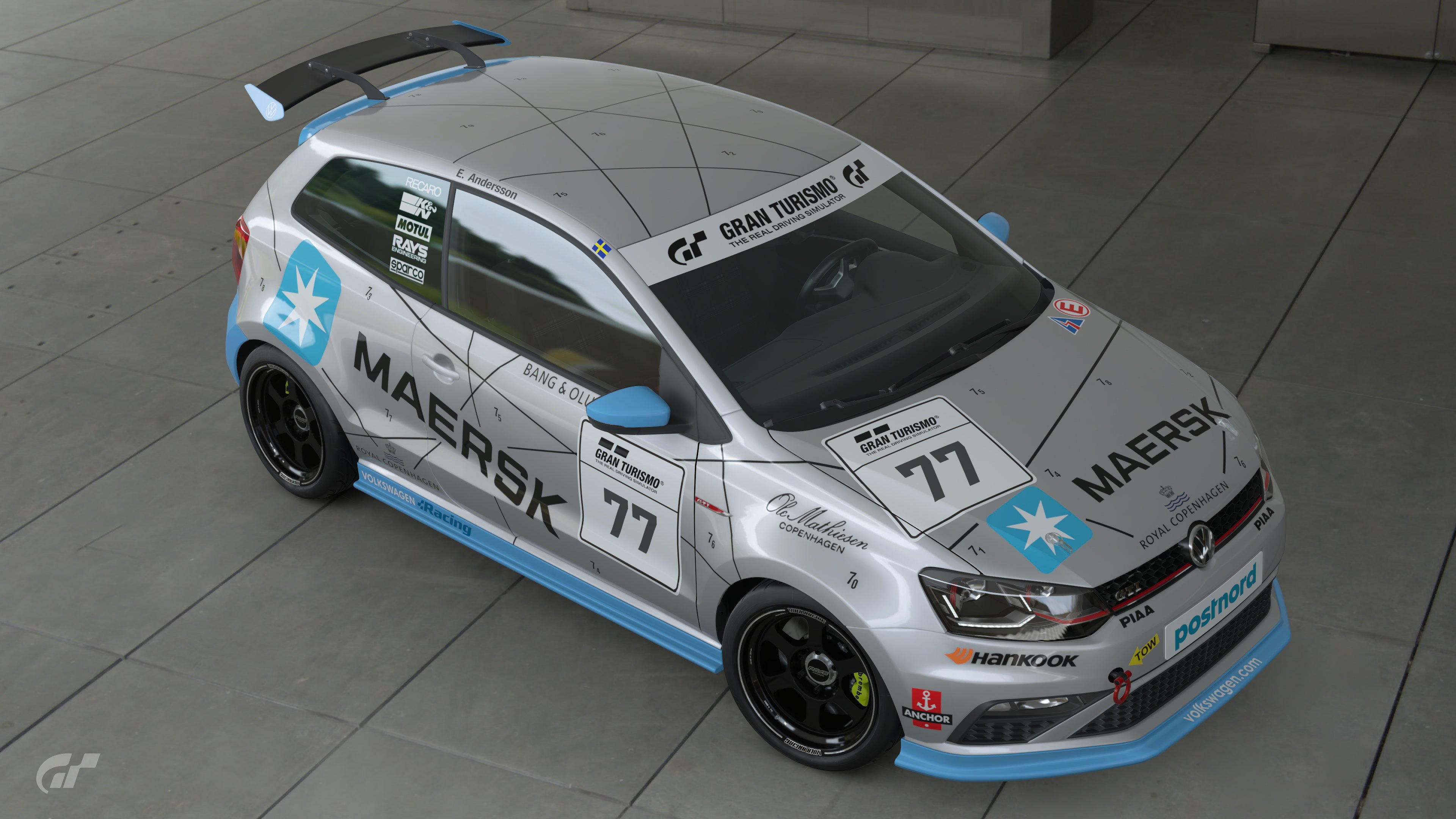
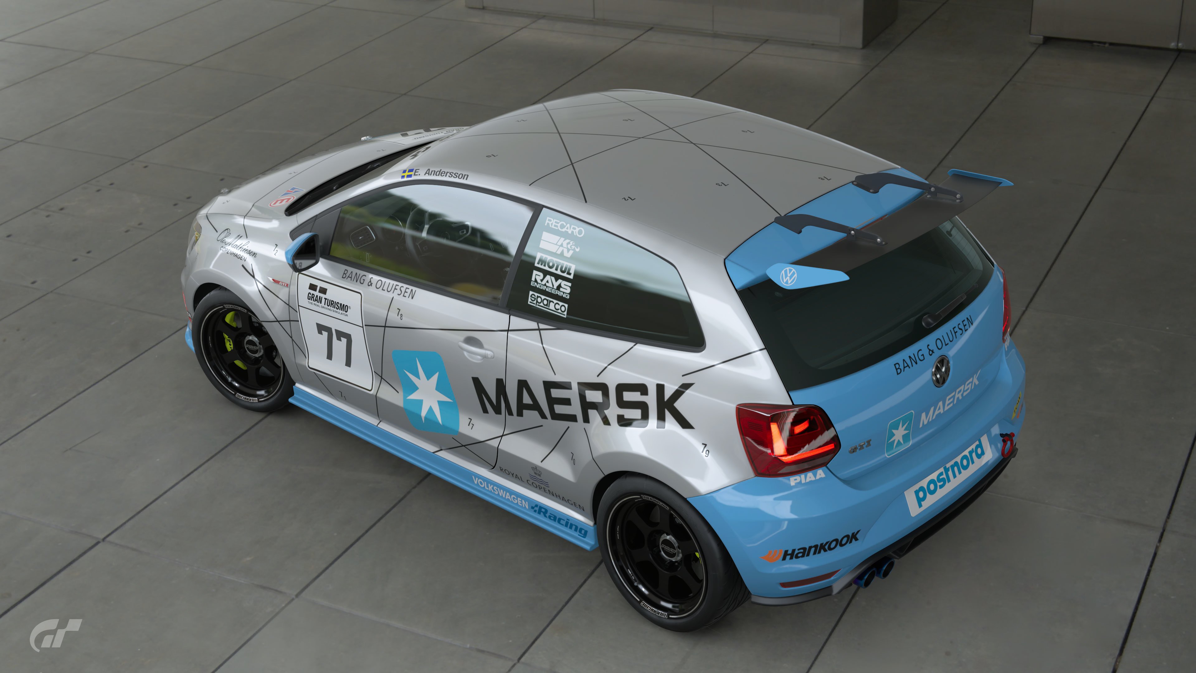
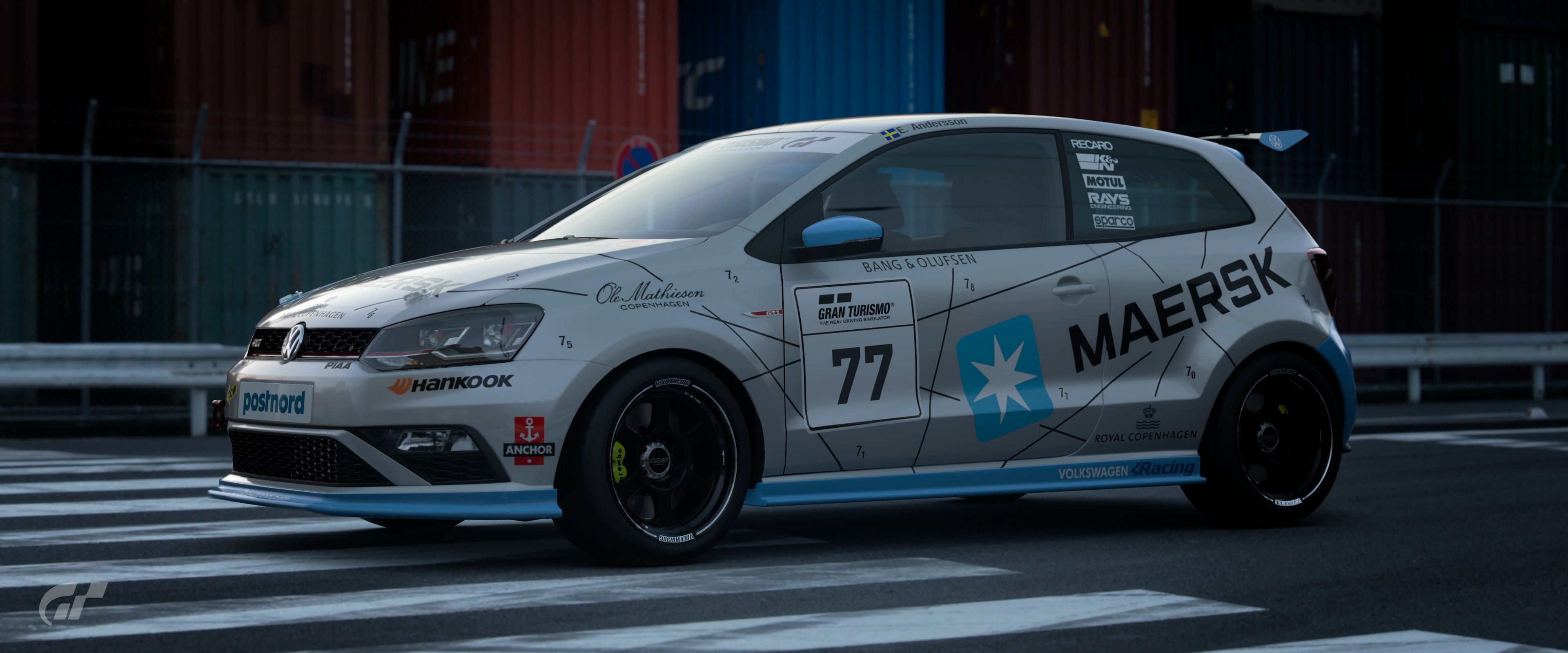
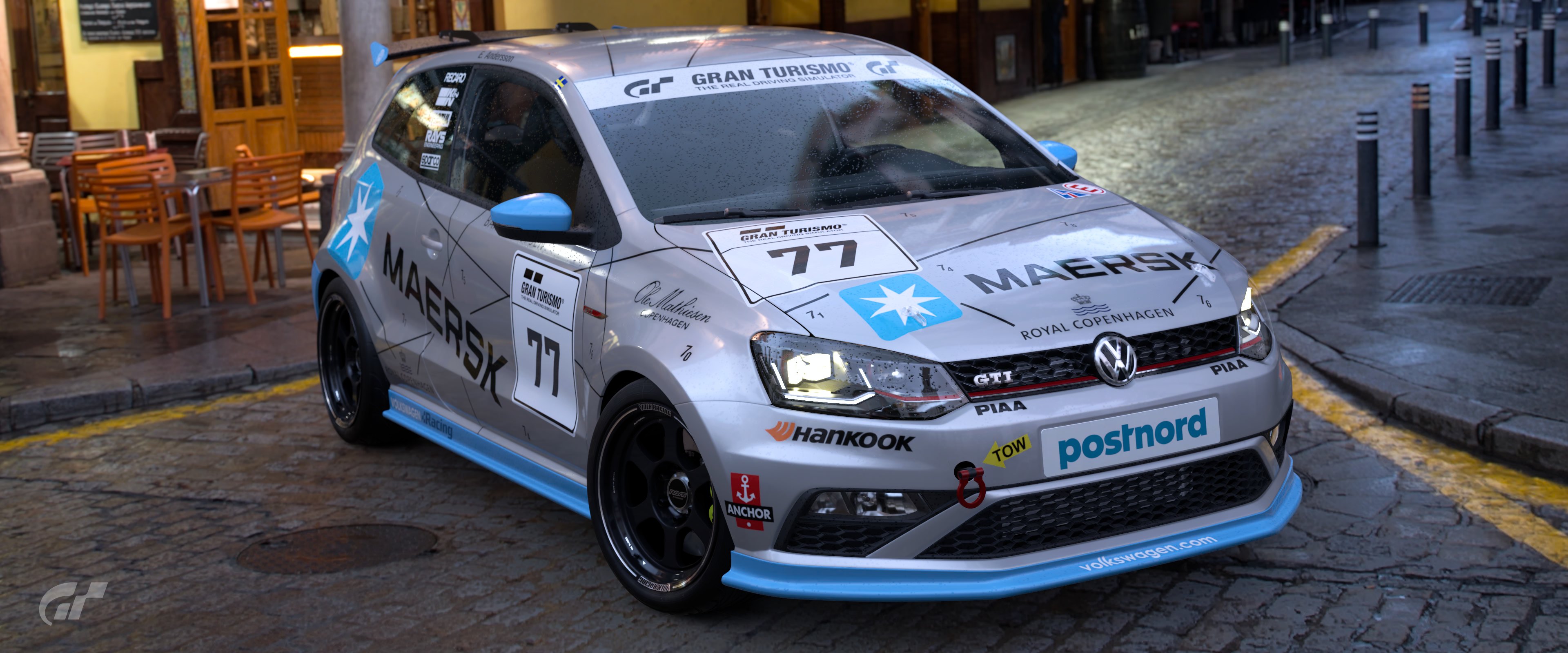
Maersk Polo
Maersk was my first thought for this. It's simple, I like the idea behind the non-logo element of the car (being the shipping routes). I could see it being some kind of STCC support race series or something.

P & O XJ220
Nice simple livery, I think my only issues were the use of the a newer P & O logo (versus the early 90's era of the car), and the fact it's pitched as a Japanese racer... contemporary British GT racing with logos to suit would have worked better in my humble opinion

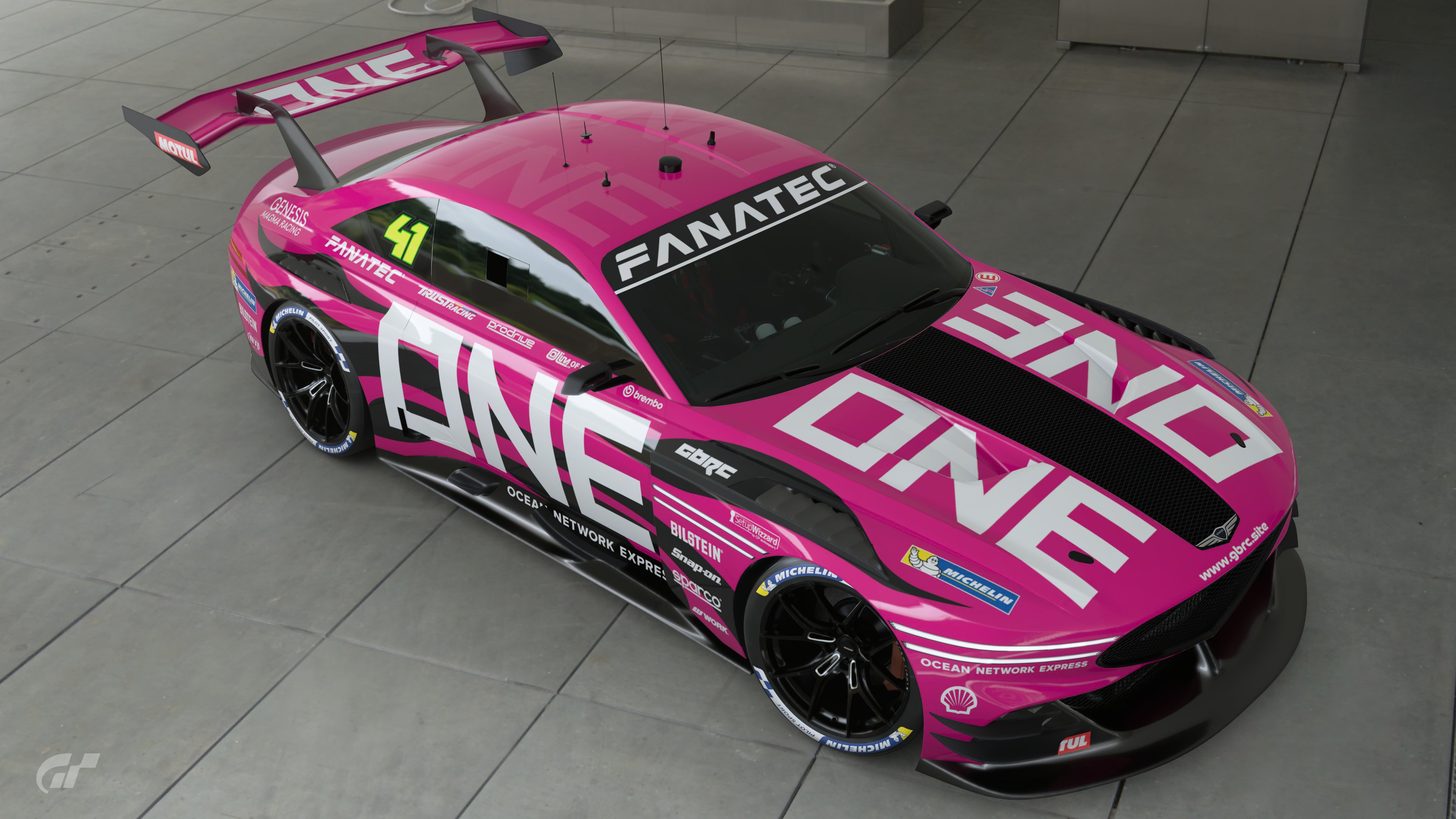
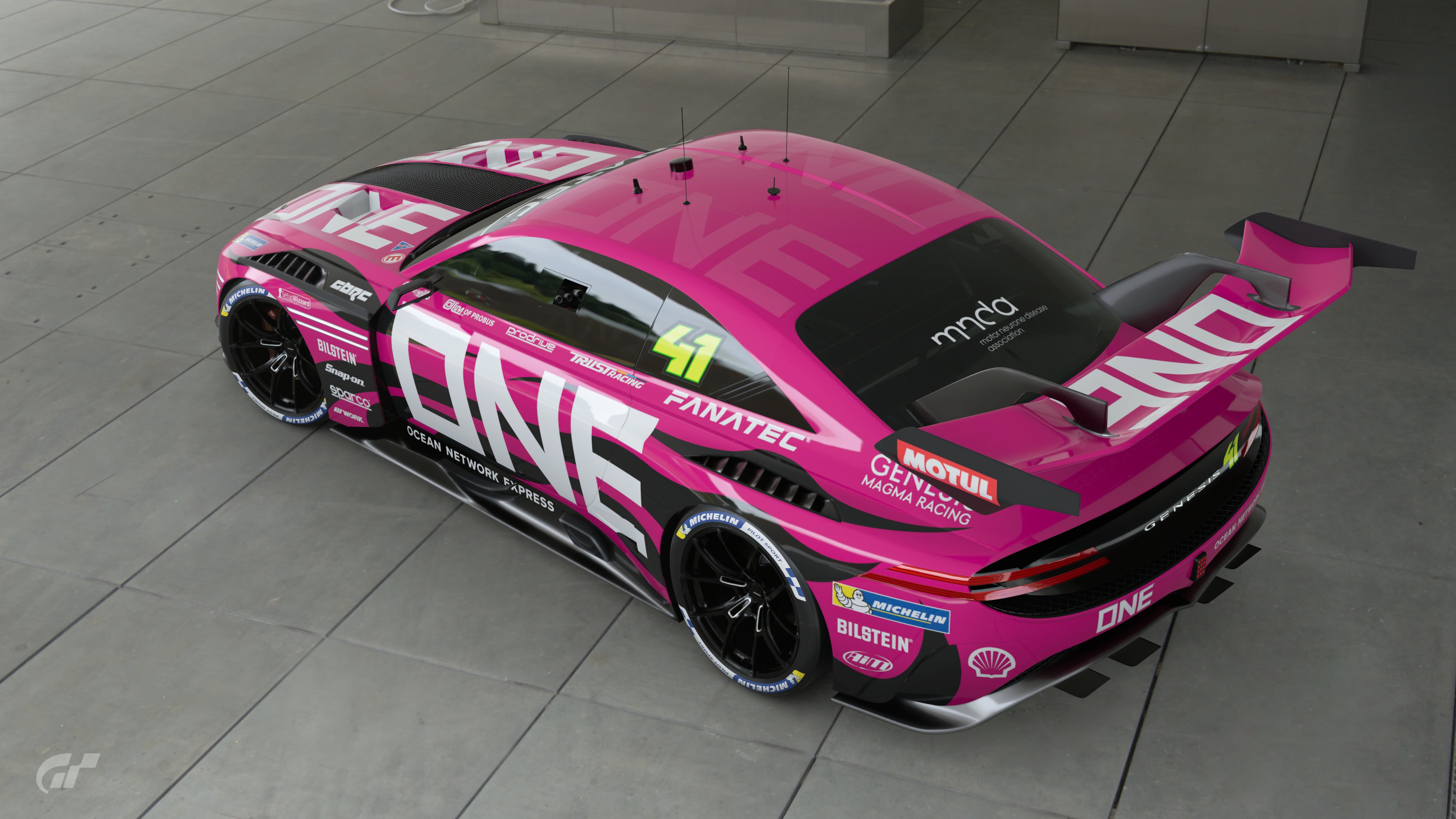
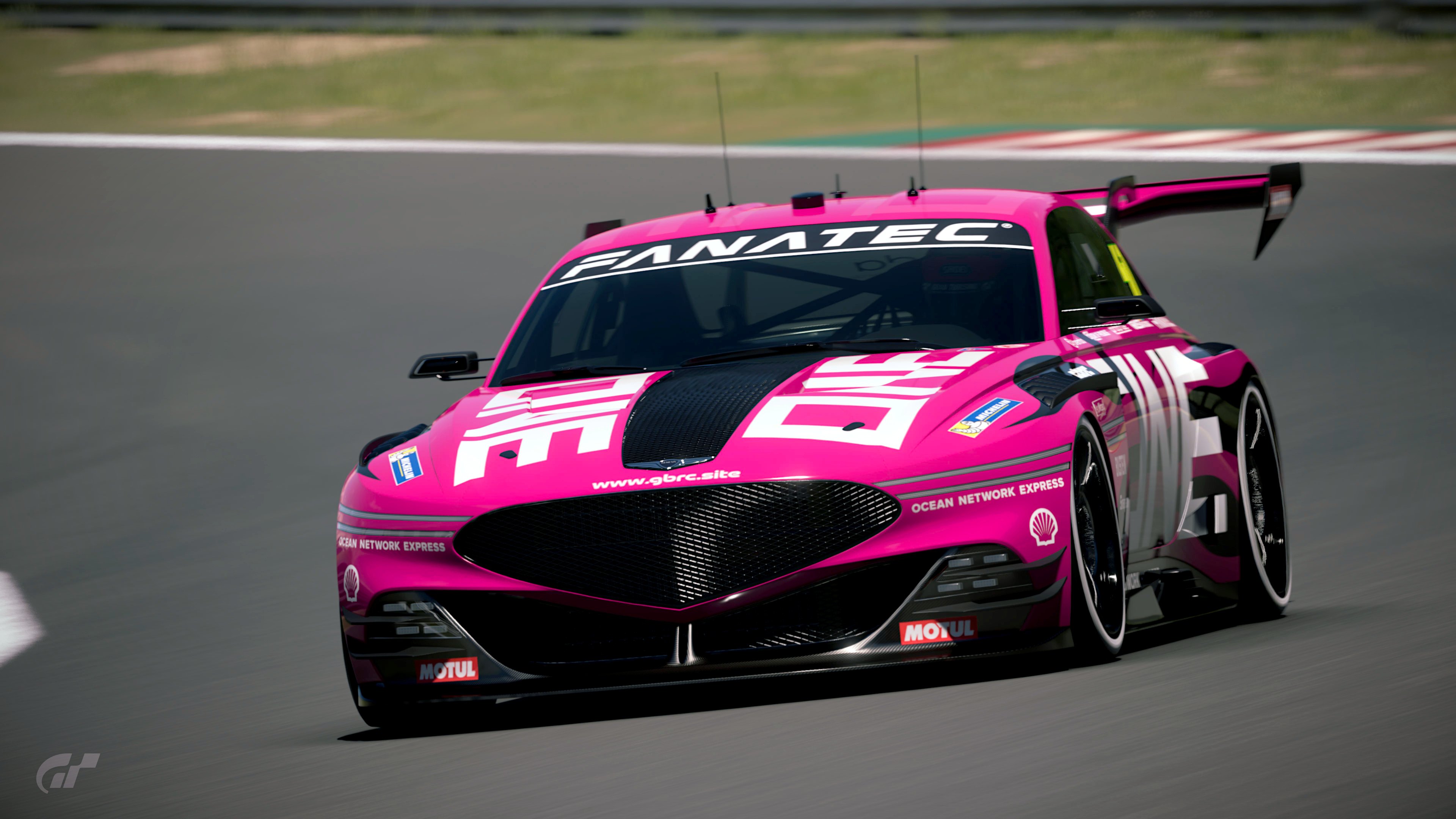
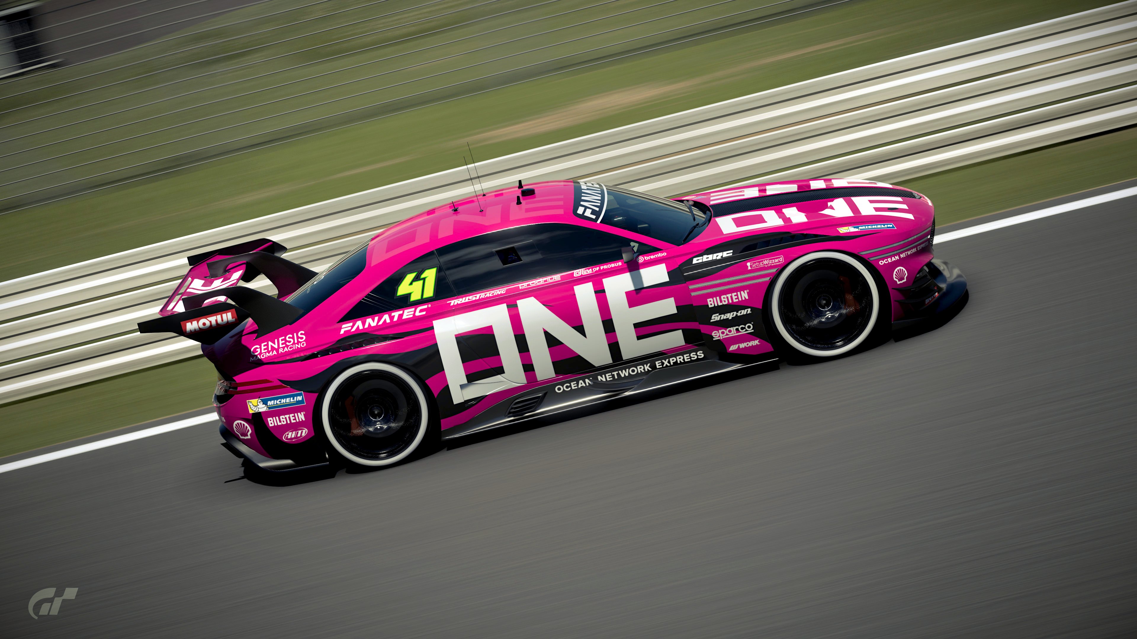
ONE Genesis
Just really strong and simple. Doesn't carry the branding of series that would validate it as a real world racer, but it's very close. It just works for me.

Hapag-Lloyd Porsche
Hapag were also one of my shortlist to do... along with the Container-esque paint job (which is what I was going to do with my Maersk idea), so I like it, but the Blue/Orange isn't at all what associate with Hapag_lloyd, and I'd have used the container markings to do something more relevant to racing. Cool though, very much looks like it would be at home on a Porsche Supercup Grid.

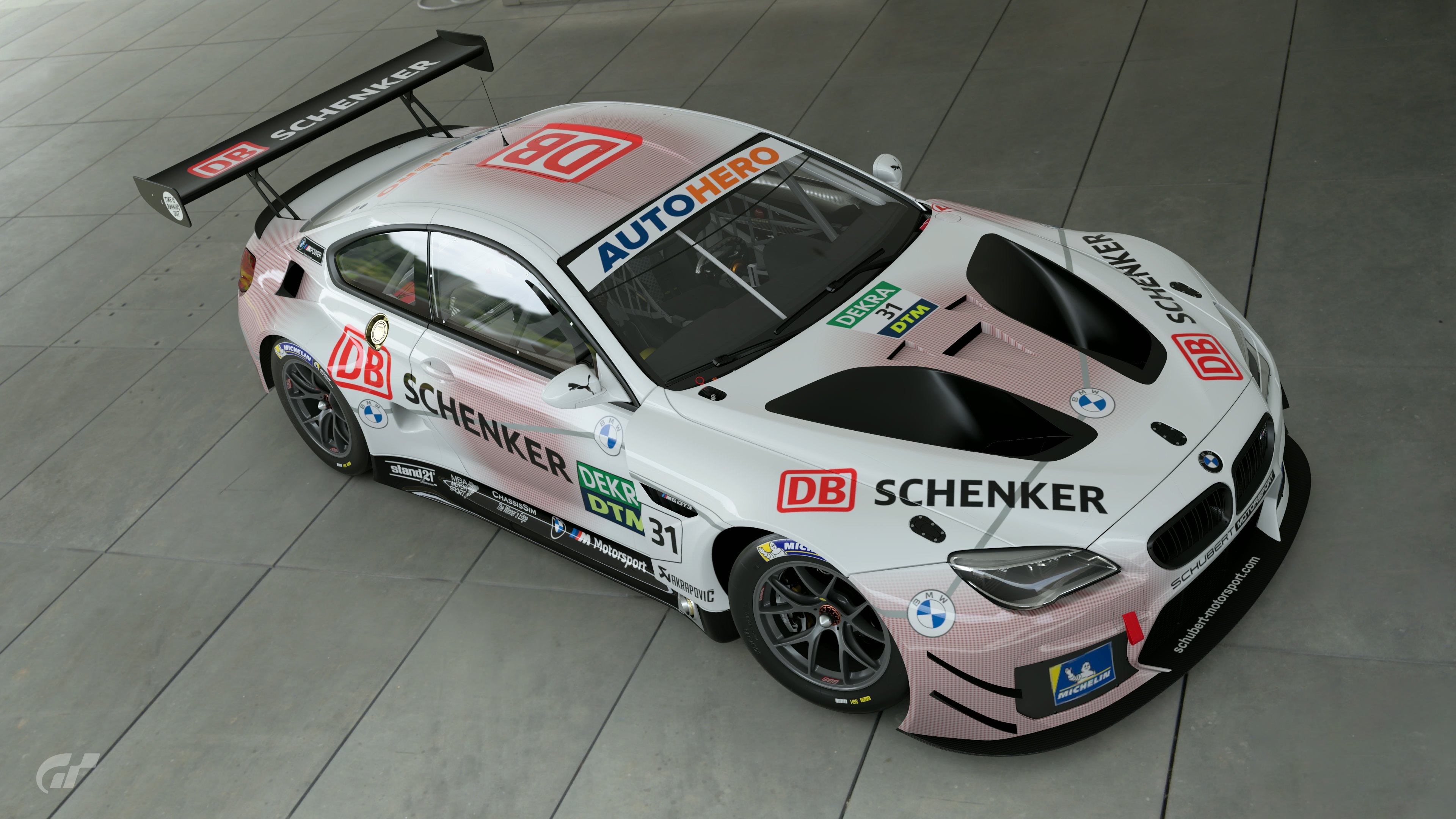
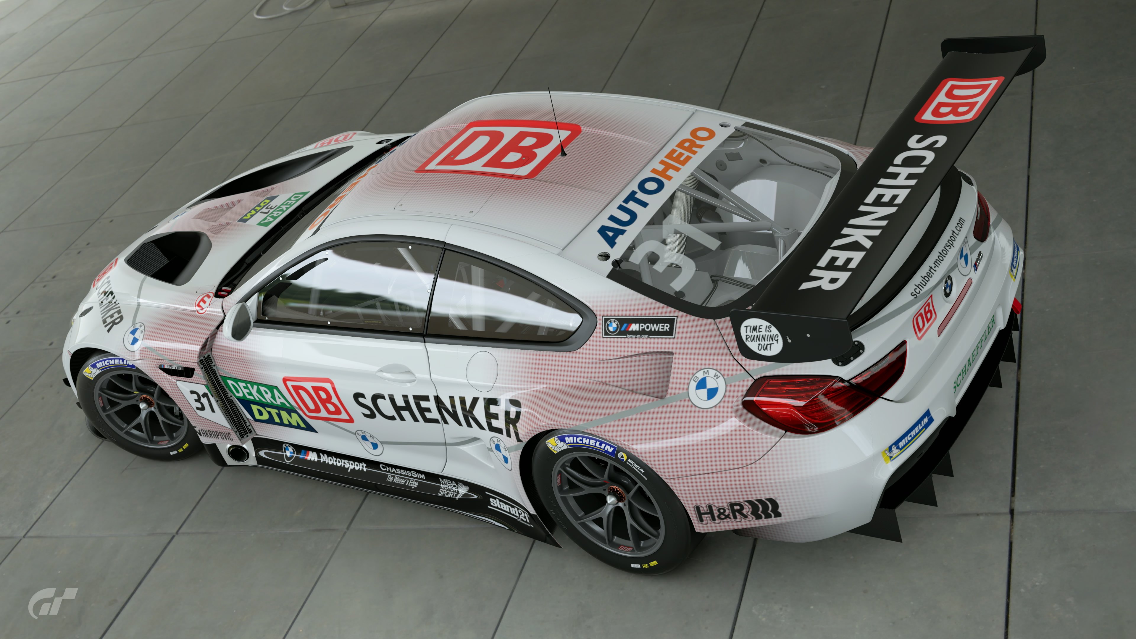
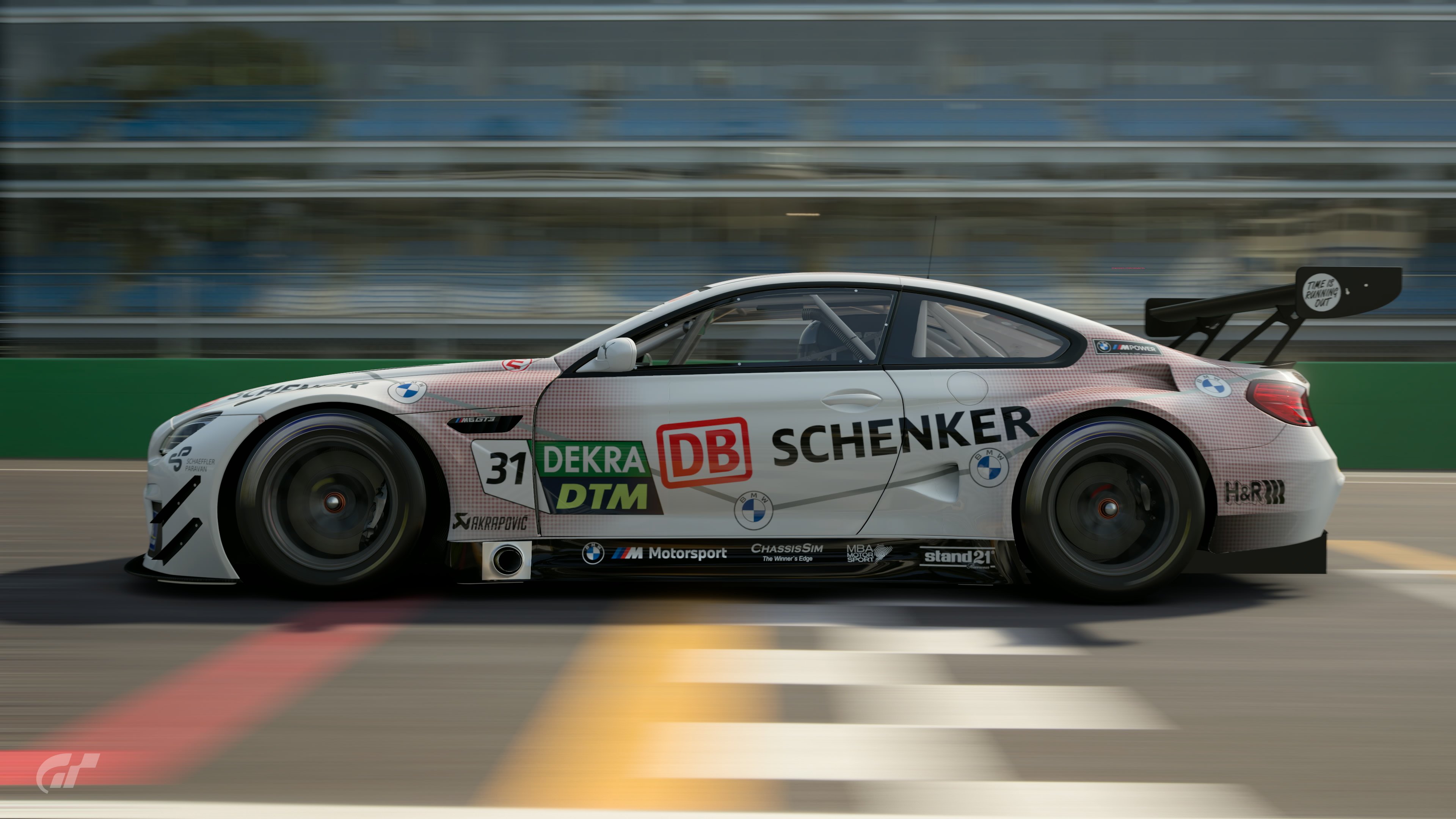
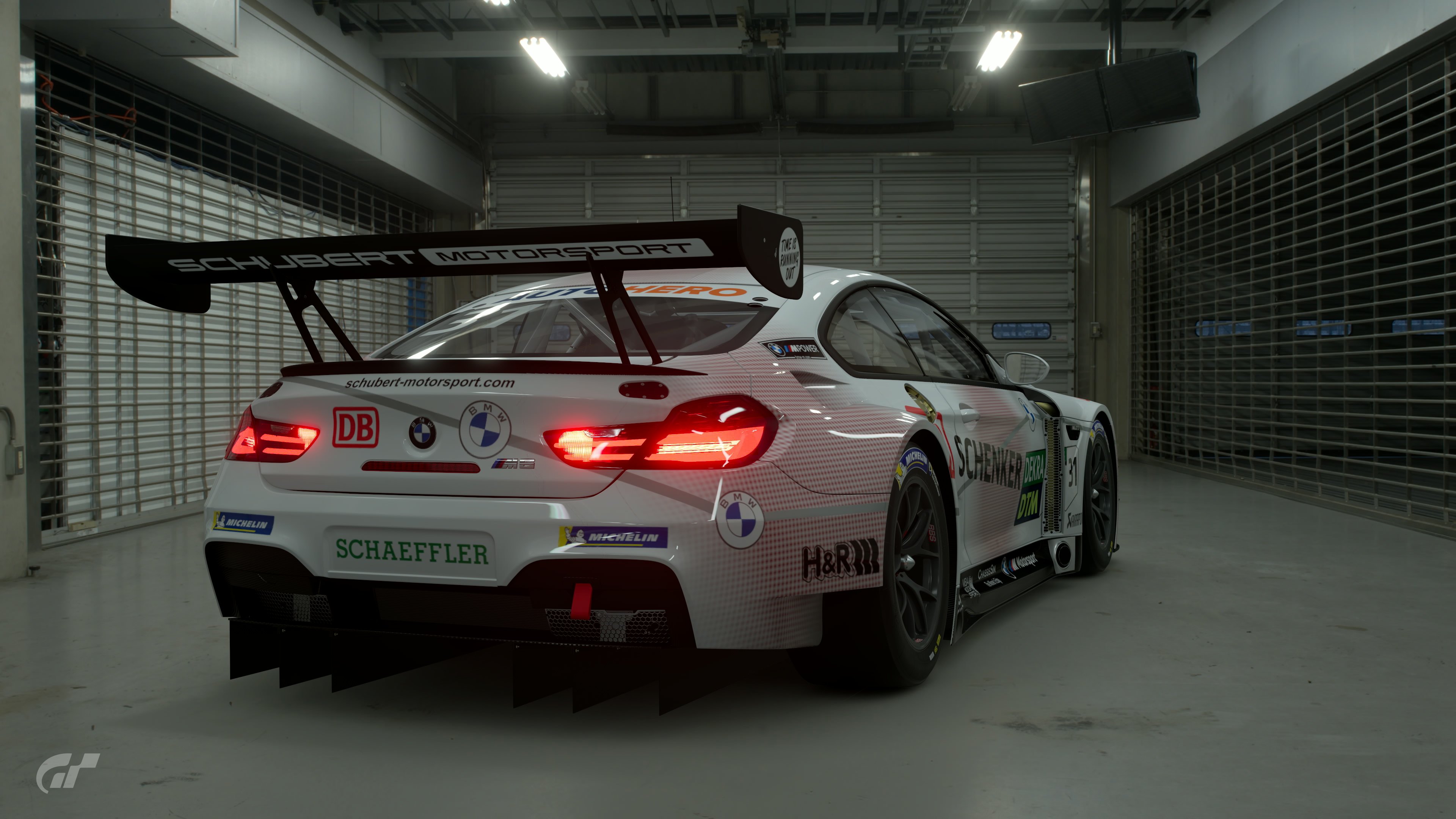
DB Schenker M6
Awful, tired, derivative idea from someone that can't see past the BMW badge. Aside from some fancy attempts at layering decals its clear that this livery was a make-it-up-as-you-go-along-job. 0/10 would not recommend.

Rock-It Civic
Strong and simple, pitched at the right level (i.e. the BTCC racer), I liked it, there just wasn't quite enough to it as a livery - maybe too simple.

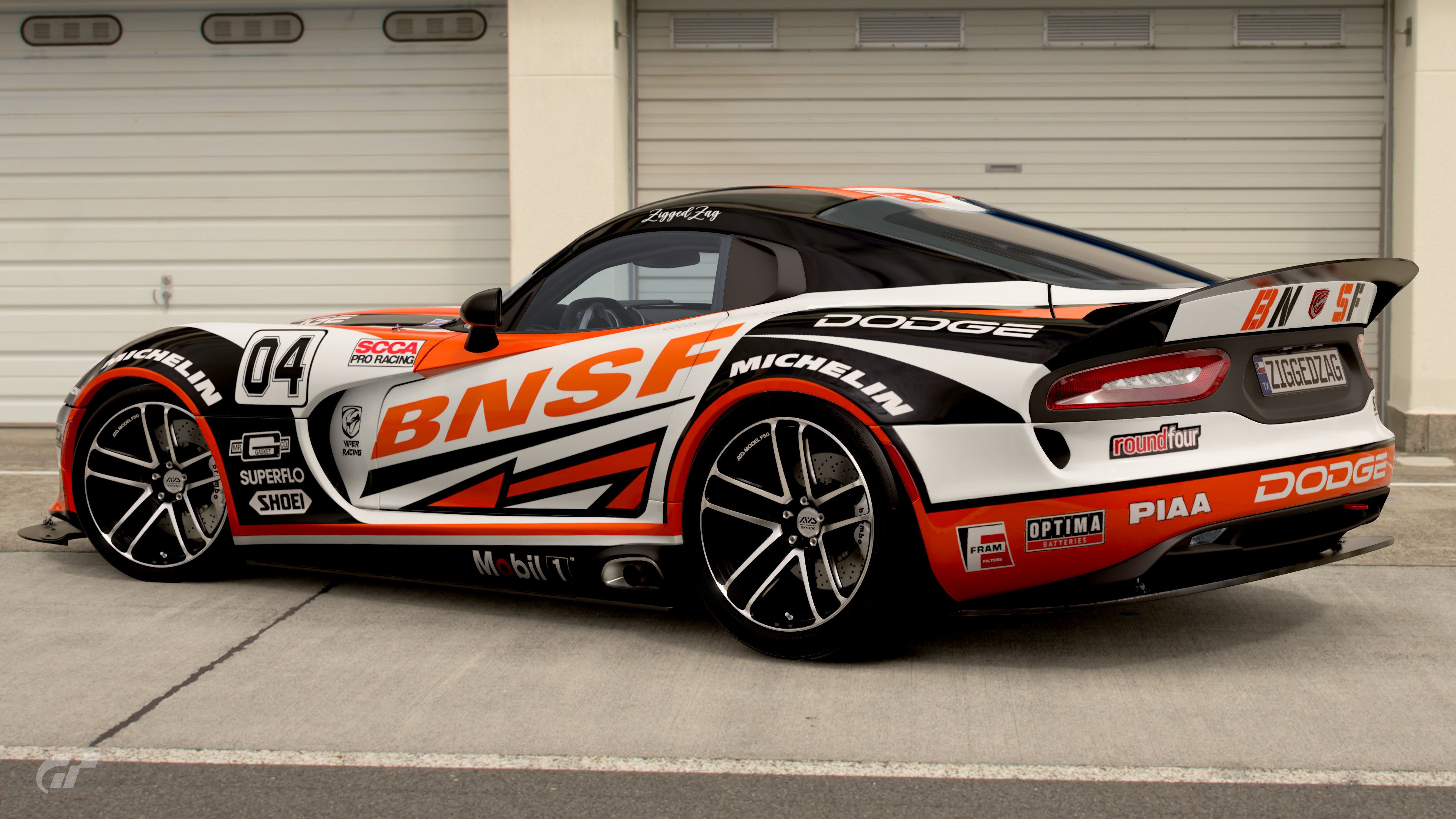
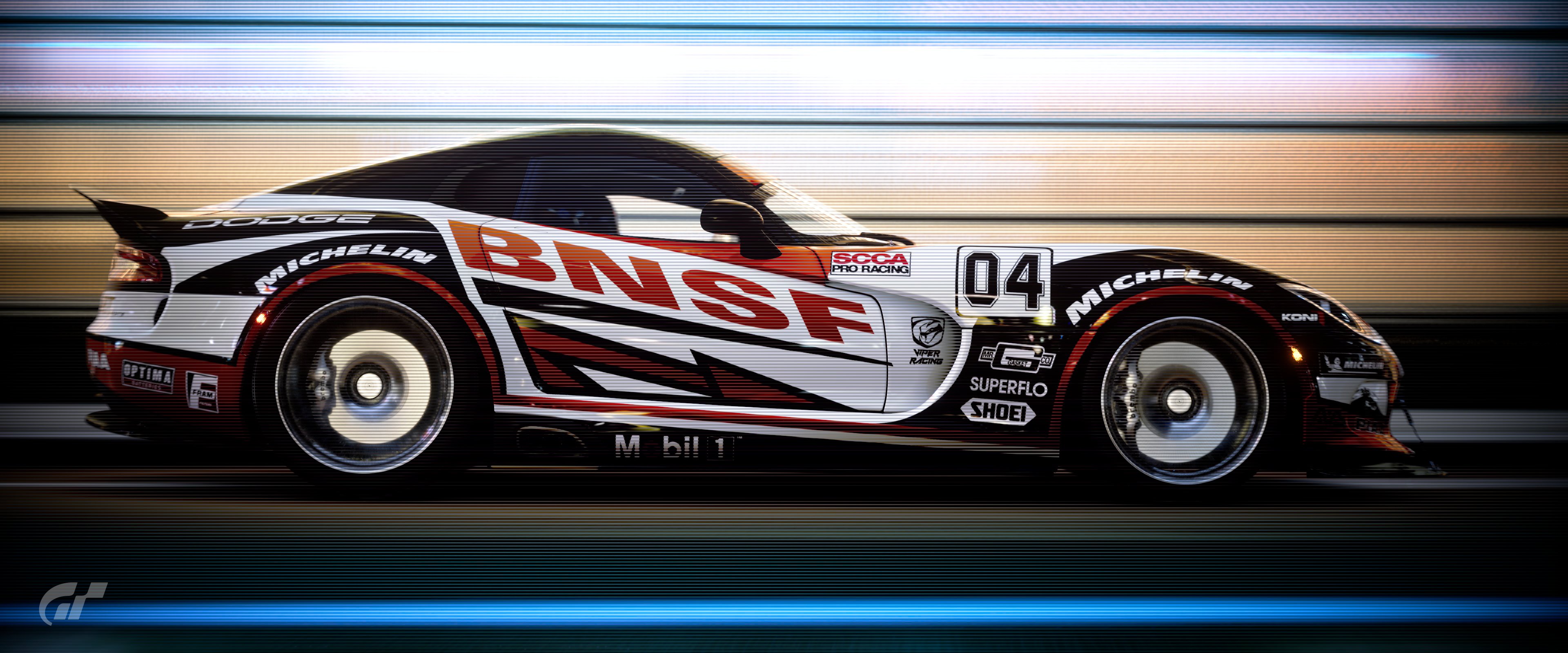
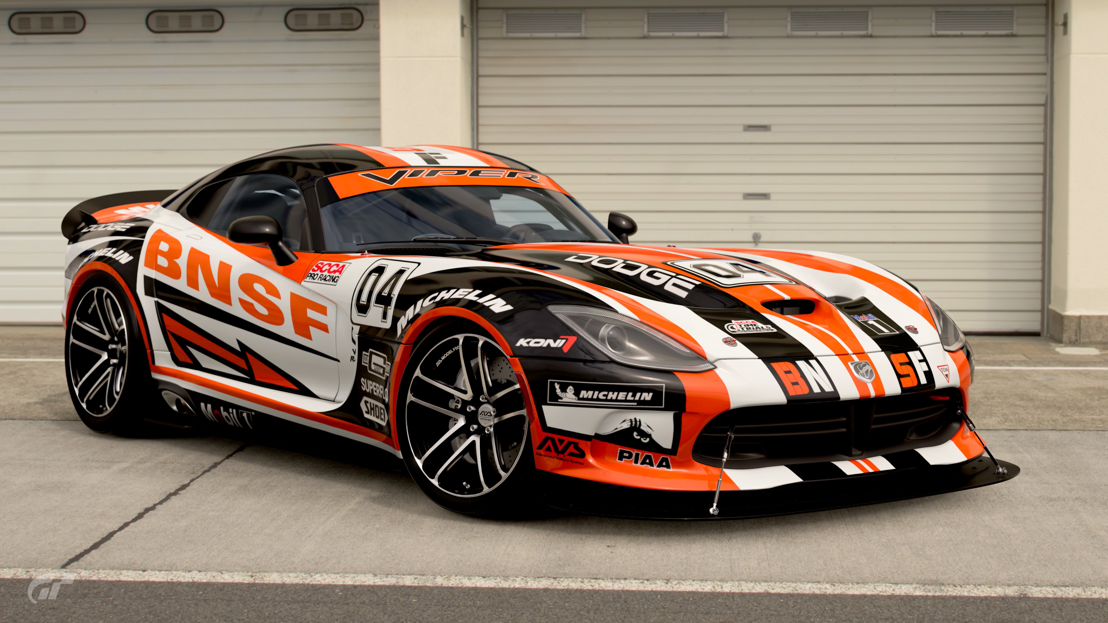
BNSF Viper
Again, strong and simple, and I'm a sucker for that stanced Viper and Duck tail spoiler, but the livery itself doesn't hit as hard as the colour combo does.

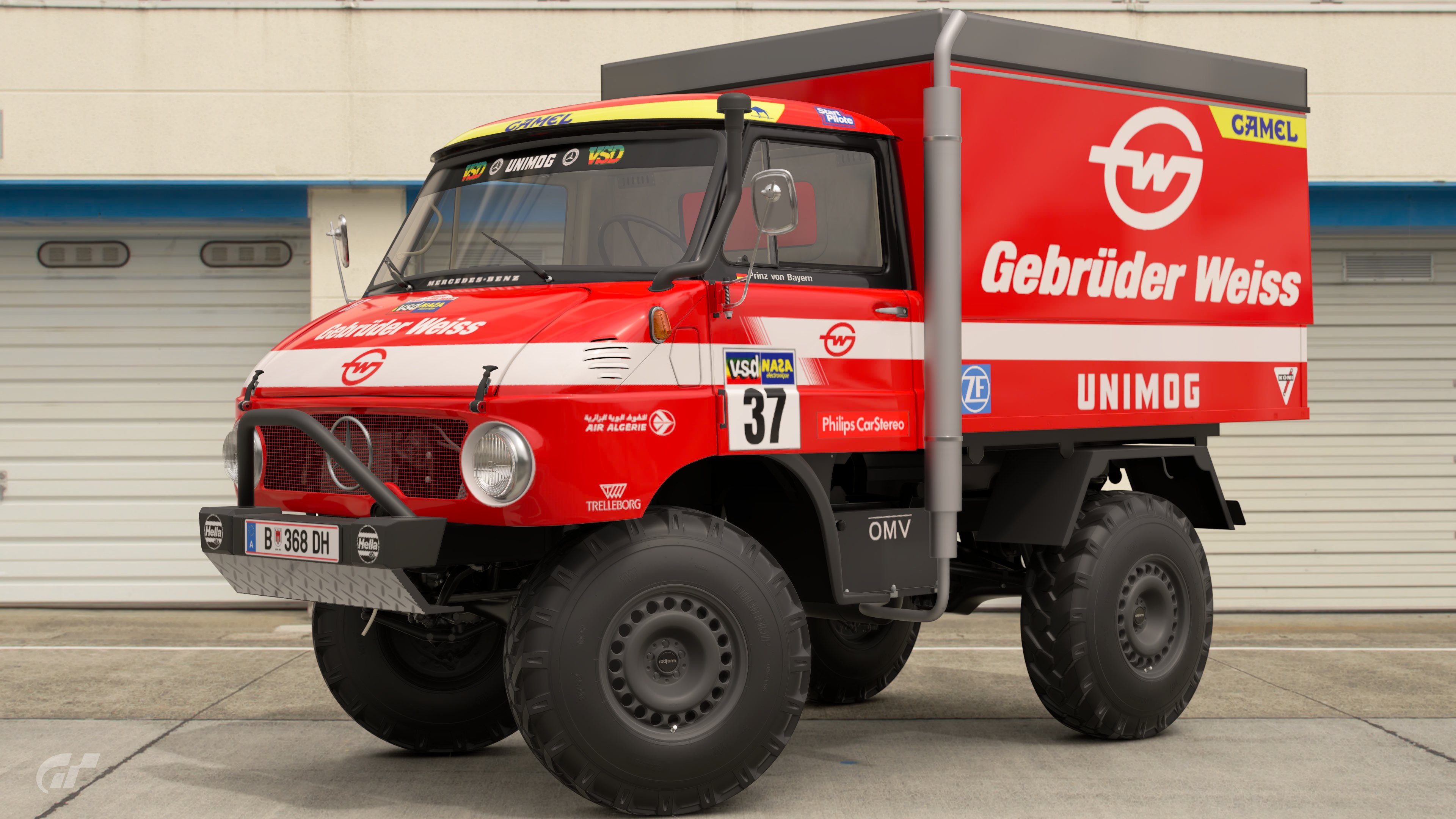
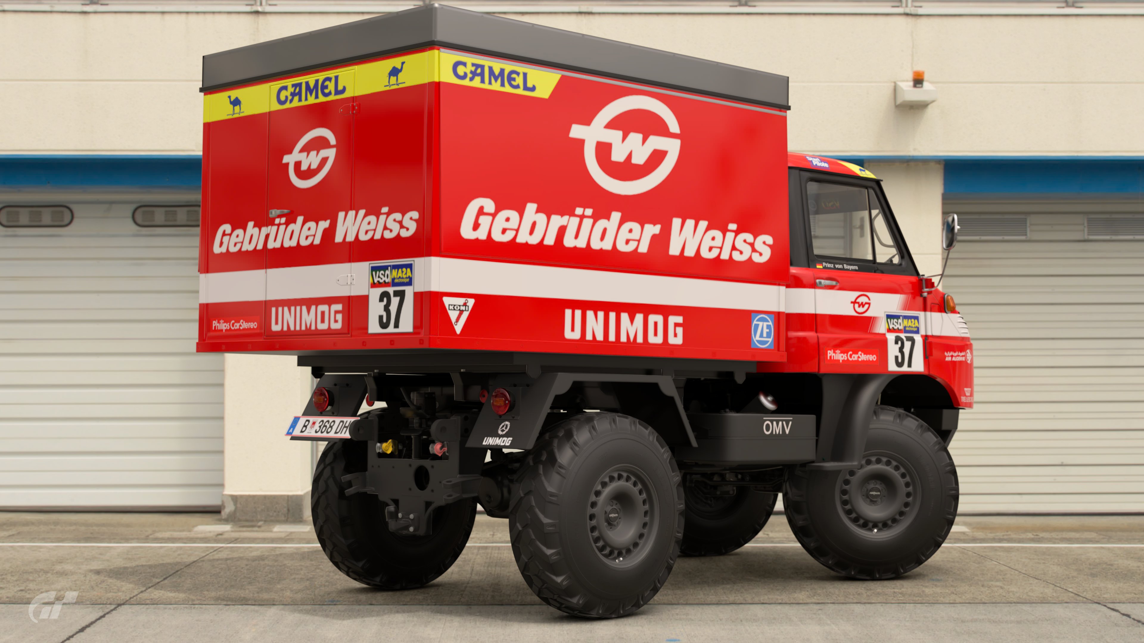
Gebruder Weiss UNIMOG
So glad we got a Unimog, great way of introducing it to this competition. The livery works for the era, but it doesn't tick all my boxes.

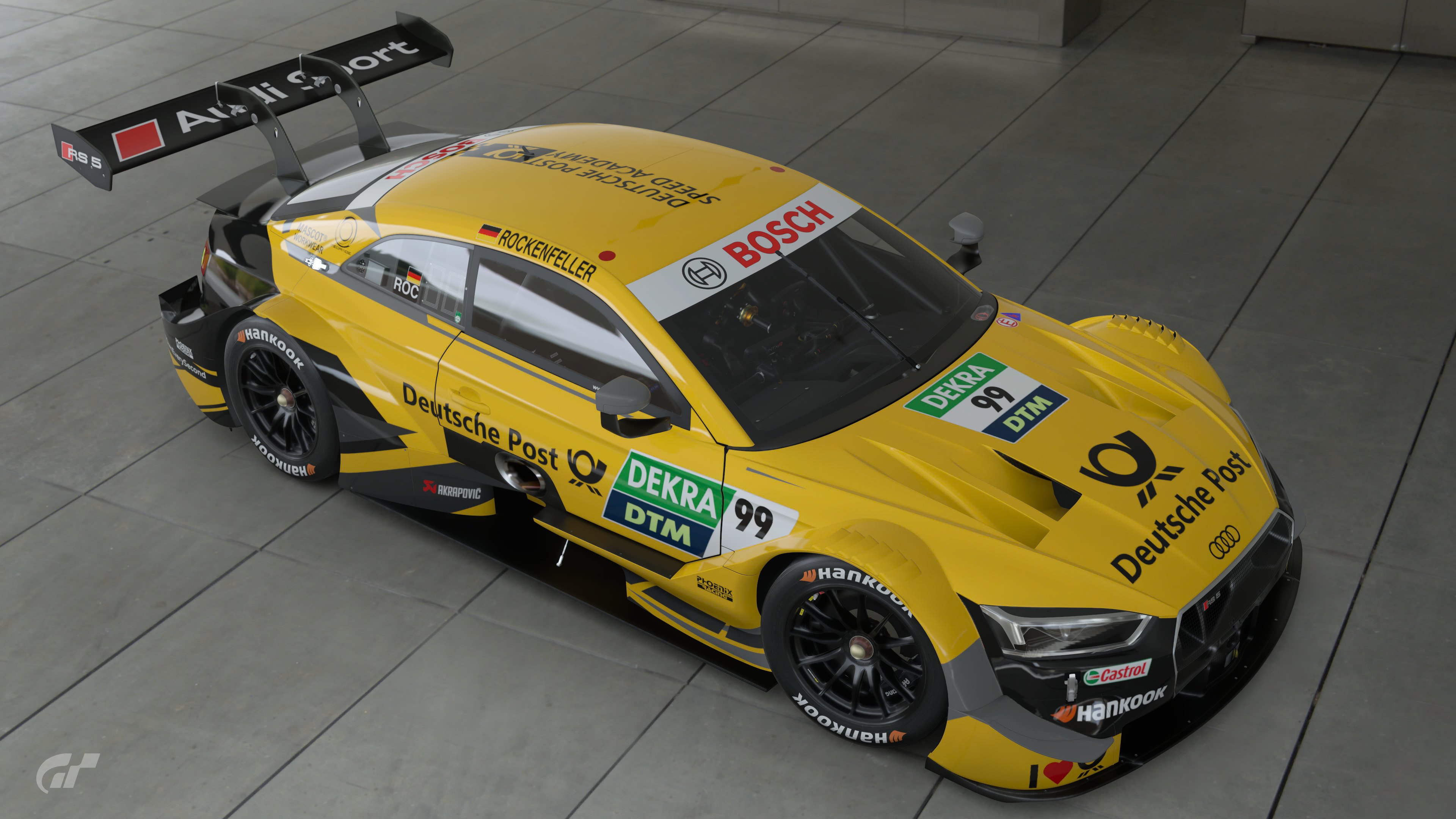
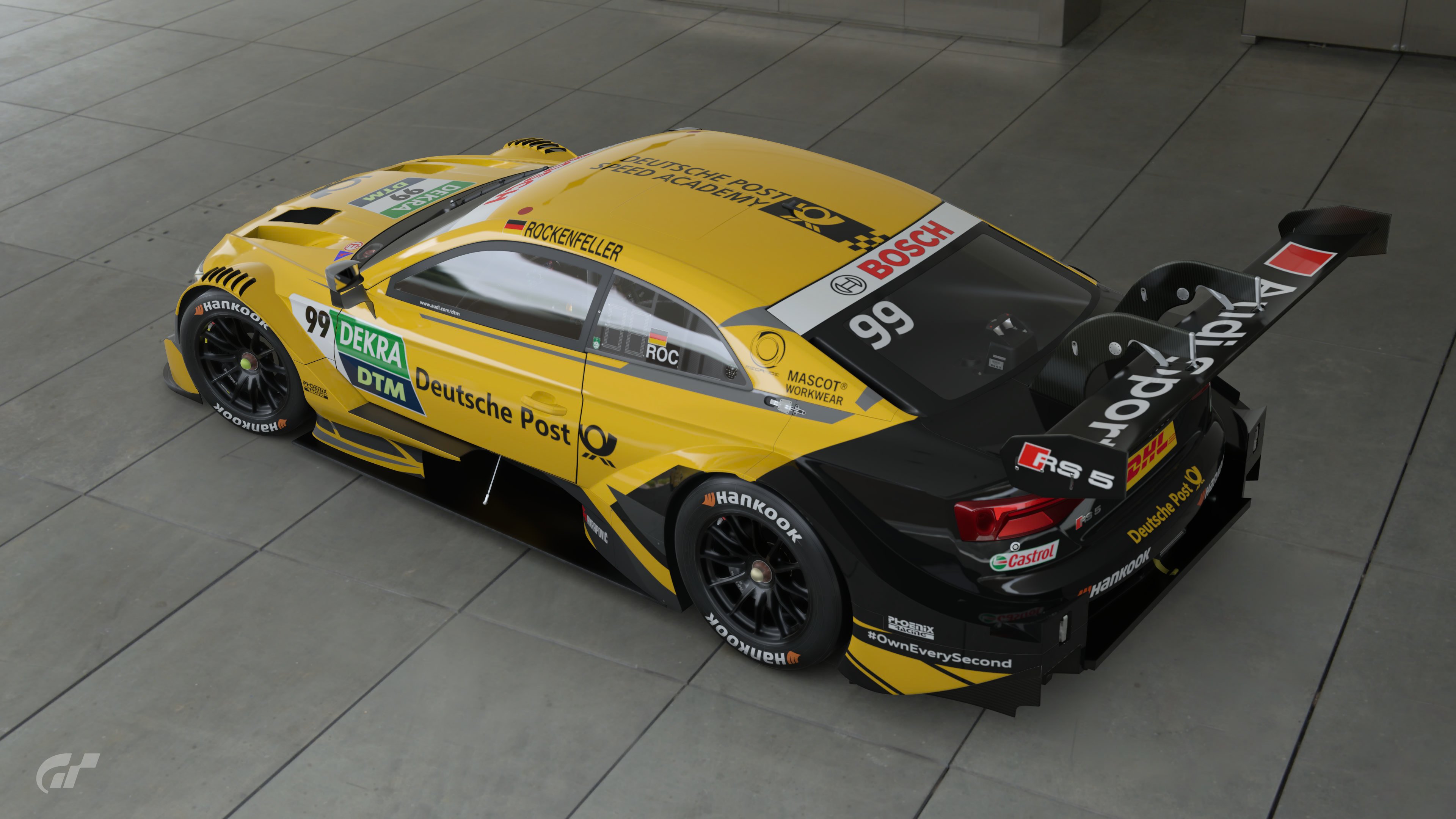
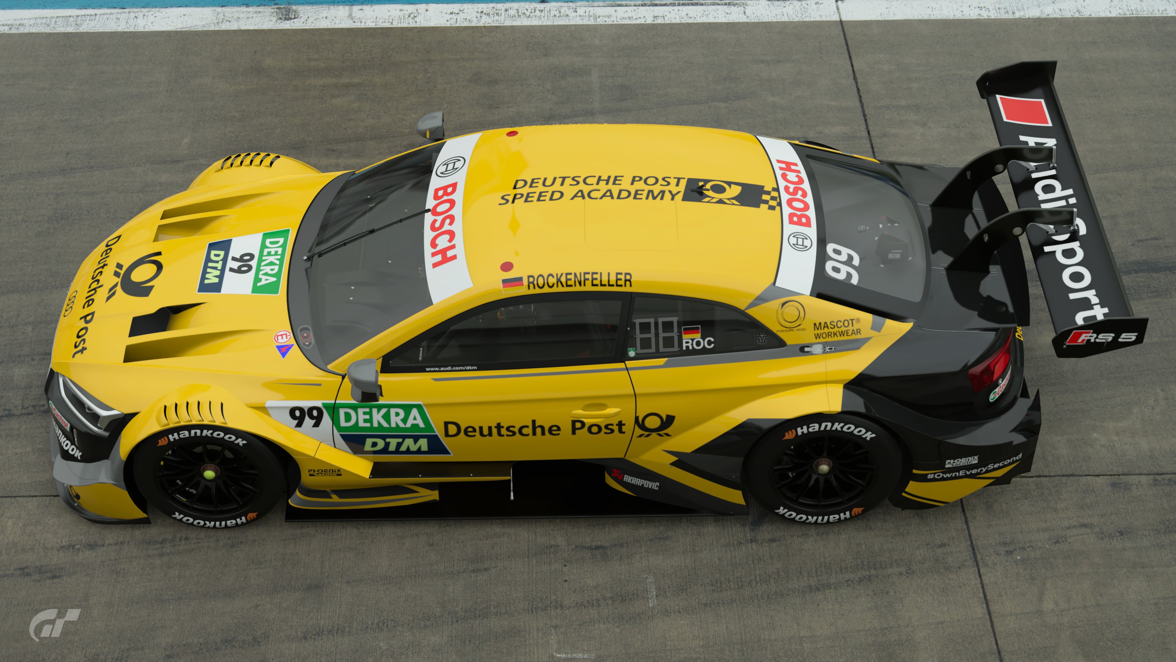
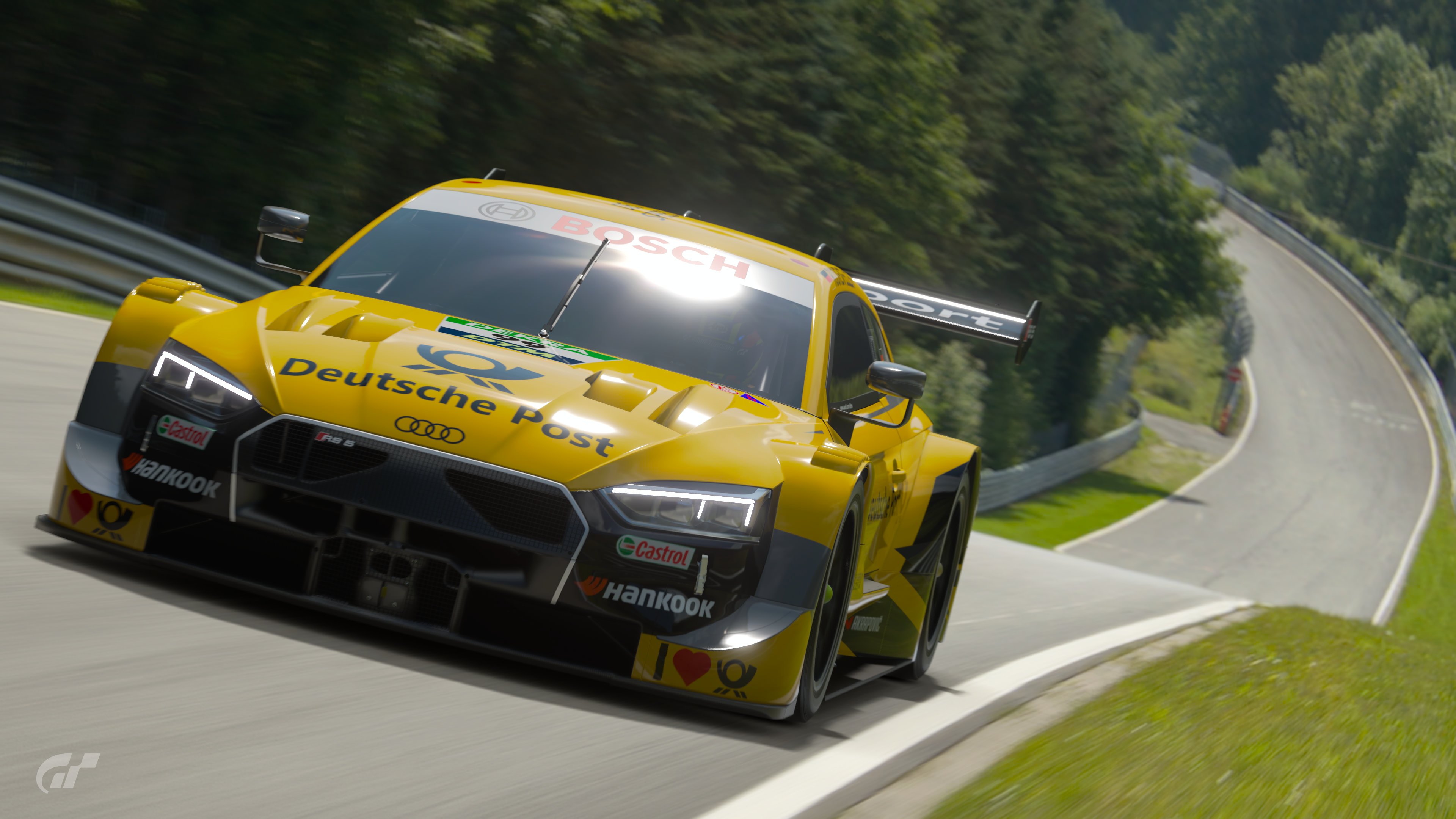
Deustche Post RS5 DTM
Absolutely works, twangs at my Livery Editor heart strings, makes sense for Rocky in the DTM too. Doesn't quote grab me though.
 
Last edited:
I'm happy to join in with a spot of dialogue here :)

Firstly, save my own (which I won't pass judgement on) there's not a bad livery in the competition; every entry demonstrates a commendable level of attention to detail. Something that I all too often see elsewhere is a lack of consideration when applying secondary sponsors - getting that right is crucial to a believable livery IMO. It's easy enough to slap a big sponsor and number board on the side but the devil really is in the details.
That said I had to pick 3 to vote for. Here is what and why:

Entry #3 - Atlas Air Ford Mustang

Deeply satisfying livery and very convincing. The masking is very well done and the gold works so well for a bit of extra visual style. The "Atlas Air" text on the flank is maybe a tiny bit awkward as it doesn't fit the space perfectly but that's a tiny nitpick.

Entry #6 - Maersk VW Polo

The sponsor choice is fairly route 1 but the execution is nigh-on flawless. It's a livery that works from a distance yet as one looks closer the detail and effort that's been put into it is readily apparent. I think it would be easy for a Maersk livery to be quite boring but this avoids that while still being a faithful representation of the brand's identity

Entry #12 BNSF Dodge Viper

I have to admit I'm a sucker for a Viper and an eye-catching livery. I also quite like trains. This firmly ticks all 3 boxes! It helps that it has fitted the same wheels as on my entry 2 rounds back which really suit the big Dodge. The colours are excellent, the shapes complement the car's lines very well and the sponsor decals very considerately placed. My only minor point is that I'm not sure about splitting the 'BN' and 'SF' on the front and rear, I'm not sure typical corporate branding guidelines would allow for that type of thing.

Honourable mentions to entries #7, #10 and #13

@MatskiMonk appreciate the feedback, that's an interesting point you've made. When I created the Genesis livery I was thinking along the lines of what I would want to run in GT7 for example in a daily race, rather than making sure it looked like an authentic GT World Challenge entry or similar. It's feedback I'll definitely take on board for future rounds.
 
Last edited:
Thank you @MatskiMonk and @adlyco for sharing your thoughts!

I always love to read a good feedback about our liveries and shows appreciation. :embarrassed:

My votes went to:

#3 Atlas Air Mustang
I love a good airline inspired livery and this one just works just so amazingly good! The masking job was executed very well!

#6 Maersk Polo
While the livery was simple, the idea behind it was brilliant. This livery just nails the competition theme very accurate.

#9 Hapag Lloyd 911
This one also nailed the theme and I love, how well the container design was transferred to a race car!

Also I liked the One Genesis very much, the colour and logo placement is very cool!
 
It's always fun to see what people come up with and how they interpret the theme. I'm happy to see so much variation, in terms of cars and in terms of styles. With that said, my votes went to:

Linfox Charger - I have a soft spot for classic cars. This livery is clear and iconic, just what the main sponsor would like to see, I imagine.

One Genesis - A bold design for a bold car. It grabbed my attention and refused to let go.

Gebrüder Weiss Unimog - And now for something completely different. What I think made me pick this livery was the Camel - Unimog combination. Looks like this thing would be right at home racing across the Sahara.
Thanks for your vote
 
Very goods entries. I just wasn't able to find time to do something this time.
#6: simple but very effective. This really is my number one vote.

#8: Honestly I'm a huge Genesis fanboy and this livery just fits perfectly with the lines of the G70.

#9: That container pattern is what got it the vote, fits the theme perfectly. I agree that my first thought of that brand gives me visions of blue containers, but off course they also have orange and red ones :P

Runner ups: #3 and #10
 
Back