Suggestion about the Livery Editor Competitions

784
Netherlands
Utrecht
YukinoSuzuka
Dear all,members, participants, organisers, etcetera etcetera..

Like in the last competition, number 09 with the very interesting theme about barnfinds, I was a bit in a photographers-block :D

I think I'm not the only one who's spending up to 4 hours or more for a single livery, not only for the competitions we take part in, but in general it's very 'normal' to loose yourself in a work of art and a single fragment you're watching at the clock, you see you've lost some hours again throwing decals onto a car..

That's what I like about it, it's a kind of ZEN therapy, you're only thinking of the present time, not the past, not the future (well maybe ish, were you're visioning how the car should be look like when it's finished)

But then, after finishing your livery, whatever the theme would be, your next step in taking part in the competition is the photography part. I had serious issues with finding the right setting, regarding the tutorial in the opening of each thread and this far, I hadn't a single image that looked as good as the others. And where the livery editor works like a therapy to me, the part of photographing the car is nerv wrecking. I don't see what I'm doing wrong. (will add pictures later on)

In the latest livery editor competition, number 9, I used another technique, as easy as it could be with almost the same results with all the settings to be made in photomode.


It has two benefits from my point of view !

At first, it's much easier to take part in the livery editor competitions, for the regular 'players' , but also for new participants !

Second and that's a discussion that's taken place now in the poll thread ; From 20 participations you get the opportunity to vote on three of your favourite liveries, where it's now a block to vote on a single liverie against our will to have more favourites and hard to choose from. The competition and voting would be better and more exciting too I think !

What to do (and I think would encourage new designers) ;

- Make the livery you want
- Save it / share it
- Choose the white backgroung in the main livery editor menu
- Take the best two (opposite) screenshots that sells your livery for the best results, regular as we are used to, or more detailed and unique angles
- export your screenshots from the ps4 menu onto your usb stick
- follow the known stepts of uploading your images on GTplanet or Flickr

:gtpflag:
 
Problem with using the white stock background in the livery editor is that when you screenshot you lose a lot of details and the quality goes down. As for size, it goes down from 4K to 1080p, not that this is an issue but see the post where @SlipZtrEm explained and showed in detail the difference between screenshot and export. The difference is huge.

I don't want to step on your toes here, I think you have some valid points, but if all steps in the "tutorial" on how to set the settings for the entry images it shouldn't be a problem - I think the problem some have that gives that blue tint is an overlooked step. I did get this at one point too, I forgot to mask the background only. And when you've set the settings correctly and taken your image(s) it's just a matter of reloading these images for the next competition and swap out the car with the new one, no need to enter the values again. :)
 
The Shiretoko place is a good « neutral » place for our liveries, and it creates a clear comparison base for the poll. But I recognize there are two drawbacks for it.

The first is that the angles sometimes don’t do justice to some parts of the liveries (for example if you’ve made an amazing roof). But this is where you get the bonus shot...

The second is that the special colours and especially chrome colours are not well showcased. I’ve used different settings that improved that point, but not enough to magnify reflections or flakes...

But I agree with you : taking pics of our liveries is sometimes the hardest part : do I take a general but « flat » pic ? Look for some detail ? Use an artistic touch but where the whole livery will not be seen ?
 
Screenshots done with the share button are just a no-go for me, as the loss in detail is unbearable...I'd rather lose the chrome effect from the shiretoko settings than have a pixelated picture that gives my livery even less justice. Bonus shots are what actually sells the livery, as they can be done however we want. Also there was the 360° gif but nobody is doing it anymore :P

Maybe one more bonus pic allowed would help?
 
Having chrome paint look like chrome is vital to my submission this week. I have to re do it since we got a much better chrome.
 
Having chrome paint look like chrome is vital to my submission this week. I have to re do it since we got a much better chrome.
It was vital for my Clio RS16 entry a few contests ago as well, but the Shiretoko thingy ruined it. It is why I remarked it was essential to look at the bonus shot for the proper effect, where the chrome stood out. Personally I'm not a huge Shiretoko fan myself, but it provides a neutral background with a good resolution. Maybe some tweaking with the effects could help? After all, as long as it results in the car with a white neutral BG, it should be fine.
 
It would be interesting to know how many people actually follow the thread and how many just go to the poll.

When I thought about it, I can propose to use 4 pics :
1) the Shiretoko pic (2 shots or 1 shot with the two angles)
2) a bonus shot in the theme (like we got the garage shot for « barn find », the drift shot, the Le Mans scape...)
3) two totally free pics : livery editor, scape, race, clode or far... it’s up to you to show your livery.

On the poll, only the Shiretoko pic will be used as a reminder/thumbnail for the livery, making it clearer and lighter to charge.

The two drawbacks (all solutions will have, that’s why the current shape of the LEC is not that bad) :
- People who only go to the poll will not see and judge the liveries in their full glory
- An average livery with an amazing shot might be more attractive than a state-of-the-art livery with a random pic. It is a livery competition, not a photomode competition, and the photo skills might imbalance the results.
Agree with everything you said...so how about the 4th shot being set on a fixed scape again (example: Mauna Kea), but with no filters whatsoever? Maybe this scape can change for every LEC, Hawaii once, then Colorado and so on...
 
Screenshots done with the share button are just a no-go for me, as the loss in detail is unbearable...I'd rather lose the chrome effect from the shiretoko settings than have a pixelated picture that gives my livery even less justice. Bonus shots are what actually sells the livery, as they can be done however we want. Also there was the 360° gif but nobody is doing it anymore :P

Maybe one more bonus pic allowed would help?

I must not be very sensitive to it, but the screen grabs from the editor look fine to me, I do it all the time. The 360 thing is flat, so doesn't really show the whole livery. Not worth the effort to me.
 
Personally I think it would be better for it to be limited to two or three shots from any angle on any scape you like, in other words the ones that you think shows off your work the best. If I remember right the first livery comp didn't have restrictions and it worked just fine. Limiting it to two angles plus a bonus pic within a spoiler (which a lot of people probably don't bother looking at) is far too restrictive and the mandatory scape and settings aren't the best for every livery (my Mazda RX-7 in the track day comp for example where the gold decals were difficult to see and the black on carbon bonnet decal was barely visible.) I really don't see why some people should be handicapped in a livery comp because they're forced into using a scape and angles which aren't the most suitable for their work.
 
MMX
I must not be very sensitive to it, but the screen grabs from the editor look fine to me, I do it all the time. The 360 thing is flat, so doesn't really show the whole livery. Not worth the effort to me.
That probably depends on the TV resolution, on mine they look quite bad compared to scape shots.

I'd be totally fine with the random scape as @Stephen220378 suggested, personally I like to use a Mauna Kea scape for my liveries, I'd be fine using it as well for the LEC.
 
When I first used those Shiretoko settings it was for my own use and calibrated against a livery that didn't have any special paints. I agree it does neutralise any fancy effects (texture or metallics etc) but it also give a good 'studio' type effect (if the settings are followed and the car positioned properly). It brightens the colours and ensures sharp detail without too many shadows or reflections on the paint (It's amazing how many scapes can was out a livery with too bright reflections).

The risk with a scapes free-for-all is that it becomes a 'scapes' contest. Some liveries can really pop in a particular scape, but might actually be quite poor in execution. By levelling the field in terms of entry you concentrate on the design itself.

But in order to mix things up a bit and provide some variety, how about this for a suggestion:

Each week the person nominating the theme also nominates a mandatory scape to be used as the primary shot. That shot has to be taken at the default setting with no re-positioning of the car, cropping, zooming or camera effects allowed. Simply place the car, auto focus and take the shot. That way we should have the same photo for each member just with a different car. This would be the photo used for the poll also.

The Shiretoko shots can then be placed in the spoiler as 'close-ups' along with an additional shot that really showcases the livery if required.

Whilst images straight from the livery editor are indeed the easiest to obtain, they export at a really low quality (even when set to PNG) and often appear very dark or washed out on a PC screen. Also the lighting engine is different to that of the main game and scapes meaning liveries can look wildly different to how people will actually use them. I found with my trial barn find livery that it looked great in the editor but looked rubbish in all the scapes I tried because the lighting made the matt effects much more glossy.

What would be great was if PD introduced a studio scape location with a proper white (or black) background almost like a green screen studio.
 
Each week the person nominating the theme also nominates a mandatory scape to be used as the primary shot. That shot has to be taken at the default setting with no re-positioning of the car, cropping, zooming or camera effects allowed.

That just seems like a way to make all the liveries look worse, rather than trying making them look the best they can.
 
That just seems like a way to make all the liveries look worse, rather than trying making them look the best they can.
I don't agree: it would level the field, unless the previous winner picks a stupid mandatory scape such as those mountain ones where the car is far kn the distance. Then at the same time it won't penalize whoever's using special paints such as chrome or large flakes. I'd say it's a good proposition that is worth trying.
 
The field is level though, even for flake paints and while the chrome paints might not mirror ball like they would on track, they are still clearly chrome.
Hm, flakes do look quite decent indeed, chromes lose their effect completely though. they're hardly "clearly chrome", at least to my eye. Could be worth a try imho.

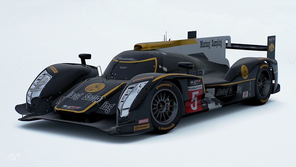
EDIT: For example, how is this clearly chrome? I had to look at the spoiler to realize it.
 
Hm, flakes do look quite decent indeed, chromes lose their effect completely though. they're hardly "clearly chrome", at least to my eye. Could be worth a try imho.

EDIT: For example, how is this clearly chrome? I had to look at the spoiler to realize it.
The spoiler is black? Wait, I didn't think that was chrome at all, it looks like a metallic gold... the colour seems to deep for it to be chrome
But there was a chrome Audi in the LMP1 Le Mans competition and it was clearly chrome.
 
The spoiler is black? Wait, I didn't think that was chrome at all, it looks like a metallic gold... the colour seems to deep for it to be chrome
But there was a chrome Audi in the LMP1 Le Mans competition and it was clearly chrome.
The yellow is chrome, but you can grasp it only from the spoiler pic. The livery looks great anyways but it loses quite a lot of its appeal. Same goes for the GTR Corona in the current LEC, another gold chrome car that lost the effect.
 
When I first used those Shiretoko settings it was for my own use and calibrated against a livery that didn't have any special paints. I agree it does neutralise any fancy effects (texture or metallics etc) but it also give a good 'studio' type effect (if the settings are followed and the car positioned properly). It brightens the colours and ensures sharp detail without too many shadows or reflections on the paint (It's amazing how many scapes can was out a livery with too bright reflections).

The risk with a scapes free-for-all is that it becomes a 'scapes' contest. Some liveries can really pop in a particular scape, but might actually be quite poor in execution. By levelling the field in terms of entry you concentrate on the design itself.

But in order to mix things up a bit and provide some variety, how about this for a suggestion:

Each week the person nominating the theme also nominates a mandatory scape to be used as the primary shot. That shot has to be taken at the default setting with no re-positioning of the car, cropping, zooming or camera effects allowed. Simply place the car, auto focus and take the shot. That way we should have the same photo for each member just with a different car. This would be the photo used for the poll also.

The Shiretoko shots can then be placed in the spoiler as 'close-ups' along with an additional shot that really showcases the livery if required.

Whilst images straight from the livery editor are indeed the easiest to obtain, they export at a really low quality (even when set to PNG) and often appear very dark or washed out on a PC screen. Also the lighting engine is different to that of the main game and scapes meaning liveries can look wildly different to how people will actually use them. I found with my trial barn find livery that it looked great in the editor but looked rubbish in all the scapes I tried because the lighting made the matt effects much more glossy.

What would be great was if PD introduced a studio scape location with a proper white (or black) background almost like a green screen studio.

You make a lot of good points BLiTZ but I disagree on a few.

Firstly I don't think it would be a scapes contest so to speak as most would probably zoom in quite a bit to show off the detail in their work, for a good example aerial shots, which would eliminate most of the background anyway. It's just more freedom to choose your own angle and lighting, plus I can't see people voting for a livery because the the background looks good, everyone knows it's a livery comp.

Secondly if the winner nominated a primary scape it's still going to handicap a lot of entries as the lighting and especially the no zooming won't show up their work at it's best and that's the shot they're stuck with when the poll comes.

I still think total freedom is the best way to go, 3 pics on any scapes you like at any angle, your first pic you post is your primary shot and that's the one which will be used in the poll. Nobody can complain as you've essentially chose your own photo for the final poll.
 
As someone who uses chrome a lot, I know that the current rules limit the appeal of these liveries in the comp. However, I feel like the current display method is the closest thing to equality that is achievable. Having entries with different pics/scapes is a distraction at best and vote swayer at worst which I don’t personally see as necessary.

Having a 2nd spoiler shot that’s completely open seems like the best compromise to me. If someone’s spent hours on a roof or their livery looks best in the dark, they get a chance to showcase it.
 
A lot of good points in here - but I don't see how changing the mandatory images could be better than the way they are now - sure some scapes might do more justice to chrome / flakey bases but like it's been mentioned a lot here, the bonus shot(s) would help.

And another thing that would help is to actually do what the rules state - take a look at every image posted, that includes the spoiler images.

I might say something you all disagree on, but I think it's neat as it is now, not cluttered with different images and un-spoilered bonus images. Once someone steps outside the rules and scale up their entries or have the wrong images, it looks cluttered right away. That's just my opinion.

But if people want change, then we should gather up the most "visible" members of the competition + the ones that desperately want change and take it to the PM and work something out. I'm sure we can make changes that will make everyone happy if needed to. I'm comfortable with how things are right now, but that's just me. :D

Also, I hope to see helmet liveries in the future of these comps.. Suits too perhaps? ;)
 
The possibilities and combinations are endless. I hope the future winners take note of this. :gtpflag:
It doesn't have to be a pure car livery competition. :)
I'm not gonna win anytime soon anyways, so...I'll be here, hoping :P
 
Nothing wrong with the current format. Especially when we stick to the settings which even i, a newcomer have seen many not adhere to. If you dont like the competition guidlines..just..dont enter and post your liveries in your own thread. Win/win situation for all
 
@Sjaak just invited me to discuss about livery competitions.

My opinion of the Shiretoko Scape:
I understand that every competition has to have its rules. If you want to see the best possible photo results in the next competitions, you may think about if its necessary to regulate the scape scene. The problem with the selected scape is the fuzzy, dusty light - especially if the livery is glossy or the paintwork has some chrome effects.

In the guidelines you are posting the camera settings to apply, there are many different setting and most of these are just to improve the bad light conditions.

I understand your point of view, everybody should have the same requirements. But there are other scapes, where you can take pictures with a clean, white background and better light conditions.

You may not know, but there is a faster and easier way to produce pictures with a complete white, neutral background: Just hit the "effect" button, select Screen Effects and check "Background Mask". Then go back and select "individual coloursettings". There you only have to maximize the brightness setiings (+500) and minimize the contrast (0). That's it.

I just do a fex shots and post them later, so you can compare.

Cheers ;)
 
I do like the idea of being able to change some of the settings. Especially if it makes our livery look better. And I do feel that it is fair to be able to do so. Here’s why.

First, everyone would have that option to do so. Everyone would have the same tools. The only requirement would be that you must link to the pic on the GT server to prove it’s not heavily photoshopped.

Second it allows us to show the car in its best form. I think I may have gotten more votes in the track day series if I dropped the contrast nd let the car look like a bigger pile of crap.

In the barn find series I had to drop the contrast so it looked like rust.


At the very least allow adjustments to the contrast setting.
 
You may not know, but there is a faster and easier way to produce pictures with a complete white, neutral background: Just hit the "effect" button, select Screen Effects and check "Background Mask". Then go back and select "individual coloursettings". There you only have to maximize the brightness setiings (+500) and minimize the contrast (0). That's it.

A 100% white background would look bad too; then you lose the shadow etc. I did this with the Audi VGT to mimic the first silhouette image we got as a teaser.

I do like the idea of being able to change some of the settings. Especially if it makes our livery look better. And I do feel that it is fair to be able to do so. Here’s why.
(...)
At the very least allow adjustments to the contrast setting.

I've let every entry in the past be valid and enter the poll, and I'm sure @Nuschel01 included everyone too, as long as the size is right. Noone said you HAD to have 110% the same settings as @BLiTZ had, as long as you get rid of most of the blue tint of the stock scape it's fine with me.
 

Latest Posts

Back