You are using an out of date browser. It may not display this or other websites correctly.
You should upgrade or use an alternative browser.
You should upgrade or use an alternative browser.
slipSHOTS: GT5
- Thread starter SlipZtrEm
- 707 comments
- 81,116 views
- 1,679

- Sin City, USA
- Primus Ortus
Great preview. I almost agree with Magic Racer on the noise, but it works well for the magazine style cover. It's only when the picture is enlarged to higher resolution that it becomes more noticeable. The other thing about the noise, of course, is that it makes the picture look more realistic - something you pulled off very well on this pic. Love the road, sense of speed and tone. Looks like you may have used a 1/125 shutter speed instead of 1/60, which is great for that shot - it brings out the grain in the road a little better and the rims are more defined.
- 8,707

- Utah
- ceiling_fan
Way to build hype for your next update! 
Agree 100%!

Great preview. I almost agree with Magic Racer on the noise, but it works well for the magazine style cover. It's only when the picture is enlarged to higher resolution that it becomes more noticeable. The other thing about the noise, of course, is that it makes the picture look more realistic - something you pulled off very well on this pic. Love the road, sense of speed and tone. Looks like you may have used a 1/125 shutter speed instead of 1/60, which is great for that shot - it brings out the grain in the road a little better and the rims are more defined.
Agree 100%!
- 27,387

- Toronto
- NewAesthetic
- SlipZtrEm
slipshots presents
Magazine Article: The Hangar (August 2011)


(click on images for full-size)
_________________________
Magazine Article: The Hangar (August 2011)


(click on images for full-size)
_________________________
Update Info: And here we go, just barely sliding under my self-imposed wire. This was a lot of fun to put together, so enjoy!
SVX - Hope you like it!
ashes619 - Thank you sir!
Soloracer3 - Thanks, I avoided using it again for the full article, but I hope the new ones make up for it

Loading - Thank you, and welcome to the gallery!
Skython11 - Godzilla hunting... itself?

Magic Racer - Yep, the noise was strictly for that preview image, nothing was final. There's another small detail change for the Cappy... try and find it

Primus Ortus - Thanks! I had been using the Cappuccino for a challenge over in the tuning sub-forum, and had just decided to pop into Photomode for fun. Found that angle and was impressed at how real it looked, thanks to the trees' shadows, and made sure to not head straight to 1/60 as I really wanted the spokes of the wheels to have some added definition. Glad someone approves

ceiling_fan - It's all about the advertising!

Last edited:
- 9,736
First of all, thank you for another update! The articles are good and the pictures are implemented very well.
Did you lower the suspension by 1 millimetre? - No, seriously, I cannot find what you changed. Tell me!
Picture #1 - I really like this one, because of the easily perceptible motion of the car; and the good lighting comes in handy, as well.
Picture #2 - Interesting angle; I like how you adjusted the focus, but the picture could have more contrast.
Picture #3 - At first glance, this one may seem a bit blurry, and while this will probably not work with all pictures, it definitely does not hurt the 'feel' of this one, because it complements the 'aggressive' character of this picture.
Picture #4 - While the angle is not too spectacular or outstanding, you were able to get nice reflections on the side window of the car successfully.
Picture #5 - This is one of my favourite pictures of this update. It is simple, yet it is outstanding; the car is clean and there are many reflections - this provides a more realistic look - and the road blur is good, too.
Picture #6 - This one seems very simple, but, actually, this is excatly what makes this picture work. The silhouette of this car is just beautiful and I am glad to see that you pay attention to such details.
Picture #7 - Given that the blur in this picture is extreme, it reminds me of Gran Turismo 4, but by looking closely at the front end of the car, anyone can notice that the quality of the pictures is much better in Gran Turismo 5.
Picture #8 - The camera angle is well chosen and I like the focus in this one; the depth of field is good.
Picture #9 - One of my favourite pictures! What I like most about this one is that the car carries many reflections, which complement its shape. Another reason is the good execution of the blur, although the background (top left corner/left side) could use a bit more blur, in order to get a better depth of field.
Picture #10 - This is a really, really good photo. I like the strong colours in this one, and the fact that you concentrated on getting a good depth of field. The focus is just as great as the good lighting effects on the car!
Picture #11 - This is another outstanding picture: The focus is good; the contemplator first notices the clean car with its gorgeous reflections, and then sees the light blue sky, which gives a natural feeling to the picture. The composition is excellent.
Picture #12 - Although I do not like the zoom on this one, by putting the picture into the context, which is mentioned in your article, I see that you had to shoot the car from such a short distance. The colours are lively and the focus is good.
All in all, you did an excellent job. 👍
Magic Racer - Yep, the noise was strictly for that preview image, nothing was final. There's another small detail change for the Cappy... try and find it
Did you lower the suspension by 1 millimetre? - No, seriously, I cannot find what you changed. Tell me!

Picture #1 - I really like this one, because of the easily perceptible motion of the car; and the good lighting comes in handy, as well.
Picture #2 - Interesting angle; I like how you adjusted the focus, but the picture could have more contrast.
Picture #3 - At first glance, this one may seem a bit blurry, and while this will probably not work with all pictures, it definitely does not hurt the 'feel' of this one, because it complements the 'aggressive' character of this picture.
Picture #4 - While the angle is not too spectacular or outstanding, you were able to get nice reflections on the side window of the car successfully.
Picture #5 - This is one of my favourite pictures of this update. It is simple, yet it is outstanding; the car is clean and there are many reflections - this provides a more realistic look - and the road blur is good, too.
Picture #6 - This one seems very simple, but, actually, this is excatly what makes this picture work. The silhouette of this car is just beautiful and I am glad to see that you pay attention to such details.
Picture #7 - Given that the blur in this picture is extreme, it reminds me of Gran Turismo 4, but by looking closely at the front end of the car, anyone can notice that the quality of the pictures is much better in Gran Turismo 5.
Picture #8 - The camera angle is well chosen and I like the focus in this one; the depth of field is good.
Picture #9 - One of my favourite pictures! What I like most about this one is that the car carries many reflections, which complement its shape. Another reason is the good execution of the blur, although the background (top left corner/left side) could use a bit more blur, in order to get a better depth of field.
Picture #10 - This is a really, really good photo. I like the strong colours in this one, and the fact that you concentrated on getting a good depth of field. The focus is just as great as the good lighting effects on the car!
Picture #11 - This is another outstanding picture: The focus is good; the contemplator first notices the clean car with its gorgeous reflections, and then sees the light blue sky, which gives a natural feeling to the picture. The composition is excellent.
Picture #12 - Although I do not like the zoom on this one, by putting the picture into the context, which is mentioned in your article, I see that you had to shoot the car from such a short distance. The colours are lively and the focus is good.
All in all, you did an excellent job. 👍
Last edited:
- 1,679

- Sin City, USA
- Primus Ortus
Brilliant work Slipz. Great job. 👍
- 16,736

- Southampton, UK
- Pebb--
- Pebb
My favourite, has to be the following shot. 👍
- 8,707

- Utah
- ceiling_fan
Amazing update! Really, this stuff is on another level than all the galleries on GTP 
The Cappy article is wonderful - beautifully written and photographed. Looks great. The small shot on the left page of the article is amazing
And that M3 shot is eye-popping

The Cappy article is wonderful - beautifully written and photographed. Looks great.
 The small shot on the left page of the article is amazing
And that M3 shot is eye-popping

- 864

- Near Marseille
- GTP_Dolp
Amazing update! Really, this stuff is on another level than all the galleries on GTP
The Cappy article is wonderful - beautifully written and photographed. Looks great.The small shot on the left page of the article is amazing
And that M3 shot is eye-popping
Can't say better! Best gallery!
- 27,387

- Toronto
- NewAesthetic
- SlipZtrEm
Update Info: Aw man, everything has ads these days...
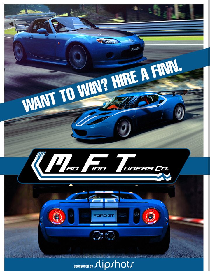
 . After some work back-stage with the boys at Mad FinnTuners Co, I've worked up a fun little ad for their garage, that conveniently fits the size of my magazine articles. As an added bonus, the full-size ad is available (simply click on the image), as well as links to the individual tunes, and the images used for the ad. Just click on the car name above the image to be transported over there. Enjoy!
Nato_777 - Heh, I was pretty tired when I wrote that one

ashes619 - Thanks, but there are many others who deserve that title more. I just like doing the magazine layouts

Soloracer3 - That RUF was a pain, and I could clean it up a bit more... but glad you like it

FishyJuice - Cheers, it's something I'm pretty passionate about, and what I enjoy doing outside of GT, so it's great to mix them up!
Magic Racer - Thank you, thank you, thank you! I love getting detailed responses, and that pretty much made my day when I read it. Glad it all went over so well... and now you know what the change was

rpanico14 - Y'know, I may just do it again, once I bundle everything up. I've been meaning to eventually collect them all, and print it in one massive go. Then have it as a coffee table book to fool visitors

Primus Ortus -

TVR - Ah, I'm quite proud of that one, even if the sky is burnt out in it

SVX - When you eventually join us in the GT5 world, I look forward to those sorts of shots from you 👍
ceiling_fan - Heh, thanks, but really, when it comes to straight photography, there's at least a dozen people around here who do it better than me... you being one of them! Glad you like it though, and that M3 was a subtle HDR

Dolp - You're too kind, sir!
JDMKING13 - Good to see you still around! I think these will be bi-monthly, so you can expect another next month, roughly!
20832 - Thanks! I really am contemplating making the templates available to everyone, so that we might be able to see more magazine articles floating around...
Last edited:
- 6,146

- Germany
20832 - Thanks! I really am contemplating making the templates available to everyone, so that we might be able to see more magazine articles floating around...
Amazing news there pal. This would be a great idea (just because I always wanted to try something like this!)

Also a very, very great update.
MaddFinns are (currently) the #1 - Adress for Tuning, let alone because RKM seems a little inactive lately.

- 14,410

- Wellington
Really nice as always, Slip. I love how the blue looks sooo good with the forest background.
Thanks a lot mate!
SVX - When you eventually join us in the GT5 world, I look forward to those sorts of shots from you 👍
Thanks a lot mate!
- 5,303

- Riverside, Ca
- GTP_Leonidae_MFT
Thank you! This is truly outstanding, and best possible promotion to our hard work! 👍 Keep up the good work, buddy!


