Review time!
TheDrummerKing - Composition is on point, and I understand the image is meant to be so dark, so just grabbing the highlights of the LFA makes sense. But what threw me off was the sky was still over-exposed. On one hand, it increases the contrast between it and the tree-line, but I couldn't shake the feeling a better-exposed sky would've had more "wow" factor. Especially because what hints we do have of the sky looks like it would've been fantastic and colourful! I had
no clue whose this was
") CCShaft7
CCShaft7 - The isolation in the image really played off the theme, which I liked. Good blur, no artifacting, and interesting composition also elevate this one for me. The frame choice was interesting without being distracting, and the vignetting further aided the focus. Another I had no clue about the owner!
zambuca - A tough one for me; I liked the general idea, and it's a fantastic combo, but the Corvette being ever so slightly uneven compared to the frame and the over-exposed trailing edge of the front is what cost it a vote for me. Any other week I wouldn't be so picky, and it's still a great shot! I especially like the detail on the headlights and the neat outline effect on the edge of the car! Another I couldn't guess!
bmxmitch - Well, due to that poll snaffu...
")
. Actually, I could guess who's this was even if it had been included from the get-go. The editing is Mitch's signature, and while it got my vote, I will say that the white burst is a bit distracting - I know exactly what the intentions of it are for, that's no problem, it's just that it has no colour at all associated with it, which I find really strange. Know what I mean? Regardless, it's a great shot anywho!
MetalBeerSolid - The LFA is right up there with the F40 as a car that's almost too good-looking in shots. The reflections are stunning... but the expanses of pure-white sky are what I noticed. If the shot would've been cropped, or the camera even moved to minimize that, it would've definitely had my vote. But, moving might've cost those excellent, fantastic reflections. So torn! I had an inkling of whose this was, but wasn't sure (and turns out, wrong!).
NTX - Ah, this one, my guess was right! Very dramatic, the shallow depth of field helping focus on the Ferrari and it's excellent rims (though that arrow on the ground is a bit distracting). I'm just not a fan of the cool filter look on some shots, and felt this one would've looked better without it.
Fido_le_muet - Ah, surprised me, this one did. Much like CCS7's shot, the isolation is what really drew me to this one - it feels like it's all alone for miles! The tones are very realistic, the little bit of shadow on the car helps increase realism, and instead of being distracting in the background, the powerlines break up what would otherwise be a fairly boring composition (what with all the important elements crowding the bottom edge). These powerlines break that up and really balance the image, bizarrely. Nice!
mastretta_mx - I can see what the goal was, but a higher shutter speed would've increased the blur (as is the wheels aren't moving quite enough for me), and some cleanup on the wheel-wells would've helped too, since the polygons can be distracting. A different sort of composition possibly would've made this more interesting too. Can't say I'm a big fan of the look of the car, but under the right circumstances I could see it working very nicely!
rpanico14 - While you earned bonus points from me for the White Stripes reference, I just couldn't find enough in the image! I realize that was the goal, much like the other LFA shot up top, to focus on the car and give very little definition to the rest of the image, but the tiny bits elsewhere in the frame distract instead of add, and the backfire just looks like a ball of glow instead of recognizable flames. The workings of a potentially epic bedroom poster, absolutely, but these little details jarred, for me. Sorry! I say turn it into a poster, hang over your bed, and blast that album
 ZEROX
ZEROX - You surprise me sir... and now I'm very worried about a potential rematch, since we just tied for votes here! The realism on display here is astounding. It's a simple picture, but done so, so well. Thought this was the work of one of our newer members, so I was wrong again... doh!
Fyshokid - You know, the angle is fantastic. It really is. But the saturation mixed with the purple-pink-ness of the car just was too much for me! I'd love to see it (and more of the combo) with those two things toned down a bit
Wallbreaker - Didn't guess this one either - thought 440 CHARGER had made a very nostalgic return to his old editing style! The composition is pretty good; I would've preferred if the left side of the image hadn't cut off any of the curve, though. The large bit of full-on white in the road also didn't work for me, though it does use the contrast very effectively in leading the viewer's eyes down the path of the car. It didn't get my vote... but it surely didn't need it! Congrats Wallbreaker - I'll be sending you a prize!
gt-detective - Wrong again... I thought atlop had returned! I like the simplicity of this shot, there's not much more to add to that - a deceptively good image, gt-detective, and it's sad to see you won't be in the rest of the tournament, as I always enjoy your work!
SMfan - This is unexpected, seeing as how you just won 2.0! Someone certainly is taking advantage of the dirt tire glitch
. The tone is right, I like that very much, but the car/track combo is well... unnatural (which explains the glitch
), as that car just doesn't look at home tackling a rally stage. The composition doesn't really do it any favours, either. I do really like the desaturated look though, so I wonder what you could've done with that car on a track
Moglet - Easiest one to determine the owner? Yes!
The reflections, that wonderful paint colour (Grigio Telesto?), and a shot that uses over-exposure in the background for positive effect. Really surprised this didn't end up with more votes!
Sam48 - Now that I see the name, I definitely can make the connection in shooting/editing style, yes. An interesting shot - very symmetrical. The size of the full-sizer and the feeling I'm looking at a toy set (the blur used) are my only two criticisms. A cool effect sometimes with the latter, but here it just didn't feel in place!
ceiling_fan - Another easy guess
. Right amounts of colour, solid composition - why'd this get so few votes? Everything is well-detailed and clean, too. Guess we're bound to have a new final winner!
Nanabu - I had an idea this was yours... I feel like I've seen this car from you before (though obviously not this shot). While it looks good in preview form, full-size showed a lot of jaggies, and the car feels a bit out of focus. That said, the reflections are the star of the show, and the shot really does focus on them very well!
Benmastaw00t - A risky Panning 1 shot, but it works so well on Formula cars. Looks straight out of coverage of a real F1 race, so I'm all for it 👍
Ciniculusxoneo - A surprise, this one! It looks like a few other veterans' style, so it was interesting to see the name. I'm not normally a fan of the Academy cars in photos, but this was done nicely, without being shouty. Full-size really shows off the realism!
JediRage - It's an odd composition, I think. It definitely leads the viewer to look up ahead at the apex, much like the driver, but the cropping doesn't let us see enough of what's going on up ahead. That's my take, anywho...
GT_johan - Another that really plays off the theme well! The black letterbox framing just further enhances the "scene from an epic movie drive" feel.
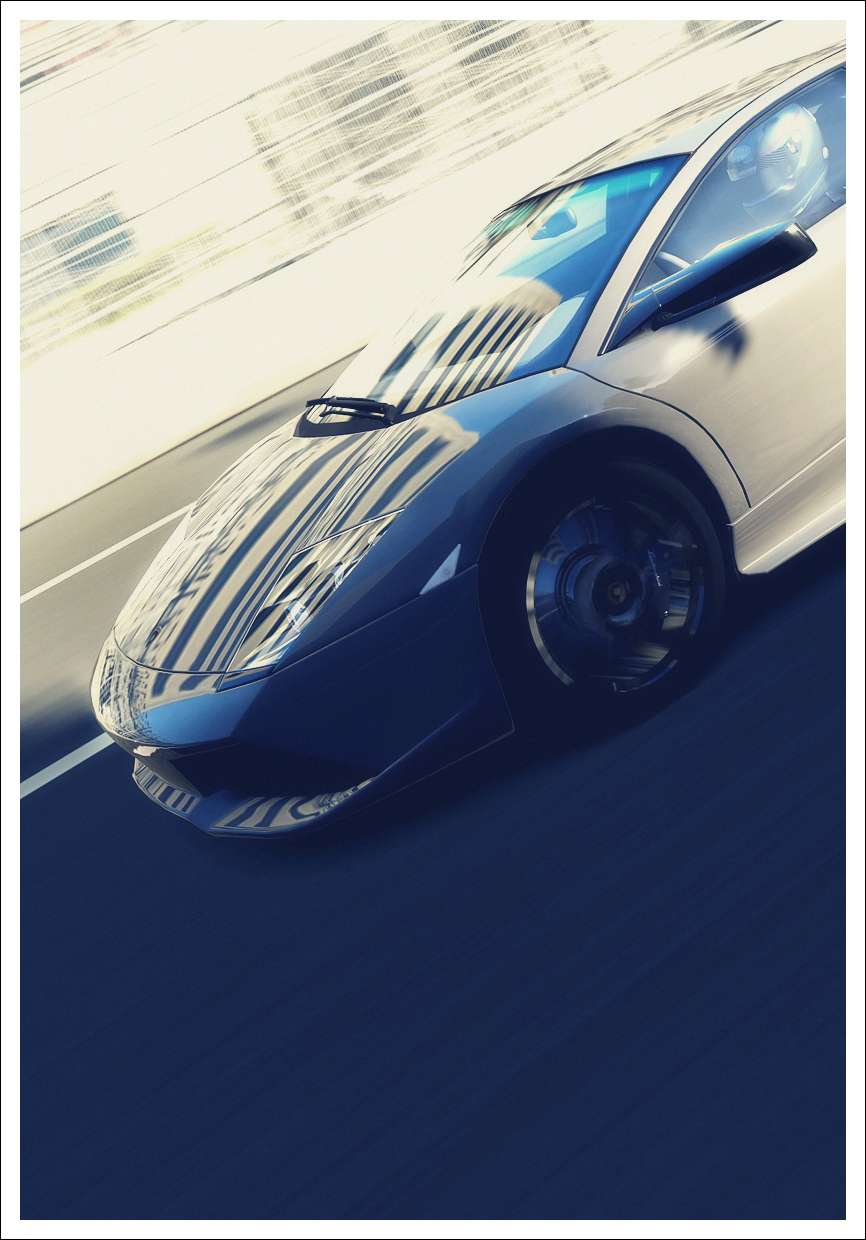
Nato_777 - I figured this was your's after the epic Lambo cleanup! I really wanted to vote for it as it looks fantastic for a standard in preview. Something about it in full-size though just felt "flat". Maybe the headlights? Not sure, this one was the hardest decision for me. Nato is quickly proving himself as an expert Standard-cleaner though, very much like our old GT4 friend alexwrc!
SlipZtrEm - Pfft, I'd never vote for this in a million years!

. I hope my goal of not being able to be identified as mine worked, though.
Klaus_PSU - This one is a slow-burner. Looks good at first, and the longer you look at it, the more impressive it is. It's hard to get realism when you're dipping off-track, but this looks great! My only criticism? Change your RM number!
Revolution. - Knew it immediately! Such a fantastic shot that I can't complain, though. Also nice to see it here, so it can't be used for the City/Country theme
. Car will be sent your way, too!
Raphaele - Ah, there's the F40! The black and white really enhances the focus on the highlights of the F40's lines; it's all a very angular, directional shot, implying way more speed than what may actually be the case. Very good!
StoneyNUFC - A good, atmospheric shot. Would've liked to see the GT watermark removed, as it's a bit out-of-place when its intensity has been turned up like that. Just enough lighting to pull off this sort of shot 👍
FishyJuice - An Italian Job?
. I like these sorts of shots - minimal, using a big portion of the canvas for just the background. The colours just don't "pop" enough for me in this one though. Also wondering if it might've been more effective (and dramatic) to switch to portrait mode...
ghostrider135 - The saturation seems to have been bumped up, but perhaps too much. The sky looks great, and the Agip sign... which sort of seems more in focus than the car. That said, the amount of detail visible right around the exhaust is nice 👍
_____________________________
Thank you very much all who voted for me!


 Really surprised by that...
 I guess I made a bad choice on which entry to submit
