You are using an out of date browser. It may not display this or other websites correctly.
You should upgrade or use an alternative browser.
You should upgrade or use an alternative browser.
Gran Turismo Sport Livery Thread and Discussion! (Read Original Post!)
- Thread starter RoadRageDudez
- 9,453 comments
- 1,075,636 views
- 6,753

- Fürstentum Lippe
- GTP_Nuschel
Link to that?

Here's my impression of a Mazda 787B wearing a Autozam livery.

Cytoria
Staff Emeritus
- 2,615

- France
- Cytoria


Here's my impression of a Mazda 787B wearing a Autozam livery.
https://www.gran-turismo.com/us/gts...lery/all/livery/1015253/1/8575513408312476217Link to that?
Agreed, this looks awesome.
- 2,943

- Derby, UK
- TPC_Abarber95
DesertPenguin
(Banned)
- 10,691

- Long Island, New York
- DesertPenguin_
How do you get the perfect shapes for the wheel arches?Total Car Service USUI Roadster NA8C
Download
Huge Thanks to @Maninashed for helping out with decals
- 6,753

- Fürstentum Lippe
- GTP_Nuschel
They‘re not perferct at all. I just messed around with the circle shapes a lot until I was decently satisfied with it.

DesertPenguin
(Banned)
- 10,691

- Long Island, New York
- DesertPenguin_
Damn I was hoping they were perfectly lined up and custom made for the car.
Do most people just get "close enough" and from the distance of the camera shot or when you're in-game racing you can't even tell?
So many cool patterns that I have get too pixelated when blown up to stretch over a car. Is it just not noticeable when racing and I should get over it?
Do most people just get "close enough" and from the distance of the camera shot or when you're in-game racing you can't even tell?
So many cool patterns that I have get too pixelated when blown up to stretch over a car. Is it just not noticeable when racing and I should get over it?
- 6,753

- Fürstentum Lippe
- GTP_Nuschel
I really don‘t know if they blow up a lot but it‘s really annoying that GT‘s SVGs are not really SVGs anymore when applied to the car 🤬
I reckon with aligning to camera and a bit of trying one could archive 100% perfection on the arches. I was ok with 99% tbh

Does anyone know how i can pull off the non purple parts of the 2019 Raybrig livery?


Sorry, I have you sent to ignore.
For the front an side sections; I used a chrome base and found a template of the actual livery (I've attached it below) to generate the rough shapes to masked them off. I used all stock shapes to create the areas and patterns. Then on top of the chrome I used a darker pink (or in this case blue) swooshes as the real car. Just trial and error, also the roof is chrome.
One part that is really difficult is the bottom side floor sections. In GT Sport we actually have an old car (2016 I think), and so the shape of the floor is different, as you can see with mine, I've blacked off the sections that are black aero parts on the real 2019 car, but it's open to interpretation. Your reference images seem to be renders and don't show this?
The rear black fender bit, I used a black base and then used a mixture of grey and black patterns to give the camo effect. And the design on the rear between the brake lights is actually Team Kunimitsu's logo which is on GT Sport's discovery section!
I don't think my results are perfect, but they look quite good.
If you could make custom shapes to match the actual car then you'd be able to create the most accurate look. But just using the basic shapes you can get 90% of the way there!Reference images that helped me;
Last edited:
- 226

- United States
Not taking aim at anyone here, just something I've been noticing more and more recently when I browse liveries on GTS. There are some really awful liveries with a butt ton of likes. The people who create them all seem to have an equally confusing number of followers, with only a small number of equally terrible liveries (zero effort type stuff) in their galleries.
Secret circle jerk, or there's no accounting for bad taste?
Secret circle jerk, or there's no accounting for bad taste?
Last edited:
- 2,943

- Derby, UK
- TPC_Abarber95
Not taking aim at anyone here, just something I've been noticing more and more recently when I browse liveries on GTS. There are some really awful liveries with a butt ton of likes. The people who create them all seem to have an equally confusing number of followers , with only a small number of equally terrible liveries (zero effort type stuff) in their galleries.
Secret circle jerk, or there's no accounting for bad taste?
You see a few bad liveries online with decals just splattered anywhere and ones that are multi coloured chrome affairs, no idea they were popular. Probably people just looking at most recent stuff, the in game search functionality is basically useless.
- 5,814

- Paint booth
- FMecha_EXE
So many game replicas, so little time. First off, the player cars from Destruction Derby 2 on S13 (I thought the S13 looks good as a early 90's stock car):


Other versions: Amateur (PS) / Amateur (PC) / Pro
Next up, the Audi R8 e-tron Special Edition from Asphalt 8:


The Corolla WRC livery used in Sega GT, uploaded a day after the Dreamcast Day no less:


Lastly, a proof that even bad games can be a livery treasure, the Manelli 748 from All-Star Racing (PS1):


Other versions: Amateur (PS) / Amateur (PC) / Pro
Next up, the Audi R8 e-tron Special Edition from Asphalt 8:


The Corolla WRC livery used in Sega GT, uploaded a day after the Dreamcast Day no less:

Lastly, a proof that even bad games can be a livery treasure, the Manelli 748 from All-Star Racing (PS1):

- 5,019

- Puerto Rico
- MW3Fan34
Something like;

But that’s it. I’m no longer going to give you any help, as you seemed to ignore my previous post.
My apologies, i wasn't able to understand clearly the explanation you gave so im sorry if i frustrated you because of it
- 2,943

- Derby, UK
- TPC_Abarber95
- 2,592

- Glasgow
- stpatty
I'm having a go at combining the classic BRE Datsun and a Feisar ship from Wipeout in a Gr.4 GT-R. When I make liveries (and certainly recently) I end up trying to overthink things and never really end up satisfied or happy with the layout of colours and sponsors and things, so if anyone has any help or suggestions I'd really appreciate it:


I feel as if there should be less colour at the front somehow, but the shape of the car and the grille doesn't really make that viable.
Also if anyone has any tips on how to shape those side stripes that'd be great too, trying to use the skew effect is a pain in the arse.

I feel as if there should be less colour at the front somehow, but the shape of the car and the grille doesn't really make that viable.
Also if anyone has any tips on how to shape those side stripes that'd be great too, trying to use the skew effect is a pain in the arse.
- 22

- Athens
- NikosD
Not taking aim at anyone here, just something I've been noticing more and more recently when I browse liveries on GTS. There are some really awful liveries with a butt ton of likes. The people who create them all seem to have an equally confusing number of followers, with only a small number of equally terrible liveries (zero effort type stuff) in their galleries.
Secret circle jerk, or there's no accounting for bad taste?
Well said...!
- 22

- Athens
- NikosD
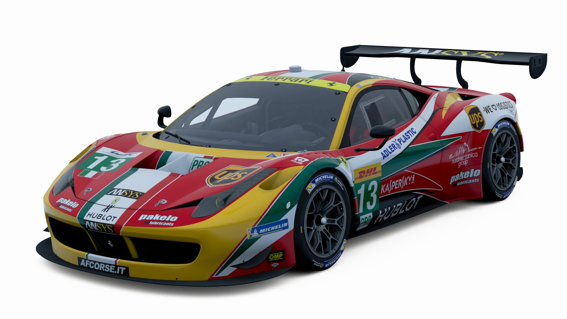
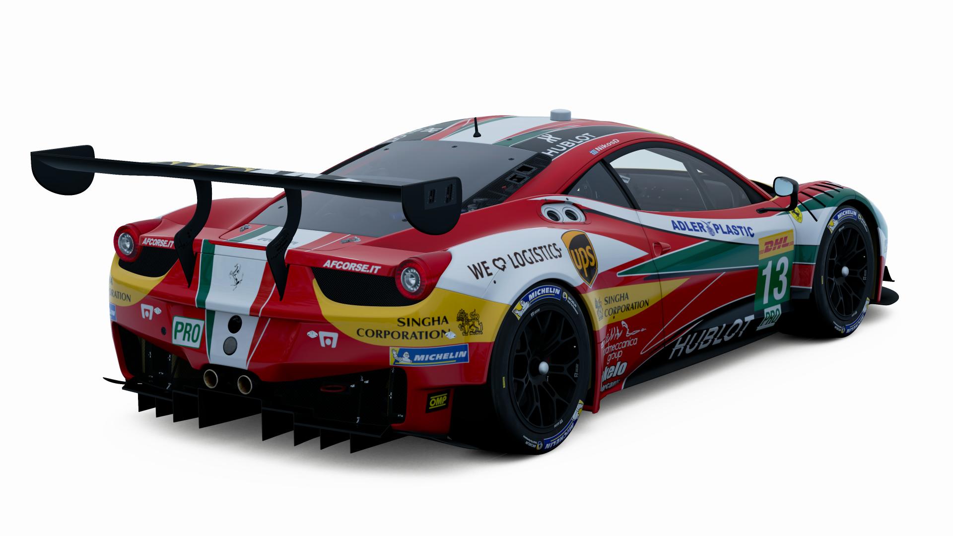
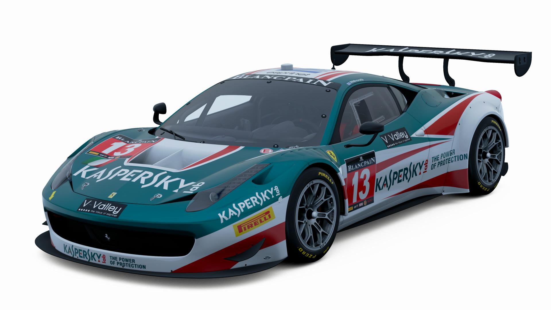
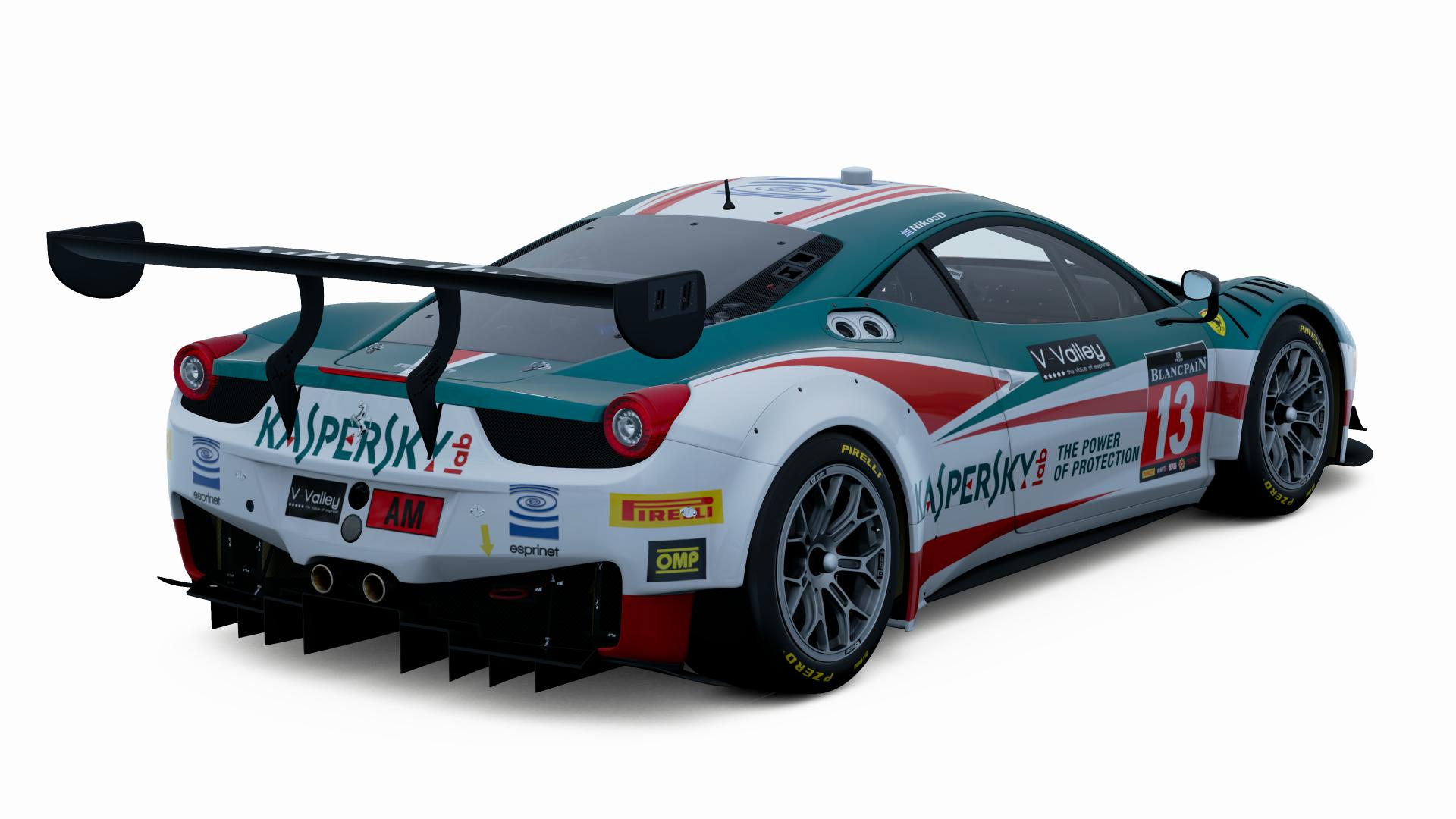
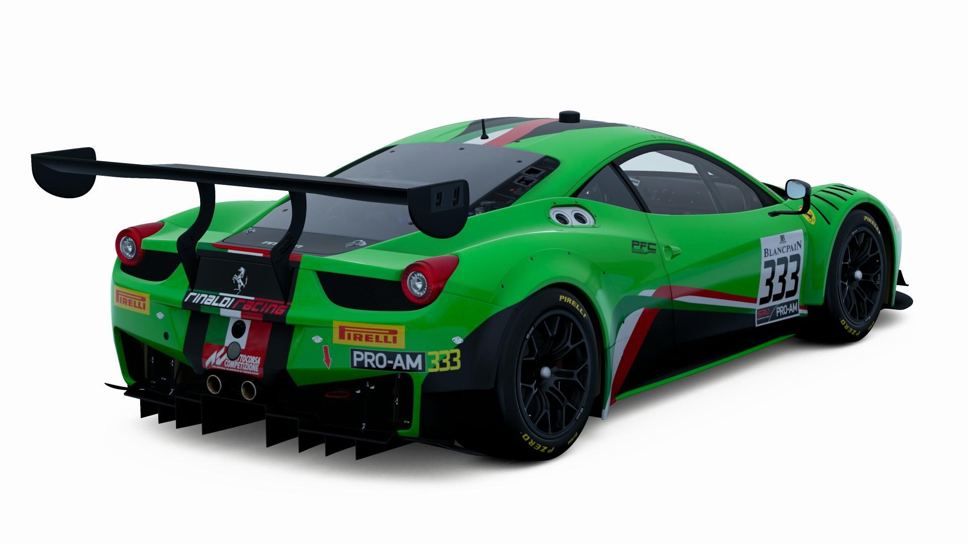
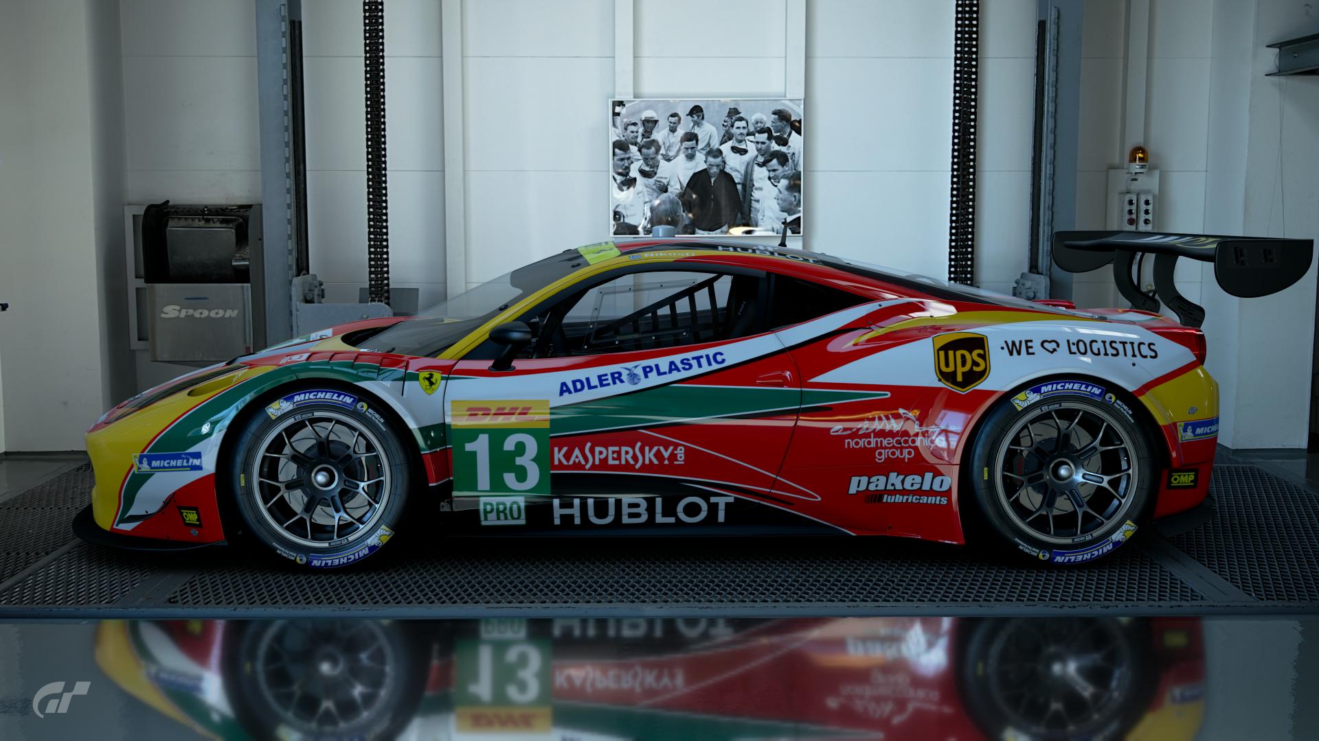
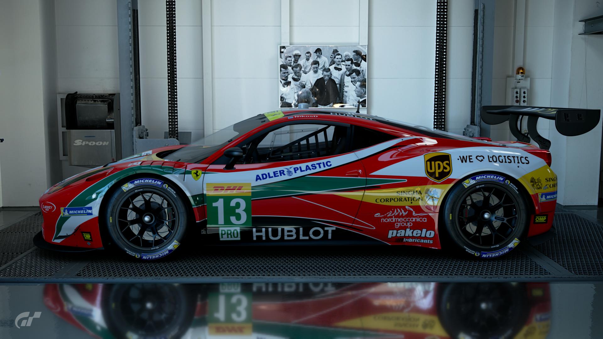
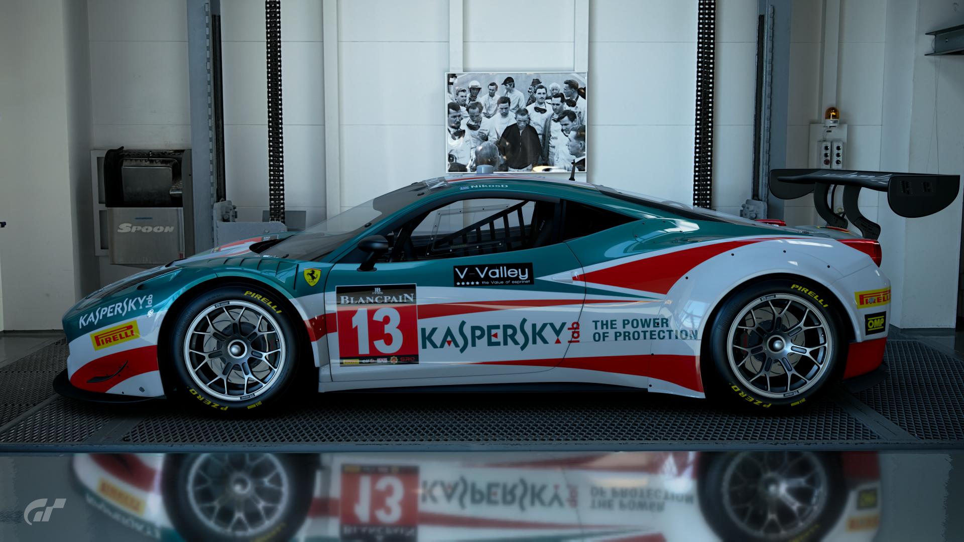
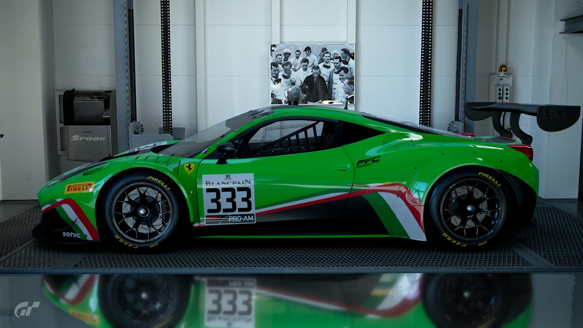
Hi everyone,
I love Ferrari, what can I say?
I decided to make some liveries for the Gr.3 one... So, here we go:
I love Ferrari, what can I say?

I decided to make some liveries for the Gr.3 one... So, here we go:
"AF Corse | Ferrari 458 Italia [GTE] | FIA World Endurance Championship - Season 2014 | prologue version"
"AF Corse | Ferrari 458 Italia [GTE] | FIA World Endurance Championship - Season 2014"
"AF Corse | Ferrari 458 Italia GT3 | Blancpain Endurance Series - Season 2015"
"Rinaldi Racing | Ferrari [488] GT3 | Blancpain GT Series - Season 2019"
Here are some extra shots, a bit more realistic lookin':
That's all for now folks! 

Last edited:
- 2,943

- Derby, UK
- TPC_Abarber95
- 438
- commanderr

Deserved victory for Hizal. Great speed and fuelsaving in that last race.
Created the liveries for Dutch (unlucky for Kevelham being ran off the track in the first corner) and German Bugatti liveries.
Dutch:
https://www.gran-turismo.com/nl/gtsport/user/livery/2399262/1/7349896597220655137
German:
https://www.gran-turismo.com/nl/gtsport/user/livery/2399262/1/7214784202297869353
- 2,026

- Vienna
- chrisspeed281
Unfortunately there was no Austrian at the Nations Cup in Salzburg but the Bugatti would almost look like this and i hope @commanderr has no Copyright at his Liveries 


Last edited:
- 1,076

- Nissa
- Sianimo
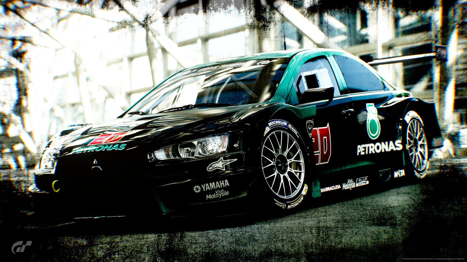
A small tribute to a future MotoGP World Champion, Fabio Quartararo. 
Jugà Coursa Lancer Evo.Final Gr.3 Fabio Quartararo
Sport Mode compatible

Jugà Coursa Lancer Evo.Final Gr.3 Fabio Quartararo
Sport Mode compatible
- 10,873

- Plymouth, UK
- motorforum


Here's another original Group C livery I've finished on, a ICI Jaguar XJR-9.
With that, I've done a unique original livery on all 5 of the Group C quintet.

Absolutely outstanding work, especially fond of the group shot.
- 2,526

- S.C.
- MMXtreme
A couple TCR Scoobies...


Kangan...https://www.gran-turismo.com/us/gts...lery/all/livery/1445033/1/8512458611710001201
Castrol...https://www.gran-turismo.com/us/gts...lery/all/livery/1445033/1/8368273052758180897
Then made my own Tuna version.


Kangan...https://www.gran-turismo.com/us/gts...lery/all/livery/1445033/1/8512458611710001201
Castrol...https://www.gran-turismo.com/us/gts...lery/all/livery/1445033/1/8368273052758180897
Then made my own Tuna version.


Similar threads
- Replies
- 3K
- Views
- 398K
- Replies
- 202
- Views
- 31K
- Replies
- 4
- Views
- 3K
- Replies
- 10
- Views
- 7K


