GT Sport Livery Editor Thread

  • Thread starter Snaeper
  • 3,669 comments
  • 561,803 views
Status
Not open for further replies.
i perfected my Last Livery which was Sinon on the Purgeot. because i made Sinon a SVG split into 5 parts i could move it to another car same with the Logo which was 3 parts, made it look better with better colours. hope you like it. (#SAO #ANIME #ITASHA i put itasha because it its Japanese for Livery well close enough to it as there is no direct translation, it also draws in more japanese considering its an Anime livery)
7349888967328694296_23.jpg
5773614791011631116_0.jpg
5917734387871416324_0.jpg
5773614799666578436_0.jpg
 
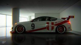
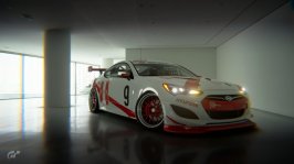
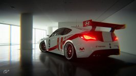
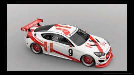
Being constructive, it looks a bit like you share a problem I have.....you ran out of ideas when you got to the front/bonnet/hood. The front is very plaincompared to the rest. Rest of it is very tidy though.


Yeah I thought that too. I sometimes can't remember which brand specialises in what, so I was just playing it safe to avoid a conflict. But otherwise, thanks for the feedback!

Edit: I just realised I have two racing apparel sponsors. :banghead:
 
Last edited:
Yeah I thought that too. I sometimes can't remember which brand specialises in what, so I was just playing it safe to avoid a conflict. But otherwise, thanks for the feedback!

Edit: I just realised I have two racing apparel sponsors. :banghead:

Google is your friend. I have a livery with three beers on it, because I used german sponsors on a german car and dont check to see what they were. It happens.

Its all curvy and flowy on the sides, then just a straight white section at the front. Now, I would love to give you an idea for what you could do, but as I say, its a weak area for me too! lol Maybe try running a flowing blue section off the roof, down the sides of the bonnet and across the front above the grill? Just so the white is outlined with curves instead of straight edges?

Tip for decals. Racing apparel, tyres, wheels, fuel, seat, suspension. Plus main sponsor. That gets you seven unique decals to use and then you can add some series unique ones or non-racing (phone, beer, website, etc) if you need more. Jus makes it a bit easier to play it safe and keep the air of realism we all like.
Sometimes even in real life stuff like this happens: you'll see a Rowe oil banner on a car sporting the castrol livery or decal mainly because rowe was one of the sponsors of the racing series
 
DTM Ford - 1988 Class Reunion
Slight element of repetition here really as the Lui car I've already posted and I have previously done the Eggenberger / Texaco Mustang livery remakes from previous years.

As I was in the position of having several cars on the go and none really getting finished I decided to try and focus a little by doing some cars from a single year as it sort of comprised of a set then.

Intro%2001.jpg

Intro%2002.jpg


Intro%2003.jpg


thumb04.jpg


Car No.4 : Klaus Niedzwiedz #dtm #doubleg213 #texaco


thumb05.jpg

Car No5: Manual Reuter #dtm #doubleg213


thumb06.jpg

Car No.6 : Steve Soper #dtm #doubleg213 #texaco


thumb18.jpg

Car No.18 : Klaus Ludwig #dtm #doubleg213 #speedware


thumb19.jpg


Car No.19 : Frank Biela #dtm #doubleg213 #biela


thumb20.jpg


Car No.20 : Bernd Schneider #dtm #doubleg213 #heingericke


thumb25.jpg

Car No.25 : Armin Hahne #dtm #doubleg213 #wurth

 
@zzz_pt That's cool.


A quick and loose Boss tribute...
Z5SFLYH.jpg


66mbWdt.jpg


Then I got an idea. Already done one Power Block giveaway car, and the RC Mustang seem to be a good fit for the PowerStop/Detroit Muscle car.
gZDWx9c.jpg


vanGtt3.jpg


5NgpaHW.jpg


Think I'm going to go back, and try to define the edges of the "over fenders" a little better, so they don't look so much like they're painted on, but it's not bad, I think.
 
]

Flickr gives an option to copy paste BB code which makes it easy to share on forums, this is the code for your image

Code:
[url=https://flic.kr/p/DRP8gh][img]https://farm5.staticflickr.com/4525/24848903418_0938a99074.jpg[/img]7215338422175564800_23[/url] by [url=https://www.flickr.com/photos/154803121@N07/]Seb K[/url], on Flickr

Which results in this when the code tags are removed

7215338422175564800_23 by Seb K, on Flickr
Thanks!!!
 
Fantasy Nismo GT3 Test Car - Godzilla


#gravelwraps #godzilla #nismo
Genre: Pop (?)

Download
Quick livery based around a poster for the 2014 movie, it kind of suited a test car, so that is the way I went. With the talk of patina in this thread, the decals could have done with some, maybe some thing for another day...

Talking of decals, they are shared as well, I am sure someone can make better use of them than me!
 
Apologies for the double post, but felt it better to keep this reply separate...My bad!

I use Inkscape and with the help from this video

I'm beginner with the whole process, so I don't understand what you ask me.. :(


You are tracing, make sure you remove the image that you have traced from the SVG, (as shown in the video clip)having a JPEG, PNG, PDF or Bitmap in there still makes for a big file.

The other reason the file is large is because the tracing has generated a lot of points, you can try the simplify option in Inkscape or go in and remove nodes yourself, this is time consuming, but will yield better results.

It would also be wise to check out this thread.
 
Don't care much for the brands as I have no idea what even half of them represents. I'm only going for aesthetics.
Then in my opinion, this might not be the artistic medium for you.

A car's livery is a political landscape, one that very rarely gets discussed in media due to the sensitive nature of money in motorsports.

A good livery, even in fiction, should represent that. Neglecting it in the interest of aesthetics is perfectly fine, but as you have seen, it will draw criticsim.
 
Apologies for the double post, but felt it better to keep this reply separate...My bad!


You are tracing, make sure you remove the image that you have traced from the SVG, (as shown in the video clip)having a JPEG, PNG, PDF or Bitmap in there still makes for a big file.

The other reason the file is large is because the tracing has generated a lot of points, you can try the simplify option in Inkscape or go in and remove nodes yourself, this is time consuming, but will yield better results.

It would also be wise to check out this thread.
Thanks for your reply!! I'll check it tomorrow morning!!
 
Then in my opinion, this might not be the artistic medium for you.

A car's livery is a political landscape, one that very rarely gets discussed in media due to the sensitive nature of money in motorsports.

A good livery, even in fiction, should represent that. Neglecting it in the interest of aesthetics is perfectly fine, but as you have seen, it will draw criticsim.

That's a rather elitist way of putting it. I don't really agree that virtual cars should be bound to real world politics. If anything they should transcend that in order to make way for more creative freedom. I saw a car in GTS a couple of days ago that had like a thousand Michelin stickers on it. Some of them were clearly visible and others were used to create interesting shapes and designs along the car body. It was not the most pleasant car to look at but I gave it a thumbs up for creativity and a bit of humour.

To be honest I had no idea that people were so intent on criticising non-authentic liveries with certain mixes of brands. I almost feel like it's a bit rude and arrogant to do so. Why question another persons artistic vision? The game does not state any kind of rules and some people really like to take advantage of that in every way possible. Me included.

It certainly appears as if constructive criticism with an explanation of why its not an ideal use of the sponsors has escalated into “dont do it or dont paint at all” discussion. Which it certainly shouldnt be. Noone can tell you you MUST do anything.

However, I still think that for minimal effort you could find sponsors which A) dont clash and in fact B) are colour coordinated to work with your design. Thereby gaining a twofold benefit for a little bit of leg(finger)work. But its an opinion, unless youre doing an exact replica there is no reason you cant do whatever you want to YOUR car.

I mean jeez, its a game. Im happy to see someone try and get to grips with the editor at all and certainly dont want to see them completely discouraged from learning it and getting feedback on their work. I see no reason to say this medium isnt for them, when clearly there can be multiple types of livery including honking great big transforming robots and men in dark suits with gadgets, not to mention small blue people and a donut loving imbecile.
 
Status
Not open for further replies.
Back