slipSHOTS: GT4

  • Thread starter SlipZtrEm
  • 725 comments
  • 62,519 views
I must say it's not my style,, but I like them alot,, I like how the exposure contrasts with the cars color,, The car is dark and the background is light... Some very classy shots out there mate,, Keep em coming and if you wish,, stop by at my gallery sometimes and drop a comment if you have some time left:)
 
Very nice, Slip.
They're good, something a little different.
I like the last a lot, it has that soft-sharp look.
 
Grear gallery Slip, I love the layout on page one and your shots are really good, I've got some wallpaper to keep me going keep up the good work 👍
 
This is the best Gallery I've seen in a while. . . .

The way the cars are colour, background black and white looks great.
I love the Suzuki Concept pictures most, hope to see more updates soon :)
 

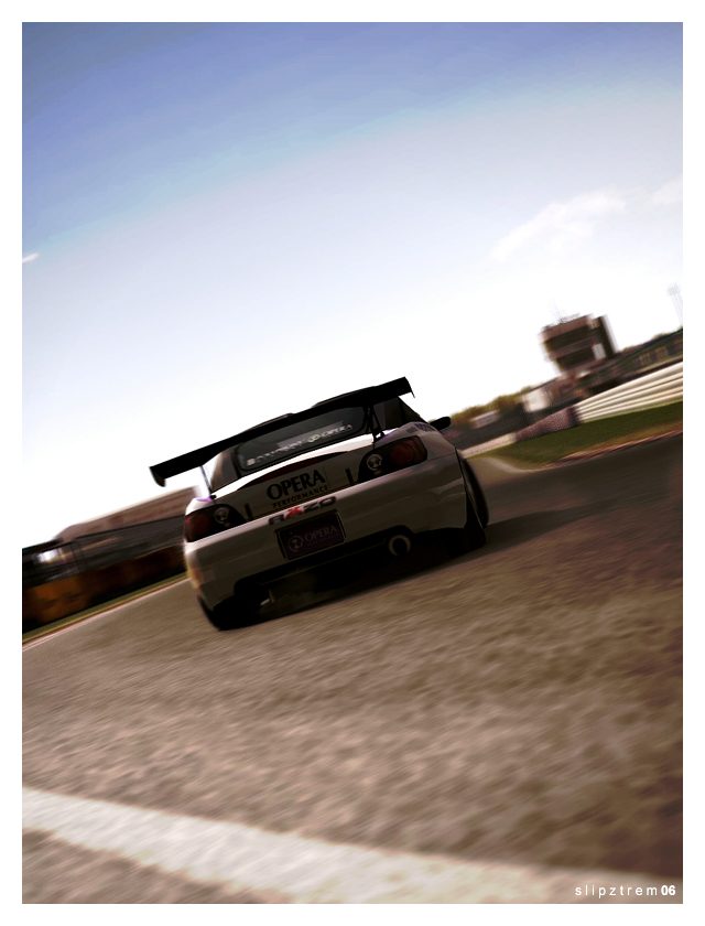
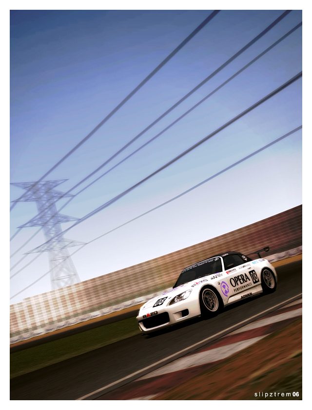
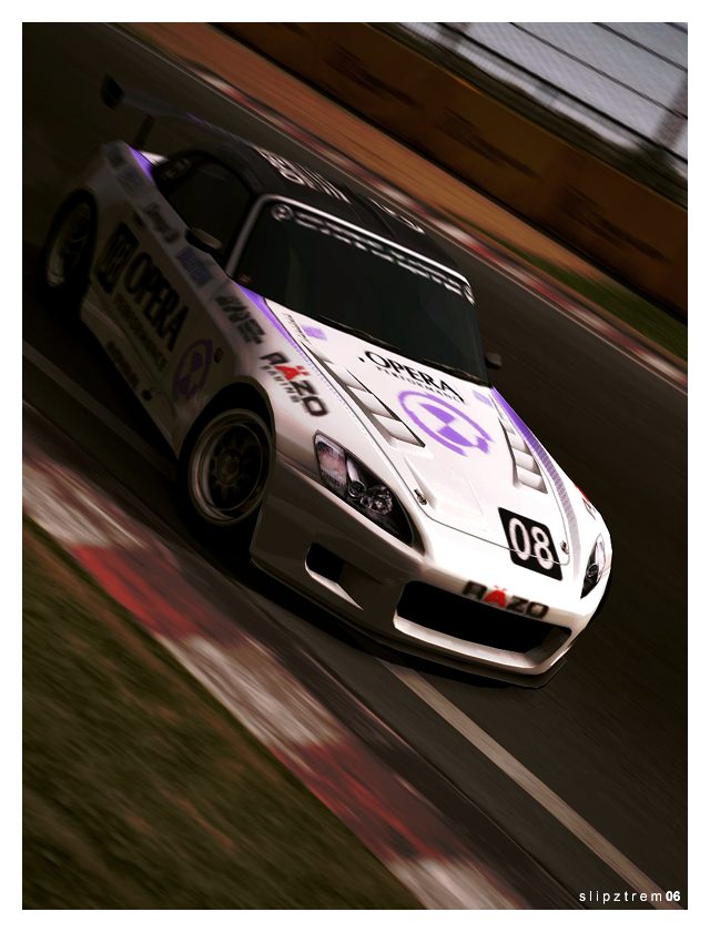
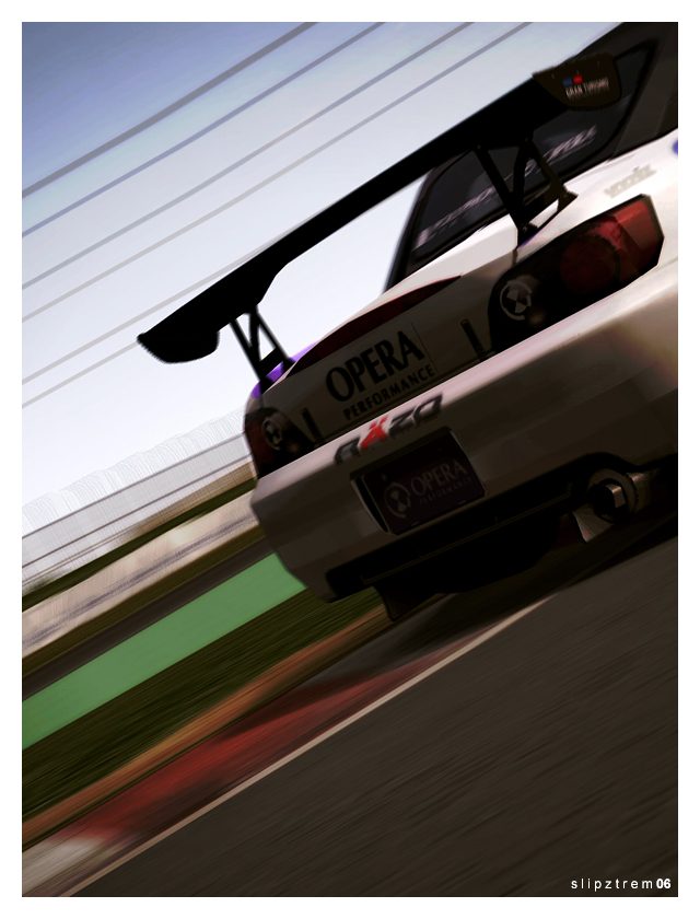
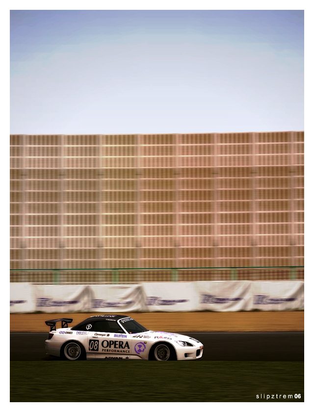
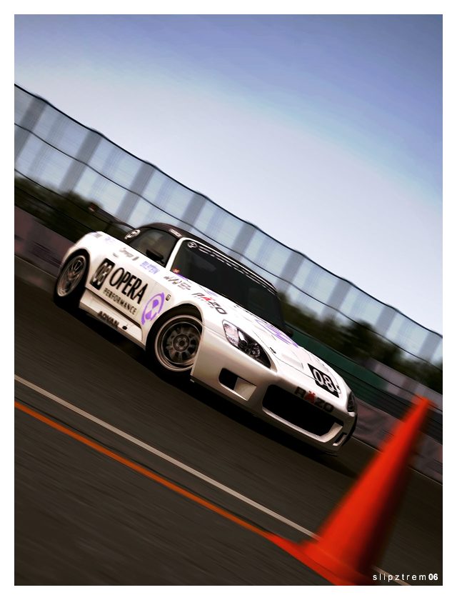
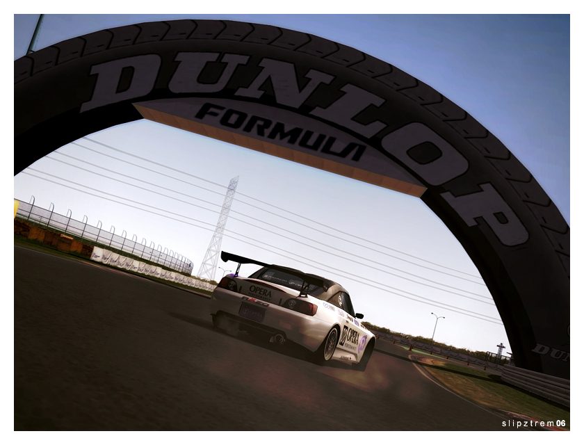
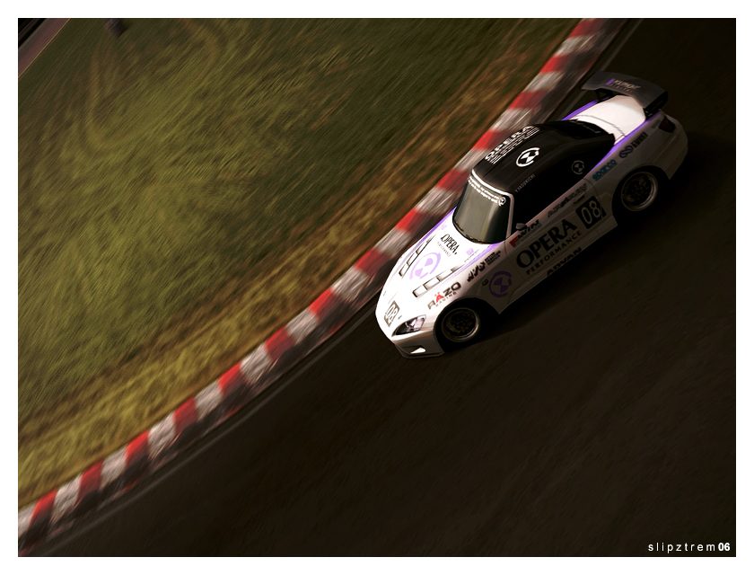
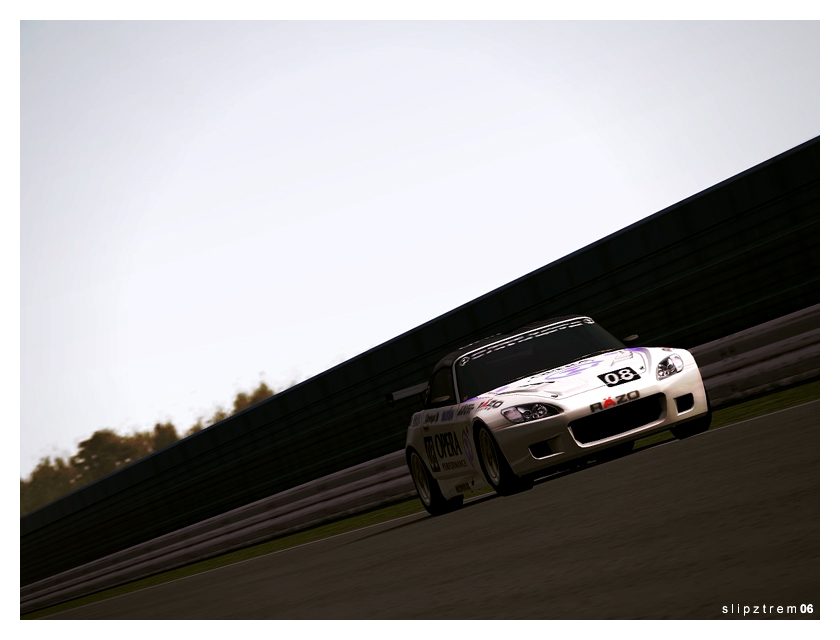
Update: I will respond to the old posts when I can, just wanted to get this up before bed. A simpler approach to editing this time around; just levels, colour balance, a bit of desaturation, and fiddling with an extra layer (vivid lighting at a low percentage, fwiw). I'm very happy with how well Number 3 turned out.
 
Last edited:
these are awesome slip, very very nice...if you get a chance, come check out my gallery and let me know what you think about my latest update...id appreciate it!
 
Hey, I like those S200 shots! 👍 Did you alter the layers blend mode to burn or dodge? Whatever you did, the effect is striking. The frist two are awesome, but thats not to take anything away from the whole set, as they are all fantastic. Great stuff, keep 'em coming! :dopey:
 
I like them. Like you said the verry simple editing its looking nice. Just like mine own opera s2000 update a few months ago. good job on the 2 and 6 pic.
 
Vonie - Wow, you must really like them then. I'm glad :). I knew when I took that 2nd shot that I had to throw it in a gallery, and it's what made me finalize the car for this update. Before it I had tried a few different car/track combos and none felt "right".

Matt - I've found my images are usually more on the dark side. I'm not sure why either, but some of the pics aren't dark; it's just that I use the same methods of editing for the whole set (levels are different for each picture, though). The layer I added made things darker, too.

D_P - ...so it's safe to assume you're a fan of your namesake? ;). Thanks for stopping by, and I dropped by your gallery as I typed this (ah, the joys of Firefox).

JFM - Thanks bud!

JMX - I'm glad you enjoyed the Ford so much, since you inspired it. To know you like the S2000 even more is a bonus, in my mind. Thanks for taking a gander :)

Magburner - I made a duplicate layer of the image and set it to Vivid Lighting and played with the percentages. I've found playing with a layer's blend mode can add a lot to an image lately, especially two or three different ones :)

Fallen - Thanks, that is exactly what I was going for. I was looking at the beginning of my gallery and realized I enjoyed the amount of work put into images then. It also meant I was more selective with taking the actual GT4 shots, instead of just thinking "oh, blur will cover that up".

LGForce - I checked your gallery and could only find a single Opera S2000 picture, but I kinda see what you mean. The #6 pic was one of many shots from that exact moment, just an angle that worked best. It worked well with my Ford GT comp entry, so I figured I'd do it again :).

Information: This isn't something I do too often; I'm probably going to be throwing another update up by night's end. Just as the last couple posts have been very different from one another, this will follow suit. That's all... ;).
 
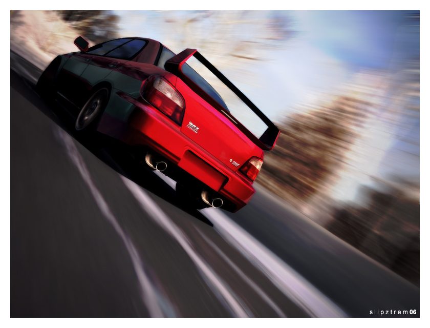
Subaru WRX STi Prodrive Style @ Togakushi Kogen


(click for full size)
___________________________​

Update: Spent a solid couple hours cleaning this one up. Wanted to show off the very nice wheels (the '00 RX-7 RZ's), but I may do another angle from the front, much like the older Civic update. I remember the red prize WRX from GT3 and wanted to recreate it (with a few differences). Enjoy!

D_A - Yes, I do, though I don't listen to them often. Noice 👍
 
Last edited:
wow! this is sooo awesome man, so clean, i wish that i could clean up images like that...nice job on the exhaust too...looks like it was there the whole time...also you put D_A instead of D_P...haha...
 
I feel special. :) Love everything about it. Interesting idea with the twin mufflers, the angle and blur is perfect and of course absolutely PERFECT car choice. 👍
 
LGForce - Thanks man 👍

D_P - Sorry about that, I'll get it right from now on. The exhaust was pretty simple, and the cleanup was too, actually (except the front door's reflection). The hardest part was pulling off the colour change convincingly. I wanted it to be as close to the Blitzen's as possible.

Krame - I was hoping you'd like it ;). I was going to throw a diffuser on the back instead of the twin exhaust, but I couldn't get it to look just right. Also, I think if I would've thrown a lower bumper on the back it would help the aesthetics a bit, but oh well, right!

725 - Thanks for stopping by, thanks man :)
 
Awesome Evo (is there an echo here?) :sly: Just seen Krames, and yours is equally impressive! I love the angle and the lighting, and the car looks super smooth. Great stuff, keep 'em coming! :dopey:

If you get chance, feel free to check my gallery, and leave comments. 👍
 
Fantastic picture, I like it a lot slip. The only thing I'm sketchy about is those exhaust tips... If I saw 2 on a Subaru, I'd look the other way...
 
Rev - Thanks for throwing a comment up, even if we've talked about it enough back-channel ;). I only do smaller photoshop stuff because I'm no expert like you!

Magburner - I'll come stop by... but Evo? EVO?! I'm offended! Haha...

Matt - Thanks buddy. My idea behind the dual exhausts? Well, swapping the 3.0L flat-six into WRX's is getting more common, so a dual exhaust would actually be appropriate then ;).

There's an update coming within the next couple hours... I apologize for the frenzy ;).
 
Back