You are using an out of date browser. It may not display this or other websites correctly.
You should upgrade or use an alternative browser.
You should upgrade or use an alternative browser.
VP's Creative Competition - 2nd Installment
- Thread starter Vicious VP
- 48 comments
- 2,053 views
- 199
It's resized to fit the image, so the borders are perhaps less than in the provided image. In addition to resizing and sharpening, I cleaned up the reflections, added a mirror reflection to the side door and enhanced the shut lines on the body some. I also substituted the wheels and added a more sunset golden hue to the sky dome reflections. I mildy increased the contrast to make the reflections pop a bit more and added the light effects to please my "client".
franz
Premium
- 5,420

- Vancouver
- GTP_Franz
that's pretty good
too bad the rear wheel doesn't align properly with the body
originally I was thinking to make bling bling wheel ad
I have been checked out TIS and Asanti
the wheel photos are all not matching the camera angle
and this is what I hate about chopping ... *sigh*
btw ... I think the ground reflection shrinked too much
Final Entry
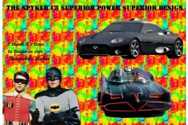
if you're going to buy a high performance car buy a spyker it's both stylish and fast
[img=http://img210.echo.cx/img210/1115/spyker1xn.th.jpg]
if you're going to buy a high performance car buy a spyker it's both stylish and fast
[img=http://img210.echo.cx/img210/1115/spyker1xn.th.jpg]
Attachments
- 3,001
- 3,001
I still don't see an entry.
- 585

- Oregon, USA
- Digi-Gen
Today is the day! Get 'em in if your gunna'! 👍
- 585

- Oregon, USA
- Digi-Gen
COMP CLOSED
I will choose a winner and post my comments soon ...!
I will choose a winner and post my comments soon ...!
- 585

- Oregon, USA
- Digi-Gen
Here are the winners of this installment of Vicious' Creative Competition


Submitted By: Easy$$
Score: 29/30
Good composition - 5
Font use - 5
Originality - 5
Overall appeal - 5
Technical proficiency - 5
Sellability / Usability - 4


Submitted By: Franz
Score: 22/30
Good composition - 4
Font use - 3
Originality - 4
Overall appeal - 4
Technical proficiency - 4
Sellability / Usability - 3


Submitted By: Easy$$
Score: 15/30
Good composition - 3
Font use - 3
Originality - 3
Overall appeal -
Technical proficiency - 3
Sellability / Usability - 3
My heartfelt thanks go out to all the other entries who did not quite make it in to the top three. Please review the winners images and see if you can incorporate some of the best traits in to your own designs. I look forward to the next set you bring to life!


Submitted By: Easy$$
Score: 29/30
Good composition - 5
Font use - 5
Originality - 5
Overall appeal - 5
Technical proficiency - 5
Sellability / Usability - 4
Vicious VPThis ad is simply awesome - Easy$$ really knocked this one out of the park. The use of high contrast and the mixture of dark and light colors really pull you in to the design. The special attention that was paid to the reflection on the auto, is very apparent; as is the quality of the bulbs as they were removed from their previous background. The lines that run throughout the ad is fairly commonplace in ads of this nature, which shows that E$ is in tune with what is the current trend in ads in this style ... or that he spends too much time looking at other peoples work.
The only issue I see, and it is a minor one, is the verbiage used in the info on the ad. It does not seem to flow well for me. Maybe if it were modified to read:
"The unique top-coat adds a slight blue tint to the lamps output while still providing the outstanding performance you have come to expect from PIAA."
NOTE: The other thing I noticed in this ad is that the PIAA factory is apparently located less then a mile and a half from my home. Who knew ...


Submitted By: Franz
Score: 22/30
Good composition - 4
Font use - 3
Originality - 4
Overall appeal - 4
Technical proficiency - 4
Sellability / Usability - 3
Vicious VPI like the look of this ad. It is bold and would stand out well on a page of text. The reflection of the car and bottle is a great touch, and really helps to ad some depth to the design. It is clean and simple, which in this ad, works well.
The part I have an issue with is the text. You can ask suzq044 about what stickler I am on that subject. The main problem I have with it is TOO clean. Look at the rest of the image: the text is the ONLY thing in it that is not semi-blury. Sometimes you have to "dirty-up" the text in order to make it fit the rest of the design. I had to do that exact thing in my New York Times Mustang ad. If I had not, the illusion of the text actually being printed on the paper would have been lost.
The second item is what the text says. It sounds like "If a lightning strike destroys a tree and it lands in my Spyker, I know that it will be fine because I used 'Armor All' on it.". A better tag line might have been: Help protect your car from natures furies.


Submitted By: Easy$$
Score: 15/30
Good composition - 3
Font use - 3
Originality - 3
Overall appeal -
Technical proficiency - 3
Sellability / Usability - 3
Vicious VPThis is what can happen when you make an "off the cuff" suggestion - and an outrageous one at that. Easy$$ took a bad idea and turned it in to a decent ad. He did a good job of mixing the car in with the item that was really being sold - toothpaste in three varieties. As for the content ... I have no clue. I really did not want to type the whole thing in to Babblefish to get a translation, so my suggestion is "Next time, paste the translated text in to the post so we can all see what it says."
The only real issue I see is that the car looks really flat on the ad. There is no shadow under the car, outer glow, anything that helps it to blend in to the ad. It just looks "pasted" in there. But, I can also see why less attention was paid to it. It is because this ad was made more as a joke then a real contender, but due to the competition, it still faired well enough to earn a 3rd place.
My heartfelt thanks go out to all the other entries who did not quite make it in to the top three. Please review the winners images and see if you can incorporate some of the best traits in to your own designs. I look forward to the next set you bring to life!
- 199
Wow...1st and 3rd, Cool!
Congrats Franz on 2nd place.
The text in the ad is as follows:
Left side: Enter for your chance to win!
Top: a Spyker C8 or 80,000 Cash (euros)
Below top" Brought to you by your favorite toothpaste brand, Parodontax.
Below the car: Delivery date of car is subject to availability. If C8 is not immediately available due to demand, Parodontax reserves the right to award the winner with 80,000 cash prize (euros)
Bottom: Entry forms available at your local supermarket, or visit us at www.parodontax.nl
Thanx for the awards, look forward to the next challange. :tup"
- 3,001
Congratulations Winners!
I am amazed with first place. I thought that franz would get first place, and Easy$$ would get second and third place.
I am amazed with first place. I thought that franz would get first place, and Easy$$ would get second and third place.
Similar threads
- Replies
- 6
- Views
- 1K
- Poll
- Replies
- 30
- Views
- 4K
- Replies
- 17
- Views
- 2K
- Replies
- 51
- Views
- 7K
- Replies
- 106
- Views
- 10K


