You are using an out of date browser. It may not display this or other websites correctly.
You should upgrade or use an alternative browser.
You should upgrade or use an alternative browser.
Welcome to GTP16: Dark Mode, Emojis, Reactions, Bookmarks, and So Much More...
- Thread starter Jordan
- 356 comments
- 21,692 views
- 16,596

- Melbourne
- ScottPuss20
- CheetahsMeow
Hello, who dis?
The website is somehow better and worse at the same time.
Worse in that I have to scroll past subscribed threads and new posts to see the sub-forums that I want.
Better in that extra new features have been added and the design refreshed.
Worse in that images are removed from the front page on mobile.
Better in that more emoticons/emojis/reactions are now available.
Worse in that the list of forums looks a bit more clogged.
Better in that more information is displayed under each user.
Take that as you will.
- 24,465

- United States
- GTP_Jordan
- GTP_Jordan
Instagram embeds should be working again, you won't have to do anything different.@Jordan the one thing I have noticed is that previously embedded Instagram posts now just show as a link. Is there another way we need to go about embedding them, or is it no longer an option?
@GTP Red Pill, the issue you were experiencing with embedded YouTube playlists has also been resolved now.
It's an item in the "Forums" menu.Liking the new look, sleek and refined 🤘
Am I being blind or is the "Mark Forums Read" link missing?
CodeRedR51
Premium
- 55,332

- United States
Confirmed, thanks.Instagram embeds should be working again, you won't have to do anything different.
- 3,003

- Dundee, Scotland
Finally the great dark mode has arrived!
Thanks for all updates, certainly makes forum much easier reading on the work PC already and thanks for all the new emoji's too!
Thanks for all updates, certainly makes forum much easier reading on the work PC already and thanks for all the new emoji's too!
- 24,465

- United States
- GTP_Jordan
- GTP_Jordan
In addition to the previously mentioned bug fixes, here are a few more updates from this evening:
- As mentioned, the search engine is back up to full strength. All of your posts and topics should also be visible from your profile again.
- The "similar threads" and "thread suggestions" feature as mentioned in the OP are now working.
- Site-wide search (including articles and forum posts) is available on the home page and articles again.
- The links to view all subscribed / followed / watched threads in the box displayed at the forum home page have been fixed.
Last edited:
A few quick updates on the most pressing issues:
- List and gallery buttons have been restored in the post editor menu.
- External login services (Facebook, Google, and Twitter) have been restored.
- Avatar uploads are working again.
- Avatar transparency is working again.
- 2,055

- Bristol, UK
- OJBrit
Looking at the new site.

Talking of reactions, will there be any custom ones? I've seen some on other forums and they do give a unique flavour.
But otherwise looks good.

I thought that's all we were supposed to do here?I'm also pooing everyone's replies because this is the behaviour you're encouraging and you cant stop me
Talking of reactions, will there be any custom ones? I've seen some on other forums and they do give a unique flavour.
But otherwise looks good.
- 30,052

- a baby, candy, it's like taking.
- TexRex72
@TexRex's font colour looks so much nicer in dark mode.

- 5,768

- Anoka, MN
Is there a way to hide the "threads you follow" and "latest posts" sections? I don't care to see those and they just clutter the top of the main forum. Also, can you remove the HOME> hyperlink from just below the header? Clicking on the GTplanet logo above already brings you to the main website, so I don't think you need another spot below it to do the same thing if you're in the forums.
For some plusses, I am enjoying the wide screen and the dark mode.
For some plusses, I am enjoying the wide screen and the dark mode.
- 40,912
This is my main criticism of the layout. I went through and deleted all of the threads in my watchlist to try and get rid of the former, and the box is still there but now says "Results Not Found"Is there a way to hide the "threads you follow" and "latest posts" sections? I don't care to see those and they just clutter the top of the main forum.
It's especially cumbersome on mobile, since you have to scroll a fair bit to get past to see any of the forum proper.
- 24,465

- United States
- GTP_Jordan
- GTP_Jordan
If you're not signed into an account you will now see a quick reply form at the bottom of thread pages. However, once you submit it, you'll be prompted to log in or register before it is actually posted.You don't have to be logged in to be able to post?
I took them out of the header as social channels and platforms are not really a priority for us. I may add them back elsewhere in the template, maybe the news sidebar or footer, but as of now there are no consistent links to them.@Jordan
Where did the social medial links go? Every once in awhile I will go here then go into one of the media pages that was on the top right.
Did they move somewhere? 🤔
Not currently, but I will add a feature that lets you collapse those sections.Is there a way to hide the "threads you follow" and "latest posts" sections? I don't care to see those and they just clutter the top of the main forum. Also, can you remove the HOME> hyperlink from just below the header? Clicking on the GTplanet logo above already brings you to the main website, so I don't think you need another spot below it to do the same thing if you're in the forums.
For some plusses, I am enjoying the wide screen and the dark mode.
- 3,411

- the bottom of my heart.
- kolio123
👍Not currently, but I will add a feature that lets you collapse those sections.
- 35,476

- Downtown North Dakota
- Cy-Fi
@Jordan - Visually I can't tell the difference between threads that have new replies and threads I've read. Is there a setting on my end that needs to be changed?

I have read GTPlanet Dads! and What are you Eating/Drinking? but not the Real Guns, Funny Screenshot and Didn't know that threads but they all look the same.
I have read GTPlanet Dads! and What are you Eating/Drinking? but not the Real Guns, Funny Screenshot and Didn't know that threads but they all look the same.
Last edited:
- 24,465

- United States
- GTP_Jordan
- GTP_Jordan
Something's definitely going on there, as it's showing all of the text as bold.@Jordan - Visually I can't tell the difference between threads that have new replies and threads I've read. Is there a setting on my end that needs to be changed?
View attachment 1061615
I have read GTPlanet Dads! and What are you Eating/Drinking? but not the Real Guns, Funny Screenshot and Didn't know that threads but they all look the same.
Nothing in the site theme would make that second line of text bold, so my guess is a browser or operating system setting is just "bolding" everything. It might be a global font or accessibility setting. Does all the text on the site look unusually bold, or just in certain areas?
For reference, here's what it should look like.
Last edited:
This is how it looks like in Firefox.Something's definitely going on there, as it's showing all of the text as bold.
Nothing in the site theme would make that second line of text bold, so my guess is a browser or operating system setting is just "bolding" everything. It might be a global font or accessibility setting. Does all the text on the site look unusually bold, or just in certain areas?
For reference, here's what it should look like.
View attachment 1061629
Last edited:
- 165

- London, UK
/FacepalmIt's an item in the "Forums" menu.
The Forums menu... It scrolls 😄🙃
Last edited:
- 5,502

- Vic, Australia
- gundalini
I'm going to have to go back to the light scheme even though the dark scheme is much more aesthetically pleasing.
Finding it too difficult to see the bold difference for the threads which have unread messages. Spending a bit of time clicking on a thread with no new messages in the dark scheme.
Finding it too difficult to see the bold difference for the threads which have unread messages. Spending a bit of time clicking on a thread with no new messages in the dark scheme.
- 35,476

- Downtown North Dakota
- Cy-Fi
It looks like it's a work computer setting because my desktop at home and my phone are working as intended. 👿Something's definitely going on there, as it's showing all of the text as bold.
Nothing in the site theme would make that second line of text bold, so my guess is a browser or operating system setting is just "bolding" everything. It might be a global font or accessibility setting. Does all the text on the site look unusually bold, or just in certain areas?
For reference, here's what it should look like.
View attachment 1061629
- 30,052

- a baby, candy, it's like taking.
- TexRex72
I've observed two full line breaks are required subsequent to embedded media for text to appear a single break beneath said media. It's not a major concern with knowledge beforehand, but it was hard to miss with my mild OCD with regards to post appearance.

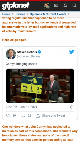
Because I am a little anal, I checked a post with an embedded YouTube video (these two are the only platforms from which I embed) prior to update and, sure enough, the single full line break in the post as originally composed results in text appearing immediately beneath the video.
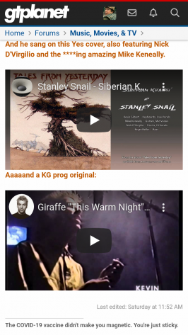


Because I am a little anal, I checked a post with an embedded YouTube video (these two are the only platforms from which I embed) prior to update and, sure enough, the single full line break in the post as originally composed results in text appearing immediately beneath the video.


- 24,465

- United States
- GTP_Jordan
- GTP_Jordan
You might want to check these Windows font settings. It's probably something in there:It looks like it's a work computer setting because my desktop at home and my phone are working as intended. 👿
Change the size of text in Windows - Microsoft Support
Change the size of text in Windows using Settings or Magnifier.
Similar threads
- Replies
- 0
- Views
- 414
- Locked
- Replies
- 22
- Views
- 2K
Latest Posts
-
-
Gran Turismo World Series (Manufacturers Cup Exhibition Season: Feb 5 - Feb 19)
- Latest: A_Higher_Place
-
-
-


