You are using an out of date browser. It may not display this or other websites correctly.
You should upgrade or use an alternative browser.
You should upgrade or use an alternative browser.
slipSHOTS: GT4
- Thread starter SlipZtrEm
- 725 comments
- 62,516 views
- 27,387

- Toronto
- NewAesthetic
- SlipZtrEm
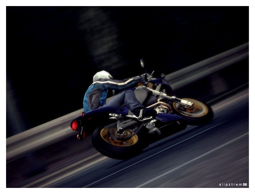
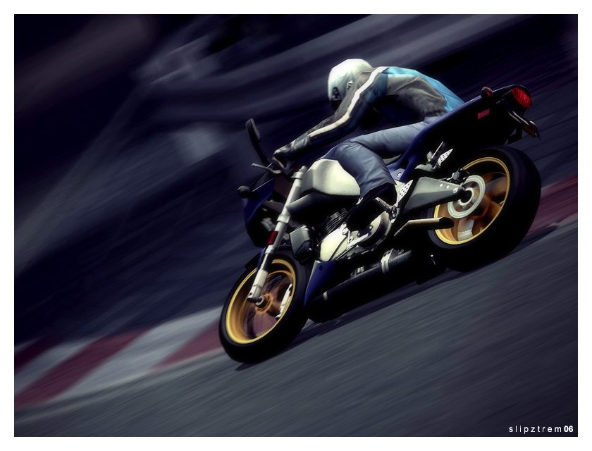
Buell Firebolt XB12R '05 @ SS Route 5
___________________________
___________________________
pain killer, Vonie, Streetz, and McLaren - Thanks guys!
Fallen - I'm glad you like it, your CF tutorial is what convinced me to bring the vision to reality!
Magburner - I originally planned on throwing a diffuser back there, but I decided a simpler, S2000-type rear would look good. Thanks!
Matt & R32Mania - I really wish they had too, so that's entirely why I did it
 .
.440 - Nope, I used FA's tutorial. It's really easy to figure out and I was happy with the results

Franz - Hey now, you're giving me too much credit!
 . The comp entries will all be organized soon, I've just been thinking of a way to do it. There's a heck of a lot of them
Diabolical - Pffft, it's been a year!
 . I'm entirely sure we'll continue seeing a lot of original stuff from you, you're one of the veterans around these parts
Enjoy!
Last edited:
- 852
Great tt pics. Very nice lighting. keep up the good work 👍
franz
Premium
- 5,420

- Vancouver
- GTP_Franz
Good bike choice Slipz 👍
they all look very nice because blue bike match blue background
I think the 4th shot can add a bit shadow under the bike
it feels like copy-and-paste a bike over a blurry background
You know they are running a Buell helmet design comp at playstation.com
the winner will get a real firebolt
but damn its for states residents only
anyway, how you like your TT so far? get used to its handling yet?
they all look very nice because blue bike match blue background
I think the 4th shot can add a bit shadow under the bike
it feels like copy-and-paste a bike over a blurry background
You know they are running a Buell helmet design comp at playstation.com
the winner will get a real firebolt

but damn its for states residents only
anyway, how you like your TT so far? get used to its handling yet?
- 4,334
The second is fabulous, the rims look sensational! 👍
I was thinking of doing a helmet design for fun, and let some random US resident enter for me… The .pdf template (867kb) you get given is great because you can import it into Illustrator and separate it into layers for Photoshoping.
It’d be neat to see what people could come up with, regardless of eligibility.
- 27,387

- Toronto
- NewAesthetic
- SlipZtrEm
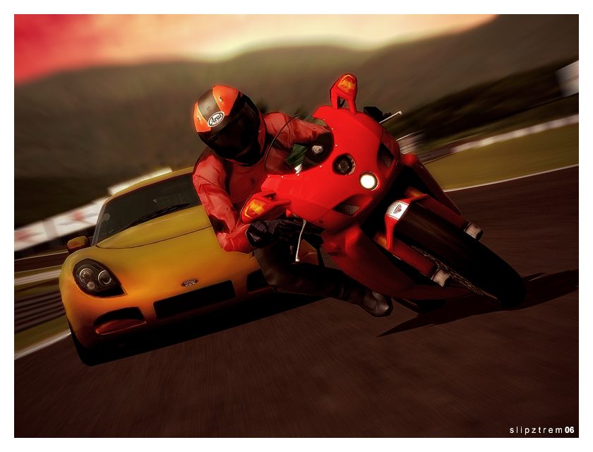
TVR T350c & Ducati 999R @ Fuji
(click for full size)
___________________________________
(click for full size)
___________________________________
Update: Cross-posted from my TT gallery, I decided this is just as suitable in this gallery, and I figured not everyone's over checking the TT boards yet. So enjoy, this took some work

Franz - Yeah, I got used to the handling pretty quickly; I golded the licenses and took out all the challenges, then the races weren't much of a problem. I was shocked with how short the game is; 100% finished in a week
 . You were definitely right about the blur; I was mostly in a rush with that update
  .
.ALPHA - Thanks, I was shocked with how well the rims came out in that shot as well!
Matt - Yep, got it too, though I don't like the blur I did
 .
.Vonie - I agree, the Buell shots are far from my best, I'm glad someone agrees 👍.
Thank you to everyone else!
Last edited:
Syntax error
Staff Emeritus
- 3,438

- Melbourne
- Fett_up
- totallyfettup
Very cool Slip, the Duke shot is great. The Buell shots are fantastic too....
- 1,805

- Adelaide
- Revolution52
Great pic, Slip. The sunset overtones add a real atmosphere to the pics, and both car and bike are oh-so-smooth 
👍👍
I can't wait to do some stuff like this when I finally get my hands on TT

👍👍
I can't wait to do some stuff like this when I finally get my hands on TT

- 507
SlipZtrEm
is that photoshoped or can you do that in TT
- 16,736

- Southampton, UK
- Pebb--
- Pebb
He photoshoped it, oh and lush shot that is.drifterboyis that photoshoped or can you do that in TT
- 507
oh okTVR&Ferrari_FanHe photoshoped it, oh and lush shot that is.
BTW AWSOME shot slip
- 27,387

- Toronto
- NewAesthetic
- SlipZtrEm
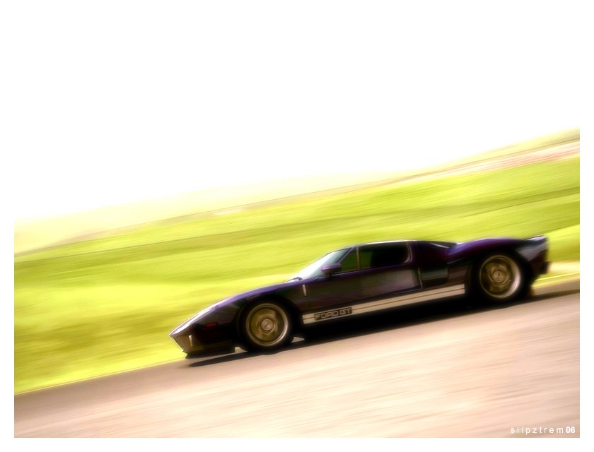
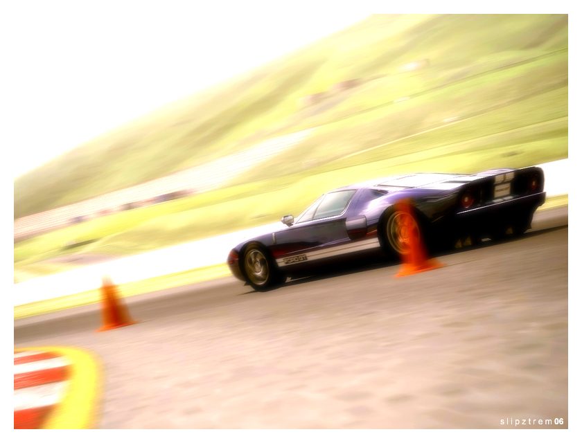
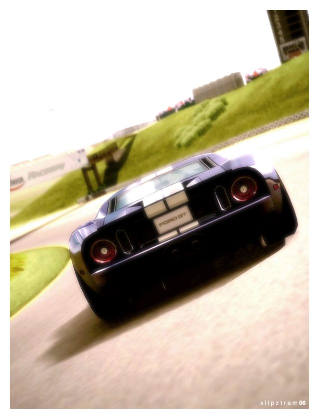
Ford GT & Supercar Friends @ Infineon Sports
___________________________
___________________________
Update: It's not much, and I know it's not my best... but it's different, for me anyways. I tried to edit the pictures in more of JMX's, or Empty Space's, style, and I'm particularly pleased with the second shot's realism. Yes, the shots are meant to look over-exposed
 .
.Enjoy!
Last edited:
- 1,238
- cod_father_204
Ohhhh... I like. I like alot. They do have a high realism factor

Keef
Premium
- 24,975

- Dayton, OH
- GTP_KeefRacer
- GTP Keef
I like all of them too. They're those less-PSed pictures I've begun to dig. Something about it makes them look more realistic than most, like you said. I have no idea how KMX and friends edit their pics, but they do turn out amazing. These are similar. No fancy blurs, no bright contrast, just really well-taken pictures.
- 2,381

- Midnight City
- RetroGiant
- TheRetroGiant
Sometimes its good to mix it up and change styles a bit. The same exact style every single time gets boring. I think these pictures were definately a success!!!
- 1,898

- Indianapolis, IN
- GTNic84
- Nic84
The Ford GT update looks great Slip. I like the fuzzy look to them. Adds realism. I just saw one of those up close at a car show this evening. Pretty sweet.👍
- 627
- DjSkyline701, GTP_DjSkyline701
i love the soft look on ur pics, the 4th,5th,and 6th pics are awesome,
- 2,421

- Southern California
SlipZtrEmFord GT & Supercar Friends @ Infineon Sports
I'm really diggin' all the white space. I can't pick out a favorite, they all look great. Well done! 👍
Similar threads
- Replies
- 6
- Views
- 3K
- Replies
- 6
- Views
- 2K
- Replies
- 205
- Views
- 27K


