GT Sport SVG request thread (Please read 1st post)

  • Thread starter daan
  • 10,545 comments
  • 578,840 views
Here goes my attempt.
Apart from a few teeny-tiny little details which most people probably won't spot, and will more than likely become almost imperceptible once the decal is slapped on a car, they're practically nigh on indistinguishable. :cheers:
I usually try to upload the files into Xerocho's SVGOMG to optimize the svg coding. You went deeper into the solution.
Yeah, thats the one I "discovered" today. Just searched the forum and saw that the issue with the original SVGOMG has been noted before but, even if I had of found that earlier, I still wouldn't have been happy not understanding why it was happening and still would have had to satisfy my own curiosity :lol:.

So I did a little more digging...

MORE NERDY STUFF:

It would seem that, according to a reply to the issue raised for SVGO itself on Github, the behaviour of SVGO (and by extension SVGOMG) of omitting some spaces in arc values is completely within the SVG specification and its actually GTS's SVG renderer that has a non-spec implementation:

1629249606774.png


Unfortunately it looks like SVGO isn't going to "fixed" to accommodate non-spec renderers so it would seem, as far as SVGOMG is concerned, we're going to have to rely on old forks of SVGO/SVGOMG which are known to work with GTS (of which I've just created one myself, just in case anything happens to the two I know to work :lol:) or hope that PD brings its in-game SVG renderer within spec for GT7 (thats if GT7 even has a livery editor... this is PD we're talking about after all :lol:).
 
Last edited:
I can help you with the third one, without the rough texture holes.

Apart from a few teeny-tiny little details which most people probably won't spot, and will more than likely become almost imperceptible once the decal is slapped on a car, they're practically nigh on indistinguishable. :cheers:

Yeah, thats the one I "discovered" today. Just searched the forum and saw that the issue with the original SVGOMG has been noted before but, even if I had of found that earlier, I still wouldn't have been happy not understanding why it was happening and still would have had to satisfy my own curiosity :lol:.

So I did a little more digging...

MORE NERDY STUFF:

It would seem that, according to a reply to the issue raised for SVGO itself on Github, the behaviour of SVGO (and by extension SVGOMG) of omitting some spaces in arc values is completely within the SVG specification and its actually GTS's SVG renderer that has a non-spec implementation:

View attachment 1074886

Unfortunately it looks like SVGO isn't going to "fixed" to accommodate non-spec renderers so it would seem, as far as SVGOMG is concerned, we're going to have to rely on old forks of SVGO/SVGOMG which are known to work with GTS (of which I've just created one myself, just in case anything happens to the two I know to work :lol:) or hope that PD brings its in-game SVG renderer within spec for GT7 (thats if GT7 even has a livery editor... this is PD we're talking about after all :lol:).
Too bad they might not be considering foolproof controls for this tool. Thanks for sharing this.
 

Attachments

  • nescafexpressGTS.svg
    7.1 KB · Views: 19
That logo is absolutely hilarious for an engineering firm... absolutely nothing lines up on it! :lol::lol:

The supplied image was also too low resolution and too noisy to get a decent auto-trace from it so I did it by hand, but it being wonky actually did me a favour... I didn't need to obsess about getting everything to line up properly! :lol:

Anywho, here you go...
Thanks very much, that's excellent!
 
The first one looks to be a bad auto-trace of the second, just with the background removed. The second one isn't even correct either; the drop shadow from the P (over the X) and the dark bevel of the X itself is grey, instead of a darker red. We can do better than that. Much better.

It took some finagling to get a 165kb Illustrator file down to a 58kb SVG and then get that under the GTS 15kb limit with no loss of detail (when view in-game), but...

1629290286119.png


(Tested in-game)
 

Attachments

  • Nescafé XPress (No BG) GTS.svg
    14.5 KB · Views: 18
  • Nescafé XPress GTS.svg
    14.6 KB · Views: 18
Last edited:
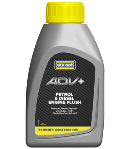
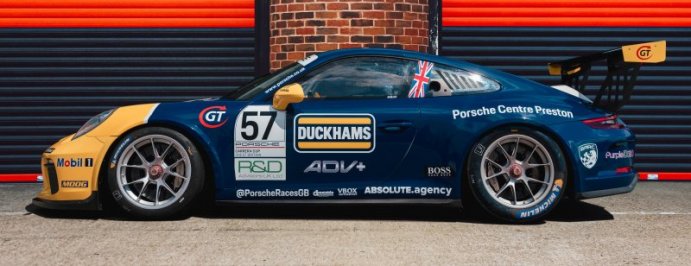
I wonder if anyone can help with this? I'm after the ADV+ from Dan Cammish''s 2021 Porsche but the only images I can find are these two, one on the car itself and the other on a picture of the product. I don't know if this is enough to create a svg?
 

Attachments

  • Duckhams-Engine-Additives-ADV-P_D-ENGINE-FLUSH_1000px-768x853.png
    Duckhams-Engine-Additives-ADV-P_D-ENGINE-FLUSH_1000px-768x853.png
    68.6 KB · Views: 16
  • porsche-normal.jpg
    porsche-normal.jpg
    63.7 KB · Views: 17
I wonder if anyone can help with this? I'm after the ADV+ from Dan Cammish''s 2021 Porsche but the only images I can find are these two, one on the car itself and the other on a picture of the product. I don't know if this is enough to create a svg?
Not exactly the same, but could do.

Can anyone make this shape semi-transparent (opacity 60)
View attachment 1074958
Check if the transparency works ingame.

Ok, the transparency doesn't work in game, but i'm totally fine with the semi transparent shape in Black, wothout gradients and colors, only the semi-transparent shape.
Now it should work with gradients.
 

Attachments

  • advGTS.svg
    2 KB · Views: 21
  • shape60GTS.svg
    894 bytes · Views: 19
Last edited:
I wonder if anyone can help with this? I'm after the ADV+ from Dan Cammish''s 2021 Porsche but the only images I can find are these two, one on the car itself and the other on a picture of the product. I don't know if this is enough to create a svg?

Not exactly the same, but could do.
I hope you don't mind but I've "borrowed" your lettering, to use as the basis of my interpretation because I felt a few things weren't quite right.

It seems to me that the corners are a little more rounded than the images suggest and I feel the highlight/shadow outlines are a little less chunky. I also found an image where the gradients look like they've been revised and simplified for the decal, making it a little less fussy (and a bit easier to mimic).

Besides, its always good to have options :)

1629335771286.png


1629325696599.png


Thanks so much, that will more than "do"!
No, thank you to you. If it wasn't for your request I wouldn't have gone looking for images and I never would have found this...

E865oK7XIAMAwMF
 

Attachments

  • ADV+ GTS (DJ).svg
    13.3 KB · Views: 20
Last edited:
Not exactly the same, but could do.


Check if the transparency works ingame.
Ok, the transparency doesn't work in game, but i'm totally fine with the semi transparent shape in Black, wothout gradients and colors, only the semi-transparent shape.
 
Ok, the transparency doesn't work in game, but i'm totally fine with the semi transparent shape in Black, wothout gradients and colors, only the semi-transparent shape.
@Seebsma Looks like more of the SVG spec that GTS's (in-game) SVG renderer doesn't adhere to.
  1. Whole shape opacity works.
  2. Gradients of different colours with opacity, i.e. black opaque > white transparent, works.
  3. Gradients of the same colour, i.e. black opaque > black transparent, doesn't.
  4. Using a shape, even with a simple black opaque > white opaque gradient, as an opacity mask doesn't.
What an utterly bizarre situation the GTS programmers have got themselves into, especially when points 2 and 3 above should functionally be no different whatsoever. How could they possibly think that absolutely no-one would want a gradient that goes from black transparent to black opaque to create a fade that is independent of the base colour of a car?!?

Its not as though they can use the excuse that rendering "tRaNspArENcy iS hARd" or "mUh CpU cYcLEs" either because its handles this monstrosity absolutely fine:

1629392373144.png


I sometimes think PD live their own little paradox, managing to somehow be both the most competent and incompetent company at the same time.

Looks even worse for them when their website programmers have a spec-compliant SVG renderer.

GIF by Equipe de France de Football
 
Last edited:
@Seebsma Looks like more of the SVG spec that GTS's (in-game) SVG renderer doesn't adhere to.
  1. Whole shape opacity works.
  2. Gradients of different colours with opacity, i.e. black opaque > white transparent, works.
  3. Gradients of the same colour, i.e. black opaque > black transparent, doesn't.
  4. Using a shape, even with a simple black opaque > white opaque gradient, as an opacity mask doesn't.
What an utterly bizarre situation the GTS programmers have got themselves into, especially when points 2 and 3 above should functionally be no different whatsoever. How could they possibly think that absolutely no-one would want a gradient that goes from black transparent to black opaque to create a fade that is independent of the base colour of a car?!?

Its not as though they can use the excuse that rendering "tRaNspArENcy iS hARd" or "mUh CpU cYcLEs" either because its handles this monstrosity absolutely fine:

View attachment 1075232


I sometimes think PD live their own little paradox, managing to somehow be both the most competent and incompetent company at the same time.

Looks even worse for them when their website programmers have a spec-compliant SVG renderer.

GIF by Equipe de France de Football
Yeah sometimes gradients and transparencies are sometimes strange.
But in this case Just a totally back semi transparent shape is perfectly fine, probably it will be easier to do.
 
Ok, the transparency doesn't work in game, but i'm totally fine with the semi transparent shape in Black, wothout gradients and colors, only the semi-transparent shape.
Yeah sometimes gradients and transparencies are sometimes strange.
But in this case Just a totally back semi transparent shape is perfectly fine, probably it will be easier to do.
If you still need it, I've updated my original post where the transparency in the gradients is fixed (tested in game).
 
Thanks mate, your help was very important.
Just to satisfy my own curiosity, because it was impossible to tell from the image you posted, did you want the gradient to A) also make the underlying colours lighter, like the decal you have now does, or B) simply fade the underlying base colour to a darker shade?

1629432123838.png
 
I suspected as much. Unfortunately, as you've probably gathered, because GTS doesn't fully support the SVG specification its not possible, at least not in any kind of practical or visually acceptable way.

I mean, it would be possible to sorta-kinda mimic it, using progressively smaller overlapping layers at 1% opacity but, because of the limited steps in opacity (0-100) it would mean that for a long transition between transparent, semi-transparent or opaque you would end up with ugly "banding" or, for a smooth(er) looking transition, the spacing would have to be much smaller which would then result in big blocks on one or both sides of the transition.

The following examples have been a little exaggerated to illustrate what I mean but you should, I hope, get the idea.


1629449292592.png


I suppose that, in certain circumstances, for some designs, this look could be exactly what you want, but for long smooth fades over large surfaces neither "solution" is really a good looking option.

I realise that none of this may really concern you much but I hope, by sharing this information, it will help to inform you about what is and isn't possible before embarking on a design which may only lead you down a dead end, because the decals you want are not possible, which would be a waste of your time.
 
Last edited:
Possibly without these lines, only the shape.
View attachment 1075365
Hang on, I've just had an idea... I'm such an idiot, I really can't believe I didn't think of this sooner.

There is a solution to your problem already in the game but the caveat is that it will not work if you are using a "special" colour as a base colour (because you can't apply special colours to the in-game provided shapes which we'll need to do this).

So, only if you are using a non-special colour as a base colour there are fades that go from completely opaque to completely transparent in the "Shape 2" library of provided shapes. In fact all of the shapes in the Shape 2 have some transition from completely opaque to completely transparent.

What you would do is take one of the square shapes that goes from opaque to transparent and resize/position it to where you want the fade. For example lets say its a roof...

1629457286572.png


You'd then duplicate that shape, flip it, and again resize/reposition it so that the fade is where you want it.

1629457382144.png


Then to get ride of the bits you don't need, and this is why a non-special base colour is important, you would then use any other opaque shapes with the same colour as base colour to hide the "overspill" of the fades that you don't want. So you end up with this...

1629457818128.png


You can then simply put the rest of your design over the top of all the "mask" shapes and no-one will ever know any different.

I'm actually embarrassed that it took me this long to think of that!!

Embarrassed The Office GIF by Justin
 
Last edited:
Possibly without these lines, only the shape.
View attachment 1075365
Maybe you could try with this shape. If a darker shade is needed, you could duplicate the decal in the livery editor.
EDIT: If you need a lighter shade, you can change the decal's color in-game.

it's actually sterange, maybe we didn't understand, as you can see i already imported many semi transparent squares.
View attachment 1075372
What i want to say is that i want it without any gradients or anything else, just the shape (like the ones in the photos).
EDIT 2: Updated to include plain shape with 60% opacity (shape3_60GTS).
 

Attachments

  • shape2_60GTS.svg
    500 bytes · Views: 16
  • shape3_60GTS.svg
    297 bytes · Views: 17
Last edited:
it's actually sterange, maybe we didn't understand, as you can see i already imported many semi transparent squares.
Cattura.PNG

What i want to say is that i want it without any gradients or anything else, just the shape (like the ones in the photos).
 
Last edited:
Hang on, I've just had an idea... I'm such an idiot, I really can't believe I didn't think of this sooner.

There is a solution to your problem already in the game but the caveat is that it will not work if you are using a "special" colour as a base colour (because you can't apply special colours to the in-game provided shapes which we'll need to do this).

So, only if you are using a non-special colour as a base colour there are fades that go from completely opaque to completely transparent in the "Shape 2" library of provided shapes. In fact all of the shapes in the Shape 2 have some transition from completely opaque to completely transparent.

What you would do is take one of the square shapes that goes from opaque to transparent and resize/position it to where you want the fade. For example lets say its a roof...

View attachment 1075367


You'd then duplicate that shape, flip it, and again resize/reposition it so that the fade is where you want it.

View attachment 1075368

Then to get ride of the bits you don't need, and this is why a non-special base colour is important, you would then use any other opaque shapes with the same colour as base colour to hide the "overspill" of the fades that you don't want. So you end up with this...

View attachment 1075369

You can then simply put the rest of your design over the top of all the "mask" shapes and no-one will ever know any different.

I'm actually embarrassed that it took me this long to think of that!!

Embarrassed The Office GIF by Justin
Yeah i know, i already used this tactic several times, but this time i'm working on a silver base.
photo-16r4-076.jpg

I wan to recreate the chrome roof, you know, i don't like replicas with no small details.
 
I want to recreate the chrome...
Thats exactly what I feared you were going to say.


So its this you're trying to recreate?

1629471854875.jpeg


Having looked at some other pictures, and the 2D views of later designs, I don't actually think there is a gradient on the roof, it is just plain chrome.

Having looked at this, even though its for the 2019 version, I can state, with a high degree of confidence, that the gradient on the roof in the drawing is not actually a real gradient on the car itself... it is just a graphic designers way of suggesting something is chrome (or highly reflective) because it can't easily be shown in a image produced with graphic design / illustration software.

1629472077203.jpeg


I know the following pictures are of models but they don't have a gradient on the roof in additional to the chrome, its just chrome.

1629473376039.jpeg

1629473843670.jpeg


Even these (admittedly) blurry stills from a 2016 video I've just found don't even hint that the roof has a gradient. Determinately chrome, but no gradient.

1629474630151.png


1629474795567.png


1629474891301.png

1629474962284.png

1629475052201.png


I strongly suspect you've been trying to "recreate" a detail that isn't actually on the car, and that if you were to just put the correct logo decals on a plain chrome roof it would be 99% accurate to the roof of the real 2016 car.
 
Last edited:
Thats exactly what I feared you were going to say.


So its this you're trying to recreate?

View attachment 1075397

Having looked at some other pictures, and the 2D views of later designs, I don't actually think there is a gradient on the roof, it is just plain chrome.

Having looked at this, even though its for the 2019 version, I can state, with a high degree of confidence, that the gradient on the roof in the drawing is not actually a real gradient on the car itself... it is just a graphic designers way of suggesting something is chrome (or highly reflective) because it can't easily be shown in a image produced with graphic design / illustration software.

View attachment 1075398

I know the following pictures are of models but they don't have a gradient on the roof in additional to the chrome, its just chrome.

View attachment 1075402
View attachment 1075404

Even these (admittedly) blurry stills from a 2016 video I've just found don't even hint that the roof has a gradient. Determinately chrome, but no gradient.

View attachment 1075405

View attachment 1075408

View attachment 1075409
View attachment 1075410
View attachment 1075411

I strongly suspect you've been trying to "recreate" a detail that isn't actually on the car, and that if you were to just put the correct logo decals on a plain chrome roof it would be 99% accurate to the roof of the real 2016 car.
That's what i was trying to say, i'm very sorry if i wasted your time, i'm sorry but my english isn't perfect i'm improving it, let's do this again.
Hi evryone, i need this shape (semi-transparent, 60 opacity)😁😅
8575518899546653208_1.png
 
Last edited:
That's what i was trying to say, i'm very sorry if i wasted your time, i'm sorry but my english isn't perfect i'm improving it, let's do this again.
Hi evryone, i need this shape (semi-transparent, 60 opacity)😁😅
:lol: :lol: :lol: No, you haven't wasted my time at all. If I didn't have time to spare I wouldn't be on here and so I'm happy to help.

Okay, so I've made the decal you requested - that shape in solid black at 60% opacity - and, having tested it on a chrome Gr.2 GT-R I fear its not going to be quite what you were expecting.

The problem is the decal doesn't make the chrome look darker but actually makes it look like grey paint with a layer of clear-coat over it. It completely removes the chrome effect.

Similarly it also doesn't work with "candy" paint either. For every other special colour (fluorescents, flakes, matte, metallic, etc) it does exactly what you'd expect (make the underlying colour appear darker) but chrome and candy paint are a total no-go. Whether this is physically accurate (since GTS is supposed to use Physically Based Rendering techniques) or whether this is a error in GTS's shader engine I could not possibly comment, but what I do know is that it doesn't work (unless you actually want the roof to be hell-hole-prison-cell grey?)

For what its worth I still think that the darkest chrome (K1), on its own, with the just the decal logos place on it will get you 99.9% of where you want to be for the roof of the 2016 Craft Sport car. The light fringes around logos/shapes when on chrome or candy is a bit of a disappointment but that is also directly related to the same alpha transparency issues we have with transparent gradients.
 

Attachments

  • GT-R Roof Shape (60% Opacity).svg
    723 bytes · Views: 18
Last edited:
Back