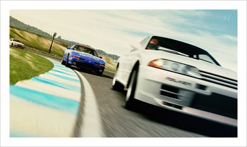
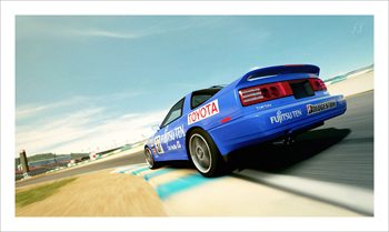
Update Info: You'd be surprised what sorts of GT-related designs are already up on the storefront. I always liked the look of the old LM, even if it was sort of a pig to drive. It still feels like a lard-arse in FM4, so the more things change... this ties in with
this week's 2.0 competition, a theme I personally love exploring, as my FM4 garage will prove. Enjoy!
ImaRobot - Excellent! I was tempted to go with a stronger sepia look, but I'm glad I didn't.
Onion - The hard work of the livery is attributed to the storefront, I just paids my monies, and shots my pictures
 Stoney
 - Thanks! The biggest surprise was that with a little bit of work, it's actually become a decent D350 performer!
RG - As long as you keep saying the noise is just right, I will continue to use the same settings
 S4
S4 - Glad you enjoy! I believe my next set is going to be a certain GT5 collection...
725 - It's definitely become one of my favourites, glad you like it too!
chromatic9 - Unless I switch it up to using all Big Shots (if I have the patience)... probably not. That watermark is so enormous that I rarely feel like removing it, hence the constant cropping. It's too bad, really.
ripenrun - Thank you!


 Great livery work Slip buddy!! How do you have all the patience to do that great looking livery of Forza Planet? Respect buddy, respect!!


