Car drawings

  • Thread starter Pebb
  • 3,548 comments
  • 471,579 views
Thank you everyone. :)


Murcielago Roadster.

I'm really not that satisfied with the way this one turned out (sorry for the blurry pic btw), and to make matters worse it is supposed to be a gift for someone. Although I haven't met that person before... >.>;

Sigh.
 
Damn, man. You're better than Exigeracer.

(Don't quote me on that)...

I will. He is better than me.

Mind you, I haven't done photorealism stuff in a long time, and we both have very different styles. I don't do very much photorealism stuff, and he doesn't sketch much on the freehand.

Latest stuff is solid u18c, although I prefer the Enzo over the newest Lamborghini.
 
Yes, I noticed what you said--the style etc..

I can never do that well.. Maybe with some more practice. But I would be happy if I was as good as either of you.
 
The latest Murc is somewhat blurry, some movements during scanning or something?


Anyway, it's clear your drawing skills are incredible, why not try some background and blur that? That would look awesome, but I guess it's pretty hard to make the rims go spinning...


Anyway, could you give a Supra a go sometimes? :D
 
That would look awesome, but I guess it's pretty hard to make the rims go spinning...

You'd be surprised how easy it is to get the wheels. I was also initially intimidated by it, but once you do learn how to softly blend the really dark areas into the lighter parts, it gets easier.

 
-> Hey guys, I've never know that there is a thread like this around. :dunce:

-> I would like to share mine, I know I'm not as good as Exigeracer and Under18carbon. But here are the cars that I've done as reference for the manga I'm planning on doing and some other stuff, here it is:

EDIT: On attachements. :)

^ As you can see, 98% of all my drawings are drawn with an average ball-point pen. I'll post more on the way soon. :)
 

Attachments

  • 2007-01-29-0104-26.jpg
    2007-01-29-0104-26.jpg
    4.6 KB · Views: 23
  • 2007-01-29-0104-51.jpg
    2007-01-29-0104-51.jpg
    2.6 KB · Views: 24
  • 2007-01-29-0341-55.jpg
    2007-01-29-0341-55.jpg
    21.9 KB · Views: 22
  • 2007-01-29-0342-39.jpg
    2007-01-29-0342-39.jpg
    11.1 KB · Views: 22
  • 2007-01-29-0342-15.jpg
    2007-01-29-0342-15.jpg
    8.2 KB · Views: 21
  • 2007-01-29-0014-03_edited.jpg
    2007-01-29-0014-03_edited.jpg
    74 KB · Views: 22
Hey, Under18Carbon, they say that imitation is the best form of flattery, so be flattered:

This is what long summer days can do to you. Unfortunately, it looks a lot better on paper than on the computer screen, and the back is kind of tall-looking, but I'm satisfied.... I'm definitely doing more.

(picture later.. no scanner now)
 
-> Hey guys, I've never know that there is a thread like this around. :dunce:

-> I would like to share mine, I know I'm not as good as Exigeracer and Under18carbon. But here are the cars that I've done as reference for the manga I'm planning on doing and some other stuff, here it is:

index.php


index.php


index.php


index.php


index.php


index.php


index.php


^ As you can see, 98% of all my drawings are drawn with an average ball-point pen. I'll post more on the way soon. :)


You can't host directly from that site... :(
 
Realizing that I'm starting school in a week and a half, I figured I might as well start drawing, seeing as I'll be doing that for the next 4 years.

Started off as a pen sketch, then was horrified at the results so I scanned it and coloured it all. It shouldn't be so messy, but I don't have a tablet so I can't really do anything.

 
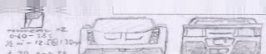
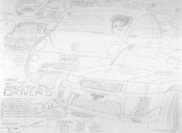
Perspective isn't quite spot on, keep this in mind:


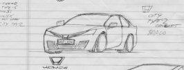
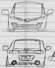
That said, I'm still not sure that the car would be more attractive if everything would be squared up. There are some design issues that really hurt the feeling of this car. Right now it looks like a FR Japanese project car. MR cars tend to be very wide, and the driving position is very far forward. Even if it really isn't, the design usually leads you to believe it is so you get a more agressive sporty feeling to it. For example, look at the current Eclipse. The whole car is leaning forwards to look more sporty, even though the motor is stuffed in front somewhere, powering the front wheels. They're cheating, essentially. The C-pillar of yours is a dead giveaway though, it looks too conservative and it doesn't quite contribute to the feel of a sporty car.

There's too much detail and messy accessories. It's got too much of a kid's dream of a car, with the side intake louvres, exposed engine and excessive rear venting. I really cheapens the look of the car, makes it seem out-dated. At the sktchiness of this stage of the drawing, you shouldn't be focusing on the details as much as the shape of the car, which is what essentially gives your car a real presence. Unless of course, those details have a strong tie to the theme of the car. For example, having the polished aluminum gas cap on Lotus Elises left unpainted adds to the bare feeling of simplicity seen in the interior of the car, where you litterally straddle a chassis sill to sit down in the thing. This, however, just looks like a gas cap. You usually leave those bits out until the engineers ask you where the gas goes so they can build the parts.

Although, that may have been your intention, but your pencil did not convey those expressions the right way. For instance, those horizon reflection lines just add to the already very cluttered back end of the car. When you're presenting a design, you don't want that. The reflections help give a sense of shape to the body (under the reflection line is ground - dark, above the line is sky, dark).

I guess, in short, focus more on the shape of the car and not so much the excess of detail. You should only have a few prominant lines that give a strong feel of the design, how the lines curve and flow, and how those lines meet. I always go back to the 350Z's marketing strategy (back then just called The Z) before they even released the car. They created hype with just two chalk lines on a black canvas. These two lines defined what the car looked and felt like.

The details of your car should compliment the feeling given off by those basic lines that make up your car. Look at the Ferrari 360, how all of the intakes are so similarly shaped not only to eachother, but also the shape of the car. The side intake on yours however, is just... there. I'm not saying incorporate it into the shoulder lines or anything, but it sholdn't look like it was an afterthough just grafted in there.
 
Back