
You are using an out of date browser. It may not display this or other websites correctly.
You should upgrade or use an alternative browser.
You should upgrade or use an alternative browser.
Car drawings
- Thread starter Pebb
- 3,548 comments
- 471,325 views
- 5,481

- Seattle, WA
- RykonZero

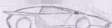
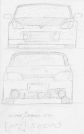
one of my drawings made in paint. the details suk because paint doesn't ley me use fine details.

The Vanishing Boy
Premium
- 9,000

- Quezon City, Philippines & Las Vegas, NV
- GTP_VanishingBoy
- Vanishing Boy
AOS-
Premium
- 28,801

- 'Sauga, ON
wow pretty nice drawings everyone gots. the Pencil/Paper drawings look damn accurate and sharp. Though I can help you improve on that. increase the contrast at the point where the car is closest to the viewer's camera ( in most cases ) the corner. and less contraast and detail in the far end. This shows a great amount of Depth.
and F1GTR, that's a pretty nice look. long hooded meaning, something like a hammer head, an SLR. that's popular nowadays.
thumbnail, click for full size
 < -- something i drew a while ago. suppose to be some sort of Civic i guess. Black Ballpoint Pen, everything was done in that.
 <- Subbie '07
 A design of some sort. I was trying out my prismacolor crayons i bought. obviously it isn't a great work.
 Probably the most accurate drawing i ever did in my life. it's clean of shading becuase i did this in photoshop. you can find it in the Digital Arts help forum.
 Some other design i did, but its in watercolour. some perspective errors but its hard to notice.
 Black Paper, White Prismacolor. looks like chalk, don't it?
 ")
and F1GTR, that's a pretty nice look. long hooded meaning, something like a hammer head, an SLR. that's popular nowadays.
thumbnail, click for full size
 < -- something i drew a while ago. suppose to be some sort of Civic i guess. Black Ballpoint Pen, everything was done in that.
 <- Subbie '07
 A design of some sort. I was trying out my prismacolor crayons i bought. obviously it isn't a great work.
 Probably the most accurate drawing i ever did in my life. it's clean of shading becuase i did this in photoshop. you can find it in the Digital Arts help forum.
 Some other design i did, but its in watercolour. some perspective errors but its hard to notice.
 Black Paper, White Prismacolor. looks like chalk, don't it?
 The Vanishing Boy
Premium
- 9,000
- Quezon City, Philippines & Las Vegas, NV
- GTP_VanishingBoy
- Vanishing Boy
The Vanishing Boy
Premium
- 9,000
- Quezon City, Philippines & Las Vegas, NV
- GTP_VanishingBoy
- Vanishing Boy

- 862
I bought myself a drawingboard for my PC, so these are all made in Photoshop. The first on is pretty heavily based on the Koenigsegg CCX, but tried to make it look more like "me". I'm quite happy with how it looks like.

This one's also made in Photoshop, and I know the front end looks like crap. It's too narrow some how. It's my try in making a 70's LeMans race car design.

I have a couple of projects going on right now, that are more Koenigsegg-like in terms of body style etc. Might post them here once I'm done with them.
")

- 862
Thanks for the tips! Never really thought of the unsharp masking  I did that one in a bit of a hurry so I didn't really bother in zooming and making it all clean and stuff. And it was supposed to be a scetch of some sort anyway, not a photorealistic piece of art But the next one will be a lot cleaner and drawn more sharply.
I did that one in a bit of a hurry so I didn't really bother in zooming and making it all clean and stuff. And it was supposed to be a scetch of some sort anyway, not a photorealistic piece of art But the next one will be a lot cleaner and drawn more sharply.- 5,987
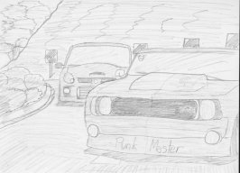
Hey yall... A bit slower with the school work so I busted out some car stuff. Here's what I came up with, 15 minutes start to finish.

Forgot some of the highlights with the white, which make the drawing pop a lot more. Not too happy with the proportions or details of this particular drawing, but certainly nice getting back into the drawing feel. Enjoy.
Forgot some of the highlights with the white, which make the drawing pop a lot more. Not too happy with the proportions or details of this particular drawing, but certainly nice getting back into the drawing feel. Enjoy.
- 35,465
- Addison,Texas
- GTP_RACECAR
Nice stuff, Skylinegoes. I really like your 70's Race car design. It reminds me alot of the ferrari 512M. I also see some great rough skech stuff from The Vanishing Boy, ATP, Stig22121, and F1GTR. I'm gonna put up my own Prototype designs as well as GT1 Mercedes SLR drawings sometime this weekend.
- 2,700
- Knoxville, Tennessee

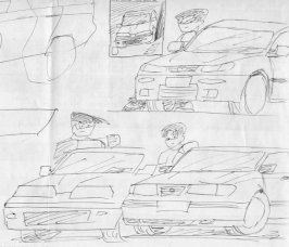
I call that little car the Raptor and it is a small, light weight car powered by a LS1. It was kinda inspired by Indy Roadsters of the 1950's, but is a two seater with a fighter style bubble canopy. I have made a 3d model of it too, which I will post on Deviantart later...
- 5,481
- Seattle, WA
- RykonZero
Mah new drawing! I call it the ACI Saloon Concept. (ACI= Automobiles to Crush the Italians) It uses a Quad Turbo system (a small turbo and a large turbo for each bank of cylinders, so a constant boost of air is on the engine.)
on a V-6 engine giving it about 400 hp. I have also developed a coupe, a 2door hatchback, and a wagon.

on a V-6 engine giving it about 400 hp. I have also developed a coupe, a 2door hatchback, and a wagon.

- 1,071
theres some really good stuff floating around here! im going to have to crack out the old pencils and paper by the looks of things!
- 6,566

- Lincoln
- Speedster502
Hey Exigeracer, what pens do you use for the colour element of the cars you design? I've been using some Faber Castell PITT artist pens, am I using the right sort of stuff?
- 5,987
how'd that happen - double post, please delete.
(I think this is my first double post in over 4 years of membership)
(I think this is my first double post in over 4 years of membership)
- 5,987
My materials are
Sketch paper, or Letraset marker pad if I have any around
HB pencil - any brand, I use Derwent
Prismacolor Verithin black - these are really hard colour pencils, ultimate tool for sketching
Woodless white colour pencil - highlights and such, mine is too soft though
Chalk pastel - scrape off some, then smudge it around
Markers - Prismacolor, Promarker or Tria, depending on what is on sale and what colors I need
You should be using something with a broad tip, the Faber Castells are pens, and you can't fill in vast areas with those. I layer on the ink like crazy when I am colouring my sketches, so I use either the cheapest markers (Promarker), because they just bleed out the ink, or the high end ones (Tria) because they are so damn smooth and precise. Any art supplies store has a rack with one of the three brands I mentioned, and there are others too. They're simple ink markers, nothing special. Don't get the pigmenty paint markers, those you don't need for this kind of stuff.
Just pick up some of those and play around with them to get a feel for how to layer the ink. I'd suggest jet black, warm grey 20 and 60, one colour of your choice. Avoid the Tria markers at first, they're oftentimes up to 7$ each.
- 6,566
- Lincoln
- Speedster502
My materials are
Sketch paper, or Letraset marker pad if I have any around
HB pencil - any brand, I use Derwent
Prismacolor Verithin black - these are really hard colour pencils, ultimate tool for sketching
Woodless white colour pencil - highlights and such, mine is too soft though
Chalk pastel - scrape off some, then smudge it around
Markers - Prismacolor, Promarker or Tria, depending on what is on sale and what colors I need
You should be using something with a broad tip, the Faber Castells are pens, and you can't fill in vast areas with those. I layer on the ink like crazy when I am colouring my sketches, so I use either the cheapest markers (Promarker), because they just bleed out the ink, or the high end ones (Tria) because they are so damn smooth and precise. Any art supplies store has a rack with one of the three brands I mentioned, and there are others too. They're simple ink markers, nothing special. Don't get the pigmenty paint markers, those you don't need for this kind of stuff.
Just pick up some of those and play around with them to get a feel for how to layer the ink. I'd suggest jet black, warm grey 20 and 60, one colour of your choice. Avoid the Tria markers at first, they're oftentimes up to 7$ each.
Thanks! Thats a great help, those things can now go on my Christmas list.

- 277
one of my drawings made in paint. the details suk because paint doesn't ley me use fine details.
you should see how good people actulay draw on ms paint they use the tinyest detail
- 5,481
- Seattle, WA
- RykonZero
Sorry. I didn't spend much time on that. about 10 min.

- 277
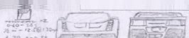
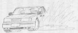
I could use some advice on shading and wheel design.


- 277
I also thought it looked out of proportion.
AOS-
Premium
- 28,801
- 'Sauga, ON
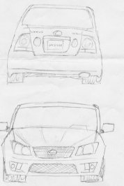
according to my art teachers and few other artistic peers i know, if your drawing has wrong perspective, it's very hard to look at. No matter how well the design looks, without the correct foundations, the image is corrupt.
Here's something that should help.. Allan Macdonald - Quick Sketch Technique
What i can tell you is that, if you want to draw a car, your lines got to be smooth, the linework in general is like bent and jagged. If you want your lines to be more organic and smooth, you got to be confident in yourself. Draw out the lines fast, but do it lightly. with enough practice this becomes much easier.
Try not to smudge your work as a form of shading, because this blurs your picture, lowers the contrast of the work, thus becoming less sharp and outstanding. If you can't blend well with your pencil, there are many alternative ways to show depth. For example, hatching and pointilism, if you have time go google what these two are.
I see you tried to do a widebody because i can see your trying to show the wheel archs converging out. As a beginner - you are still a newbie right? - i recommend you stay away from widebody wheel arches because those are a bit tricky, even for me. the image post above yours was mine and you can see i'm avoiding it for now. With enough practice find a picture of a car that has wheel arches like the ones your drew and try it out.
the door is extremely small, I'm not going to bother to ask you how you managed to do that.
the Spokes of the rim don't even touch the outer lip of the rim, and your tires are blown out.
the roof shouldn't be that visible at this ideal angle you have. If you have trouble doing parts like this, i suggest you look at more pictures of cars at the ideal angle so you can get a better understanding as to why it looks like that.
I personally have trouble drawing a 3/4 front, bird's eye view of an MR car, because the roof sit relatively low and the widebody lines meet up wit the roof so it always looks awkward.
You mentioned something about wheel design? Well basically, you come up with an idea. that's it, anything goes, but i think your real question was how to make the rims look good, correct? Not everyone gets rim perfect dead on, i have trouble drawing it sometimes myself (at specific angles).
Wheel Rendering - Allan Macdonald
That's photoshop stuff, but i learned how to draw rims much better on paper from this. the spacing of the spokes is essential in drawing a rim, it's like perspective. First of all we know that a circle consists of 360 degrees (deg.). Got it? Simply in your case, you have 6 spokes, divide 360 by 6. the dividend is 60 deg. This means that the space between the first and the 2nd spoke is 60 deg. as well for the other spokes. once you have that kind of an idea down, you can better picture what a 6-spoker rim should look like.
If your still lost, try it out on paper. quickly draw out a Circle, then lightly, make ticks which'll represent the center of each spoke. Look at it afterwards to see if the spacing all around is the same. Turn the paper clockwise or upside-down , then look at it and see if anything's wrong. I say to look at the work in a different perspective because the artist themself may not always be able to identify their own mistakes. By flipping it around (usually flipping it horizontally), you see the image in a completely differnt way, and thus means flaws can be pointed out in ways which the normal view wouldn't have done.
Hope you use this mini-essay as a future reference.. Go forth and Practice, EnJoy:tup:
