Gran Turismo Sport: General Discussion

  • Thread starter Formidable
  • 47,132 comments
  • 4,819,266 views
To change up the subject... does anyone else here think the cover design is pretty weak? I know the game is not out yet and that it could change but as it stands, I don't like it very much. Usually, their covers are pretty artistic in my opinion (GT6,5,4) but GT Sport's just feels as if someone spent 10 minutes in Photoshop and selected a photo of the driver and slapped on the GT logo with a boring, default font.

i1m2Eimm2MQGPC.png
i1dTCBWlkxausuB.png

Yeah, the box art for both editions actually look the BEST in my opinion:lol:, but no really they are pretty basic in terms of their design. I was expecting the driving avatar figure and the golden gt logo (like the one posted below, subtract the grey GT SPORT and PS4 logo) and some cars showing off some of the cars in each grade level on the front, similar to what F1 2016 had; drivers and then the cars.

When this cover came out I was also thinking the avatar could be slightly smaller and the cars shadow outline car classes featured could be behind the figure...

i1juUYMctT1Wgz-638x269.jpg


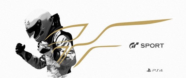
But yes... Very basic... Let's just hope the final game is not what the "dull" and "basic" cover makes it seem...:lol:👍
 
To change up the subject... does anyone else here think the cover design is pretty weak? I know the game is not out yet and that it could change but as it stands, I don't like it very much. Usually, their covers are pretty artistic in my opinion (GT6,5,4) but GT Sport's just feels as if someone spent 10 minutes in Photoshop and selected a photo of the driver and slapped on the GT logo with a boring, default font.

i1m2Eimm2MQGPC.png
i1dTCBWlkxausuB.png

You're not alone. I've always assumed it was a — wait for it — "placeholder". The typography seems to have default kerning, and I'm reasonably sure that's a stock gradient in Photoshop on the driver on the LE cover.

There's nothing inherently wrong with having the left-justified title, but the visual weight puts it at odds with the centred logo. I really think they could've used the different font used on the steelcase (Whatthefont isn't finding an exact match) to just write "Sport" under the GT logo.
 
To change up the subject... does anyone else here think the cover design is pretty weak? I know the game is not out yet and that it could change but as it stands, I don't like it very much. Usually, their covers are pretty artistic in my opinion (GT6,5,4) but GT Sport's just feels as if someone spent 10 minutes in Photoshop and selected a photo of the driver and slapped on the GT logo with a boring, default font.

i1m2Eimm2MQGPC.png
i1dTCBWlkxausuB.png
The font is Helvetica (arial), which is quite literally the most overused font on the planet (not without good reason), so yeah its about as stock as it gets. I sort of like the offhand approach they took with the gradient though, just because I haven't seen anything quite so 'silly' since, like, 70s graphic design, which kind of makes me like it. Otherwise yeah its not particularly interesting.
 
Either that or he's fuming in rage because he's in the background, judging by the closed fists.
 
The thing that surprises me about the covers is that the normal version is the black and white one and the limited edition has the colour. You would think it would be the other way around, use the bright colours to stand out on the regular shelf of games, catch your eye. The people buying the LE already know about the game, they'll find it.
 
The thing that surprises me about the covers is that the normal version is the black and white one and the limited edition has the colour. You would think it would be the other way around, use the bright colours to stand out on the regular shelf of games, catch your eye. The people buying the LE already know about the game, they'll find it.

I confuse myself whenever I visit the PS Store and check on the game's store page because of those colours. The colour Black to me makes me perceive it as exclusive, high-end, and sleek. It's a good thing I haven't pre-ordered yet, I would mistake the standard edition and can accidentally miss out on pre-order incentives. The physical-only CE version comes with a gold cover that holds the GTS LE game and the Apex book, but its exterior box is the standard Black as well. Pretty inconsistent if you ask me.

Off-point here about the GTS cover; How come this time a car is not depicted in the cover art? Each car featured in the cover of GT is chosen by Kaz himself and is a car that has respect for him (GT PSP), or is a promotional tie-in for the manufacturer that has worked with PD (GT4,5, and 6). Doesn't feel right.

EDIT: I wish the development team will rename Tokyo Expressway into 'Special Stage Route 2'. When I drove it at the GT Academy qualifiers, the overhead road signs list the route we're racing on as 'R2'. The track is a fictional city course based on real-life roads, it's all too similar to the SSR theme. However unlike SSR5, 7, and 11, the signage on this track has name references to real locales located in Tokyo, its track design are all too similar to the C1 loop and Tomei Expressway sections. I could see why they would name it Tokyo Expressway, but since it's no real C1 Loop, I'll just say it's SSR2.
 
Last edited:
Their brand is very well known so the cover doesn't really have much importance but I do agree it seems really boring and generic.
 
The thing that surprises me about the covers is that the normal version is the black and white one and the limited edition has the colour. You would think it would be the other way around, use the bright colours to stand out on the regular shelf of games, catch your eye. The people buying the LE already know about the game, they'll find it.

Use the 'special' colours for the normal cheap version? As if. That is some weird logic right there.
 
Use the 'special' colours for the normal cheap version? As if. That is some weird logic right there.

I don't think anyone sees colour in general as being special. The gold Steel Book Edition, sure, but not colour full stop. The point of game art is to stand out amongst other games, otherwise they'd all be black boxes with white text on them. Which funnily enough is what the normal GTS cover is.

They're relying on people not only recognising the GT logo but recognising it without the regular red and blue colour.
 
Who buys boxed games anymore anyway? Seems a bit old-fashioned.

And how many people will be randomly cruising a game shop and think, ooh bright colours, that looks nice. I'll buy that.

Like I said, weird logic.
 
I will buy GTS as a boxed game because I want that Merc AMG GT :P it will be my first boxed PS4 game :D (will obviously buy it digitally too.)
 
I always thought 45FPS would be a perfect FPS for many games. Feels almost as smooth as 60 and allows for more eye candy.

Unfortunately the TVs and monitors most gamers have in homes mostly removes that option.

The covers are meh.

Casual person shopping for games won't make any connection with the cover and the racing game with online focus/FIA championship etc.

Car game - putt a car on the cover. Clear and concise message.

But maybe they don't care about catching an eye of a casual brick&mortar shopper ?

In any case they are mediocre looking to me.
 
Who buys boxed games anymore anyway? Seems a bit old-fashioned.

Millions of people still do and it's primarily those who don't know what they're going to buy, plus the 'buying a gift for someone else' approach. Mind you the concept still vaguely applies online because of the below..

And how many people will be randomly cruising a game shop and think, ooh bright colours, that looks nice. I'll buy that.

That isn't what I meant. I'm sure you understand the basic concept of standing out, don't you?
 
Who buys boxed games anymore anyway? Seems a bit old-fashioned.

And how many people will be randomly cruising a game shop and think, ooh bright colours, that looks nice. I'll buy that.

Like I said, weird logic.

Because people don't like being forced to pay an arm and a leg for digital prices which sometimes end up being more expensive than the physical copies, especially for AAA games. Plus game shops offer this little thing called discounts on those physical copies more often than digital stores do, which makes consumers go and look around for the best deal in something that they call shopping.
 
Millions of people still do and it's primarily those who don't know what they're going to buy, plus the 'buying a gift for someone else' approach. Mind you the concept still vaguely applies online because of the below..


That isn't what I meant. I'm sure you understand the basic concept of standing out, don't you?

Ok listen the 'weird logic' thing was maybe too extreme, sorry about that. But let's leave out the 'are you a bit intellectually limited?' approach to a someone questioning your statements, eh? You're better than that.

You made some point about some edition deserving different colour treatments which I thought was a little silly. They're different so people know if they pay a little more, they can show that's the case. Which colours fit which price range? Not so important for me.

Also, you linked that to a more general assertion - that a decent proportion of 'millions of people' visit game shops and see nice colours and make purchasing decisions of $60 or more based on that. I see that as an extension of the 'casuals are dumb and know nothing' argument. Which is one of the biggest falsehoods propagated by niche or 'hardcore' gamers. Normal gamers, normal people maybe aren't quite as stupid as we seem to think.

The cover is nice, the design is nice. They are focusing on the driver, not the car this time around. So it makes some sense, in addition to being visually appealing. You're entitled to disagree with that. totally fine. but your more general, extended points are not right, I don't think. That's all.

Because people don't like being forced to pay an arm and a leg for digital prices which sometimes end up being more expensive than the physical copies, especially for AAA games. Plus game shops offer this little thing called discounts on those physical copies more often than digital stores do, which makes consumers go and look around for the best deal in something that they call shopping.

Slightly overly sarcastic there, but I agree with your points about the discounts, and trade-ins and all that. Totally fair.

It was a mistake to think that my experience is the norm.
 
Ok listen the 'weird logic' thing was maybe too extreme, sorry about that. But let's leave out the 'are you a bit intellectually limited?' approach to a someone questioning your statements, eh? You're better than that.

You made some point about some edition deserving different colour treatments which I thought was a little silly. They're different so people know if they pay a little more, they can show that's the case. Which colours fit which price range? Not so important for me.

Also, you linked that to a more general assertion - that a decent proportion of 'millions of people' visit game shops and see nice colours and make purchasing decisions of $60 or more based on that. I see that as an extension of the 'casuals are dumb and know nothing' argument. Which is one of the biggest falsehoods propagated by niche or 'hardcore' gamers. Normal gamers, normal people maybe aren't quite as stupid as we seem to think.

The cover is nice, the design is nice. They are focusing on the driver, not the car this time around. So it makes some sense, in addition to being visually appealing. You're entitled to disagree with that. totally fine. but your more general, extended points are not right, I don't think. That's all.

I think you've completely missed my point, to be honest.

I didn't suggest certain editions deserved different colours, I said I was surprised that the LE was the one with eye catching colours whilst the standard edition had the dark appearance that doesn't stand out. The LE will sell no matter what because people going in already know they want that, it doesn't need to stand out. Normal game art is generally designed to stand out amongst the competition.

It's nothing to do with 'casual gamers' and everything to do with human behaviour. We tend to be drawn to things that stand out and ignore those that don't, therefore a huge part of marketing a product is about standing out. If you don't see a product you can't buy it and that can have a huge affect when it's someone going in without their mind made up.

Someone could vaguely know about GT Sport among many other games, head to a shop to buy *something* and because Game X that they also already knew about stood out they buy that one without even noticing GT Sport.

In short it's nothing to do with the design overall and nothing to do with which version I think 'deserves' certain colours. It's simply that generally speaking you want your standard product to stand out amongst it's competitors and I therefore found it strange that the standard edition doesn't whilst they've made the version that doesn't need to stand out, stand out.
 
Back