- 1,984

- Barcelona
- mannjonusa
I think you've completely missed my point, to be honest.
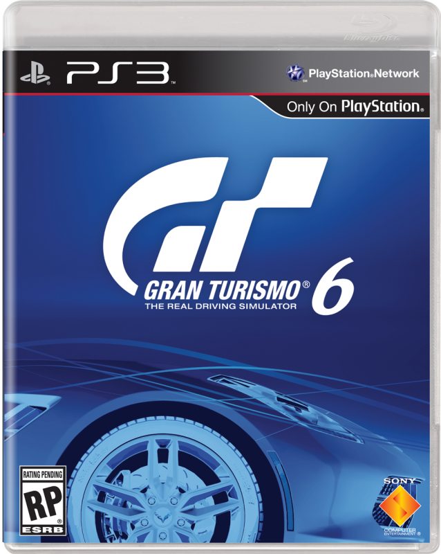
I didn't suggest certain editions deserved different colours, I said I was surprised that the LE was the one with eye catching colours whilst the standard edition had the dark appearance that doesn't stand out. The LE will sell no matter what because people going in already know they want that, it doesn't need to stand out. Normal game art is generally designed to stand out amongst the competition.
It's nothing to do with 'casual gamers' and everything to do with human behaviour. We tend to be drawn to things that stand out and ignore those that don't, therefore a huge part of marketing a product is about standing out. If you don't see a product you can't buy it and that can have a huge affect when it's someone going in without their mind made up.
Someone could vaguely know about GT Sport among many other games, head to a shop to buy *something* and because Game X that they also already knew about stood out they buy that one without even noticing GT Sport.
In short it's nothing to do with the design overall and nothing to do with which version I think 'deserves' certain colours. It's simply that generally speaking you want your standard product to stand out amongst it's competitors and I therefore found it strange that the standard edition doesn't whilst they've made the version that doesn't need to stand out, stand out.
I think the dark one does stand out actually.
It looks classy and minimalist and is obviously gran Turismo. The game covers I see all generally follow the rules of 'human behaviour' you mention and try to stand out, making the typical game shelf a big colourful mess.
This looks like a premium product amongst all that. Also, I still don't think people buy games based on the covers as much as you think. Books maybe, at a stretch...? Not games...


