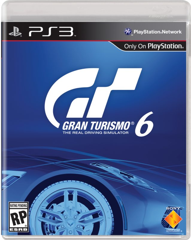
I guess, but the purpose of the box it to encourage people to pick it up and buy it. It's not supposed to be artistic, it's supposed to be functional and any artistry is largely incidental. Ideally it should give the customer a decent idea of what the game is about at a glance. If they're interested in that sort of thing they may pick it up. Otherwise you're relying on them thinking "I have no idea what that game is about, I better spend some of my time picking it up and reading about it". I think you'll find that a lot of people will simply keep walking.

This is a better example of what you're talking about. It's odd, and most people will take a moment to go "what the...oh, it's a tyre". That's the moment of hesitation that makes it work. But that image doesn't say anything much about the game except "probably cars", so they intelligently included the tagline "The real driving simulator". That tells the customer what they need to know about the game. It's the elevator pitch. The addition of the logo in colour compared to the rest of the monochrome image makes it pop and draws the customers eye to the tag line.
This is how you take a "weird" image and still make it a well designed cover. It's designed as a pattern interrupt, but it still contains all the information needed to tell the customer about the game and get them interested. It just takes the customer half a second more to process, and can probably still be done without breaking stride. It doesn't need ten seconds of picking up the box and scanning the back.
Gran Turismo Sport + constipated driver doesn't do that unless you already know what Gran Turismo is. Which many people do, but they're not the target of a box cover. An eye catching GT logo is all you need for people who know the brand already (which the GTS box still doesn't achieve). The target is people who haven't had exposure and may be seeing the game for the first time.


