You are using an out of date browser. It may not display this or other websites correctly.
You should upgrade or use an alternative browser.
You should upgrade or use an alternative browser.
slipSHOTS: GT4
- Thread starter SlipZtrEm
- 725 comments
- 64,742 views
- 479
I like thisupdate 👍
- 1,037
good job on this update man. i really like the 1st and 5th ones. 👍 👍
- 3,863
- forever_n00b
- random1self
good stuff 👍
btw - are you still updating your nordschliefe open track day thread?
btw - are you still updating your nordschliefe open track day thread?
- 1,580
awesome pictures man  iono which one i like best, they're all bomb diggity
 iono which one i like best, they're all bomb diggity
- 27,387

- Toronto
- NewAesthetic
- SlipZtrEm
Krame - Glad you enjoy it 
Franz - Oddly enough for the 5th shot, I used the same colour balance I used for the rest of the shots. I even double-checked, because I thought I had made a mistake. It's grown on me, but it's still not my favourite of the set. The 6th shot has those funny spots because they're sparks. The NSX driver got defensive .
.
Revolution - I'm really proud of how well #9 turned out, since usually text on the cars turns out like crap. #11 was my HM for this week's PMC; while I like the shot better, it didn't show enough of the car to show I had really crossed the line.
Empty_Space - Actually, I just noticed your LMR time and updated. So yes .
.
Everybody else - Thanks for the kind words, guys!
There will be another update, either later tonight or some time tomorrow, depending on how my day goes.

Franz - Oddly enough for the 5th shot, I used the same colour balance I used for the rest of the shots. I even double-checked, because I thought I had made a mistake. It's grown on me, but it's still not my favourite of the set. The 6th shot has those funny spots because they're sparks. The NSX driver got defensive
 .
.Revolution - I'm really proud of how well #9 turned out, since usually text on the cars turns out like crap. #11 was my HM for this week's PMC; while I like the shot better, it didn't show enough of the car to show I had really crossed the line.
Empty_Space - Actually, I just noticed your LMR time and updated. So yes
 .
.Everybody else - Thanks for the kind words, guys!
There will be another update, either later tonight or some time tomorrow, depending on how my day goes.
- 4,394
Nice work, like franz pointed out the spots (sparks) in #6 really add to the picture. This update has an interesting 'look' from the colors.
- 3,863
- forever_n00b
- random1self
Empty_Space - Actually, I just noticed your LMR time and updated. So yes
good cause someone just knocked fud off the top of the leader board

- 27,387

- Toronto
- NewAesthetic
- SlipZtrEm
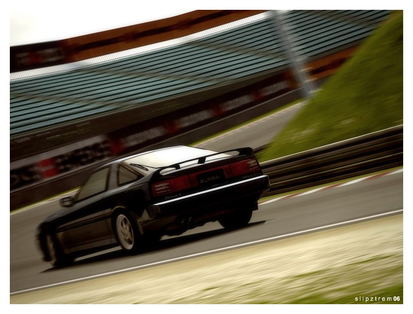
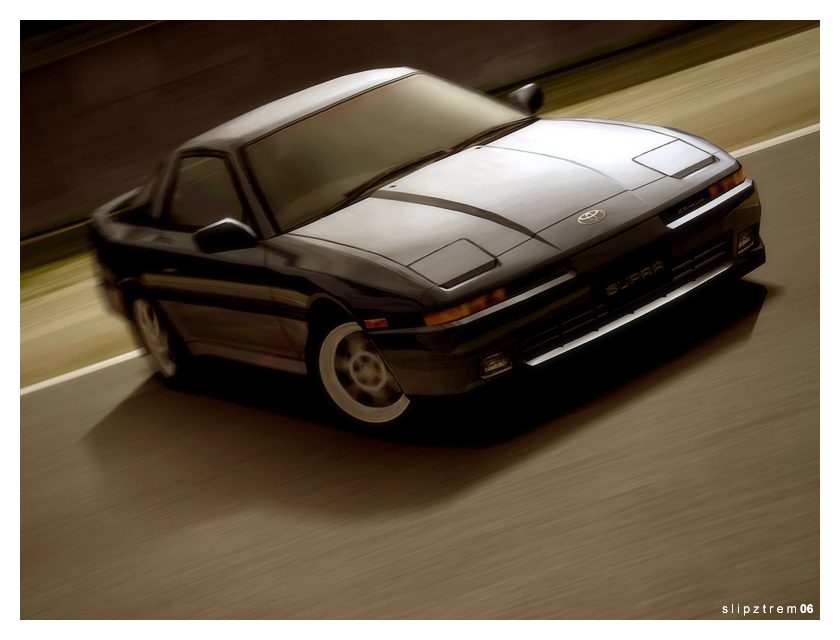
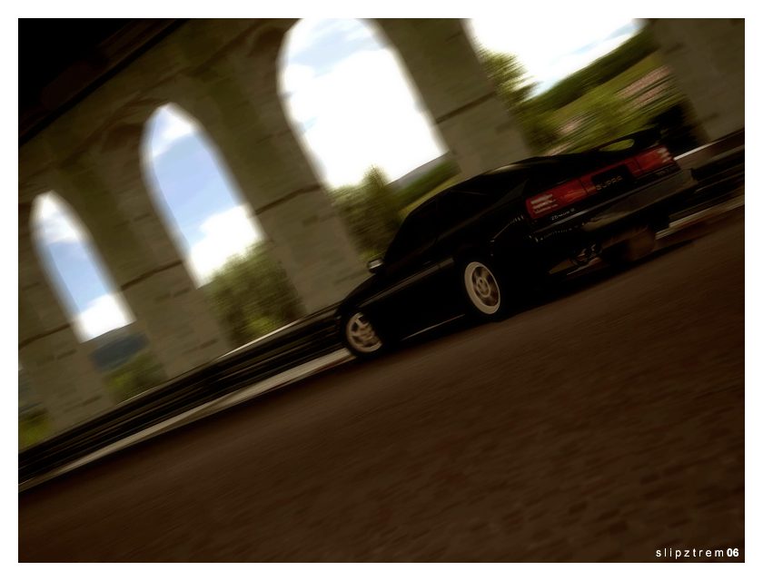
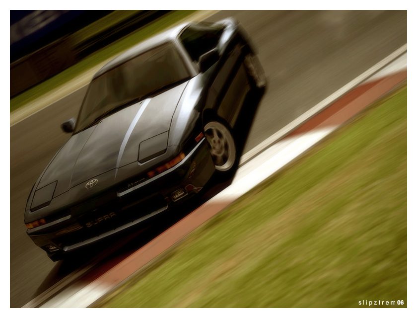
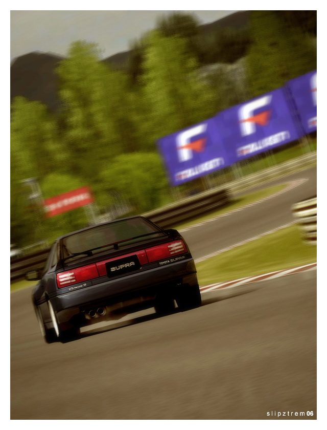
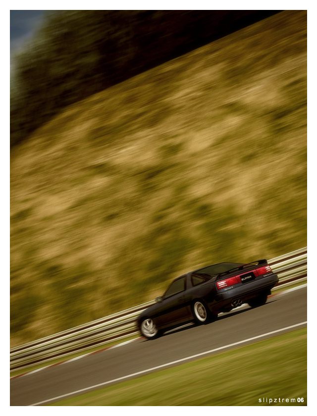
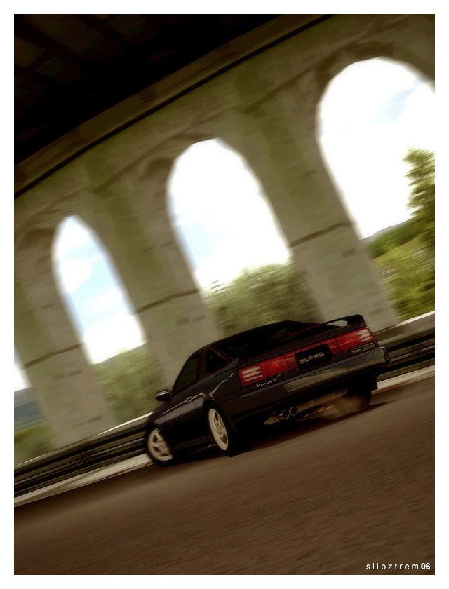
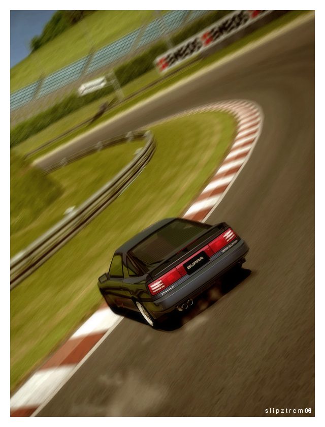
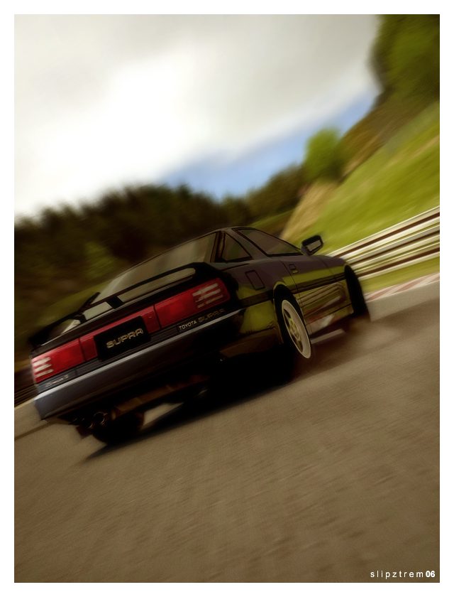
Toyota Supra 2.5 Twinturbo R @ Midfield
___________________________
___________________________
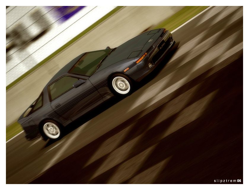
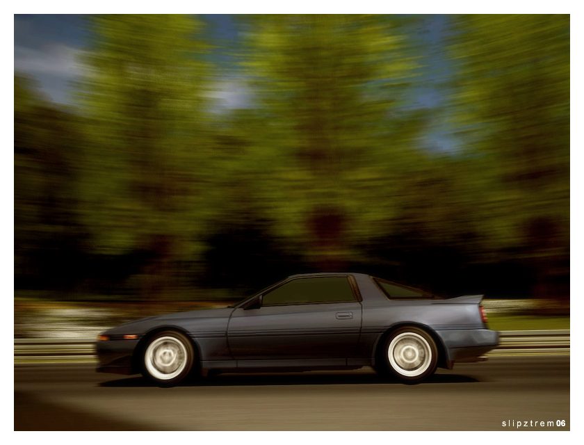
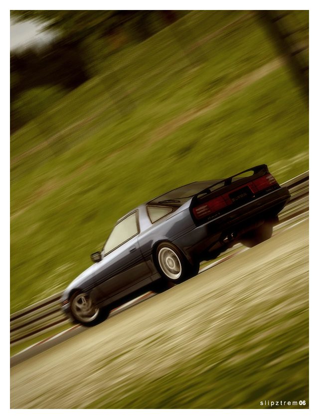
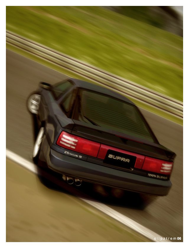
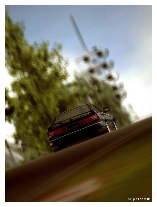
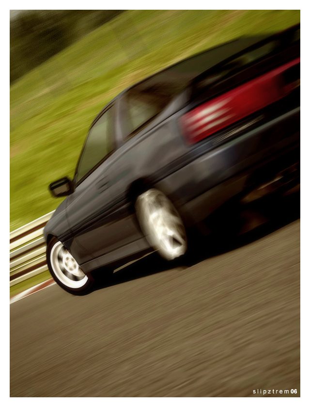
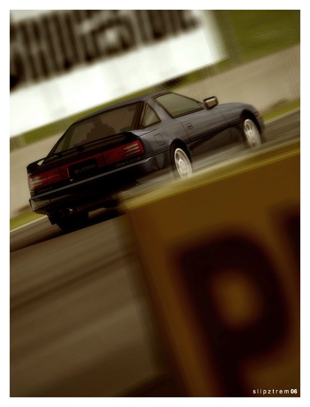
Update: Yes, I know the range of angles is pretty weak this time around. The car is quite the drifter, so that was my primary focus. However, I wanted to go with something a bit more mature looking; for example, the second shot was chosen because of the realism, and the entire batch actually was desaturated a bit, the opposite of what I normally do. It's nothing too dramatic I suppose, but I want to branch out a bit. So apologies if it's not well liked; this is me being experimental
 .
.Kenny - I really wanted that one to be special, because I've nearly exhausted that angle on that part of the track, so I needed something different
 .
.Es - Yes sir, captain!

Last edited:
- 248
Wow, I'm lovin' that Supra drifting. Nice shots. Hey, If you get a chance, you might want to drop by my gallery, the link is in my sig.
- 1,805

- Adelaide
- Revolution52
Nice work here, Slip. Revo's pick: The 4th vertical one. Very nice.
- 196
theeey aare sooooo greaaaat , i think im gonna buy a supra 


- 830
 I did an update not to long ago with that same car and in the same color in my old gallery... Good update man!
- 479
Nice Supra update but it's too dark for in my opinion. Not enough contrast either 

- 8,480
- P_Balance
Wow dude, really nice pictures, they have a really soft feelinf to them.
- 1,037
i really like this update man. i presonally like the saturation in these pics. it looks good. also for being "experimental" these pics are great. 👍
- 27,387

- Toronto
- NewAesthetic
- SlipZtrEm
Bedheadben and Rohrl-fan - Thanks you guys! I will definitely get around to it, though I'm on the school's computer right now, so I'll try to later on when I'm back home 
Revolution - I really like that shot too!
Appie - As a guest, just make sure you clean that up!
Integra - You really should. I thought it wouldn't make a very good drift car, and I spent next to no time setting it up, but it's incredibly predictable on R1's and with about 560hp. I stuck the slicks on because I wanted the bigger rims .
.
Turbo - Please tell me it wasn't the same track too! Heh, I'll have to go check it out
Matt - Thanks for being honest. I didn't want to go overboard on the contrast because like I said, I wanted it to look realistic. It was more down to paying attention to the levels and the colour balance for this update
Sejtur - Probably because I started with the vivid saturation in game . I didn't want to desaturate too much, again, I was just going for a realistic tone this time, and I felt that going further would've taken away from that. However, I do like some of the more desaturated style shots, so I may take it further in my next update. It's a nice look
  .
.
Perfect Balance - That was the intent, glad you enjoy it .
.
Pain Killer - Thank you! I realize now though that tagging them "experimental" was pretty weak in the face of what others are experimenting with. These are positively normal compared to the around-the-turn blurs and moving Photo Travel shots .
.
Vonie - . That is exactly what I was trying to avoid! Normally I bump saturation up between 20 and 30. It's eye-catching, but sometimes it's just overpowering.

Revolution - I really like that shot too!
Appie - As a guest, just make sure you clean that up!

Integra - You really should. I thought it wouldn't make a very good drift car, and I spent next to no time setting it up, but it's incredibly predictable on R1's and with about 560hp. I stuck the slicks on because I wanted the bigger rims
 .
.Turbo - Please tell me it wasn't the same track too! Heh, I'll have to go check it out

Matt - Thanks for being honest. I didn't want to go overboard on the contrast because like I said, I wanted it to look realistic. It was more down to paying attention to the levels and the colour balance for this update

Sejtur - Probably because I started with the vivid saturation in game
 . I didn't want to desaturate too much, again, I was just going for a realistic tone this time, and I felt that going further would've taken away from that. However, I do like some of the more desaturated style shots, so I may take it further in my next update. It's a nice look
  .
.Perfect Balance - That was the intent, glad you enjoy it
 .
.Pain Killer - Thank you! I realize now though that tagging them "experimental" was pretty weak in the face of what others are experimenting with. These are positively normal compared to the around-the-turn blurs and moving Photo Travel shots
 .
.Vonie -
 . That is exactly what I was trying to avoid! Normally I bump saturation up between 20 and 30. It's eye-catching, but sometimes it's just overpowering.
- 27,387

- Toronto
- NewAesthetic
- SlipZtrEm
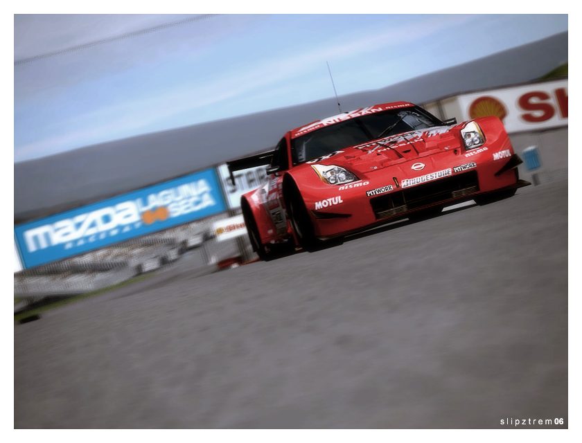
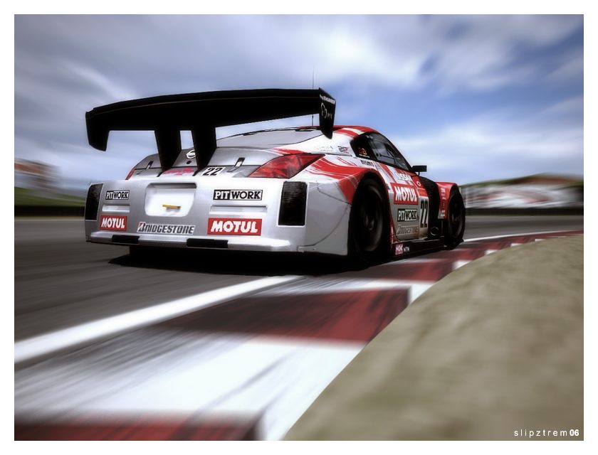
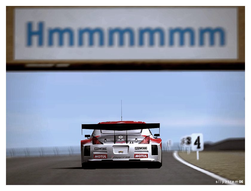
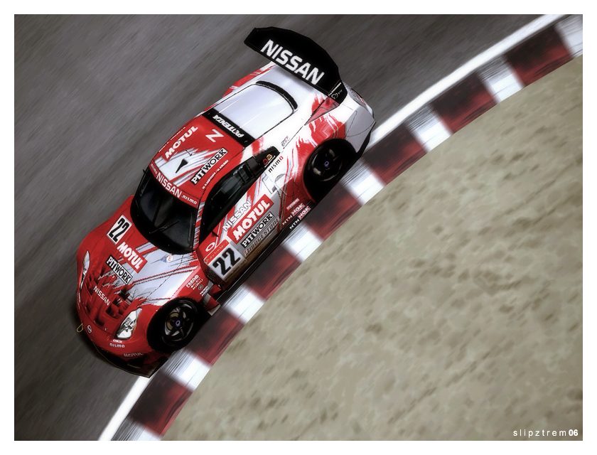
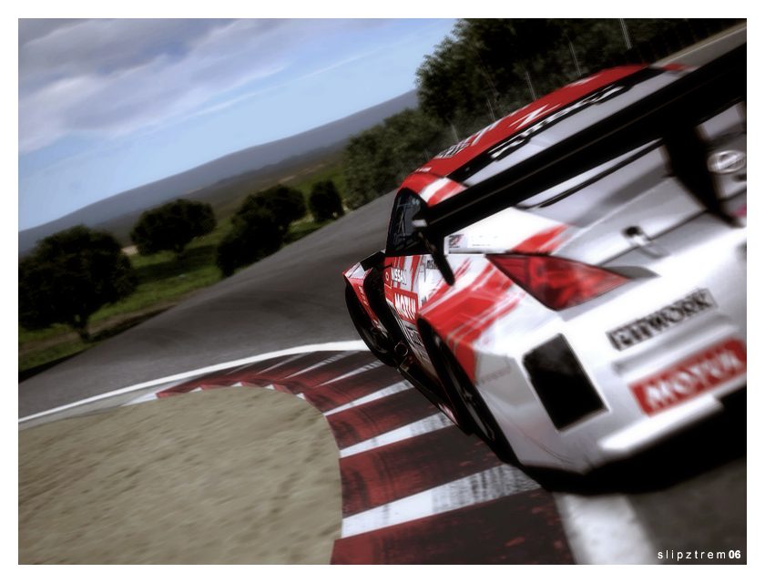
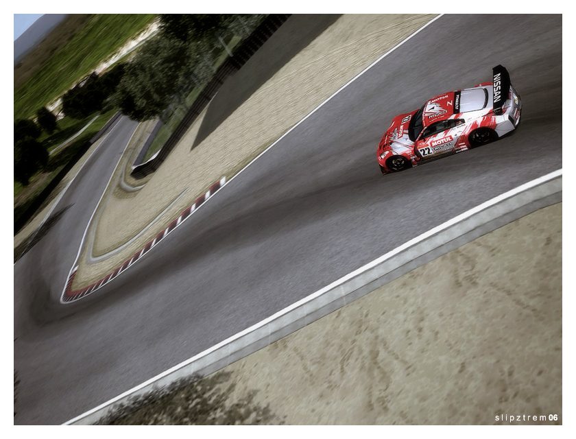
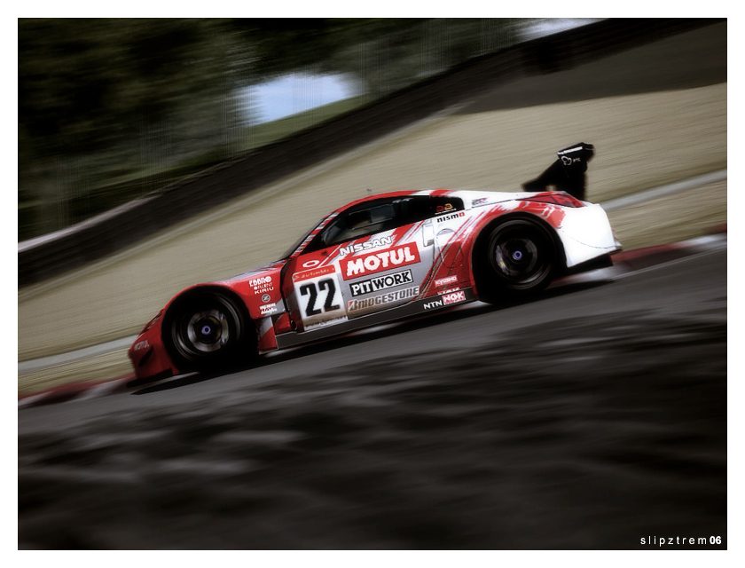
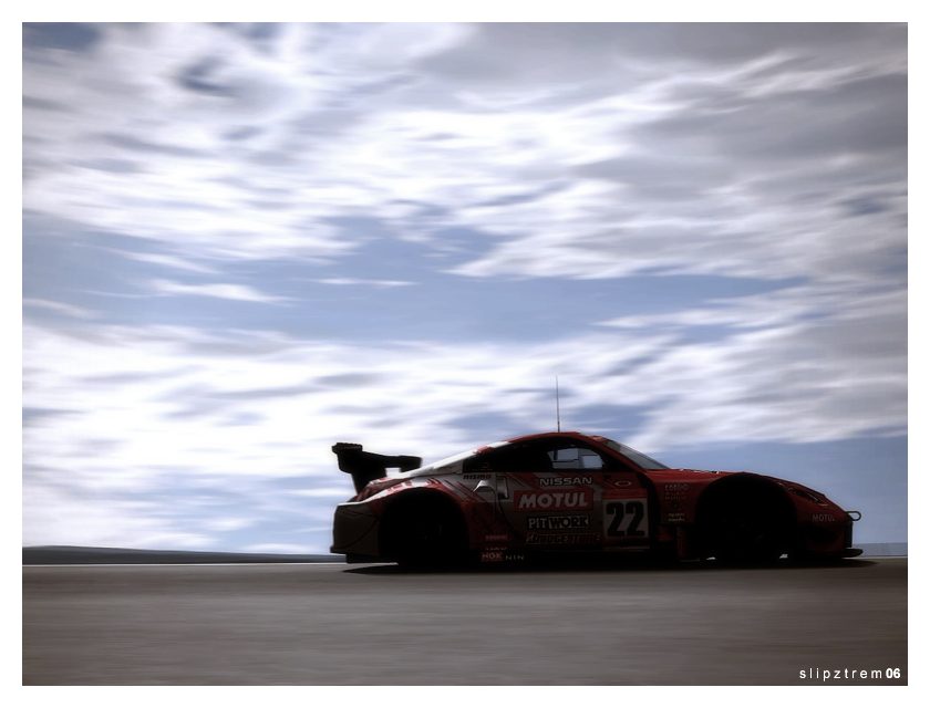
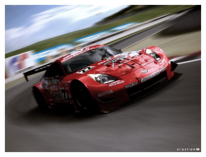
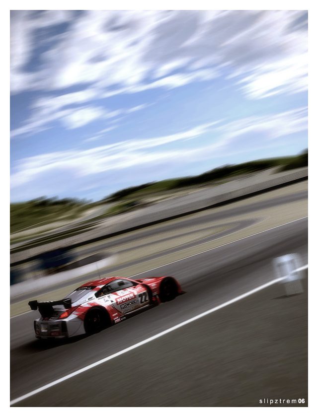
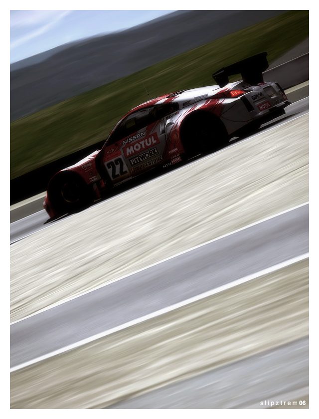
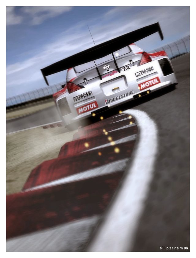
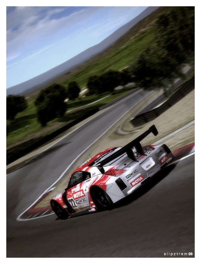
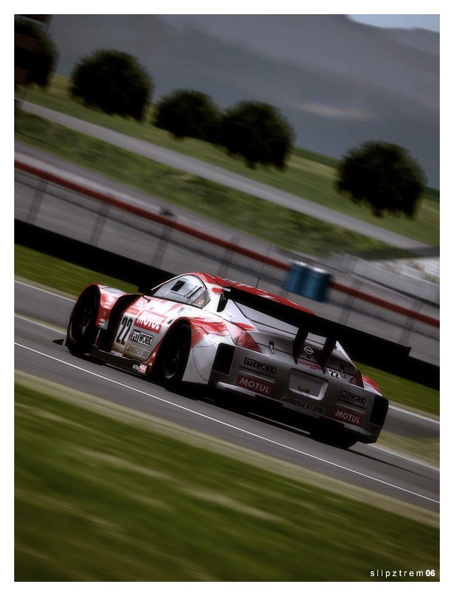
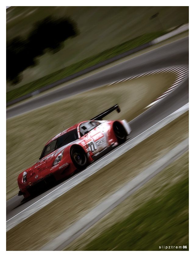
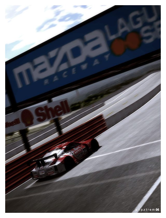
Nissan Motul Pitwork Z @ Laguna Seca
___________________________
___________________________
Update: This has been a long time coming, and I've spent a fair amount of time cleaning the shots up (and even attempting the around-the-corner blur perfected by Franz and Rev). I decided to do my own personal set for my most prized GT4 car; the Pitwork Z. How much is that car worth to me? A year's tuition, after winning CampusCup with it. Obviously, 2P replays aren't saveable in GT4, so all of these shots are taken from a replay of a Time Trial I did the day before the contest. I don't have the exact time on hand, but it's a 1:14.6xx. That's an Arcade car on RSS tires, MT, TCS only, and no Quick-Tune. I hope you enjoy it as much as I did

Diabolical - I've gone back to the Supra for fun lately, and I can't get over how much of a ball i is. But the MR2 set definitely has it trumped in variety, I'll give it that
 .
.
Last edited:
- 728
Excellent shots! I never really liked that car, but you make it look awesome!!! 👍 I have to admit, I'm beginning to become a real fan of your work. Please, keep 'em coming!
And congratulations are in order I see! 👍SlipZtrEm...after winning CampusCup with it.
- 1,805

- Adelaide
- Revolution52
Great work on the Zed, Slip. My favourites are numbers 4, 5, 7 and 8. A great update, 👍👍
- 479
Awesome pictures dude. I love that blur you did...I like the fact you didn't over saturate or over do the pictures...Those looks sexy 

- 830
Good job on the Pitwork you got somw nice angel's on it. 👍
- 2,110
Awesome set with the 350z. I still am trying to do that blur trick!!! Hopefully you can figure it out yourself. 

Similar threads
- Replies
- 11
- Views
- 1K
- Replies
- 6
- Views
- 3K


