The GT7 Bonus Livery Editor Competition #04 (24 Hours of Le Mans & Spa)
- Thread starter Racerx_34
- 70 comments
- 12,488 views
This is the 2016 #99 BMW M6 GT3 for the ROWE Racing Team, the race winner at the 24h of Spa Francorchamps. This was the only succes for M6 gt3, I like the old scool bmw's more but this livery is so nice that's why I chose the m6 instead.
I hope you enjoy it to Peace.
Last edited:
- 832

- Amsterdam
- HennyGingerale
Wow how? That is really unique, well done manFINAL ENTRY
PS4 Base
Amazing, I absolutley love your usage of gradients, great choice and great execution my good sir!
Cheers for all the likes and kind commentsWow how? That is really unique, well done man

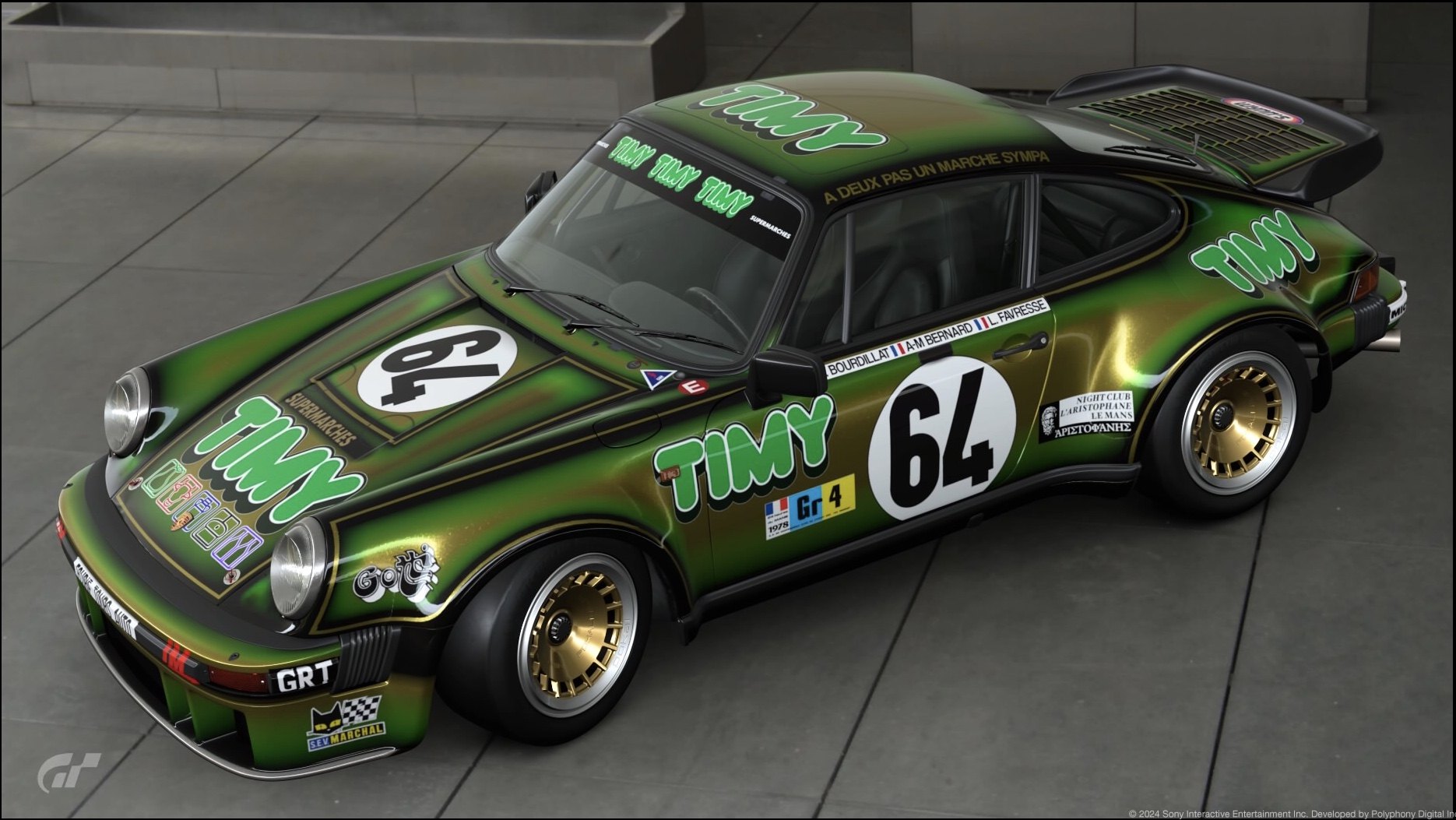
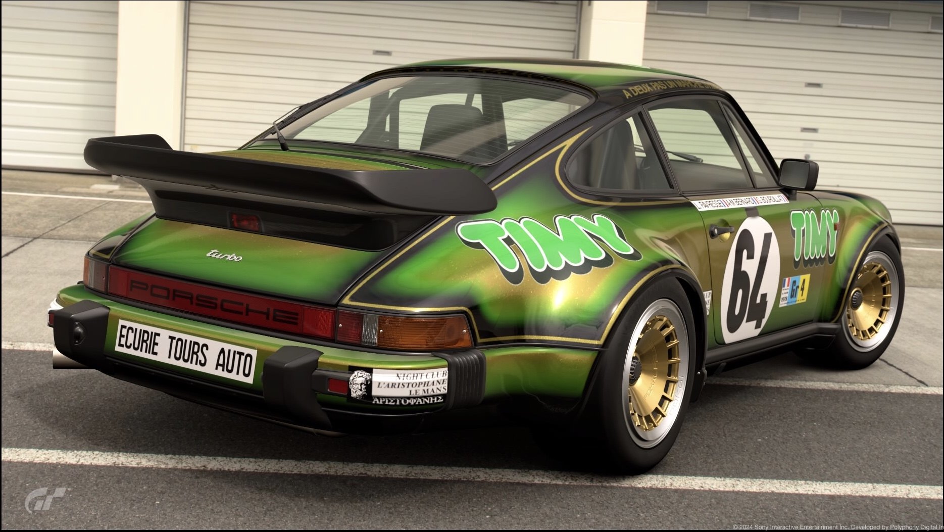
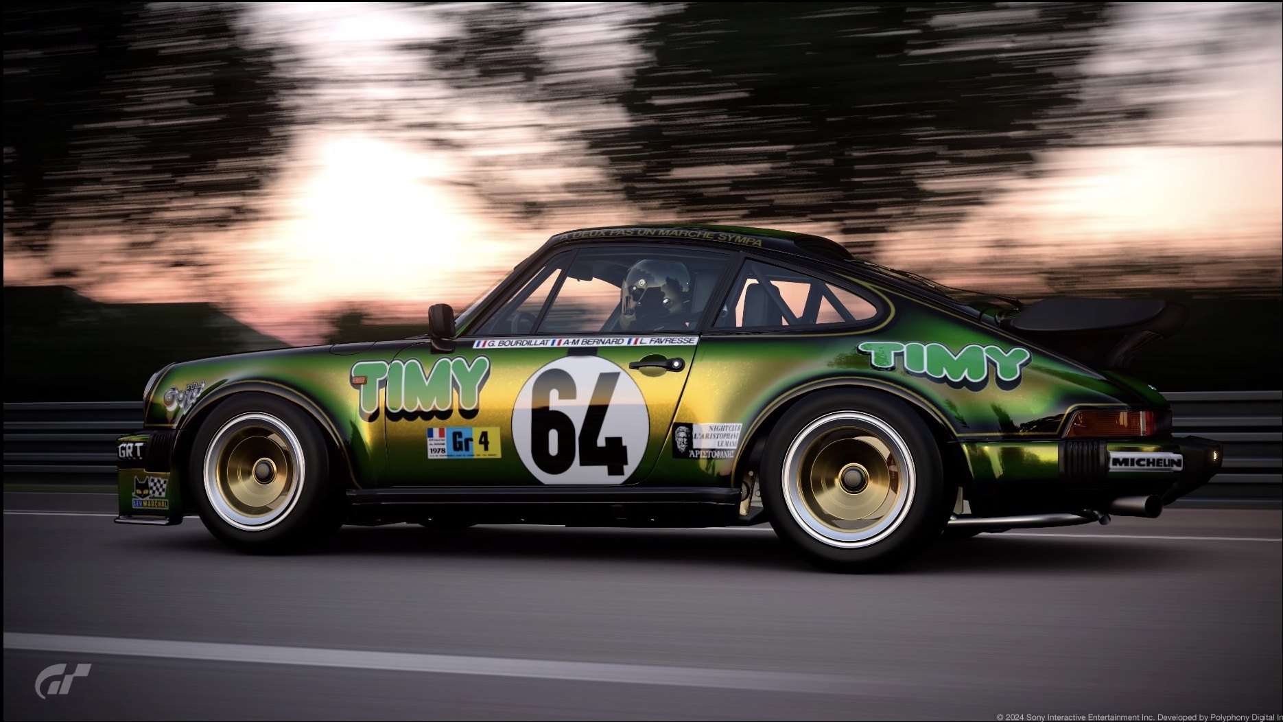
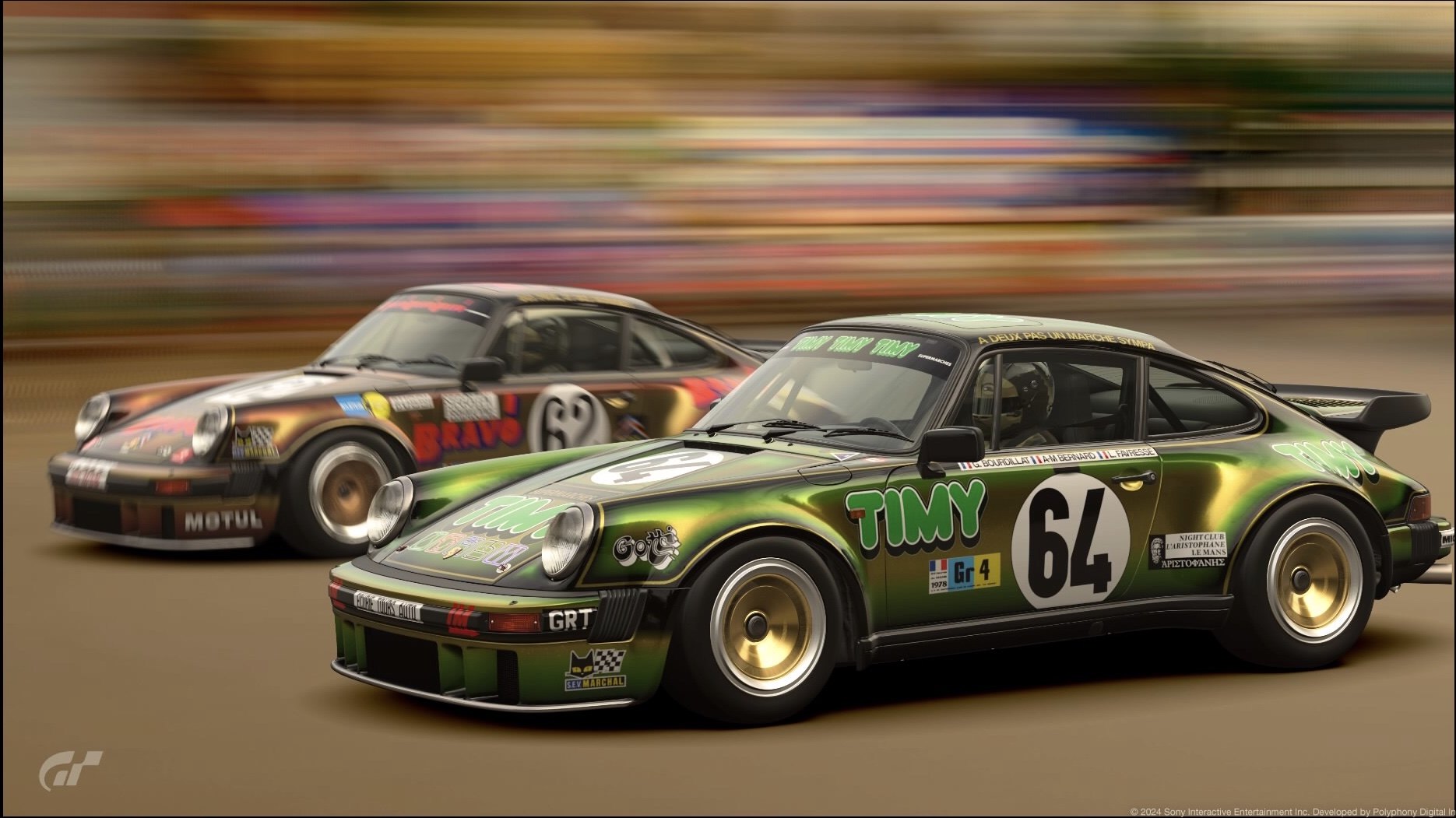
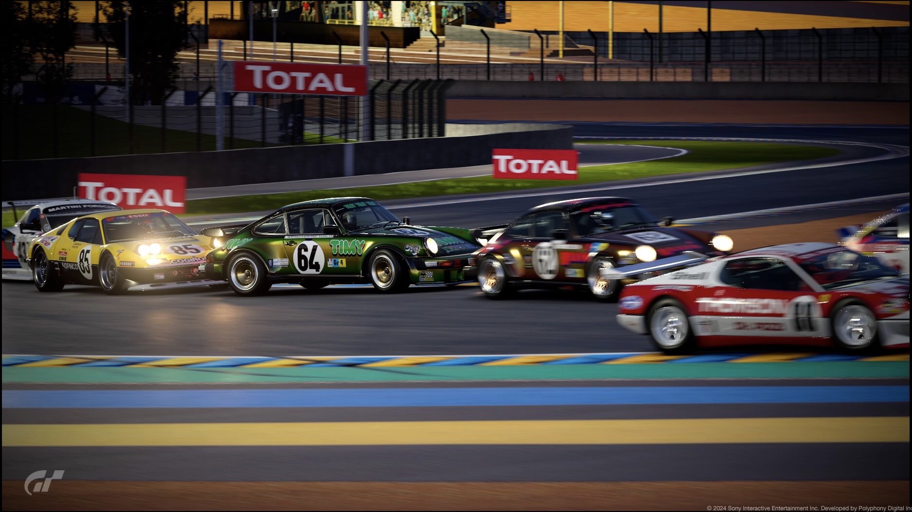
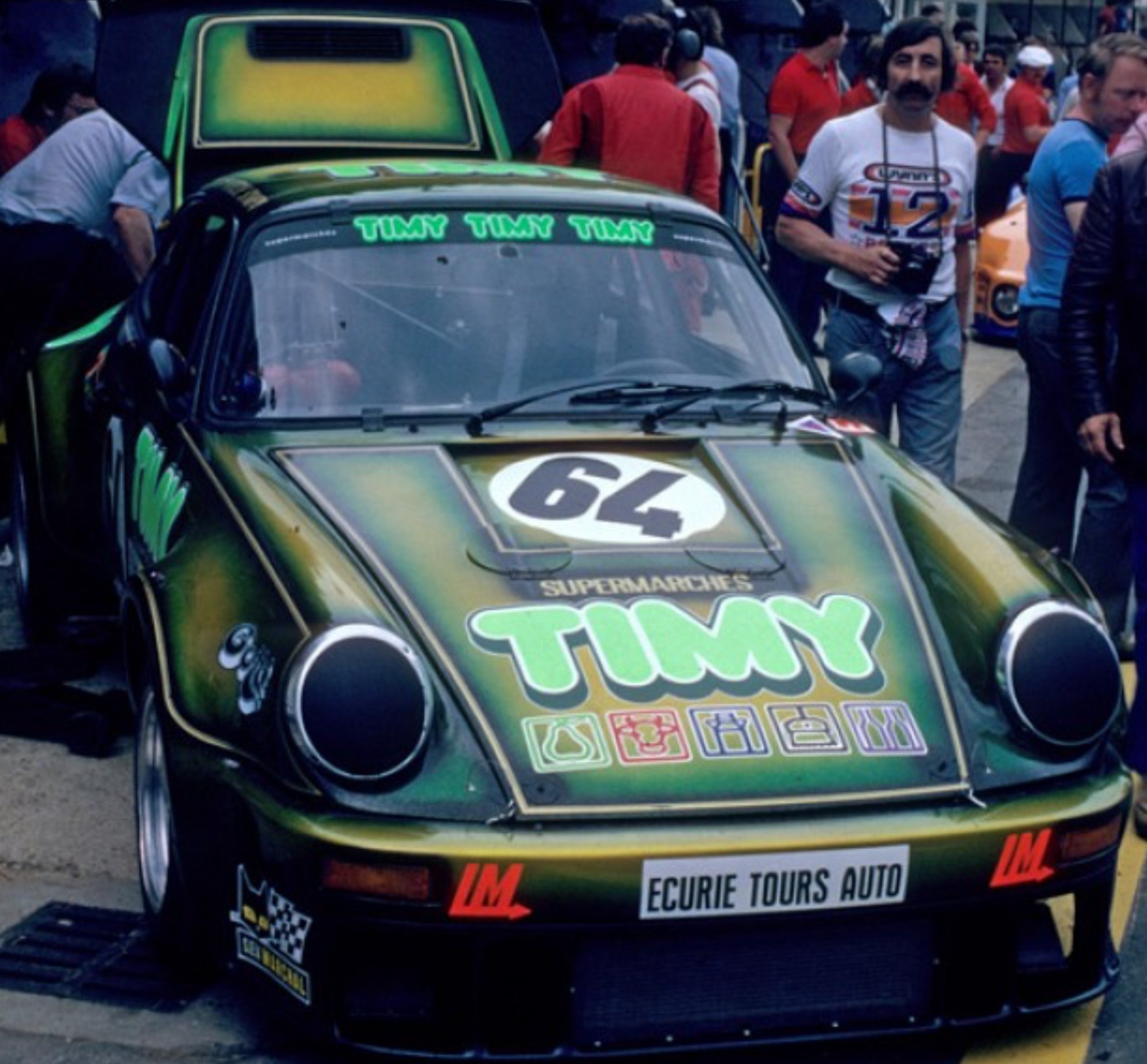
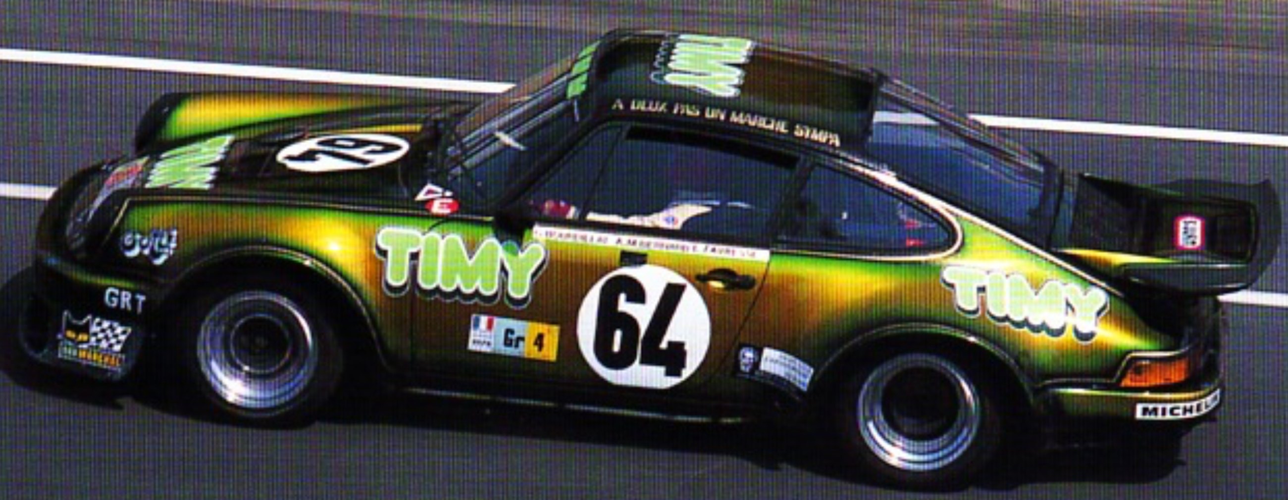
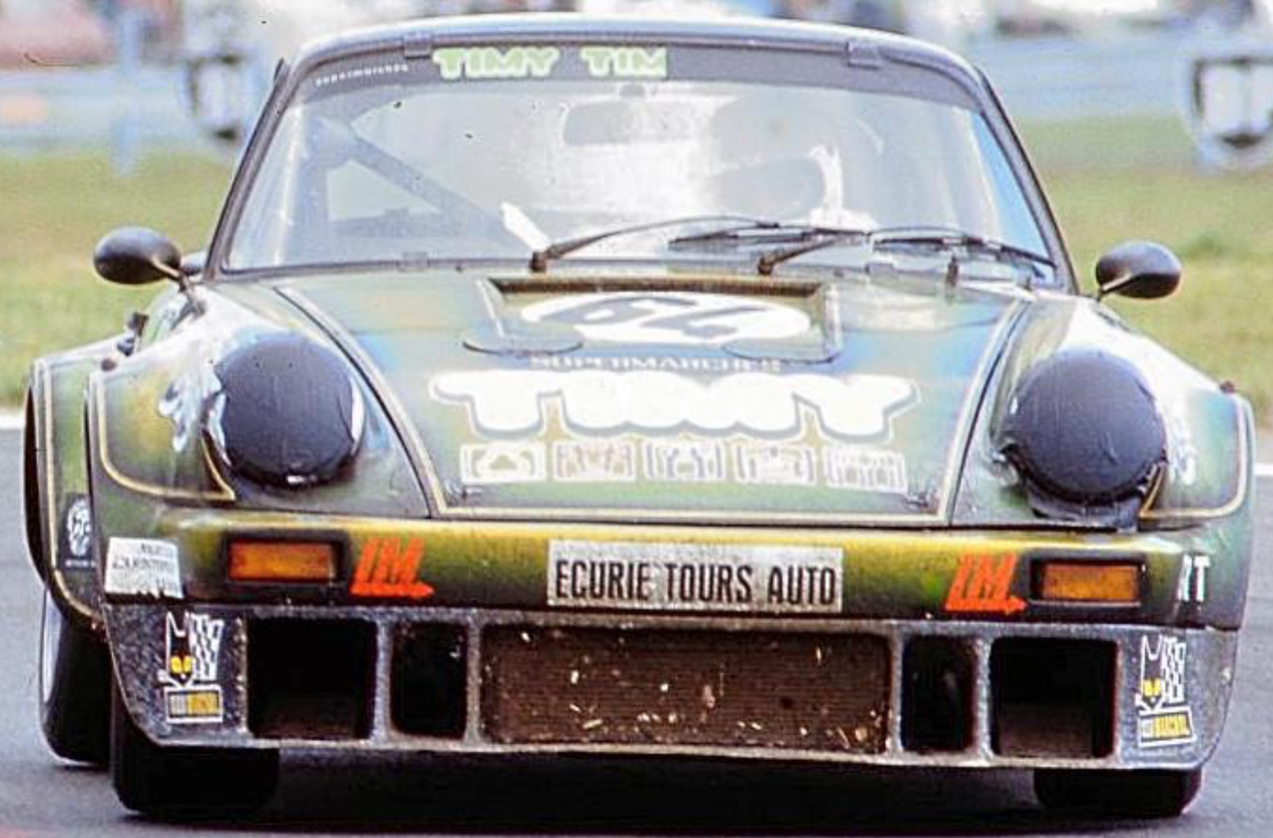
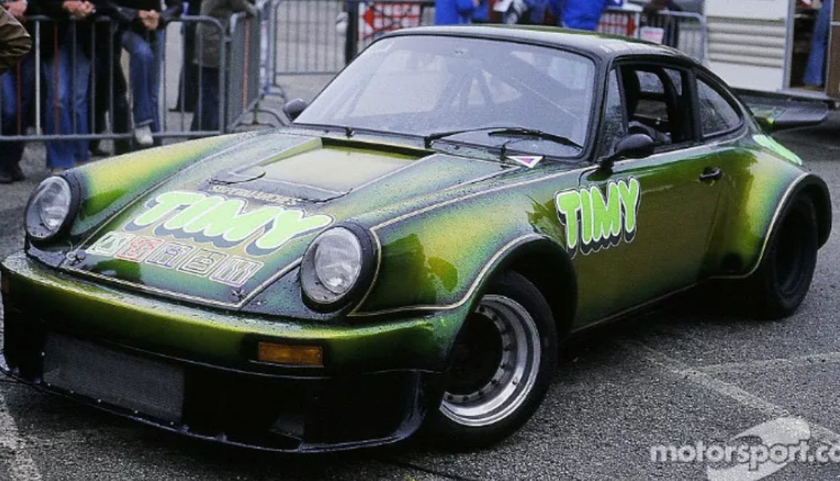
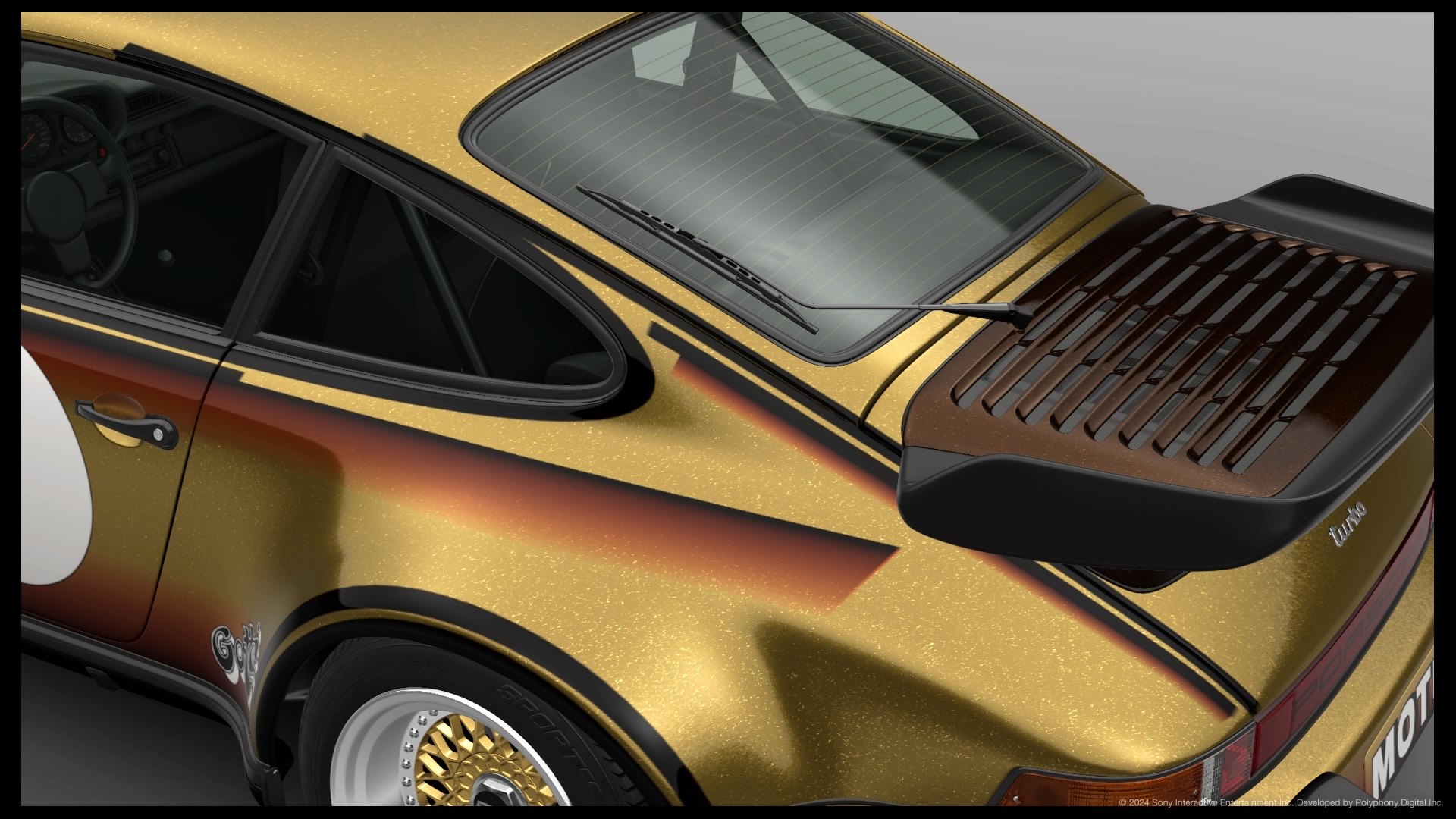
I've updated one of the bonus photos. This TIMY is one of 3 cars that had a pinstripe and gradated flake livery in the 1978 Le Mans, the Bravo 934 was the 3rd livery I attempted when GTS came out, (on the Gr3 Porsche), I failed so many times lol, but I've had plenty of time to track down photos, make decals and figure a way to do it.FINAL ENTRY
PS4 Base
Phew, another hi-res shot
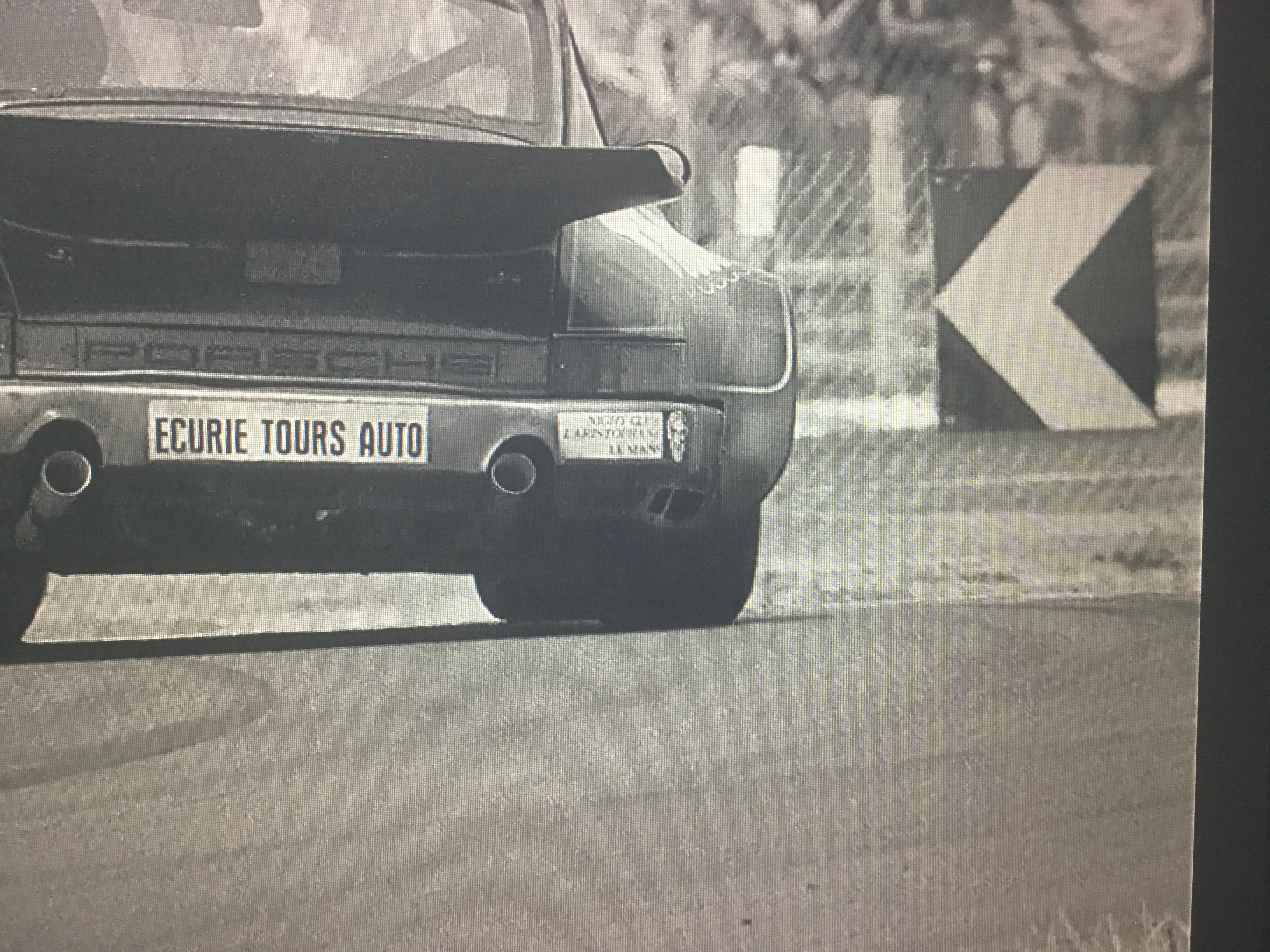
... and now I've just realised I put Aristophanes on the wrong side of the rear sticker, doh!
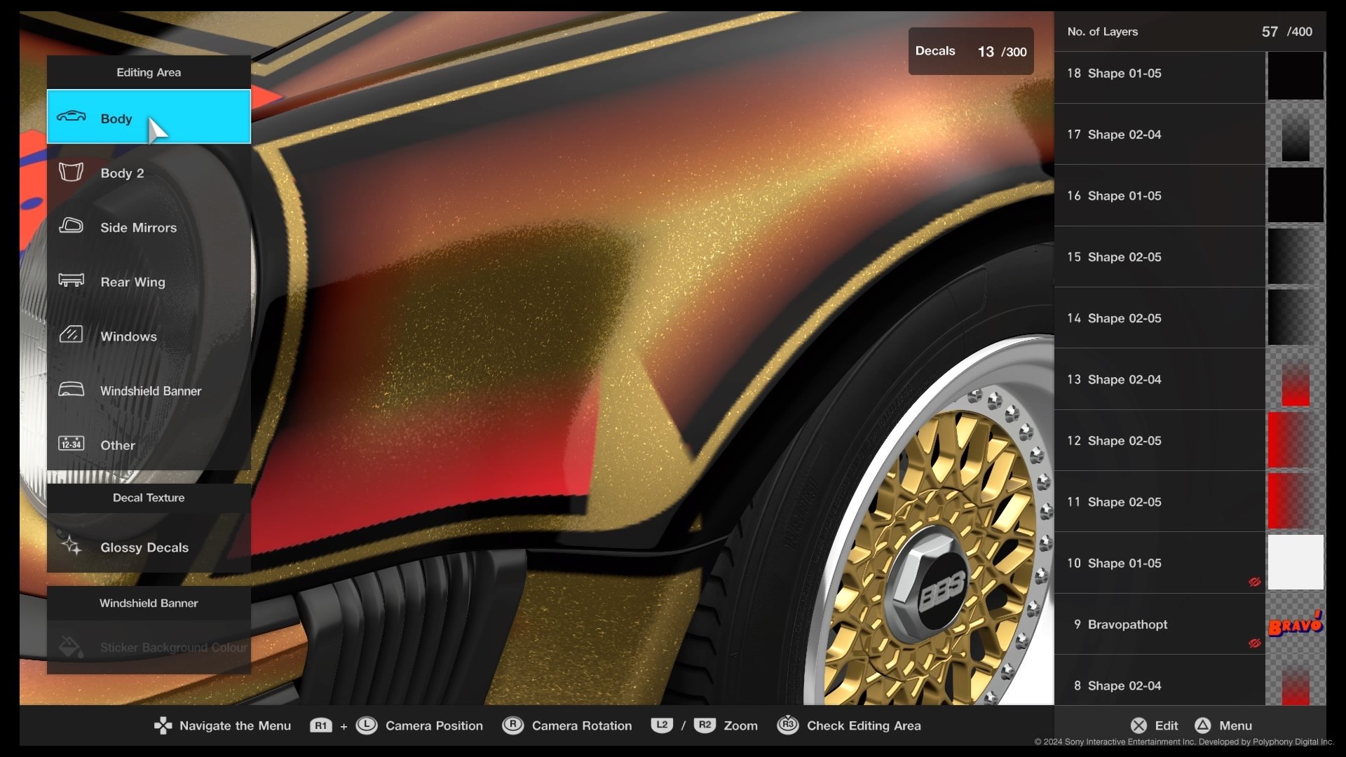
I took these photos to make decals while working on the Bravo version. The starting point is dark flakes; they take colour transparencies and keep saturation, the more transparent your decal the better, which usually means bright to start with, and usually maximum saturation for colours that are 'above mid brightness' once mixed with the base.
... (continuing photo description) yellow transparency. I ended up making a decal for the roof corner and other 'transition' areas, pie slice gradients are good for filling the gaps because they deform flexibly. Transparency overlaps and gaps stick out like a sore thumb, you have to be close to pixel perfect  . Place a decal at the angle of the photo when you go off to make decals, so you get the placement correct later.
... and replace with gradient (bright green for TIMY), adjust width and 20% transparent, duplicate gradient and make black. For the Silver headlight surrounds, theres a break in the yellow base transparency, and a 16% transparent white with a tinge of blue to offset the dark yellow flake (it's 20% in the photo). There's a lot of trial and error with dark flakes and transparencies after trying the livery in different lighting. For the TIMY I used the greener dark yellow flake.
 . Place a decal at the angle of the photo when you go off to make decals, so you get the placement correct later.
... and replace with gradient (bright green for TIMY), adjust width and 20% transparent, duplicate gradient and make black. For the Silver headlight surrounds, theres a break in the yellow base transparency, and a 16% transparent white with a tinge of blue to offset the dark yellow flake (it's 20% in the photo). There's a lot of trial and error with dark flakes and transparencies after trying the livery in different lighting. For the TIMY I used the greener dark yellow flake.
- 641

- Iowa
- Tealjbody
I’m ready for the next homework assignment.Last call for entries.
- 2,033

- Ireland
- Racer X
I’m ready for the next homework assignment.
I'll get the new LEC up this week.
- 2,033

- Ireland
- Racer X
Are we a still doing this?
Work has been busy so I haven't had a chance to put up polls yet.
If you have an entry put it up and I'll include it.
- 832

- Amsterdam
- HennyGingerale
The poll is up!

 www.gtplanet.net
Please cast your 3 votes!
Poll: The GT7 Bonus Livery Editor Competition #04 (24 Hours of Le Mans & Spa)
Poll #01 Poll #02 Poll #03 Poll #04 Poll #05 Poll #06 Poll #07 Poll #08 Poll #09 Poll #10 Poll #11 Poll #12 Poll #13 Poll #14 Poll #15 Poll #16 [URL='https://flic.kr/p/2pYMwiu']
Please cast your 3 votes!

Similar threads
- Sticky
- Replies
- 30
- Views
- 2K
- Replies
- 49
- Views
- 9K
- Replies
- 106
- Views
- 11K
- Replies
- 51
- Views
- 8K


